
Visualisation Notes #2
Association, Aggregation and Causation
Visualisations can be useful, but we shouldn't read too much into them
Published on 14 February 2025
Welcome to the second in our series of visualisation notes. In the first one, we learned what data visualisation is, and why it is so powerful at revealing patterns and trends in data. We also discussed the grammar of visualisation, the symbols it uses (marks) and the way that it encodes data through the variation of certain attributes of those marks, such as height, position, angle, colour and other things.
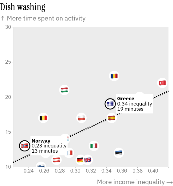
This second visualisation note is connected to a story about how Europeans spend their time, and how that relates to economic inequality. The first charts you'll see in the story are called scatter plots. They are one of the best ways to reveal the positive or negative association between variables.
For instance, as explained in the story, the scatter plot below reveals that the higher the inequality of a country is (position of the flags on the horizontal axis), the more time people on each country spend washing dishes every day in general (position on the vertical axis).
As we hope we've demonstrated with this fun story about the way that Europeans spend their time, scatter plots can be intriguing, and they are also powerful tools in the visualisation toolkit. However, we need to be careful not to read too much into them – something that is also true of any other visualisation.
To begin with, the 'in general' mentioned above is critical when reading scatter plots and many other visualisations. You, an individual, may live in one of these countries, but may spend more or less time washing dishes than a typical person.
This chart is based on an aggregate of many responses by many people within each of these countries who participate in the Harmonised European Time Use Survey, but those people have very different backgrounds and living and economic conditions
Let's imagine that you are from  Norway and make friends with a few people from
  Greece. Based on the scatter plot alone, can you infer that you spend less time than them washing dishes? You shouldn't; you'd be committing an ecological fallacy , which is a technical term to refer to cases in which we incorrectly infer characteristics of individuals based on characteristics of the groups that those individuals belong to (countries, in this case).
Perhaps your Greek friends don't spend as much time washing dishes as a typical Greek person. You can't know based on the scatter plot alone.
Moreover, you may be familiar with the mantra 'correlation is not causation' (in statistics, correlation is one of possible ways to analyse the association or interdependence between two variables). We cannot infer causation from a correlation alone for many reasons, one of them being that we don't know whether there are other factors that may contribute to the interdependence between the variables.
Does economic inequality alone explain the fact that people spend more time washing dishes? Or, vice versa, does spending more time washing dishes explain inequality, as the causal arrow could go in the opposite direction? Probably not. There are surely many other cultural, societal or economic factors that affect the association between a daily activity and the inequality of a country.
When reading scatter plots – or any other chart, graph or map, for that matter – remember a saying that Alberto Cairo popularised in his 2019 book How Charts Lie: 'A chart shows only what it shows, and nothing else.' All that the scatter plot above reveals is that, at the national level, there's a positive association between economic inequality and spending more time washing dishes. Nothing more, and nothing less.
From this fact alone we cannot infer that (a) this association applies to everyone in each country, or that (b) one variable causes the other. To address questions like those we would need much more data and further research.
Story #2