
Visualisation Notes #1
The Power of Data Visualisation
How visualisation allows us to reason through data
Published on 25 November 2024
We hope that you've enjoyed the first data story of our series based on the European Union's (EU) high-value datasets!
In this story we used maps to show areas in Spain that may be at risk of fluvial or coastal flooding in the next years or decades.
Maps that represent data are part of a practice called data visualisation. Our goal with this series of stories isn't just to create beautiful graphics based on high-value datasets, but also to prove that visualisation is a powerful tool to reveal patterns and trends in data — and to teach you how to use it.
Therefore, each of our data stories will be paired with an article like this, intended to introduce you to the wonderful world of data visualisation.
Let's begin with some basics.
Hans Rosling, a popular Swedish international health professor, medical doctor, book author and statistician once wrote that 'The world cannot be understood without numbers. But the world cannot be understood with numbers alone'.
Quantification is an essential part of science and critical thinking, but it's not sufficient on its own. Qualitative knowledge and domain-specific expertise are necessary to put data into context.
Moreover, when it comes to communicating insights from data, there are few tools that are as useful as data visualisation.
Data visualisation consists of encoding data. This sounds a bit technical, doesn't it? However, it isn't hard to understand.
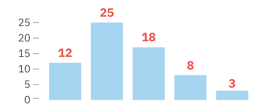
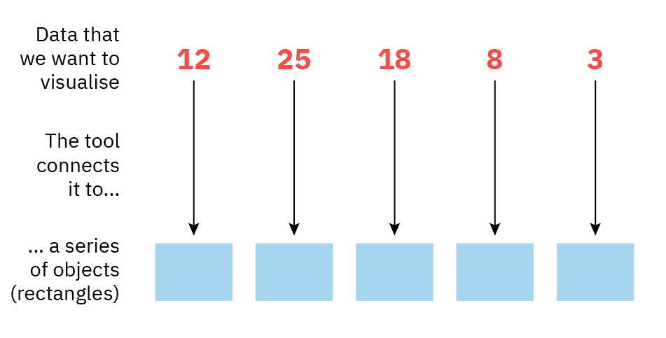
Here's an example: when you ask a software tool to create a bar graph like the one below, what is the tool actually doing?
The software tool first reads your data and connects it to a series of geometric objects.
In the case of the bar graph, these objects are rectangles:
The software tool then changes the height of these rectangles in proportion to the numbers that we want to visualise.
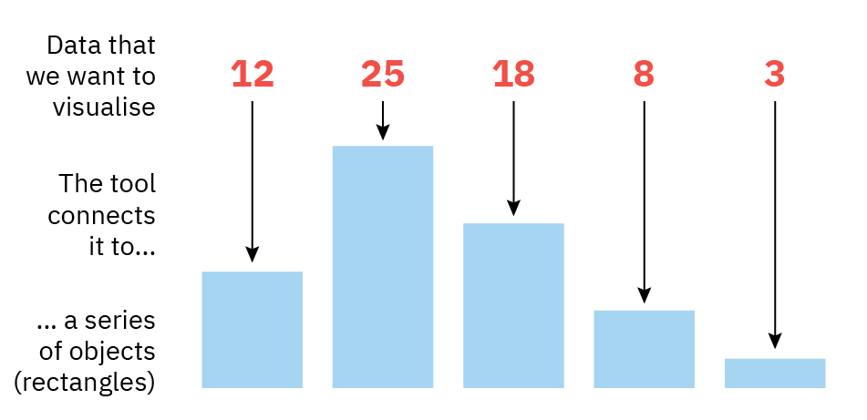
This process of connecting data to graphical objects is called encoding. Visualisation is a language and encoding is the foundation of the grammar of visualisation.
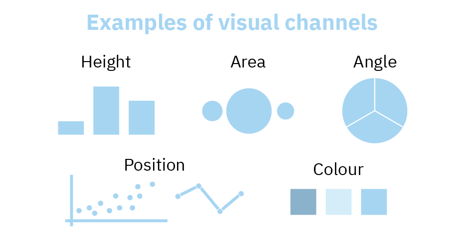
In the grammar of visualisation, the objects we use to represent data — dots, rectangles, circles, triangles, lines and others — are called marks.
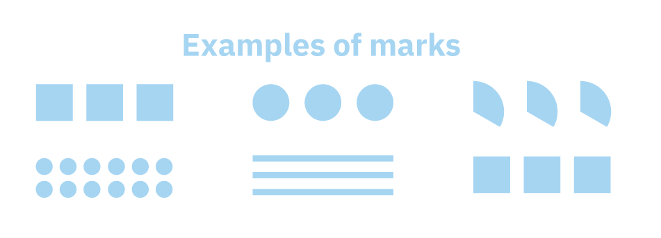
The attributes of these marks that we vary to represent our data (e.g. the height of the bars in the case of a bar graph) are called visual channels.
Visualisation designers use a broad variety of visual channels to encode data. For example, we can vary height or length (like in bar graphs), angles (like in pie charts), areas (like in bubble charts), colour hue and shade (like in certain types of data maps) and many others.
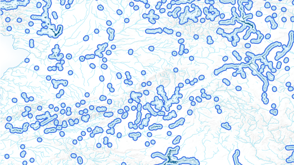
Now that we've learned a bit about the grammar of visualisation, it's time to go back to an example from our story about flooding risk in Spain. This is one of the data maps in it:
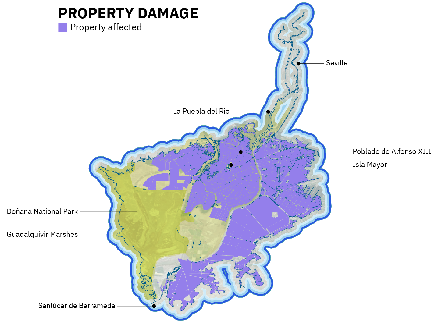
Let's try to identify the marks and visual channels used in this map.
One visual channel is position. A map is generated by positioning points, lines and other marks over a coordinate system, where the horizontal axis corresponds to longitude and the vertical axis corresponds to latitude.
This map also uses another visual channel - colour - to identify different types of geographic features, such as the points at different degrees of risk of flooding.
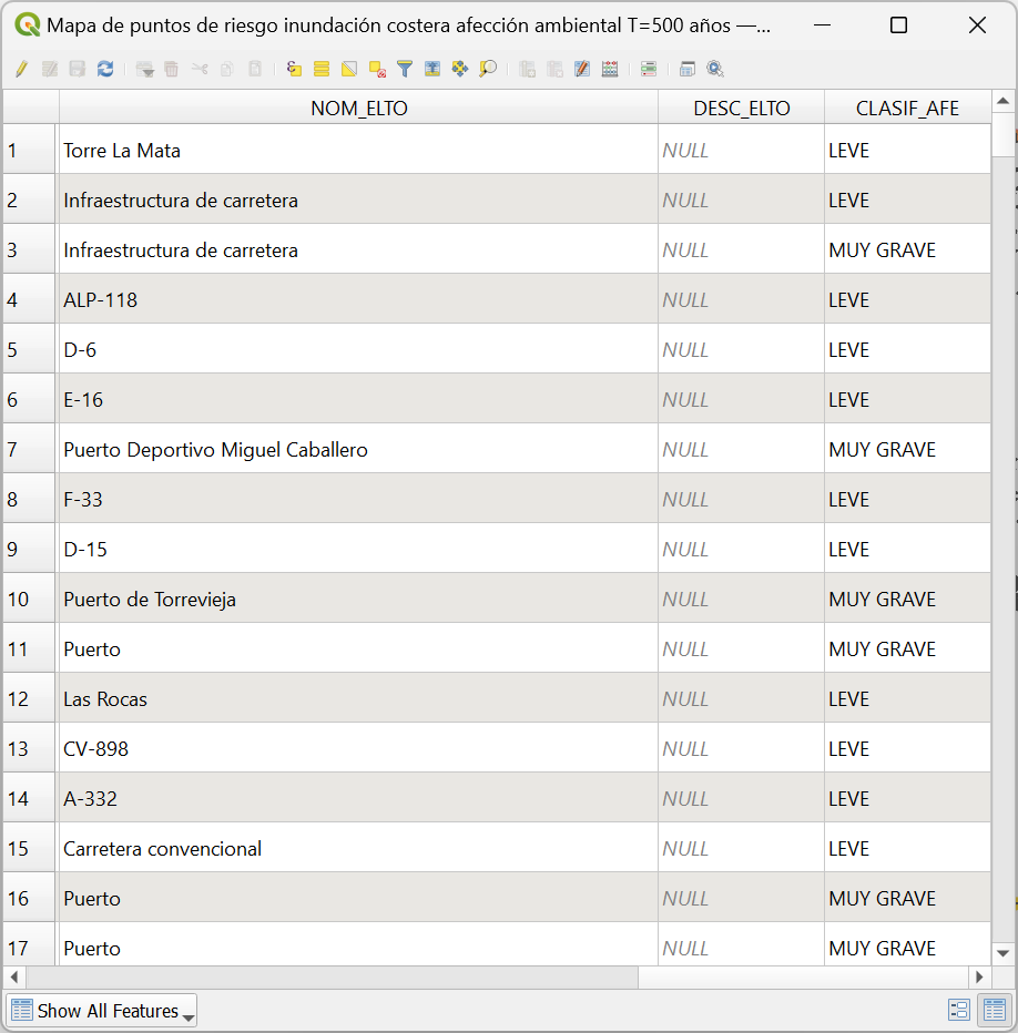
The power and purpose of data visualisation lie in helping us notice patterns that may be impossible to see if the data was presented just as figures in a table. Imagine that we only showed you the data itself, but not the map; you wouldn't understand much:
But by transforming the data into a visualisation — a map, in this case — your eyes and brain can quickly perceive where the points at high risk of flooding are more or less concentrated. That's the power of data visualisation.
That's all for now! In following articles, we'll discuss other aspects of data visualisation. For example, how to choose the most appropriate type of chart for every message or story, or the fact that individual visualisations are sometimes meaningless on their own and acquire deeper meaning when woven into a narrative with other visualisations.
Story #1