Outliers are data points with extreme high or low values. They can point to errors in the data, and they can also skew analysis results (they can have a big effect on the average value, for example, see the mean versus the median page). In visualisations, outliers can hide the finer details in the other values.
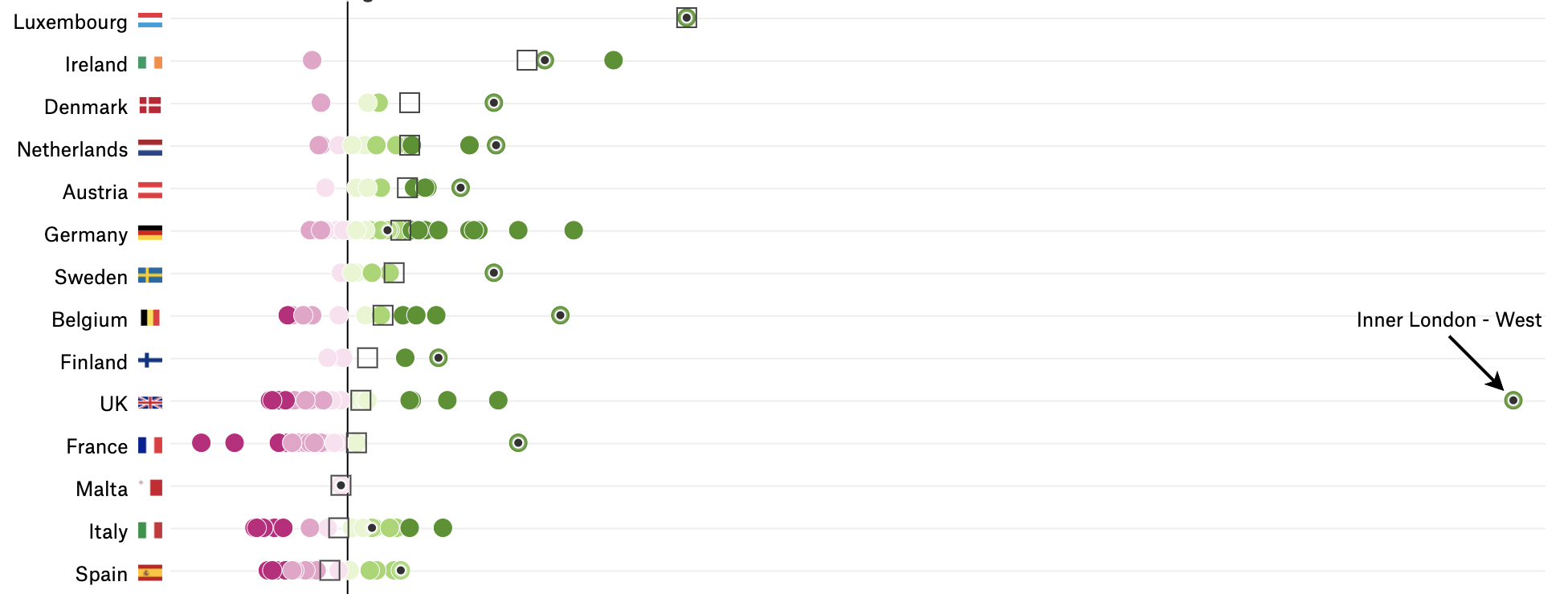
An outlier in the data is squeezing the other data points all to the left of the chart. Source: Why Budapest, Warsaw, and Lithuania split themselves in two, pudding.cool
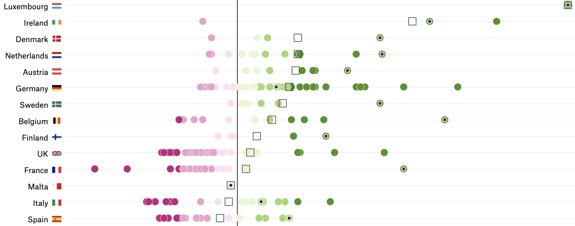
Removing the outlier gives more space to the other data points. Source: Why Budapest, Warsaw, and Lithuania split themselves in two, pudding.cool
Sorting your data can help you to inspect the lowest and highest values in numerical columns. Check whether or not they fall in the expected range and if they do make sense. Visualising the data with a dot plot or a histogram can also reveal outliers.
When extreme values in data are the result of errors, they should be corrected or filtered out. When they are inherent to the data and constitute real data values, they should be taken into account in analysis and visualisation. But depending on the purpose of the analysis and visualisation and depending on the nature of the outliers, they can also be filtered out in some occasions.