What is Observable Plot?
Observable Plot is a JavaScript library for data visualisation based on the Grammar of Graphics. It can be used as a stand alone JavaScript library, but it was developed by and it is conveniently integrated in the Observable platform.
Observable is a platform to make interactive notebooks based on JavaScript. It is focussed on data analysis and data visualisation, and Observable Plot was developed to let users of the platform quickly add data visualisations to their Observable notebooks.
Getting started with Observable Plot
Getting started with Observable and Observable Plot is as easy as creating an account on the platform. Click the “Sign up for free” button on the left or the “Sign up” button in the top right of the Observable home page to create an account.
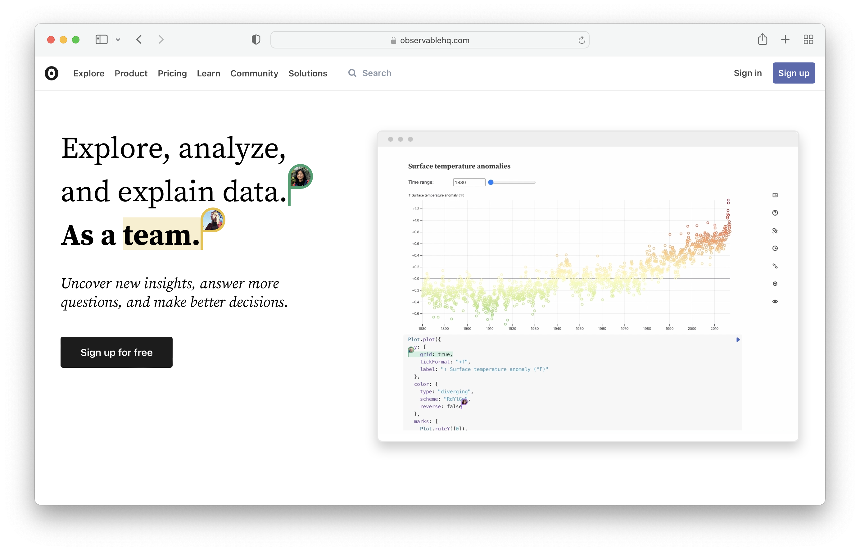
Source: Maarten Lambrechts, CC-BY-SA 4.0
Before making any visualisations with Observable Plot, you should get used to the way Observable notebooks work. Start by creating a new notebook from your Observable home screen by clicking the “New” button under Recent notebooks, or navigate directly to observablehq.com/new.
In the dialogue that pops up you can select a template with prefilled content. Leave the blank template selected and click the Create notebook button in the bottom right.
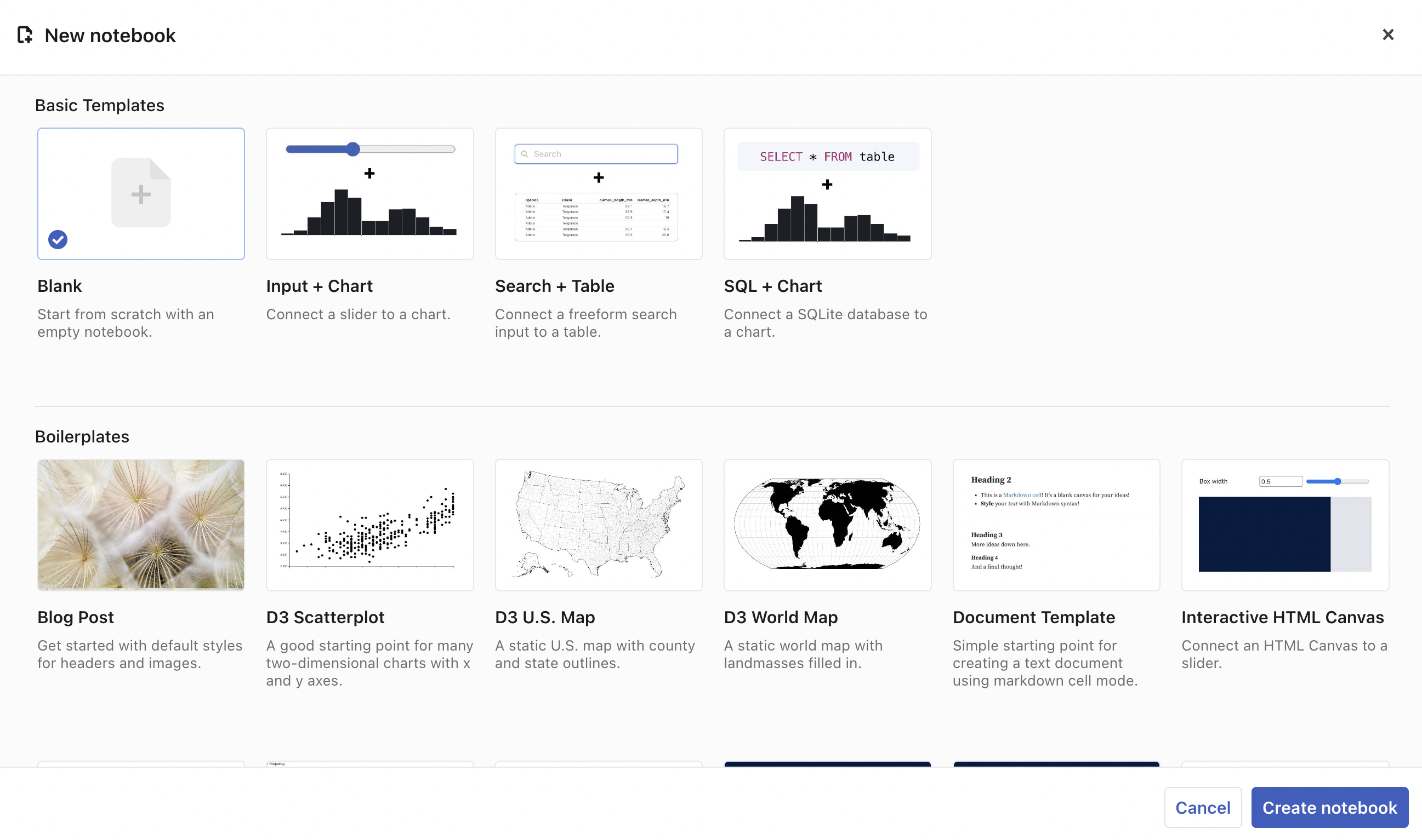
Source: Maarten Lambrechts, CC-BY-SA 4.0
A blank notebook will open, with a single cell with “# Untitled” as content.
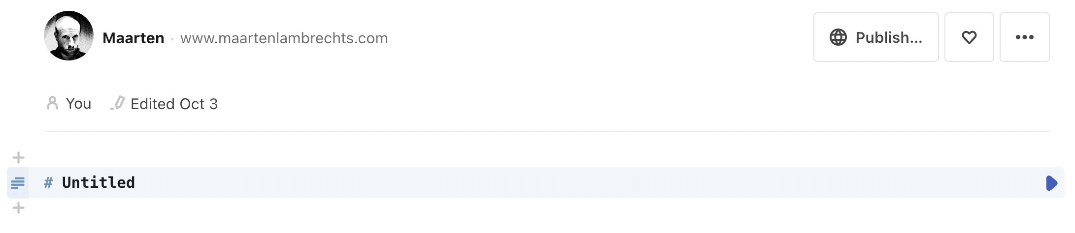
Source: Maarten Lambrechts, CC-BY-SA 4.0
Change the “Untitled” title to something else (keep the “#” in place) and click the blue arrow on the right of the cell.
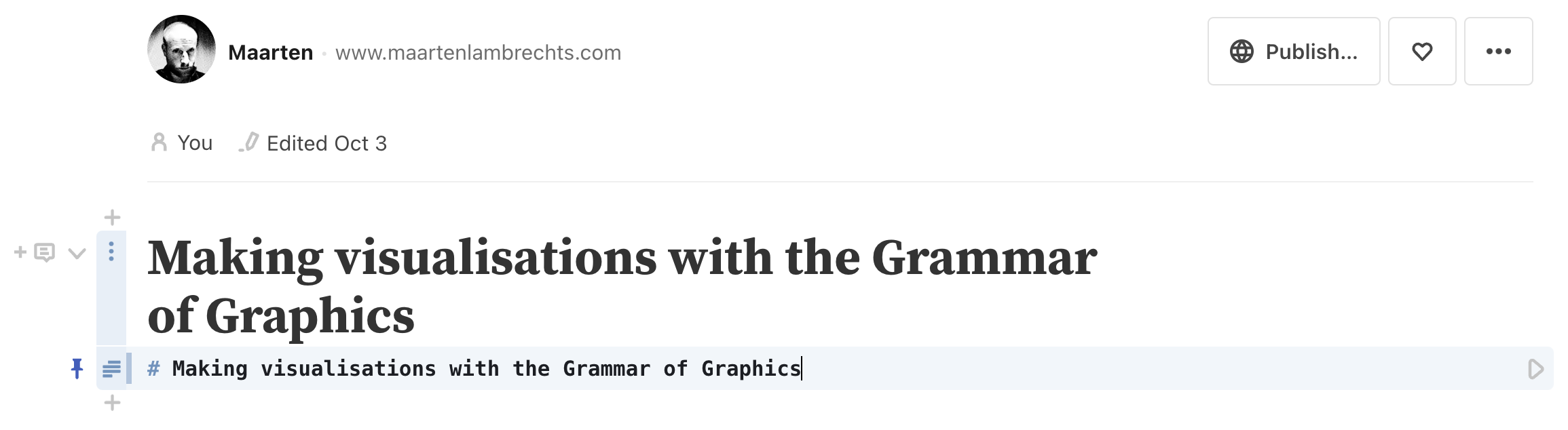
Source: Maarten Lambrechts, CC-BY-SA 4.0
You have just edited a cell and ran it in Observable. Cells are the building blocks of Observable notebooks, and can contain HTML, JavaScript or Markdown.
In this tutorial, you are going to use JavaScript cells only (accept for the first cell, which contains the title of the notebook as Markdown).
Making visualisations with Observable
To make a visualisation with Observable Plot, you can connect to online data sources, but you can also upload files to Observable. We are going to use the latter option.
Download the file linked below.
Next click the paper clip icon at the top of the icons on the right side of your notebook, and click the “+” button next to “File attachments”.
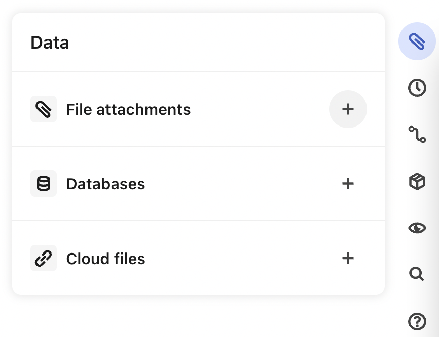
Source: Maarten Lambrechts, CC-BY-SA 4.0
Then upload the CSV file you just downloaded. When the file is uploaded, add a new cell by clicking the title of your notebook and click on the little “+” sign that appears on the left of it. Click “JavaScript” to create a new JavaScript cell.
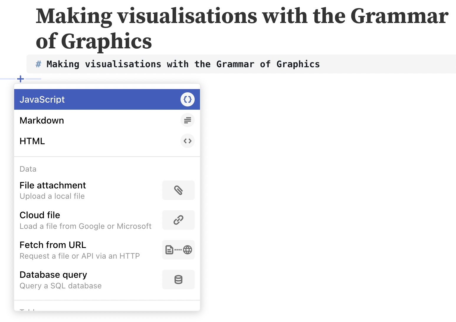
Source: Maarten Lambrechts, CC-BY-SA 4.0
In the new JavaScript cell, copy/paste the snippet below:
countries = FileAttachment("bubble-chart-data.csv").csv({typed: true})This snippet
- gets the content of the attached bubble-chart-data.csv file you just uploaded with the Observable function
FileAttachment() - parses the content of the file as csv with the
FileAttachment().csv()method - with the
{typed: true}option, you make sure that numbers in the data are correctly parsed as numbers - creates a new variable called
countriesand assigns the parsed content of the CSV file to it
When you click the blue arrow on the right of the cell, the JavaScript snippet will be run, and you will be able to see the output of the cell right above it. In this case, countries is an array of 184 JavaScript objects. Click the little black triangle before “Array(184)” to get a preview of the content of the array.
You can get a cleaner preview of the data by turning it into a table with the Observable Inputs.table() function. Create a new cell and add the following snippet to it. When you run this new cell, a table with the data will be generated.
Inputs.table(countries)Notice that cells can reference the content of other cells. In this case, the countries variable was created in a cell, and was referenced in another cell.
With the data in place, you can start building up the plot. Observable Plot is available in all Observable notebooks, so you can use its Plot.plot() function directly to generate a plot. Add the following snippet to a new cell and click the blue arrow to run it:
Plot.plot({
  marks: [
    Plot.dot(countries, {x: "income", y: "lifeexp"})
  ]
})
Here is what this snippet is doing:
- it creates a new Observable Plot visualisations with
Plot.plot() - this visualisation has 1 layer of marks (”marks” is the name of the geometric objects in Observable Plot). This layer uses the dot geometry created by
Plot.dot() - the dot marks layer uses
countriesas data - and the columns “income” and “lifeexp” in the data are mapped to the
xandyaesthetics of the dots. In Observable Plot’s language the columns are encoded in the x and y channels of the dot marks.
Now, let’s add the additional encodings for the fill and r channels (r stands for the radius of the dots):
Plot.plot({
  marks: [
    Plot.dot(countries, {
      x: "income",
      y: "lifeexp",
      fill: "continent",
      r: "population",
    })
  ]
})
Channels do not have to be encoded from the data, you can also set them to fixed values. For example, you can give the dots a 1 pixel wide black stroke:
Plot.plot({
  marks: [
    Plot.dot(countries, {
      x: "income",
      y: "lifeexp",
      fill: "continent",
      r: "population",
      stroke: "black",
      strokeWidth: 1
    })
  ]
})
Next, you need to convert the x scale from a linear one to a logarithmic one. You can configure scales by adding a property with the name of the channel of the scale (”x” in this case) and set an object with option properties as its value. In this case, we set the type option to “log”.
Plot.plot({
  marks: [
    Plot.dot(countries, {
      x: "income",
      y: "lifeexp",
      fill: "continent",
      r: "population",
      stroke: "black",
      strokeWidth: 1
    })
  ],
  x: {type: "log"}
})
You can add more configuration options for the x and y scale: you can add grid lines and axis labels, limit the number of tick values displayed and set a domain (the minimum and maximum values of a scale) explicitly, for example.
scaleOptions = Plot.plot({
  marks: [
    Plot.dot(countries, {
    x: "income",
    y: "lifeexp",
    fill: "continent",
    r: "population",
    stroke: "black",
    strokeWidth: 1
  })
  ],
  x: {type: "log", grid: true, ticks: 3, label: "Income (GDP/capita) →"},
  y: {grid: true, ticks: 4, domain: [50, 85], label: "↑ Life expectancy (years)"}
})
For colour scales, you can set the range of colours to use. You can also add a colour legend. Unfortunately a legend for the size scale is not (yet) available in Observable Plot.
colorLegend = Plot.plot({
  marks: [
    Plot.dot(countries, {
    x: "income",
    y: "lifeexp",
    fill: "continent",
    r: "population",
    stroke: "black",
    strokeWidth: 1
  })
  ],
  x: {type: "log", grid: true, ticks: 3, label: "Income (GDP/capita) →"},
  y: {grid: true, ticks: 4, domain: [50, 85], label: "↑ Life expectancy (years)"},
  color: {legend: true, range: ["#FF265C", "#FFE700", "#4ED7E9", "#70ED02", "purple"]}
})
Extra
You can add basic tooltips to marks, by using their title channel:
Plot.plot({
  marks: [
    Plot.dot(countries, {
    x: "income",
    y: "lifeexp",
    fill: "continent",
    r: "population",
    stroke: "black",
    strokeWidth: 1,
    title: "country"
  })
  ],
  x: {type: "log", grid: true, ticks: 3, label: "Income (GDP/capita) →"},
  y: {grid: true, ticks: 4, domain: [50, 85], label: "↑ Life expectancy (years)"},
  color: {legend: true, range: ["#FF265C", "#FFE700", "#4ED7E9", "#70ED02", "purple"]}
})
Hover over the dots in the plot below to reveal the country names.
Finally, you can facet a plot in Observable Plot specifying a facet option. When using facets, you might want to modify the width and height options of the plot.
Plot.plot({
  facet: {
    data: countries,
    x: "continent"
  },
  width: 1000,
  height: 300,
  marks: [
    Plot.dot(countries, {
    x: "income",
    y: "lifeexp",
    fill: "continent",
    r: "population",
    stroke: "black",
    strokeWidth: 1,
    title: "country"
  })
  ],
  x: {type: "log", grid: true, ticks: 3, label: "Income (GDP/capita) →"},
  y: {grid: true, ticks: 4, domain: [50, 85], label: "↑ Life expectancy (years)"},
  color: {legend: true, range: ["#FF265C", "#FFE700", "#4ED7E9", "#70ED02", "purple"]}
})
Resources
Here are some links to learn more about Observable and Observable Plot:
- The notebook to get started in Observable
- The gallery of Observable tutorials
- The gallery of tutorials also includes a tutorial on Observable Plot
- The Plot Cheatsheets gives an overview of all marks, scales and theming available in Observable Plot
- The complete Observable Plot documentation is published here.