What is Tableau?
Tableau is one of the most popular visual data analytics software. It was created as a spinoff company of research done at Stanford University in 2003. In 2019 Tableau was acquired by cloud-based software company Salesforce for 15,7 billion dollars.
Tableau has its roots in the Grammar of Graphics. This is very clear in the way visualisations are created in Tableau: users literally map variables of their data to aesthetics of geometric objects by dragging and dropping them onto visual properties in the interface.
The main focus of Tableau is on building and sharing interactive dashboards. It is not designed to be a tool for making print ready graphics.
Tableau sells many versions of its software. In this module, you are going to use the free Tableau Public. The main limitation of this free version is that files cannot be saved locally on your own computer. Saving is only possible by uploading and publicly sharing files in the cloud.
Getting started with Tableau Public
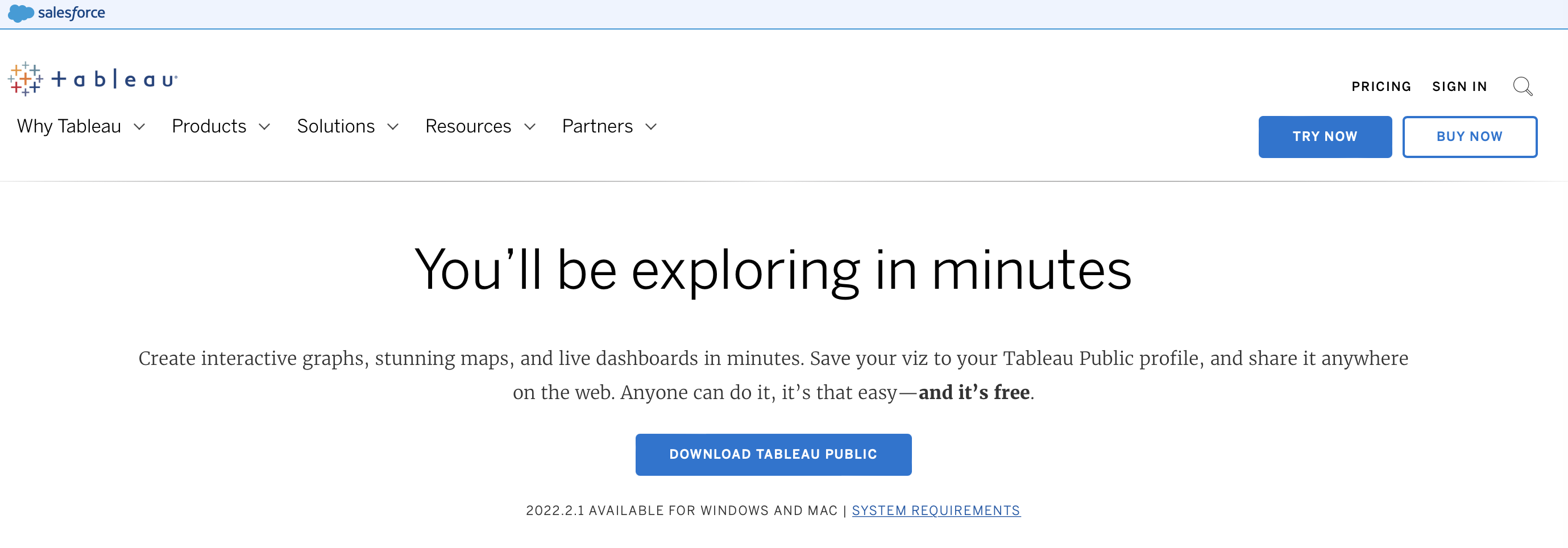
Using Tableau Public requires you to download and install it. To do so, navigate to tableau.com/products/public/download and click the “Download Tableau Public” button.
Source: Maarten Lambrechts, CC BY SA 4.0
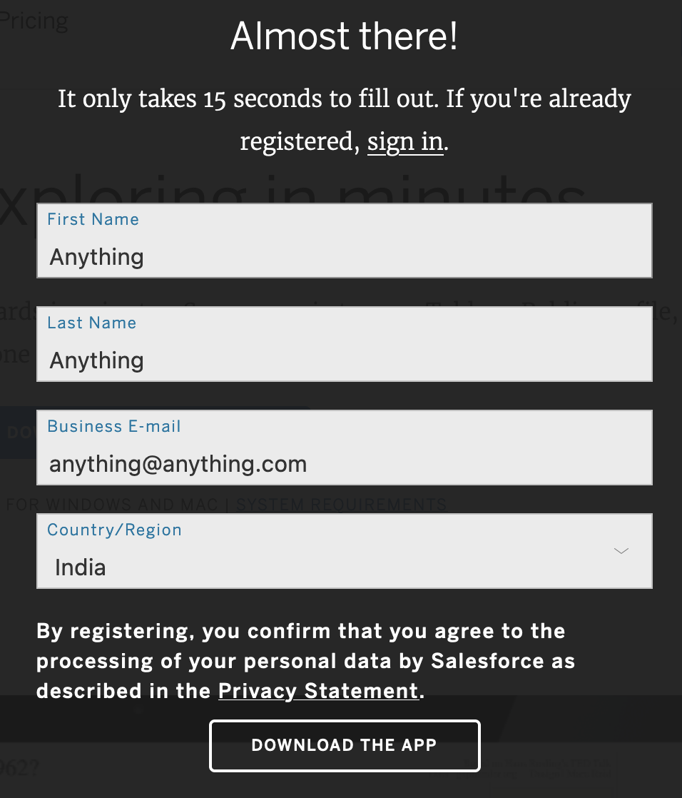
An overlay appears asking you to leave some of your details. You can put anything in these fields, you just have to make sure that the field for your email address contains a “@” character and a dot with some extension, like “.com”.
Source: Maarten Lambrechts, CC BY SA 4.0
Clicking the “Download the app” button will start your download. If this does not start automatically, you will be presented with some links to start the download manually.

Source: Maarten Lambrechts, CC BY SA 4.0
Using Tableau online
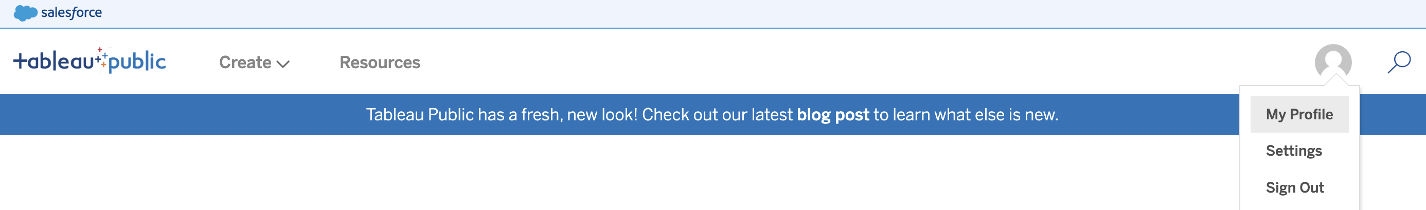
An alternative to downloading and installing Tableau Public is to use Tableau online. To do so, navigate to public.tableau.com/app/discover?authMode=signUp and create a Tableau Public account. After you have created an account and have signed in, click your profile icon in the top right and go to My Profile.
Source: Maarten Lambrechts, CC BY SA 4.0
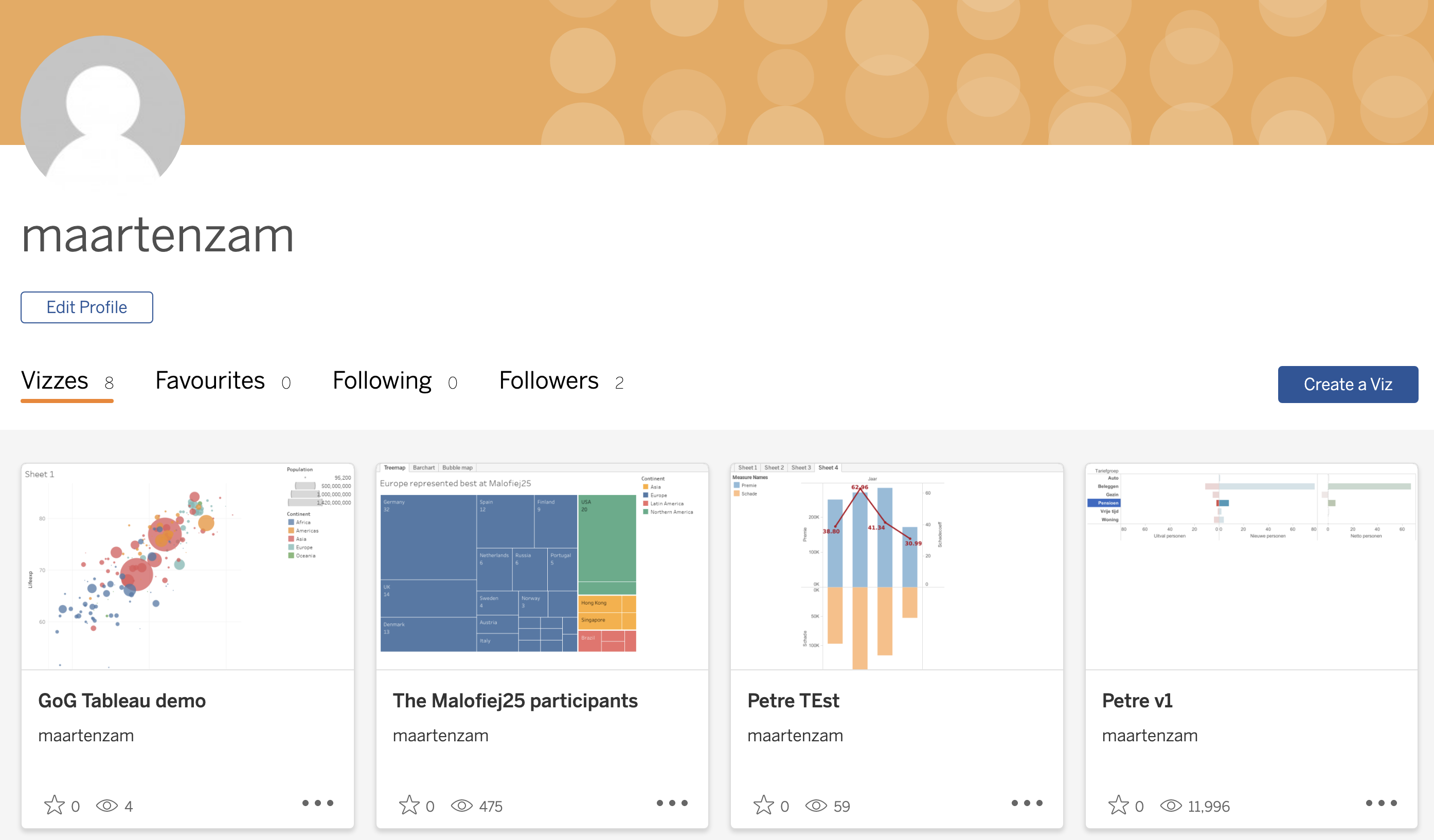
On your profile page, click the Create a Viz button to launch the online Tableau interface.
Source: Maarten Lambrechts, CC BY SA 4.0
The online interface of Tableau is similar to the interface of Tableau Public, the only difference being that you have to upload the data you want to work with instead of just localising it on your computer.
Making a visualisation with Tableau Public
After you have installed the app, you can open it (if you are using the online version, you can click the Create a Viz button).
You will be presented with the opening screen in which you can load (or “connect to”) different data sources.
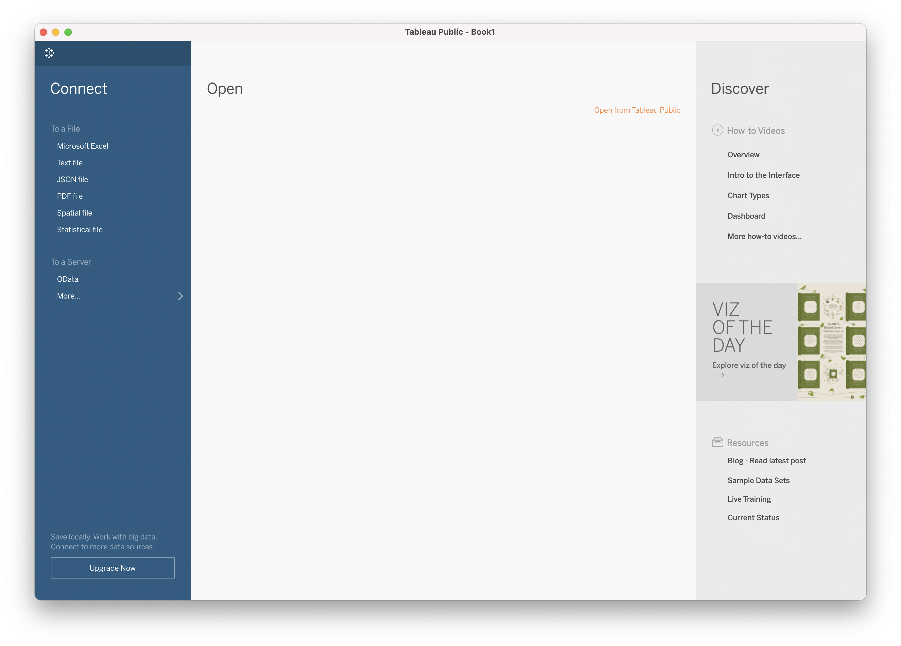
Source: Maarten Lambrechts, CC BY SA 4.0
In this module, you are going to recreate the following plot.
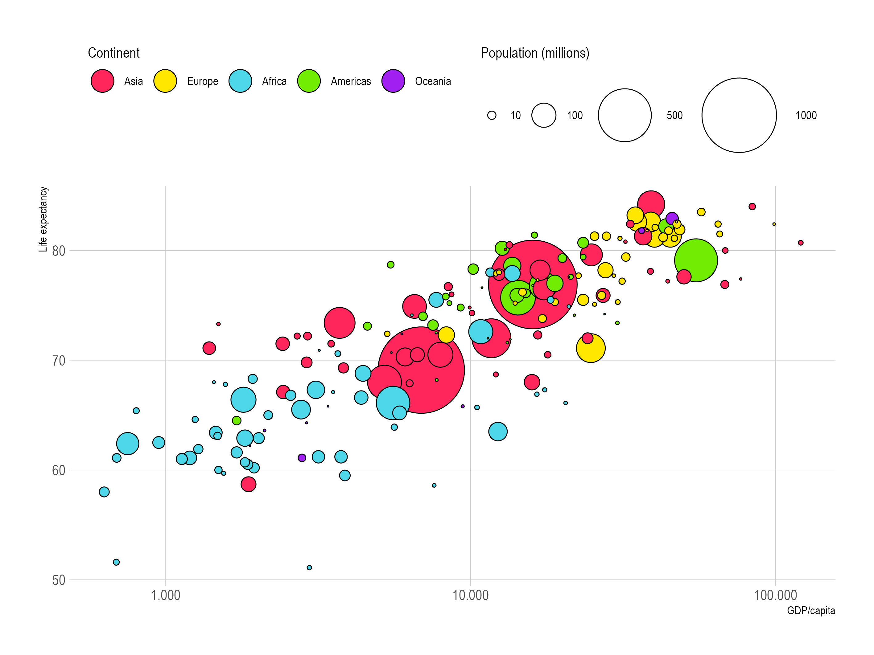
Source: Maarten Lambrechts, CC BY SA 4.0
The data to make this visualisation is contained in the file linked to below. Click the link to download and save it.
After that, click “Text file” in the left column in Tableau, navigate to the folder that contains the downloaded data and open the CSV file (in the online version of Tableau, you have to upload the file).
Tableau will open a preview of the data.
Source: Maarten Lambrechts, CC BY SA 4.0
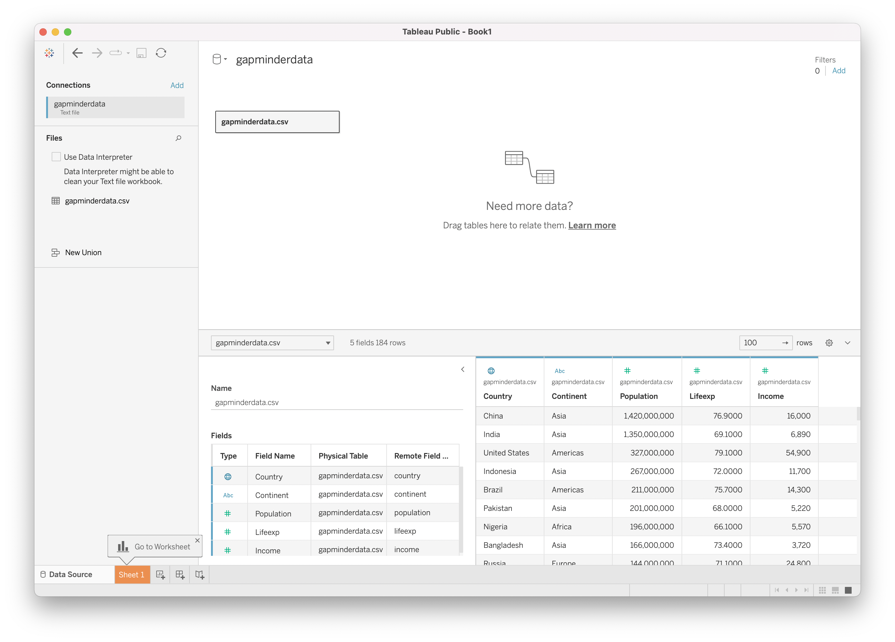
The data is already well prepared for this tutorial, so you can navigate to “Sheet 1” in the bottom left. The sheet is marked with a pop-up saying “Go to Worksheet”. This will take you to a blank worksheet, with the data loaded in the left column of the interface.
Source: Maarten Lambrechts, CC BY SA 4.0
On the left, the variables in the data are listed, together with their type. For example, you can see that the “Continent” variable is recognised as a text (or categorical) variable, while “Income”, “Lifeexp” and “Population” are correctly recognised as numerical variables (marked with a “#” sign).
Notice that the “Country” variable (which contains the names of the countries as text) is recognised by Tableau as a geographical variable (it is marked with a little globe icon). As a result of this, Tableau has automatically generated two additional variables (Latitude and Longitude). More on this later in this module.
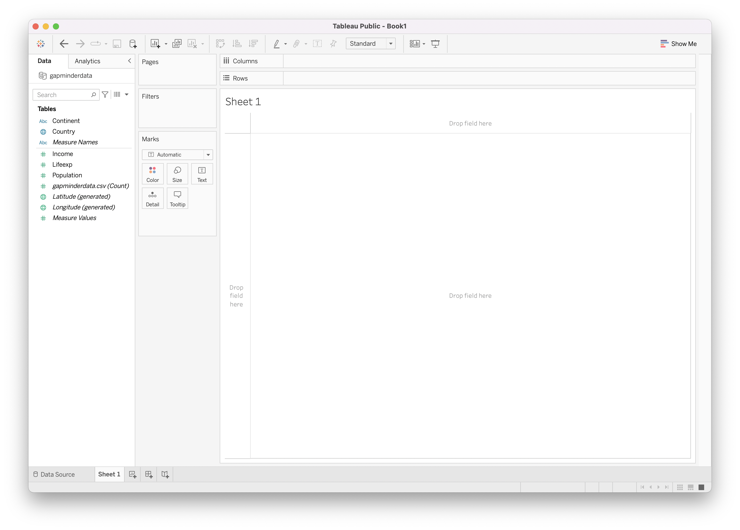
The Tableau interface is based on drag-and-drop: in order to build up your visualisation, you drag the variables (called “fields” in Tableau) onto the aesthetics listed in the Marks pane, or on the visualisation canvas itself.
To build up the plot, start by dragging the Income variable onto the y axis of the plot (this is the area on the left of the canvas that says “Drop field here”).
The result should look like this.
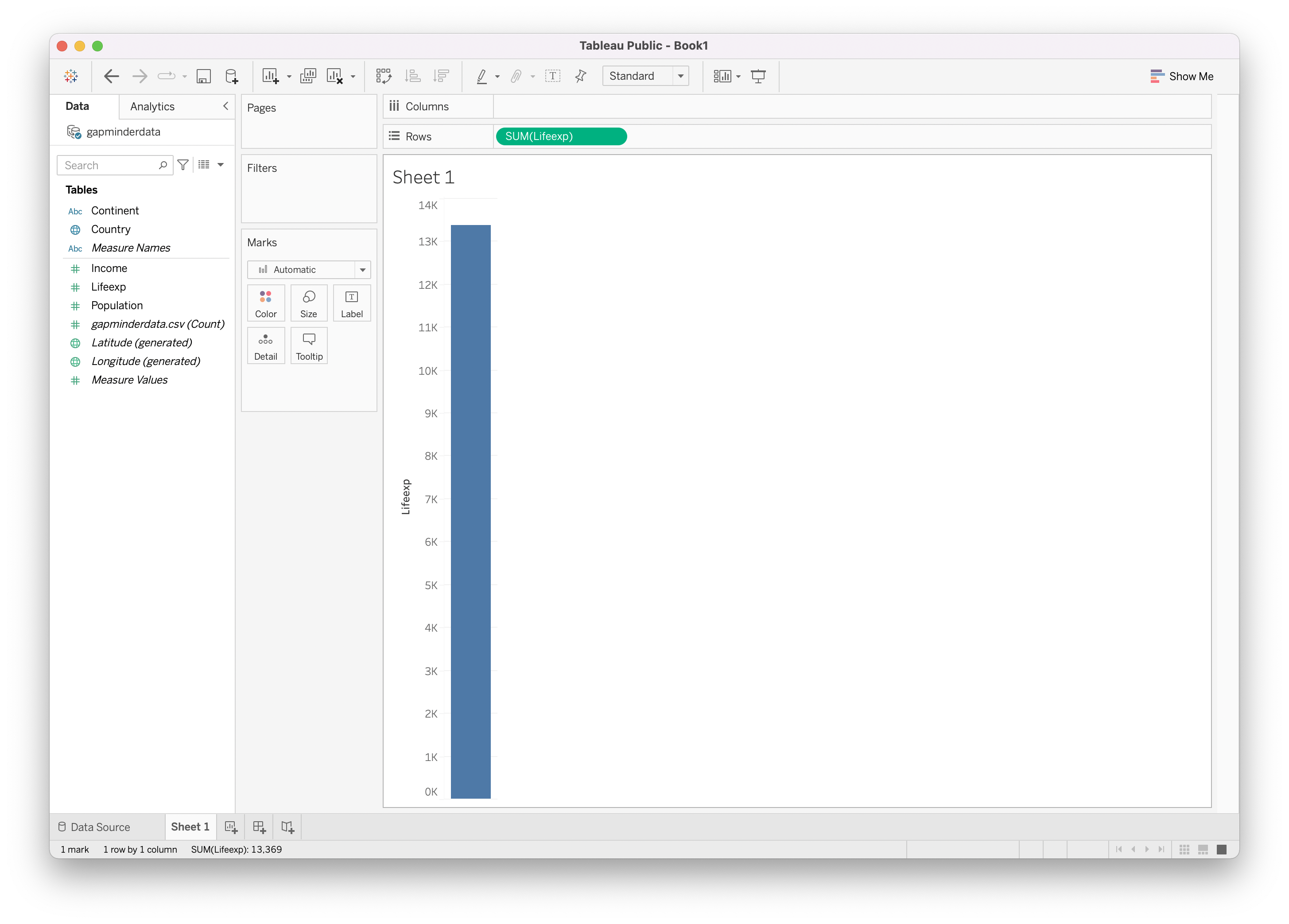
Source: Maarten Lambrechts, CC BY SA 4.0
Notice that a green pill is add to the Rows shelf on top of the canvas, that says SUM(Lifeexp). You can just ignore this and keep building up your visualisation. Now, drag the Income variable to the Columns shelf above the canvas. The result should look something like this:
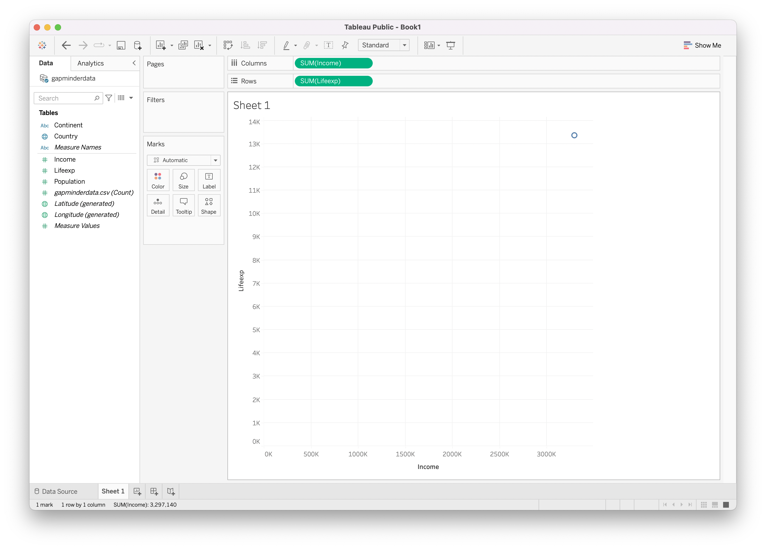
Source: Maarten Lambrechts, CC BY SA 4.0
This plot is not making sense yet. This is because Tableau automatically calculates the totals over all countries for the Lifeexp and Income variables. So you only see one dot on the plot representing these totals.
Of course, what you want is a dot for each country in the data set. The simplest solution is to drag the Country variable onto the Detail aesthetic in the Marks pane. After doing so, the plot should look like this:

Source: Maarten Lambrechts, CC BY SA 4.0
Looking at the example of the plot we want to build, we need some more aesthetic mappings: we want the marks to be coloured according to the Continent variable, and the size of the marks should be proportional to the Population variable. So drag to Continent variable onto the Color aesthetic, and the Population variable onto the Size aesthetic in the Marks pain.
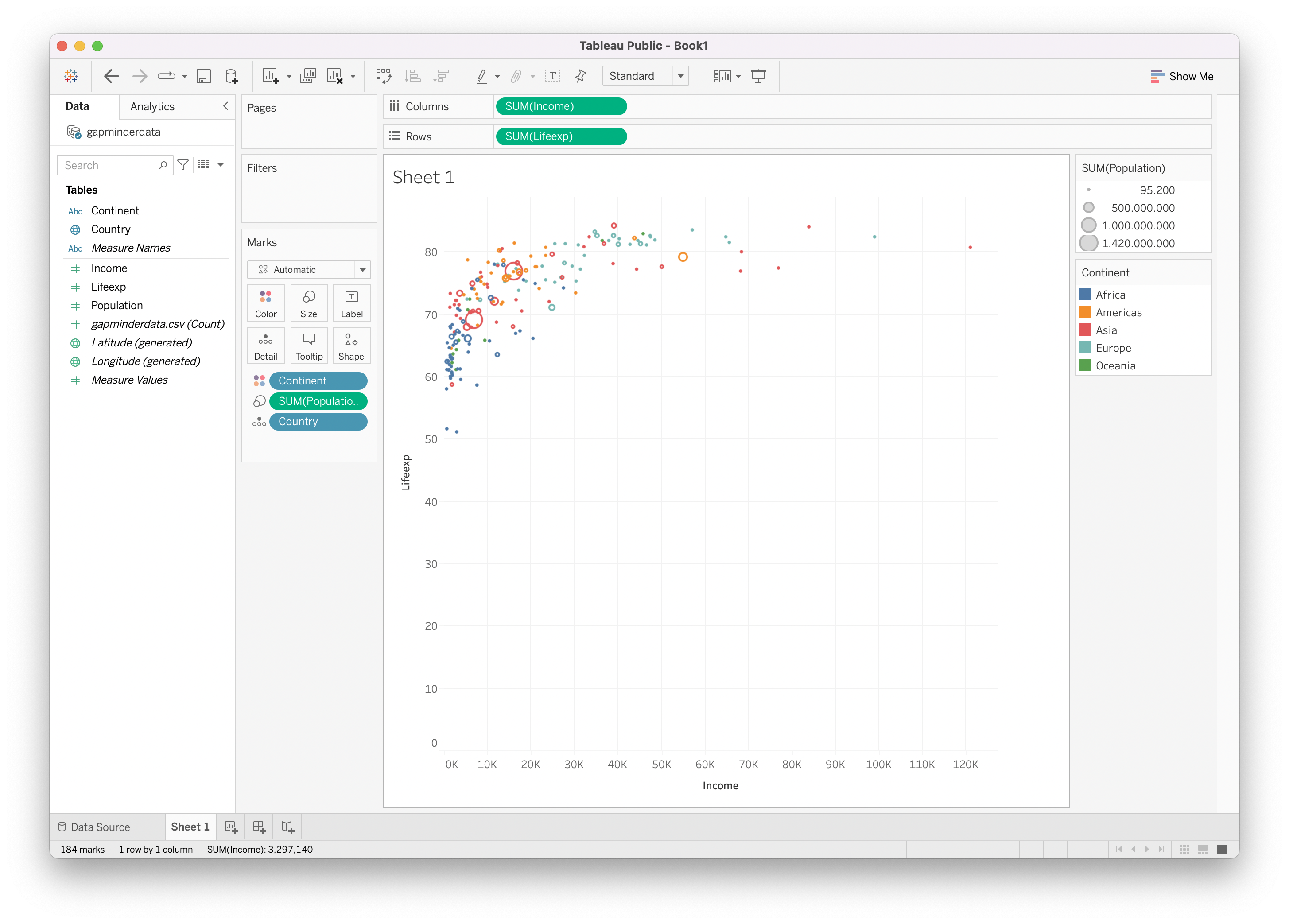
Source: Maarten Lambrechts, CC BY SA 4.0
Notice how in the Marks pane, all the aesthetic mappings are listed, and that on the right of the canvas guides are added for the size and colour aesthetics.
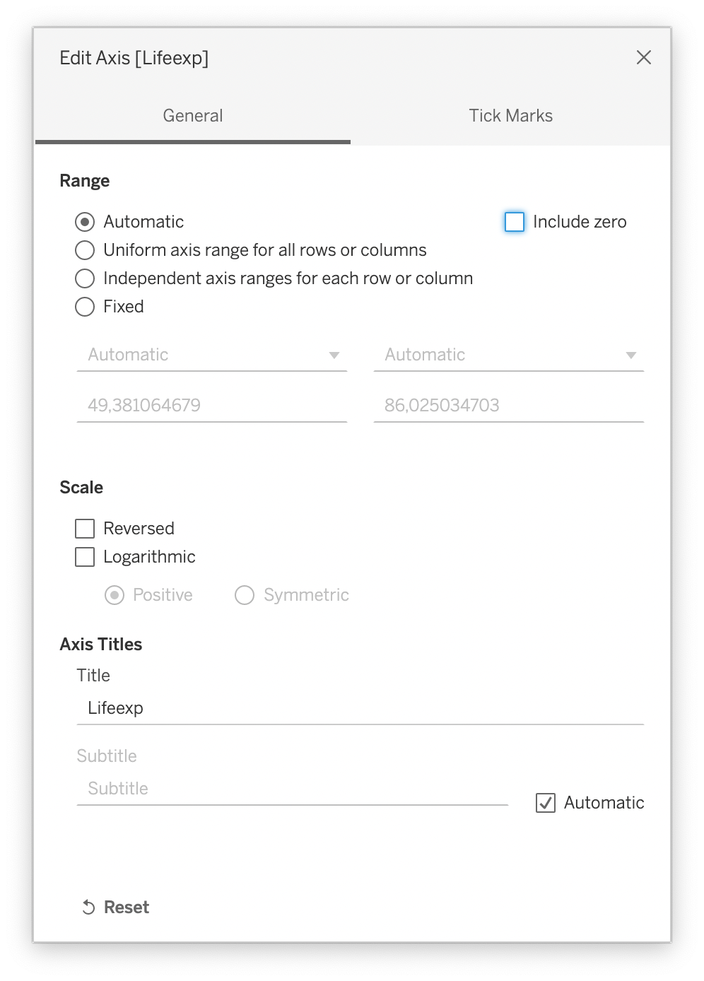
The aesthetic mappings are done, but we still need to configure the scales that the plot is using. First, we don’t need the y axis to start at zero. You can configure this by double clicking somewhere on the y axis, which will open the Edit Axis dialog. In this dialog, uncheck the “Include zero” checkbox.
Source: Maarten Lambrechts, CC BY SA 4.0
The example chart has a tick interval of 10 years of life expectancy, so let’s configure this too. In the Edit Axis dialog, switch to the Tick Marks tab, set the Major Tick Marks to be fixed and leave the Tick interval to a value of 10. After this, you can close the Edit Axis dialog.
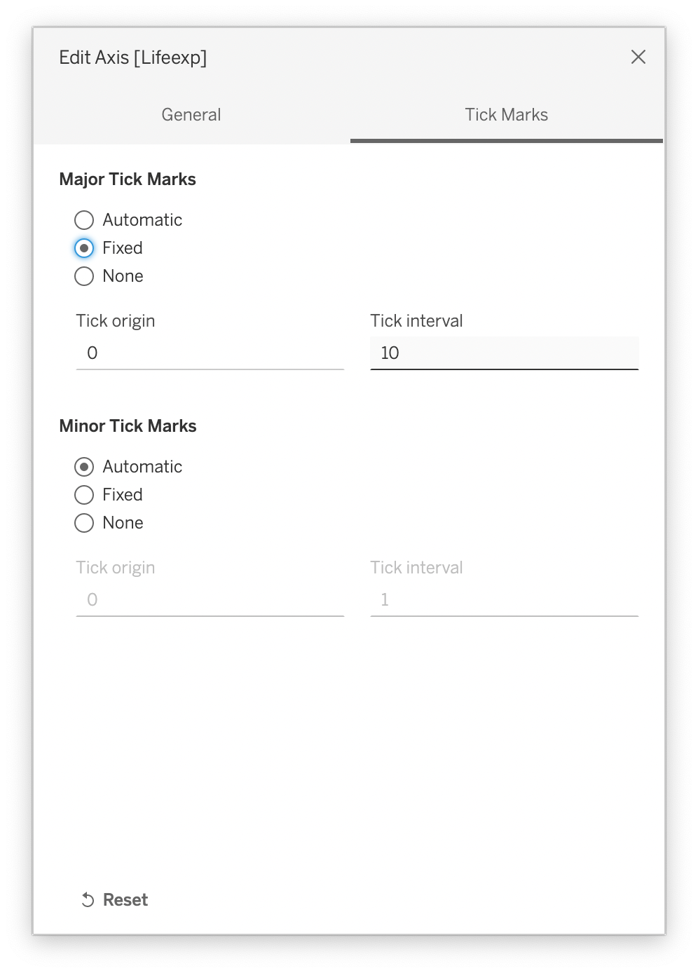
Source: Maarten Lambrechts, CC BY SA 4.0
Now you can configure the x axis, which should use a logarithmic scale instead of a linear one. Double click the axis and check the Logarithmic check box under Scale. Also uncheck the Include zero checkbox (which in fact does not make sense for logarithmic scales, because the logarithm of zero is undefined) and set the Major Tick Marks to be fixed to powers of 10.
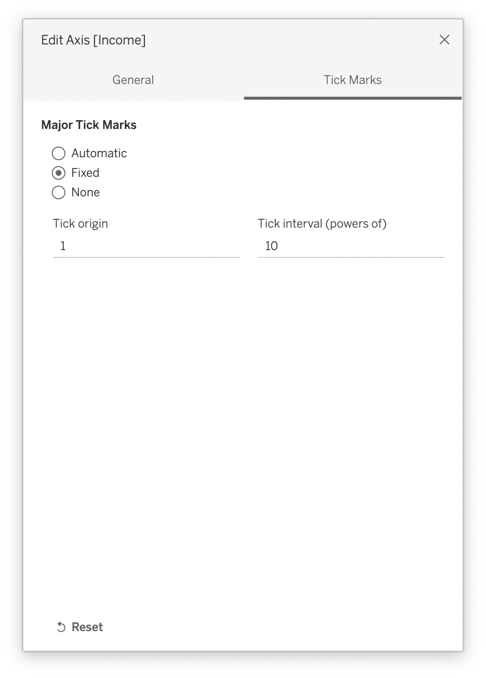
Source: Maarten Lambrechts, CC BY SA 4.0
By now, the plot starts to look very familiar.
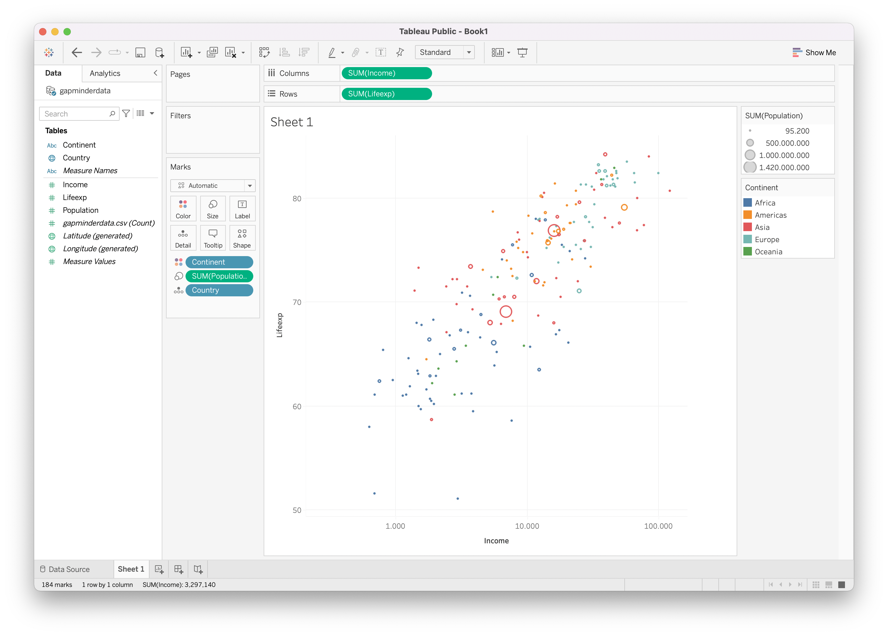
Source: Maarten Lambrechts, CC BY SA 4.0
The circle marks are a little small, you can make them bigger by clicking the Size aesthetic in the Marks pane and drag the appearing slider to the right.
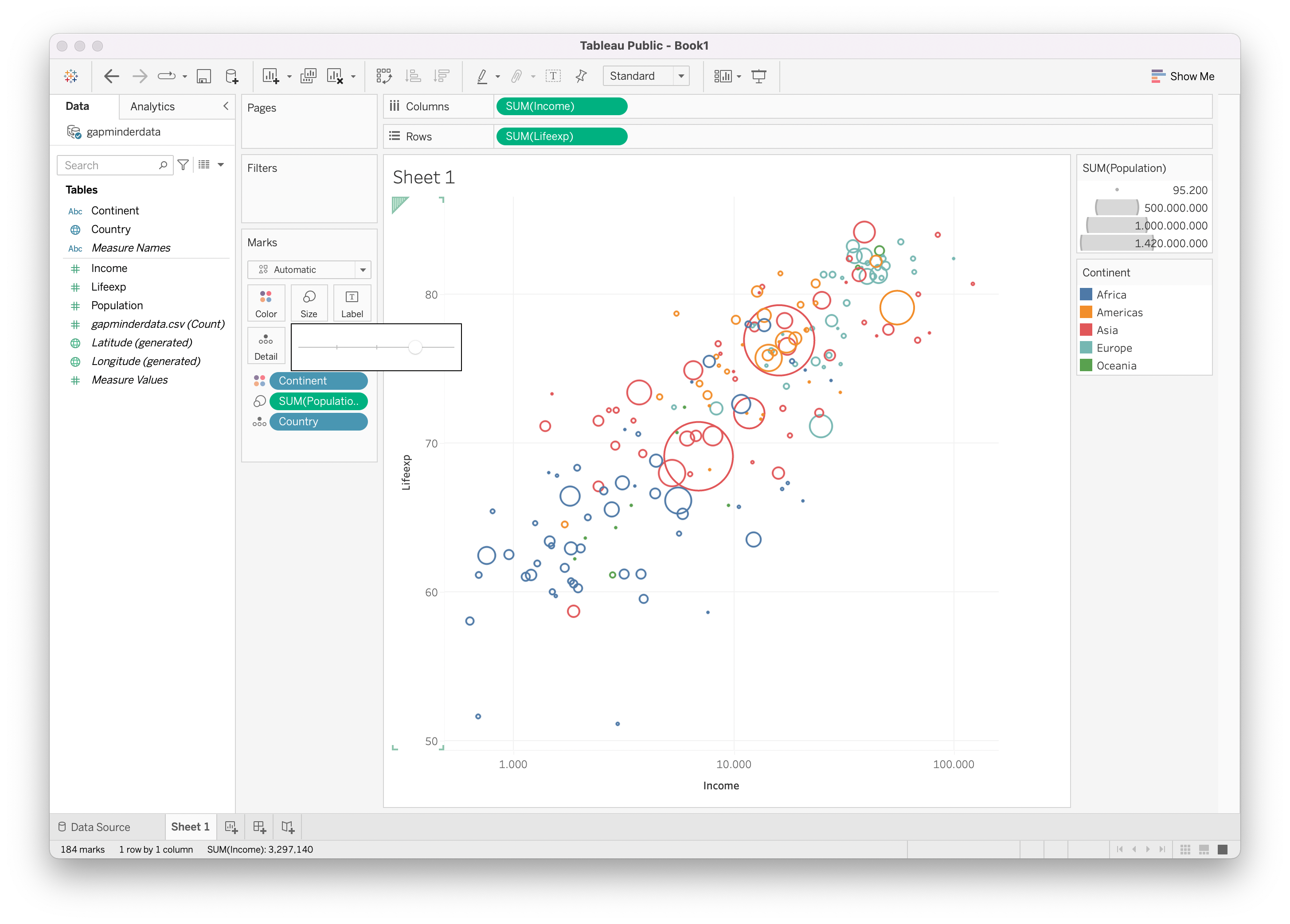
Source: Maarten Lambrechts, CC BY SA 4.0
The original chart uses the fill colour of the circles for the Continent variable instead of the stroke colour. Change the shape of the point geometry to use a filled circle by clicking the Shape aesthetic on the Marks pane.
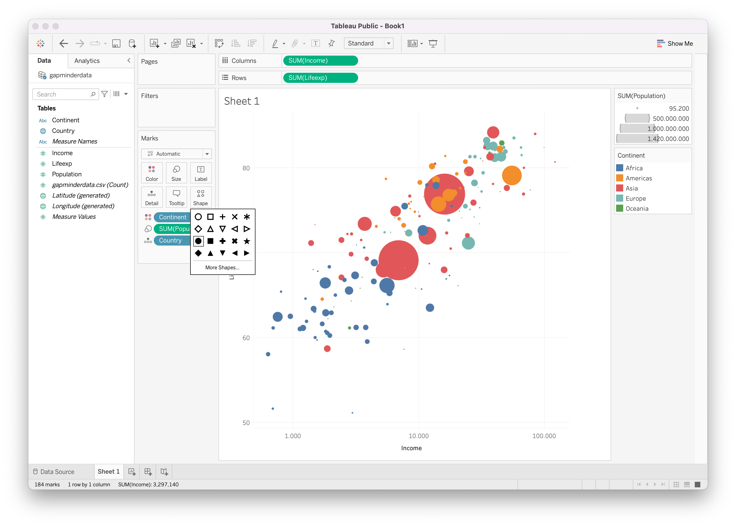
Source: Maarten Lambrechts, CC BY SA 4.0
The original uses a black stroke colour for the circles. Unfortunately giving a shapes a stroke outline colour is not possible in the version of Tableau you are using. Instead we can add some transparency to the circles in the configuration of the colour aesthetic.
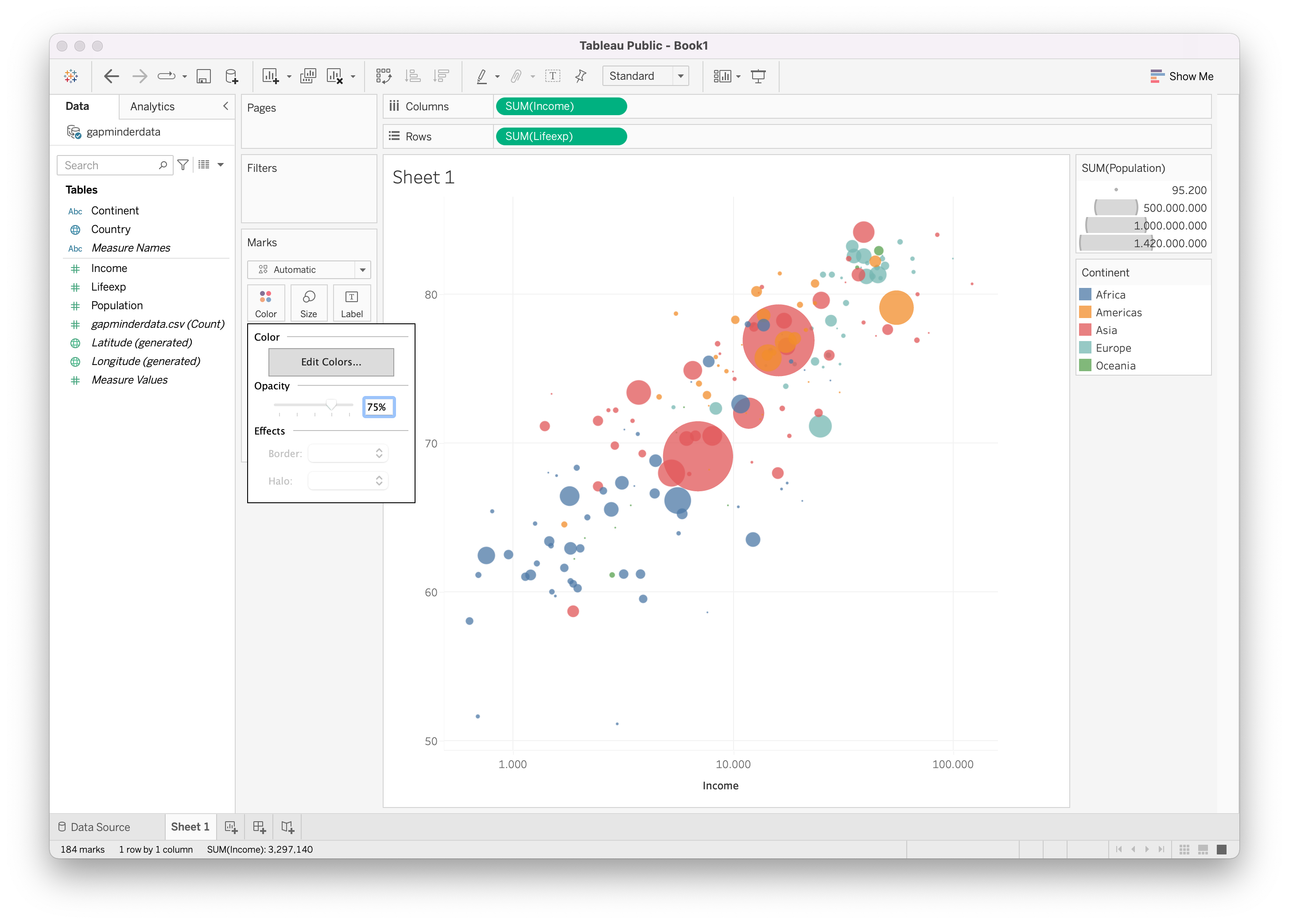
Source: Maarten Lambrechts, CC BY SA 4.0
When you click “Edit colours” in the configuration of the colour aesthetics, you can customise the colours used for each value of the Continent variable if you like.
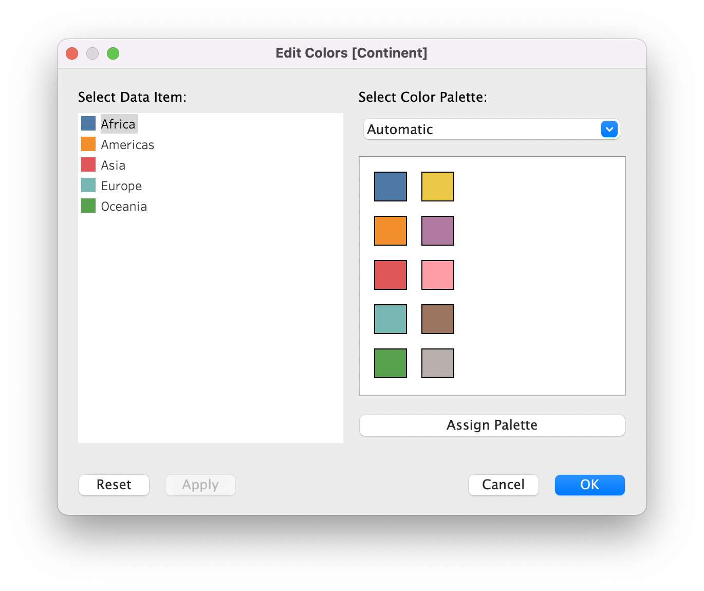
Source: Maarten Lambrechts, CC BY SA 4.0
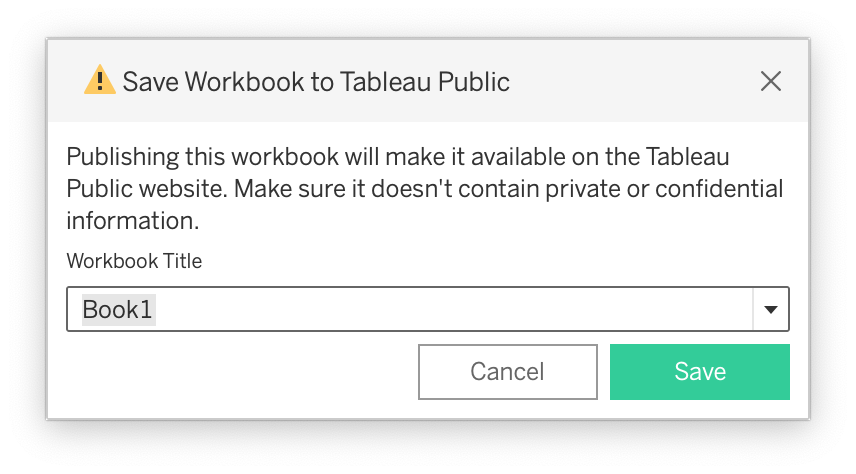
Saving your plot
With the Tableau Public desktop application, saving a plot is only possible on the online Tableau Public platform. So when you click the Save button in the top left of the interface, you will be asked to log in to the Tableau Public platform, or to create an account if you don’t have one already.
Source: Maarten Lambrechts, CC BY SA 4.0
Saving a local copy is not possible with Tableau Public, and all Tableau workbooks you save on the Tableau Public platform are publicly available.
Source: Maarten Lambrechts, CC BY SA 4.0
The finished Tableau Workbook for this tutorial is located here is located here
Extras
Tableau is a pretty powerful visualisation program. Here are some features that come with it.
The visualisations in Tableau are interactive by default. For example, hovering over the circles in the plot will reveal the underlying data in a tooltip.
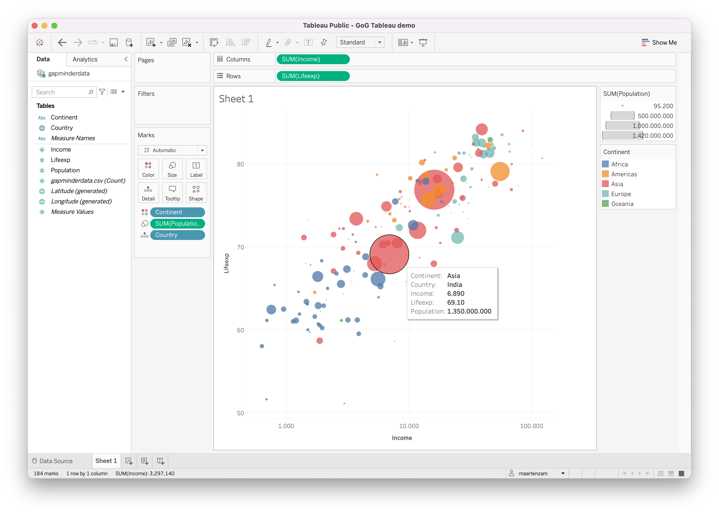
Source: Maarten Lambrechts, CC BY SA 4.0
The colour legend is interactive too, and serves as a filter: if you click a legend item, it will be highlighted in the plot, and you can choose to filter the data by only keeping the observations in the clicked category, or to exclude them.
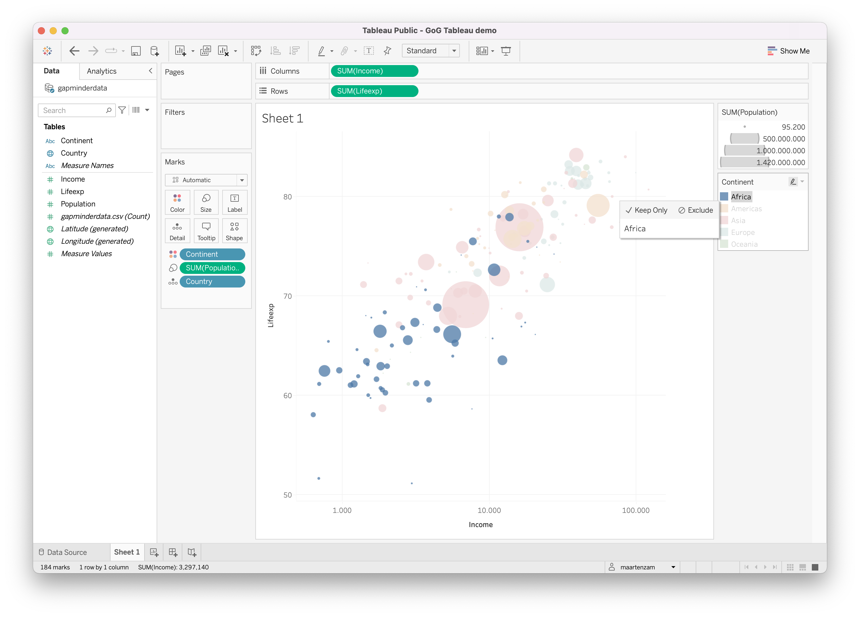
Source: Maarten Lambrechts, CC BY SA 4.0
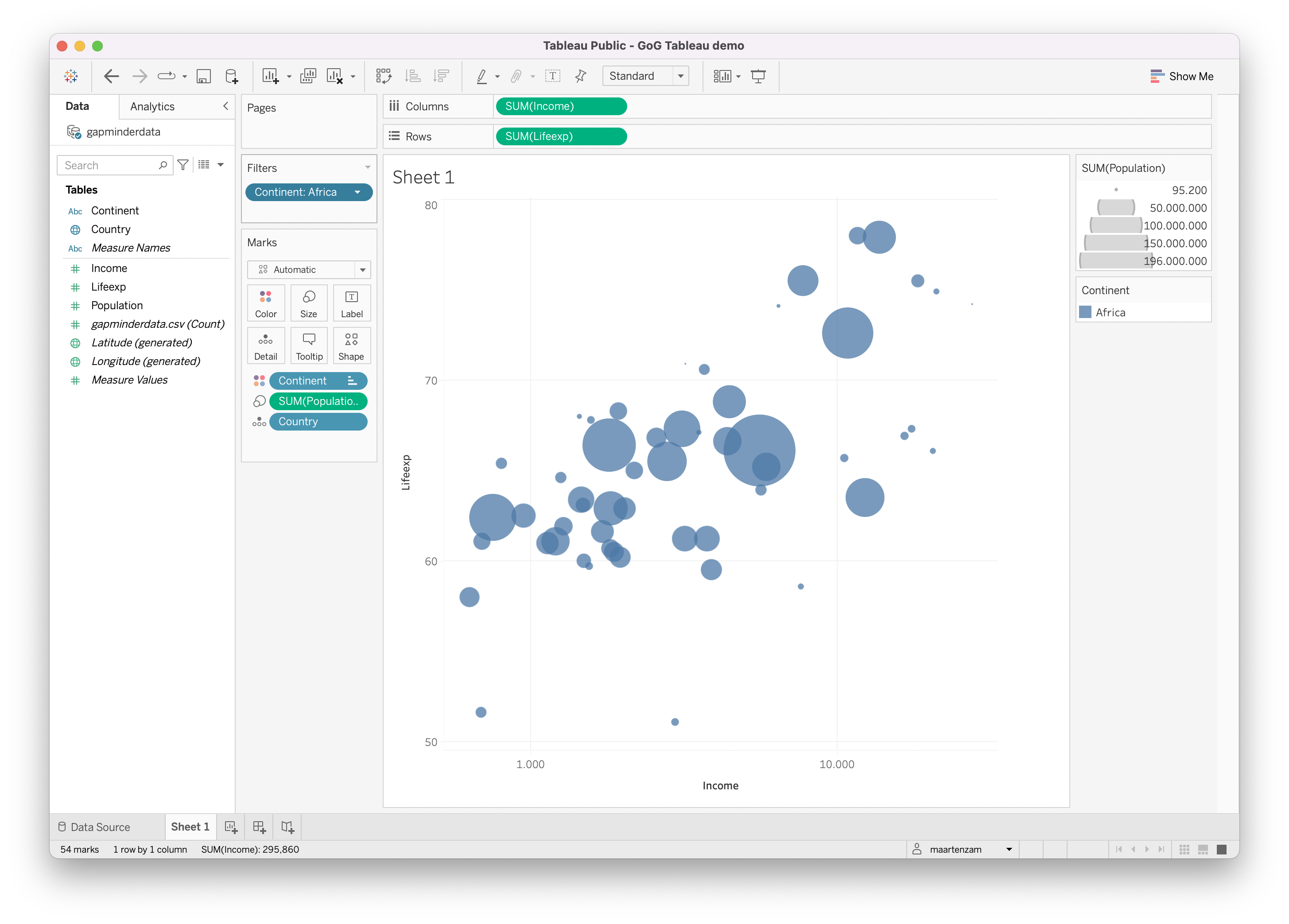
When you choose to only keep or exclude the observations in a category, a pill will be added to the Filters pane to the left of the visualisation. You can configure the used filters there, and drag and drop more variables to filter the data in other ways.
Source: Maarten Lambrechts, CC BY SA 4.0
Faceting the plot to create small multiple visualisations can be done by dragging additional variables to the Columns or Rows shelves above the visualisation.
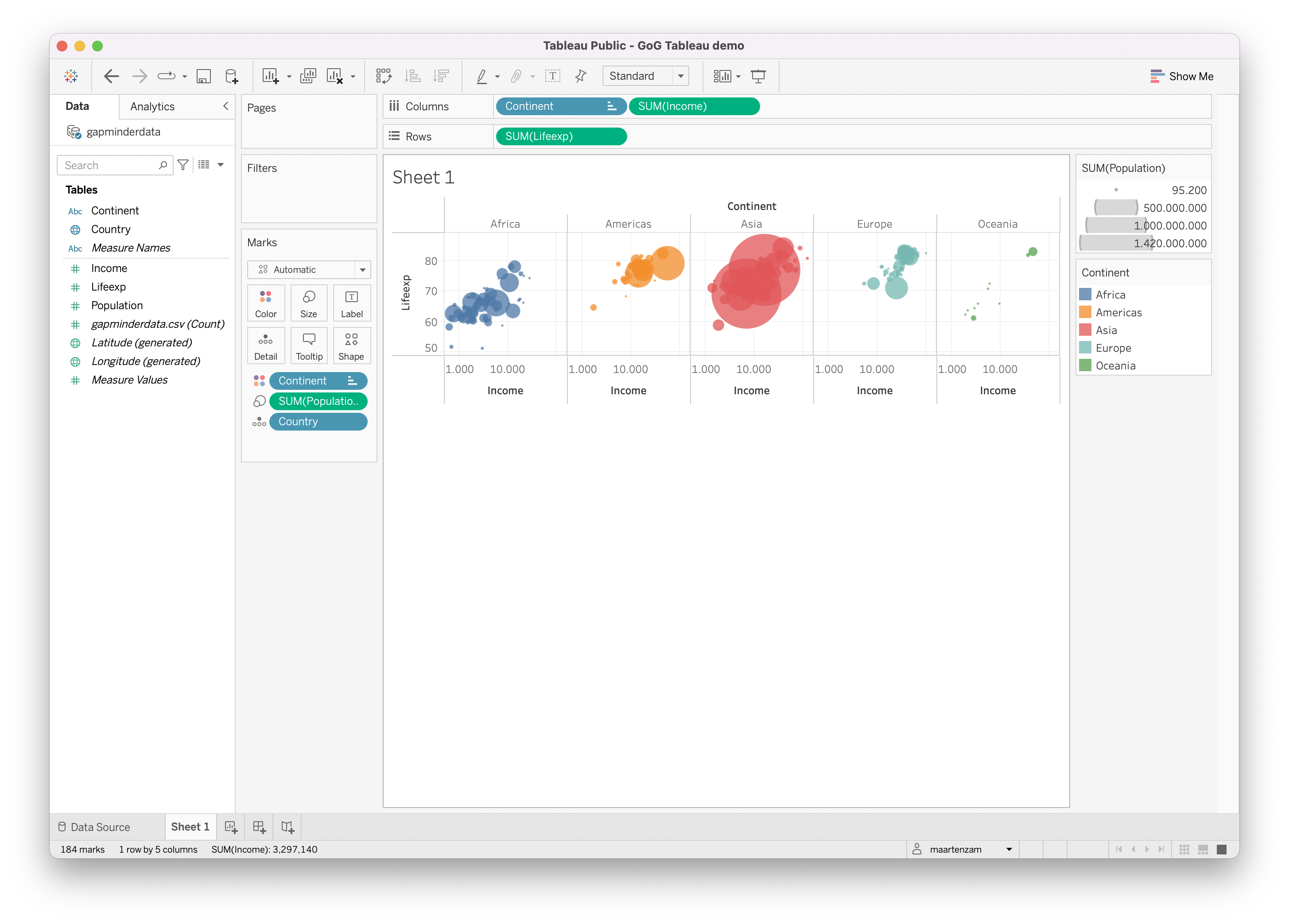
Source: Maarten Lambrechts, CC BY SA 4.0
Double encoding of a variable can be done by dragging the same variable onto multiple aesthetics. Below, the Continent variable is double encoded in the fill colour and the shape of the marks.
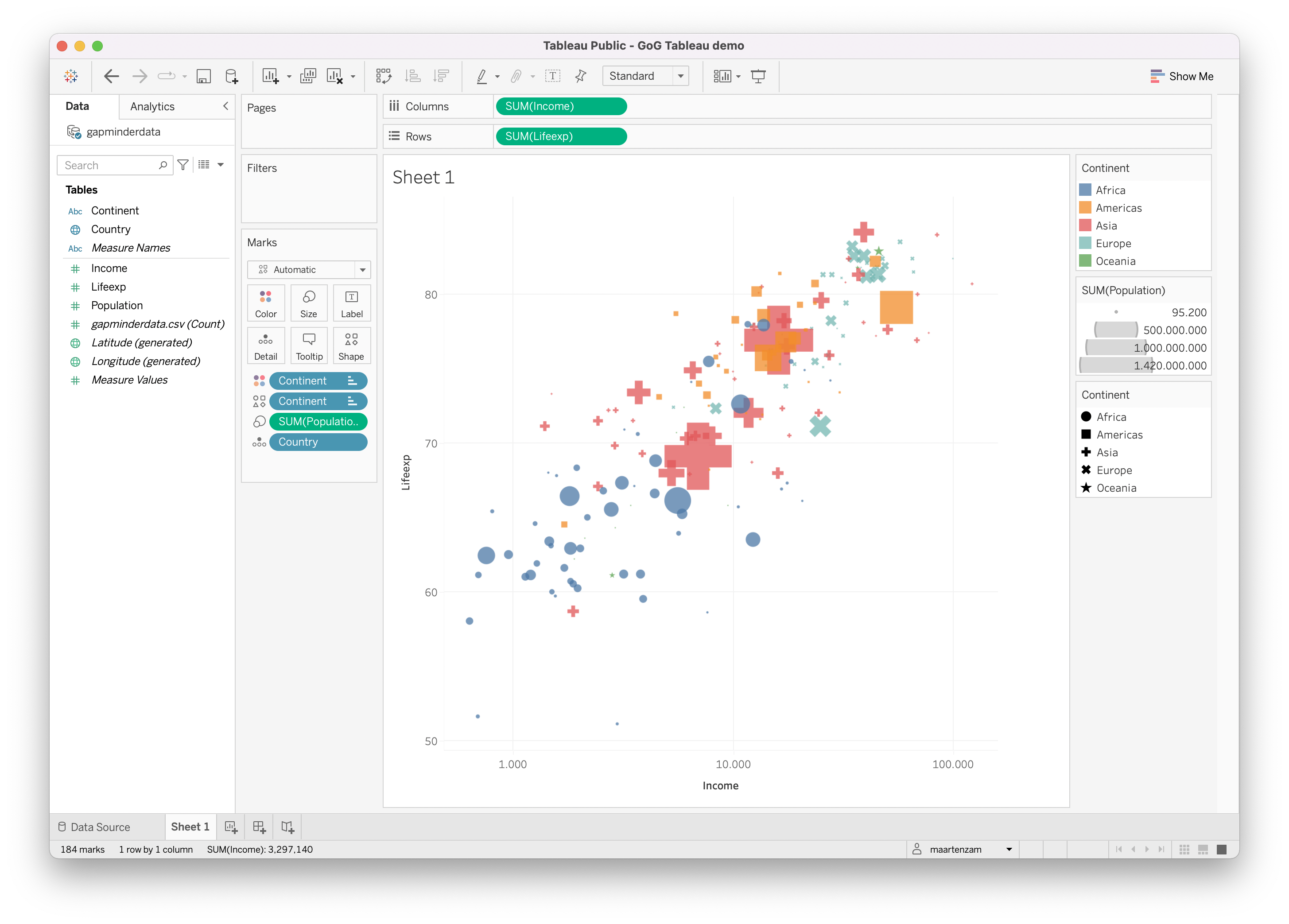
Source: Maarten Lambrechts, CC BY SA 4.0
The Longitude and Latitude variables (automatically generated from the country names in the Country variable) can be dragged to the Columns and Rows shelves to create a bubble world map.
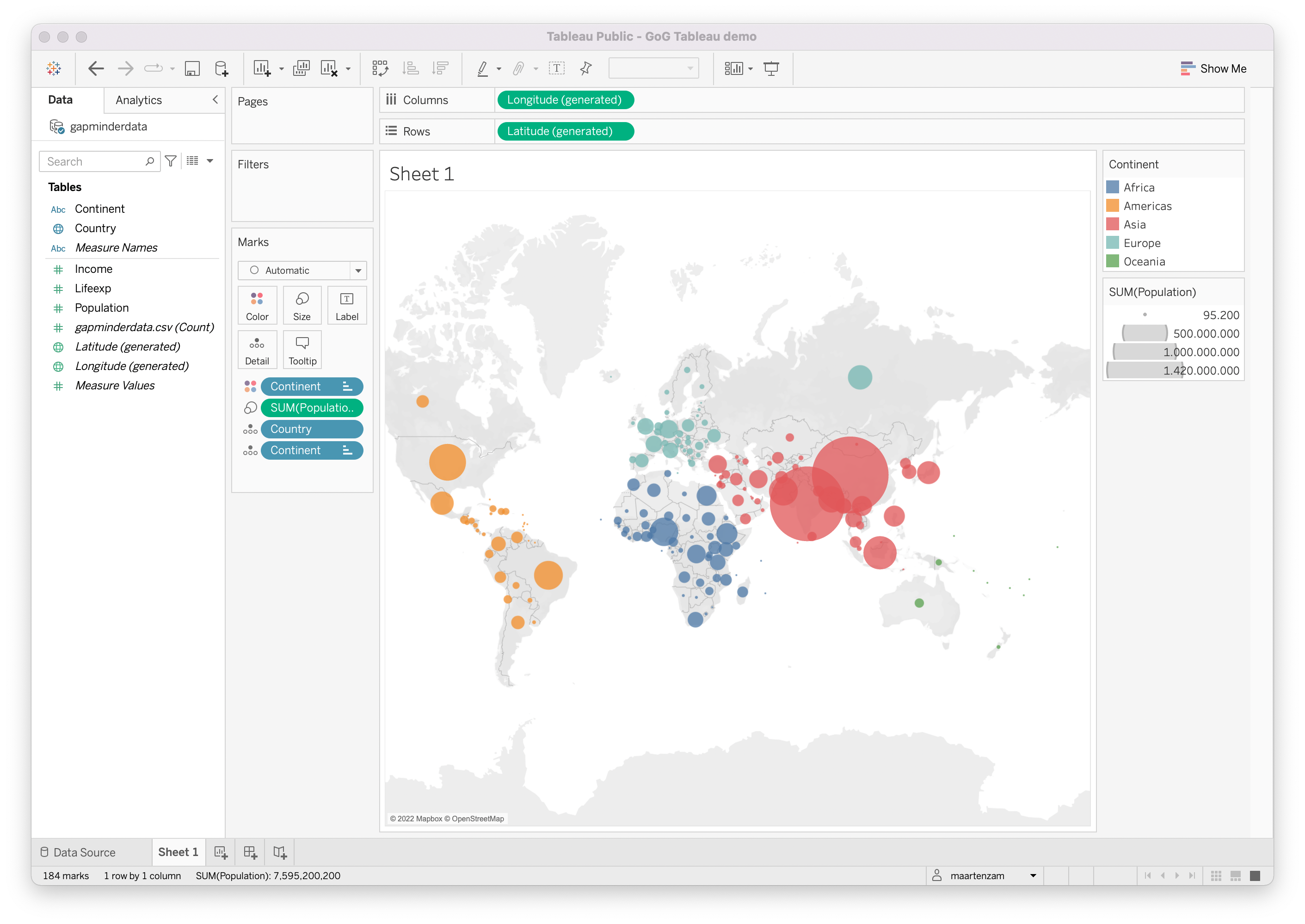
Source: Maarten Lambrechts, CC BY SA 4.0