Adding a secondary y axis is an often used technique to show the evolution of two time series in different units, and to show how both series are connected. But this technique suffers from some issues.
The first issue is that the user needs to know which time series should be read on which axis. If this isn’t obvious, the reader will get confused. Usually this connection is made through the use of colour, like on this chart shared by US President Biden on Twitter.
Source: @POTUS
But look what happens when this chart is printed in black and white.

Source: @POTUS
It has become impossible to read the chart correctly, now that the colour has been removed.
Another issue is how the upper and lower values of the y axes are chosen. Double y axis charts almost never have axes starting at zero (see also the scales in line charts page). The reason for this is that chart authors making use of double axes often have the intent to show some kind of correlation between the 2 time series on the chart. And as a chart author you can control the upper and lower values of both axis, which makes “fitting the lines” quite easy.
“Spurious correlations”, a website and book by Tyler Vigen, proofs that you can show correlations (and suggest causality, see the correlation is not causation) between many completely unrelated time series.
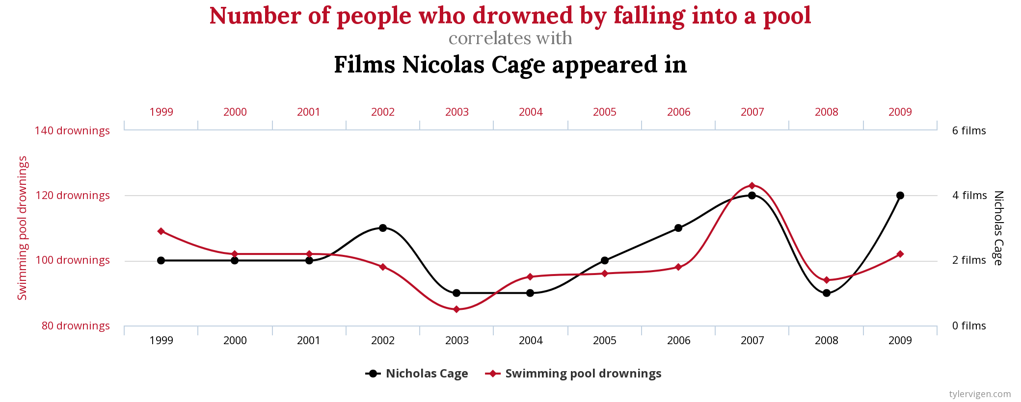
Source: tylervigen.com/spurious-correlations
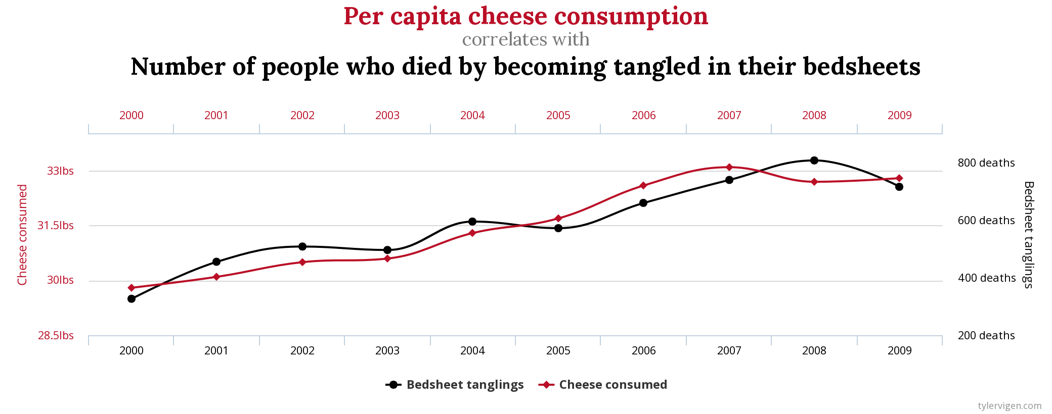
Source: tylervigen.com/spurious-correlations
The easiest technique to avoid the secondary y axis is just to make 2 separate charts and put them side by side or on top of each other.
You could also index both time series and make them relative to their first value. To do so, you divide all values by the first value in the time series (and multiply them by 100 if you want the indexed values to be relative to 100). Doing so resolves the issue of the time series being in different units.
Source: youtube.com/@eagereyes
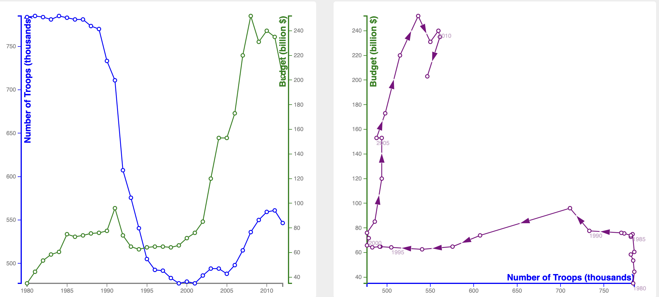
An interesting alternative chart type for showing correlation between different time series is to use a connected scatterplot. In a connected scatterplot the values of the 2 time series are plotted on the x and y axis, and time is shown by connecting the dots in the scatterplot in chronological order. Below is an example of a double axis line chart next to a connected scatterplot based on the same data (US military budget vs number of troops).