Should the y axis used on line charts also always start at zero? Next to the use of pie charts, this is one of the most discussed topics in data visualisation. That is an indication there is no easy and simple answer to the question.
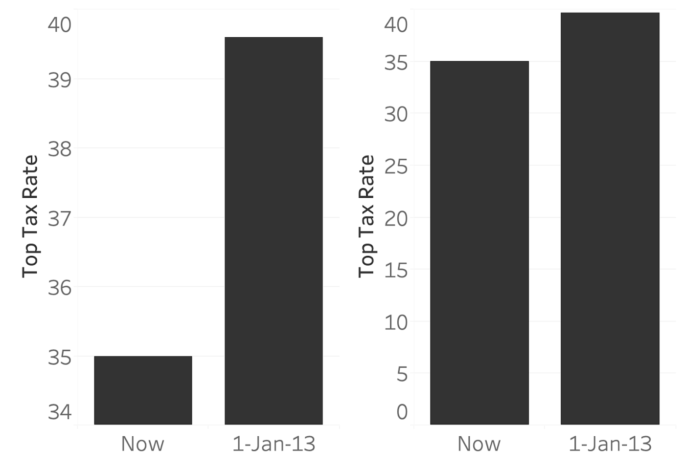
The question is: is the left line chart, with a truncated y scale, misleading (or: as misleading) as the left bar chart below?
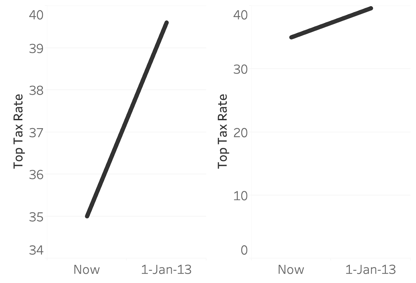
Source: Truncating the Y-Axis: Threat or Menace?, engineering.tableau.com
Source: Truncating the Y-Axis: Threat or Menace?, engineering.tableau.com
Researchers have stepped in to try to answer this question by exposing people to line charts with varying degrees of y scale truncation, and asked the participants how quickly the values were changing over time.
Conclusion? The researchers found that y scale truncation has a strong impact: the higher you start the y scale, the bigger the visual difference between data points, and the bigger a deal people thought the trend was.
The researchers didn’t provide us with guidelines on if and how to truncate the y scale on line charts. But a reasonable strategy would be to start the y axis at zero as a default for all your line charts, and only deviate from that rule in the following cases.
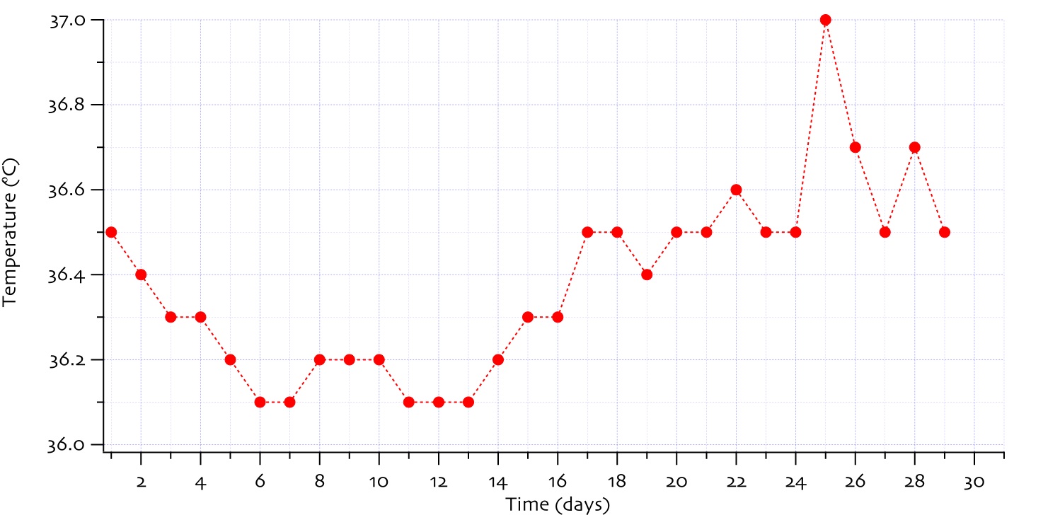
When the zero line is not meaningful. A chart showing measured body temperature does not need to have a y scale starting at zero. A temperature of 0°C is not meaningful for a (living) person, so there is no reason to start at that value. On top of that, changing the units to degrees Fahrenheit or degrees Kelvin and start the y axis at 0 degrees would lead to very different charts, with different starting temperatures values for the y axis (0°F is -17,8°C and 0°K is -273°C).
Source: Elizgoiri, CC BY SA 3.0
When including zero on the y axis hides important changes in the data. A good example are time series showing the value of stocks and commodity prices. Potentially, these could drop to zero (or come close to zero), but they usually fluctuate within a limited range. Small increases or decreases in prices can mean big monetary gains or losses, but could be hard to spot on charts with y axes starting at zero.
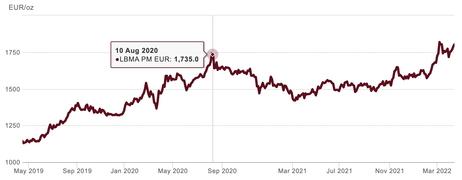
The price of an ounce of gold varied between 1.130 and 1.800 euros over the last year. Source: gold.org
Charting tool developers have to come up with smart defaults for starting values of axes. But they don’t know how meaningful the zero value is or how important small fluctuations in their users’ data are, so they have to take a different approach. They will usually start with the minimum and maximum values in the data, apply some margin around that range and include zero if it is not too far away from the resulting data range. This will result in sensible axes in most cases, but as the chart author you should spend some time to check if the starting values for the axes that a visualisation tool picks for you make sense and are optimal for what you want to show.