Source: Narrative Visualization: Telling Stories with Data
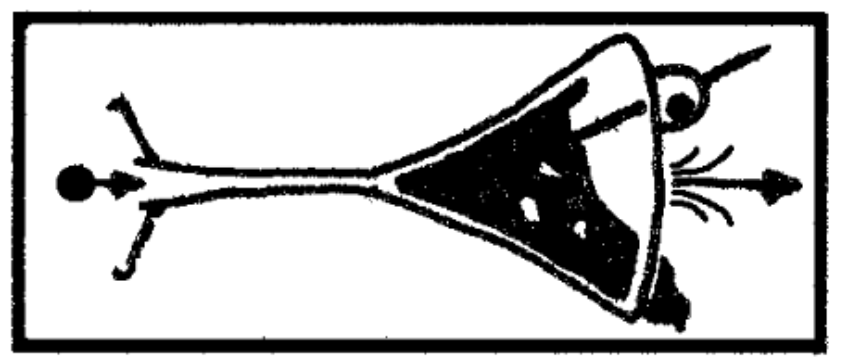
Stories that start of with an author-driven approach (with an introduction to the data, with a view on the data curated by the author and with a few observations on the data), but that give controls to the user to filter or (dis)aggregate and change the visualisation of the data at a later stage in the story, are said to have a Martini glass structure: the freedom of the user has to control the story is initially very narrow, but at the end the user has a sandbox at her disposal to slice, dice and visualise the data in the way she wants.
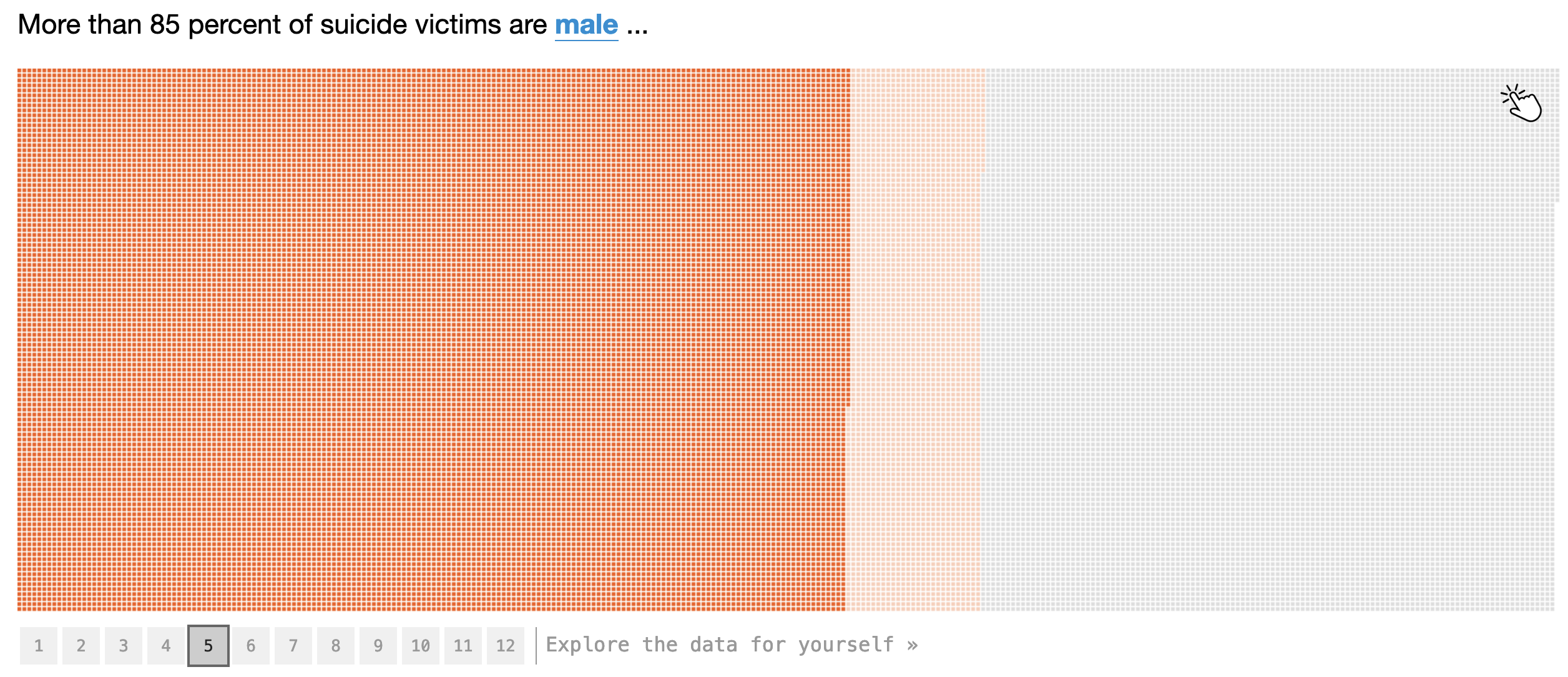
A 12 step slideshow reveals the demographics behind gun deaths in the United States. As a last step in the slideshow, the reader is asked to explore the data for herself. Source: fivethirtyeight.com
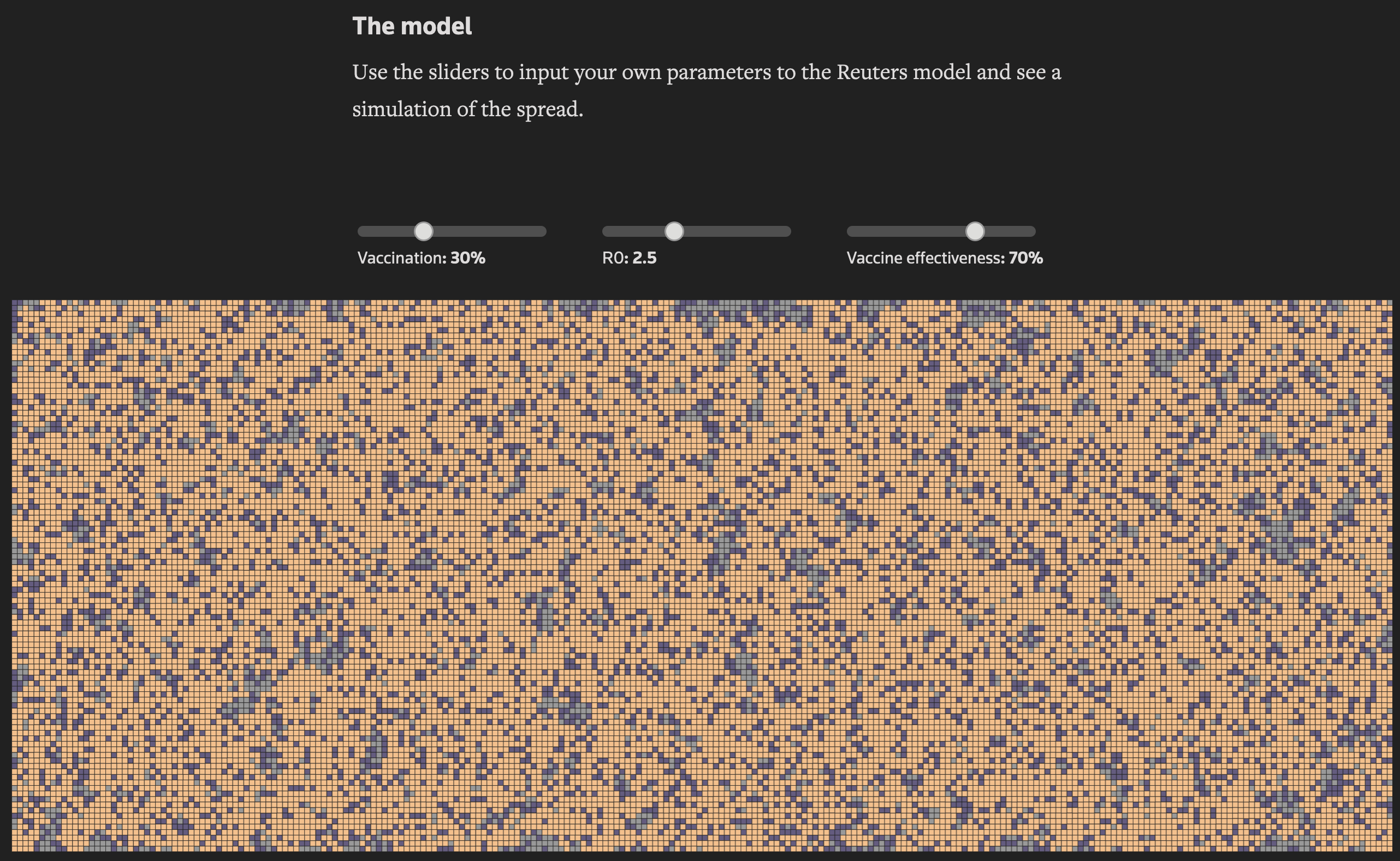
At the end of Stopping the spread of COVID-19, the reader is asked to use 3 sliders to experience the effect of 3 parameters used in the modelling of covid-19 spread. Source: graphics.reuters.com
Sometimes the order of the Martini glass structure is reversed, and an article is opened with an interactive visualisation, inviting the reader to explore the data first before the author’s findings are presented. In that case, the story has a “reverse Martini glass” structure.