Source: Narrative Visualization: Telling Stories with Data
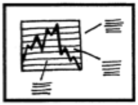
The narrative power of adding visual and textual annotations is described on the visual annotations and text annotations pages. The researchers recognised this power by identifying the annotated chart as a separate genre.
Annotated charts will have only a limited amount of surrounding text and use a visualisation as the canvas for the annotations, which are the building blocks of the narrative.
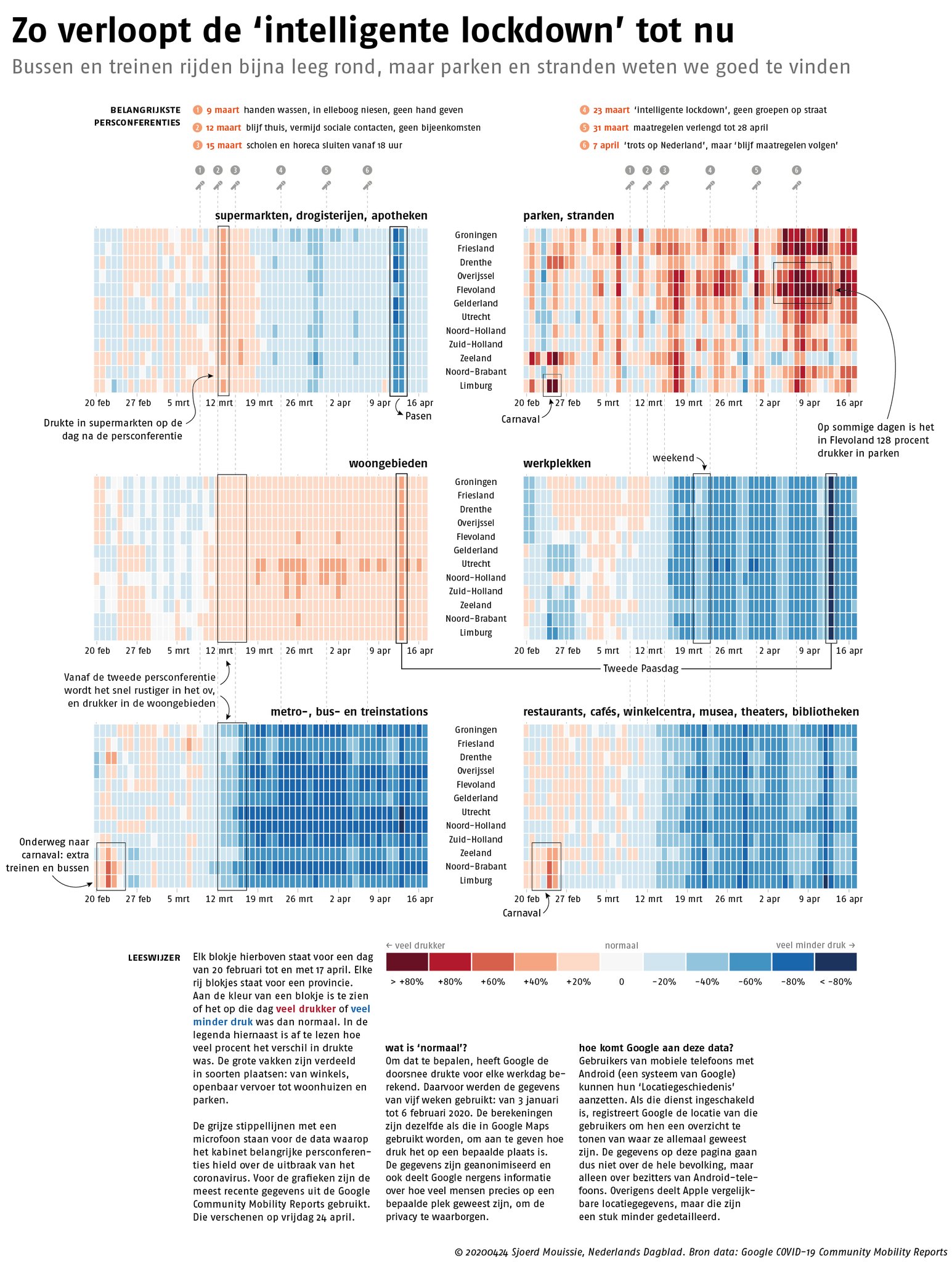
A page from the Nederlands Dagblad newspaper explaining the effects of lockdown measures on mobility in different parts of the Netherlands (shops, parks and beaches, residential areas, …). The annotations on the chart tell the story, and the text below the graphic only explains how to read the chart and where the data comes from. Source: @SjoerdMouissie
You can find more examples of the annotated chart genre on the text annotation stories page.