As someone working in data visualisation, you might be asked to reproduce a chart in a publication without having access to the underlying data. In situations like this, it might be tempting to take the chart and manually trace it using software like Adobe Illustrator or similar tools.
As with all manual data manipulation, this is prone to errors:
- if there are any errors in the original chart, you will copy the errors
- you have to pay special attention to also copy the axes of the original chart
The process of tracing a chart will not solve the issue of not having access to the data. If you would like to perform some analysis on the data, aggregate it or use it in another chart, you are still stuck.
A tool to get the data out of a visualisation is WebPlotDigitizer. The process of “reverse engineering” the data in a visualisation with WebPlotDigitizer looks like this:
- you upload an image with the visualisation for which you would like to extract the data from
- you select the type of visualisation on the image (usually a 2D plot with 1 y and 1 x axis)
- you calibrate the axes by selecting points on them and entering their data values
- you trace the lines or bars on the visualisation
- you download the dataset with the data values you traced
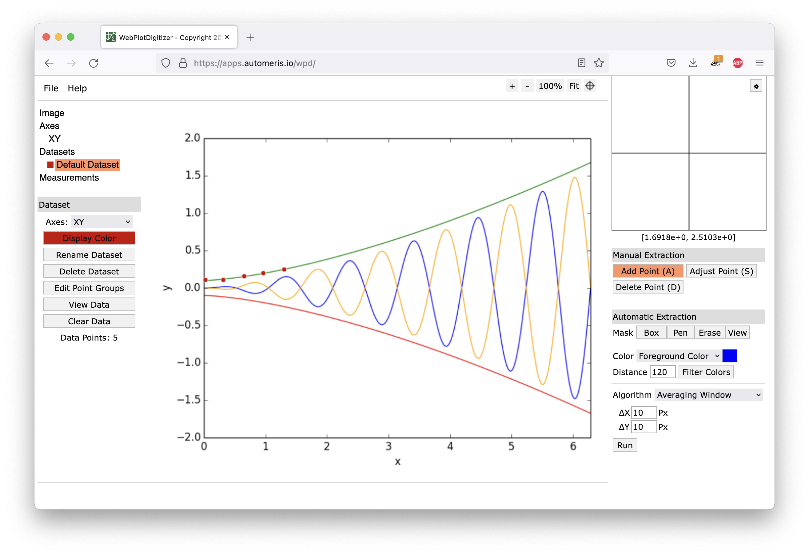
The WebPlotDigitizer interface. Source: Maarten Lambrechts, CC BY SA 4.0
WebPlotDigitizer can be handy if it is impossible to obtain the source data of a visualisation you would like to reproduce. Because it results in a dataset you can work with, it is preferred over tracing a chart. But it still better to try to obtain the source data the chart author used to produce the original visualisation, and only resort to WebPlotDigitizer if this is not possible.