Almost all visualisation tools offer a gallery of chart templates to choose from in order to make a visualisation.
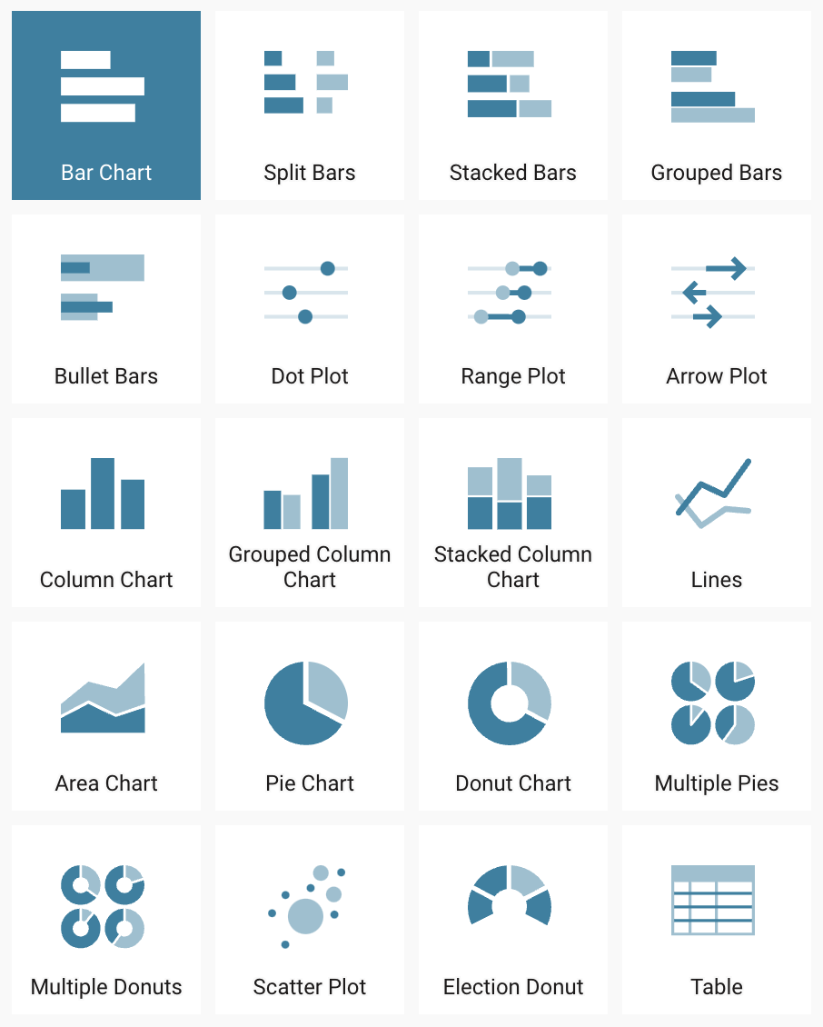
Chart templates in Datawrapper. Source: Maarten Lambrechts, CC BY SA 4.0
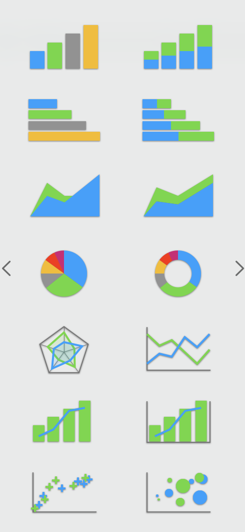
Chart templates in Apple Numbers. Source: Maarten Lambrechts, CC BY SA 4.0
When selecting a template from the chart template gallery, a visualisation with a default styling will be generated. To make a chart your own and brand it, you probably want to style it by applying a theme to it. A theme specifies things like the colours to be used, the font family and size of text elements, how to display axes and grids, …
Some tools have built in themes that you can use to move away from the default theme.
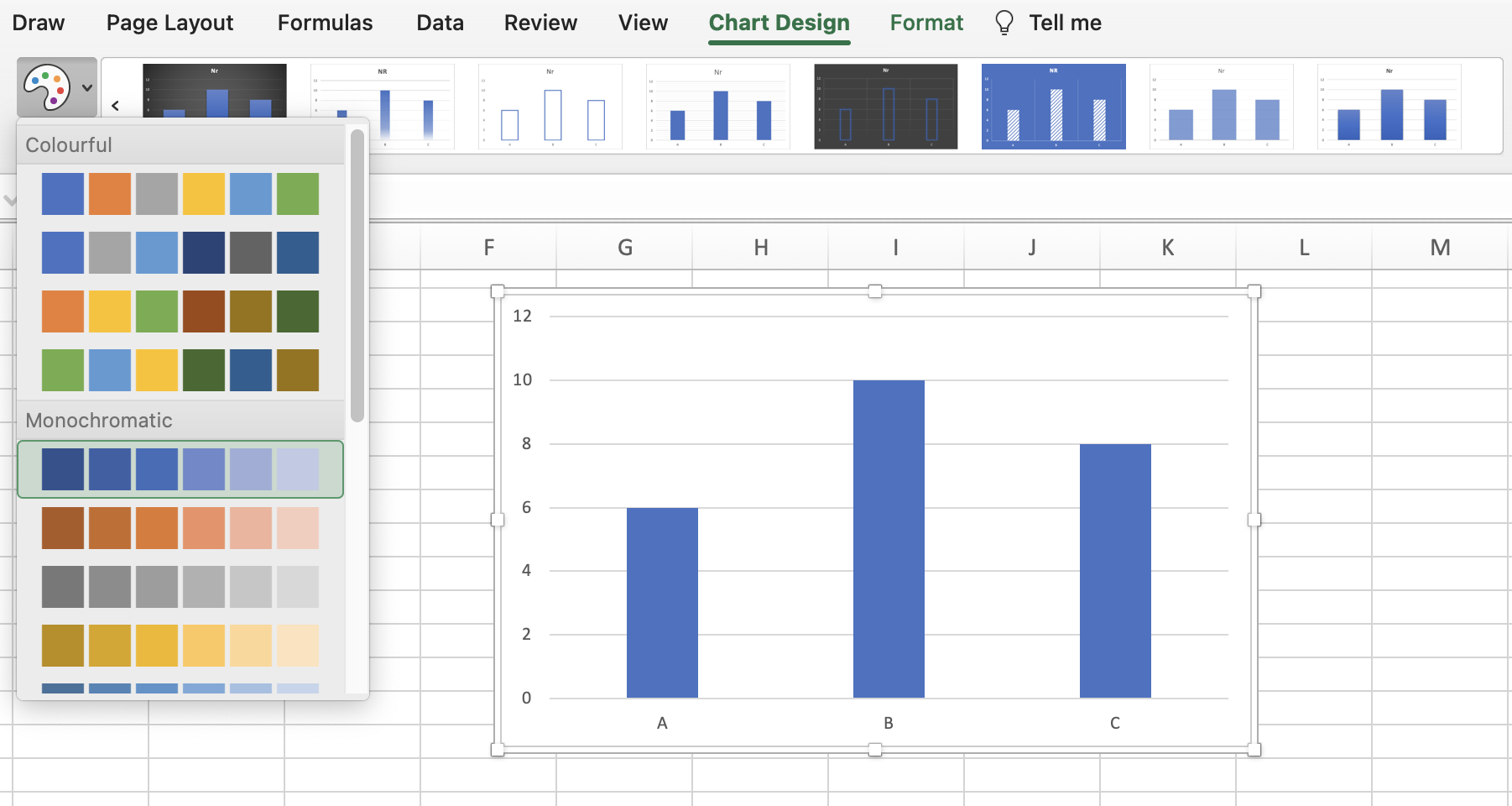
Changing colours and chart design in Microsoft Excel. Source: Maarten Lambrechts, CC BY SA 4.0
If you want to make charts in your own custom styling, one option is to create a template in the desired styling for each of the chart types that you use the most. After that, creating a new visualisation in your custom style then involves
- duplicating the chart template file
- update the data in the template with the new data
This process eliminates the need for manually overriding your tool’s default styling over and over again. Microsoft Excel offers functionality to manage these templates: if you click right on a chart that you styled, you can choose to save it as a template. You can then select this template when you create a new chart, or when you change the chart type of an existing visualisation. See Save a custom chart as template for more information.
A problem that can arise when working with styled chart templates is that the data in the template can be a bit different than the new data. For example, a chart template can contain monthly values for a full year, while the new data may contain monthly data for a longer time period. If the template is configured to show the name of every month on the time axis, updating the data in the template with the new data can lead to overlapping labels on the time axis, for example. In cases like this, it might be useful to create a template for both kind of data: one for shorter time series, and one for longer time series.