
Visualisation Notes #5
Data sensification
Data visualisation is just one of the many ways to encode and communicate data
Published on 20 October 2025
The fifth story in our series is an experiment inspired by a few questions: what if visualisation doesn't always consist of communicating insights from data clearly? What if visualisation could be used for other purposes, such as artistic expression? And what if visualisation isn't the only way to encode data?
An underlying theme in these articles is that visualisation is a language with its own vocabulary and grammar, as explained in our first note.
As you may remember, in visualisation we encode data through the manipulation of visual attributes – height, length, position, colour and so on – of objects such as dots, circles or rectangles. We use visualisation to explore or communicate relevant facts about a dataset or to reveal trends or patterns that may lie hidden in it.
However, is that the only appropriate or legitimate way to use the language of visualisation? Think about written language as an analogy.
Writing can certainly be a tool for communicating ideas clearly, but it's not limited to that. Depending on what the intention of the author is, writing can also be made ambiguous, poetic, evocative or simply playful. Visualisation is the same; it can be simple and straightforward – if its goal is to communicate clearly – or intricate, unique, artistic and even weird or whimsical. It all depends on our intended purpose when designing it.
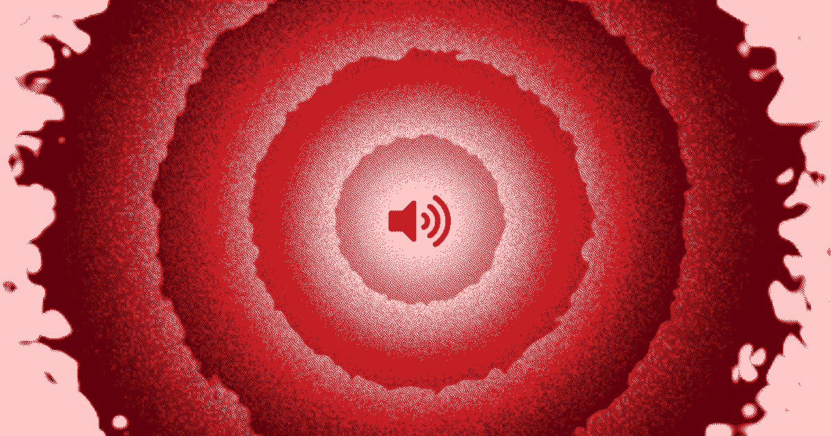
With this fifth story we also wanted to demonstrate that visualisation is just one of the many aspects of a wider world sometimes called data sensification or data visceralisation.
Vision is just one of our senses. It's a very powerful one, and that's why data visualisation is so useful for understanding data, reflecting on it and building stories based on it.
But what about our other senses? Why not experiment with data physicalisation, data smellification or, like in our fifth story, data sonification? And what if we could transform visualisations into multimodal experiences, so a person can not only see the data, but also touch it or hear it at the same time?
The possibilities are endless and are still largely waiting to be discovered. We hope that, after reading our five stories and the corresponding visualisation notes, you feel inspired to keep exploring this wonderful world.
Story #5