
Visualisation Notes #3
Visualising Change and Flow
To build a data-driven narrative, connect every step to its previous and following ones
Published on 6 May 2025
So far in this series of articles about the art and language of data visualisation we have covered the main elements of its grammar, and some common misinterpretations when reading certain charts, such as scatter plots.
Let us now discuss some recommendations for effective visualisation design and narrative-building.
When creating graphics to display data, do not simply load the numbers into a software tool and let the program decide which type of chart to use. Also, do not go with your first instinct. Rather, think of the chart that you are designing as a tool for understanding. What do you want readers to see in your chart? What is its intended goal?
You should make your choice of charts, graphs or maps based on the answers to these questions. To expand your visualisation vocabulary, and, as a consequence, the variety of choices you can make, we recommend consulting websites such as the Data Visualisation Catalogue or the Visual Vocabulary.
In the story paired with this visualisation note, we visualise data through charts that may be familiar to you (line graphs) and others that may look a bit unusual (Sankey diagrams).
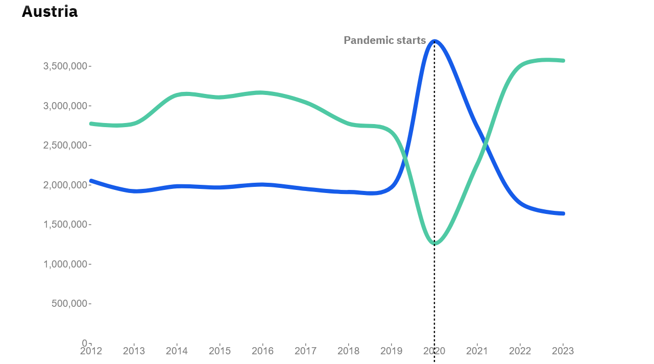
Line graphs work well when our goal is to display the variation of one or more variables over time — in our case, the number of leisure trips.
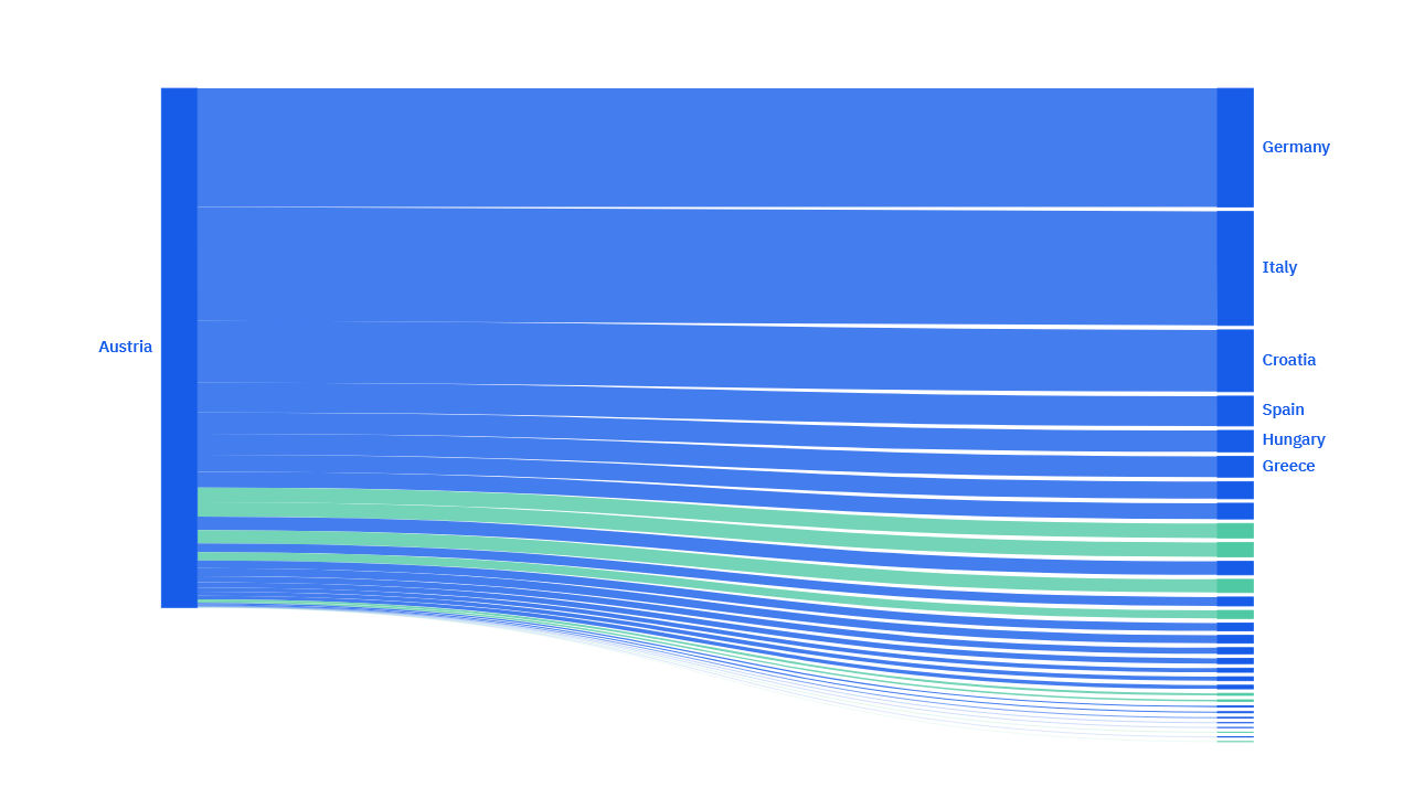
Sankey diagrams encode data through line weight: bigger quantities lead to thicker lines. In our story, we use Sankey diagrams to say "of all the trips that originated from country X, this is the proportion that went to each of these destinations". These diagrams represent the flow between a total and its components.
Our story also employs another form of "flow": animated transitions. Animation is like any other component in data visualisation; it should not be an arbitrary gimmick, but it should be used when it fits a purpose. In our case, it is to strengthen the sense of continuity between one set of charts and the next — to connect them to one another.
Imagine this story without these animations: transitions between one set of charts and the next would be too sudden, and it would not be obvious to the reader that the charts are structured in a linear narrative. Moreover, the story wouldn't look as visually compelling as it does now.
When it comes to visualisation design, functional and aesthetic considerations are both relevant and should be carefully balanced.

Story #3