One powerful feature of the 3 tools implementing the Grammar of Graphics is the possibility to layer geometries on top of each other. A common technique in line charts, for example, is to mark the data points with a dot. In the Grammar of Graphics, this is as simple as layering a point geometry over a line geometry.
Source: vega.github.io/vega-lite/examples/line_overlay_stroked.html
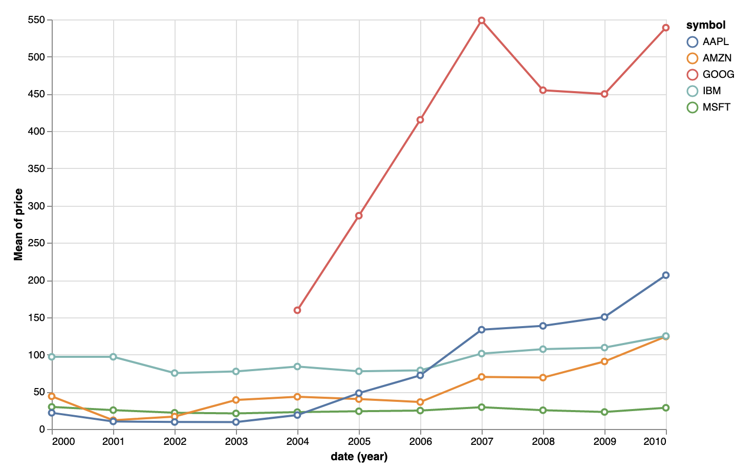
Some chart types use geometrical objects that might not be available directly in one of the implementations of the Grammar. But in many cases, these specific geometrical objects can be constructed by layering 2 or more of the available primitive geometries on top of each other. For example, the chart below (called a dumbbell chart in chart template language, see Grouped bars) can be created by layering point geometries on top of a line geometry.
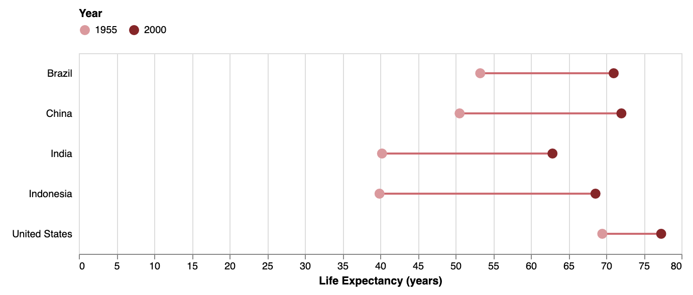
Source: vega.github.io/vega-lite/examples/layer_ranged_dot.html
Showing the distribution of the values of a numerical variable can be enhanced by both showing the individual observations on top of a geometry that summarises the distribution, like a box plot geometry.
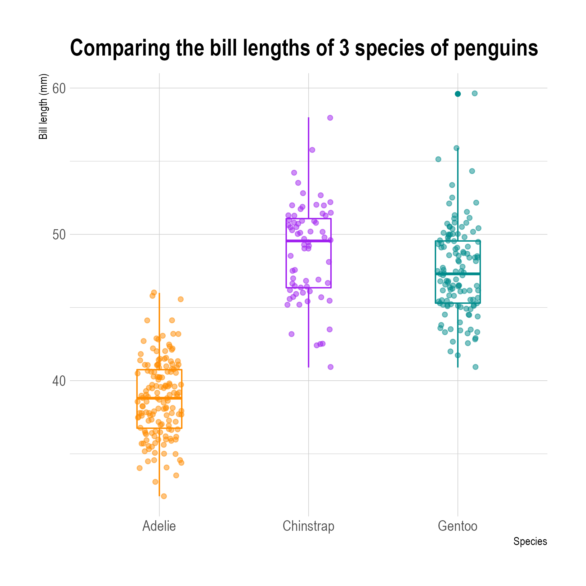
Box plots with the data points plotted on top of them. The x position of the points is jittered, which means that their x position is randomised. ggplot2 has a jitter geometry for jittering point geometries. Source: adapted from Allison Horst
Similarly, layering a best fit curve to a series of data points (see Smoothing lines) can help in seeing trends and patterns in a data set.
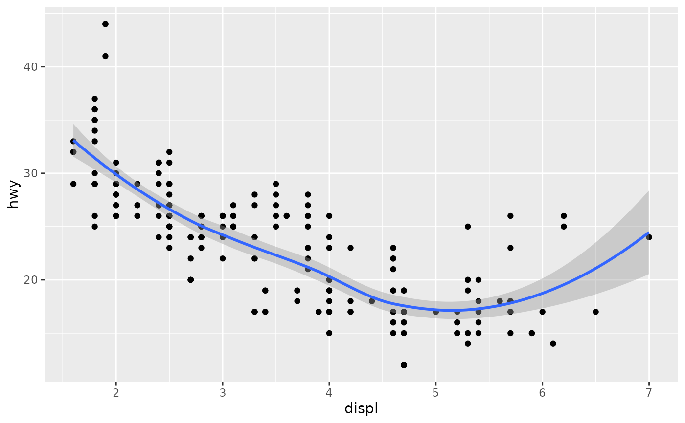
Source: ggplot2.tidyverse.org/reference/geom_smooth.html
Different geometry layers in a single plot share the same position aesthetics (x and y), but they don’t have to use the same data. In the box plot example above, the boxplot geometry transforms the data internally to construct the box plots. But the transformation can also be explicitly done outside of a geometry.
In the chart below, daily maximum temperatures are used to plot point geometries. But on top of the dots, a line geometry is added that is using a 30 day rolling average of the daily maximum temperatures. This 30 day rolling average was computed using a transformation of the original data, all within Vega-Lite.
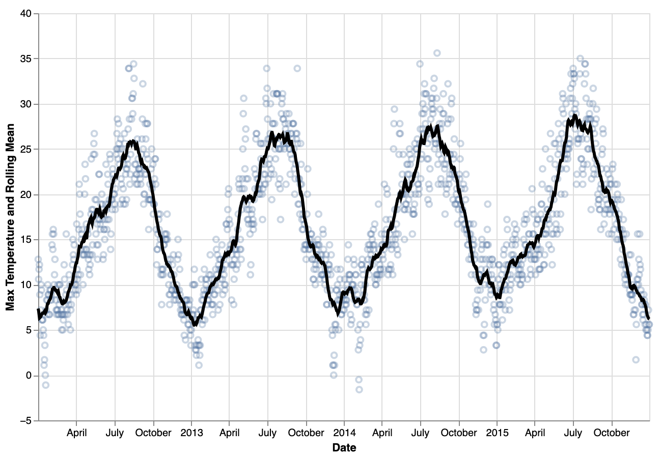
Source: vega.github.io/vega-lite/examples/layer_line_rolling_mean_point_raw.html
Text geometries can be used in versatile ways to add data labels and annotations. The bar chart below layers a text layer with the values for each bar on top of a bar geometry.
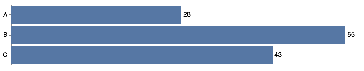
Source: vega.github.io/vega-lite/examples/layer_bar_labels.html
Because layers in a plot do not have to share the same data, layering geometries can also be used creatively to add annotations to a plot. The plot below uses 3 geometry layers: a line geometry, a point geometry (which is helpful for indicating the irregular intervals between the observations), and a rect geometry to add annotations indicating 2 different time frames.
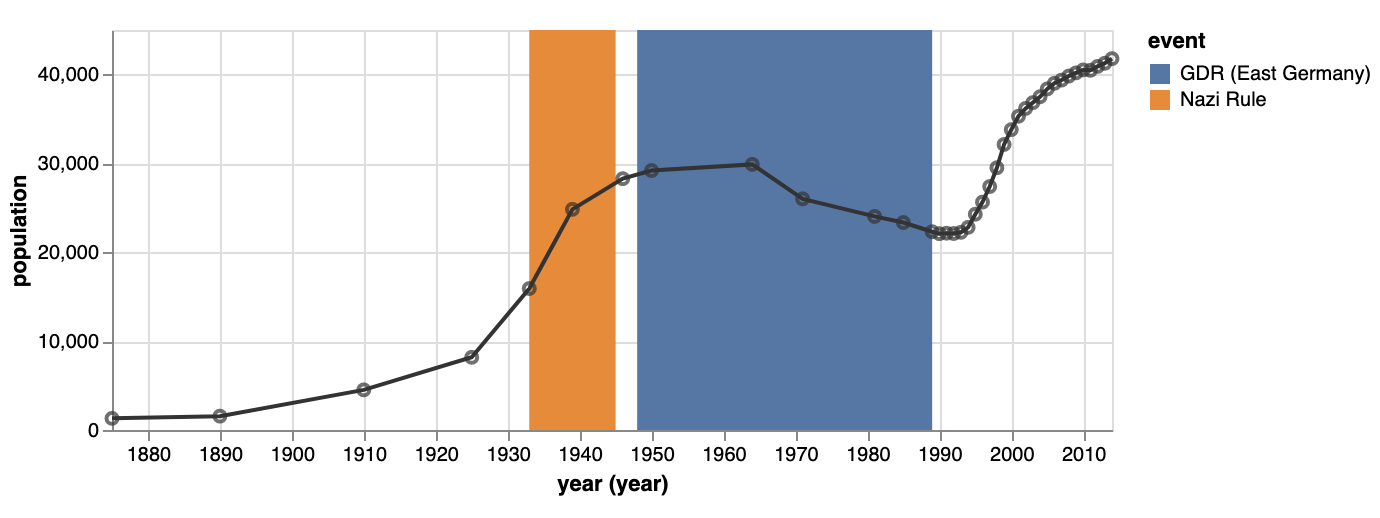
Source: vega.github.io/vega-lite/examples/layer_falkensee.html