Rounding numbers in your visualisations will improve legibility: rounded numbers are easier to read, and in a lot of cases numbers can be formatted more efficiently without compromising precision.
An easy rule to follow in the formatting of numbers is simply to remove leading and trailing zeroes. “1,5” means the same as “1,500” and it is easier to read, so the trailing zeroes should be removed and the number should be displayed as “1,5”.
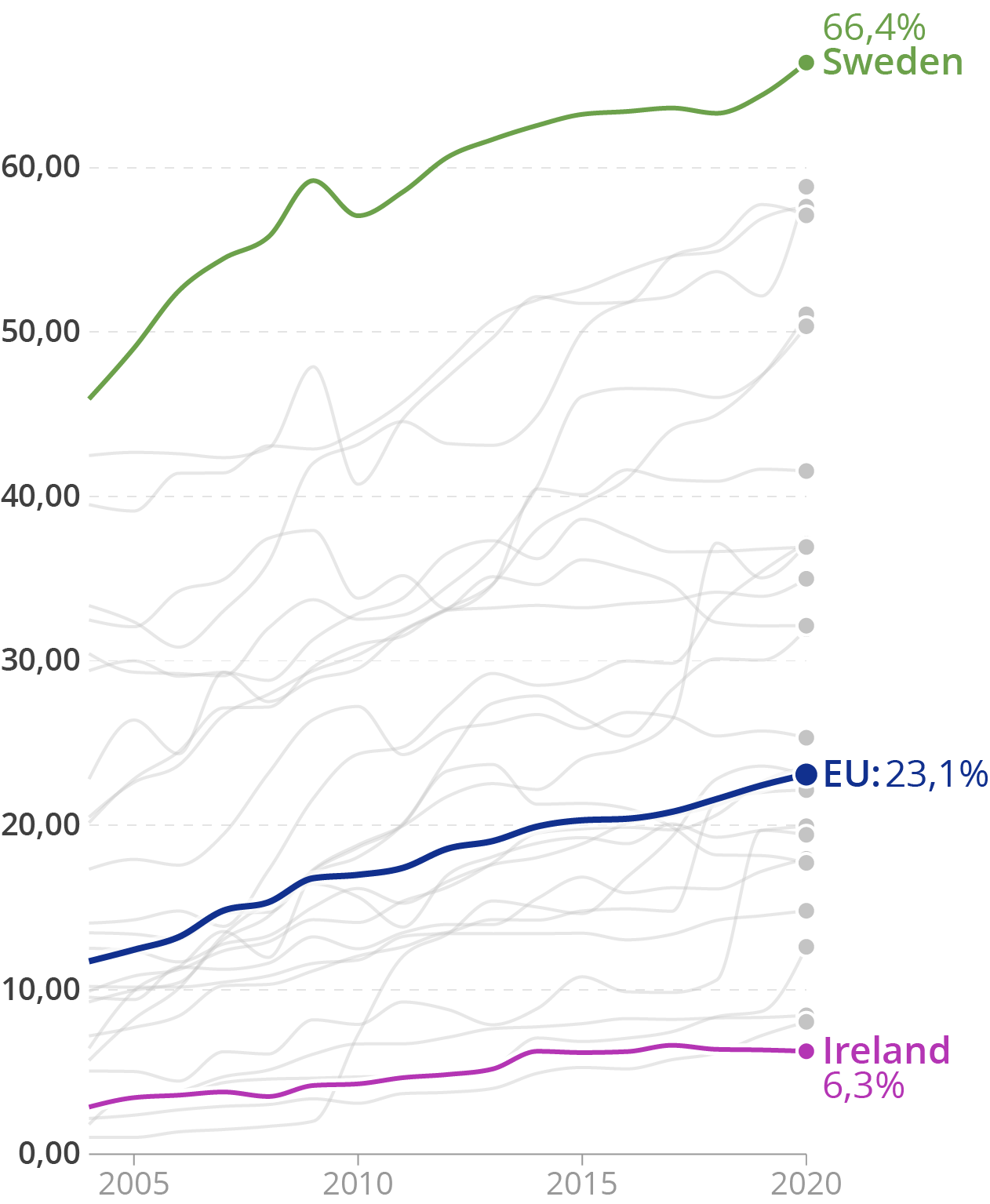
The y axis labels have too much precision, and the trailing zeroes should be removed. Source: Maarten Lambrechts, CC BY 4.0
An exception to this rule is the case when the data is measured with an accuracy up to the thousands, and so “1,500” is meaningfully different than “1,501”: in that case the number should be written as “1,500”.
But in that case you should consider changing the units of your data, and multiply the numbers by 1.000. For example, when distances are measured with an accuracy of 1 meter, you shouldn’t write “1,501 kilometer”, but write “1.501 meter” instead. Similarly, when distances are measured with a lower accuracy of 100 meter, numbers should be written as “1,5 kilometer” and not as “1.500 meter” because the latter gives a false sense of precision.
Leading zeroes can be removed in the same way: writing “5,6 centimeter” is preferred over “0,056 meter”.
Note that writing “1.501 meters” or “1,501 kilometer” is meaningless when the data measurement only has an accuracy of 100 meter. So numbers should be rounded to remove the insignificant digits. In this case, the number should be formatted as “1,5 kilometer”.
This rule is often disrespected when numbers have a certain degree of uncertainty. If numbers are reported with a confidence interval, it is not meaningful, or even misleading to label values with too many significant digits. For example, if a value is reported with a confidence interval with limits of 137 and 162 it is not really meaningful to write the point estimate to be 149,5. This number might have significant digits that are too precise for the measurement (the boundaries of the confidence intervals are reported as integers in this case, so the measurement might only have an accuracy of 1). An on top of that, the number is just an estimate, and not a precise number.
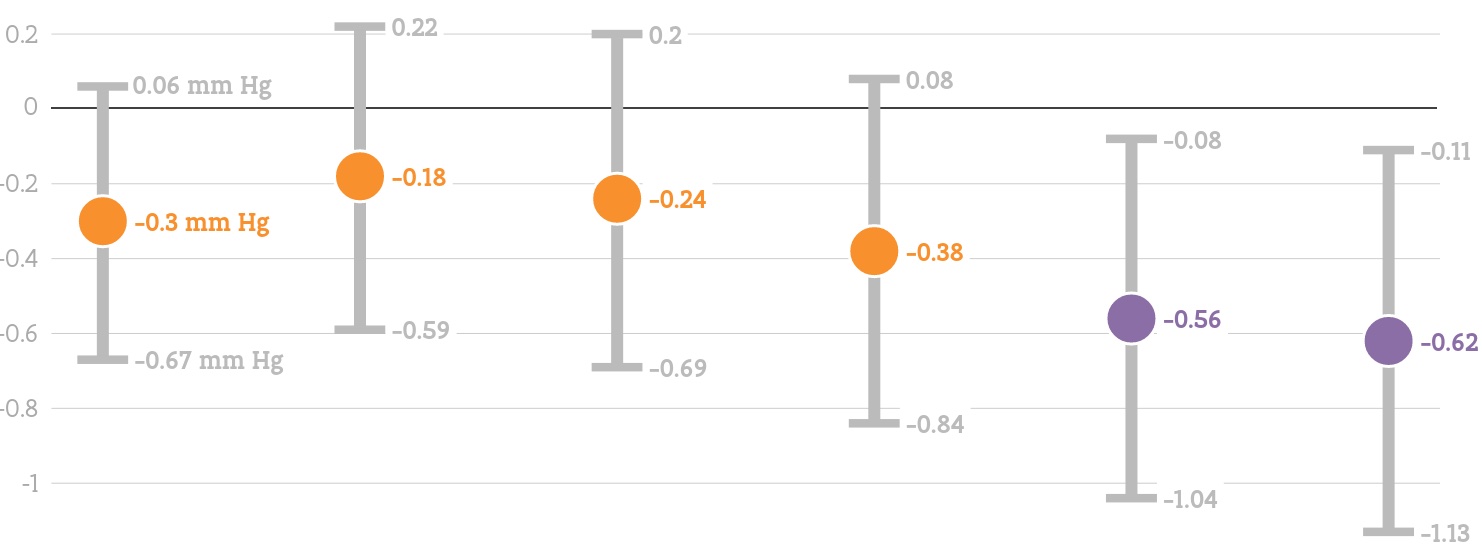
A visualisation showing confidence intervals. The central estimate should probably be less stressed visually, and the labels should be left out, or suggest less precision. Source: Ruimterapport Vlaanderen
“Spurious digits”, digits that are actually meaningless, can also pop up when large but imprecise numbers are divided by some number. For example, an imprecise yearly value of 37 million euro could be divided by 12 to get a monthly value of 3.083.333,33 euro. But because the resulting number can never be more precise than the initial value, this number should best be rounded to 3 million euro per month.
A similar error even happens in scientific papers, as this tweet explains:
As a rule, more than 1 digit after the decimal sign is not needed, and many numbers in your visualisation can be rounded to 1 digit after the decimal sign, or even to integers. Remember to round numbers in the correct manner (round numbers with less than 5 tenths to the lower integer, and numbers with 5 tenths or more to the higher integer).
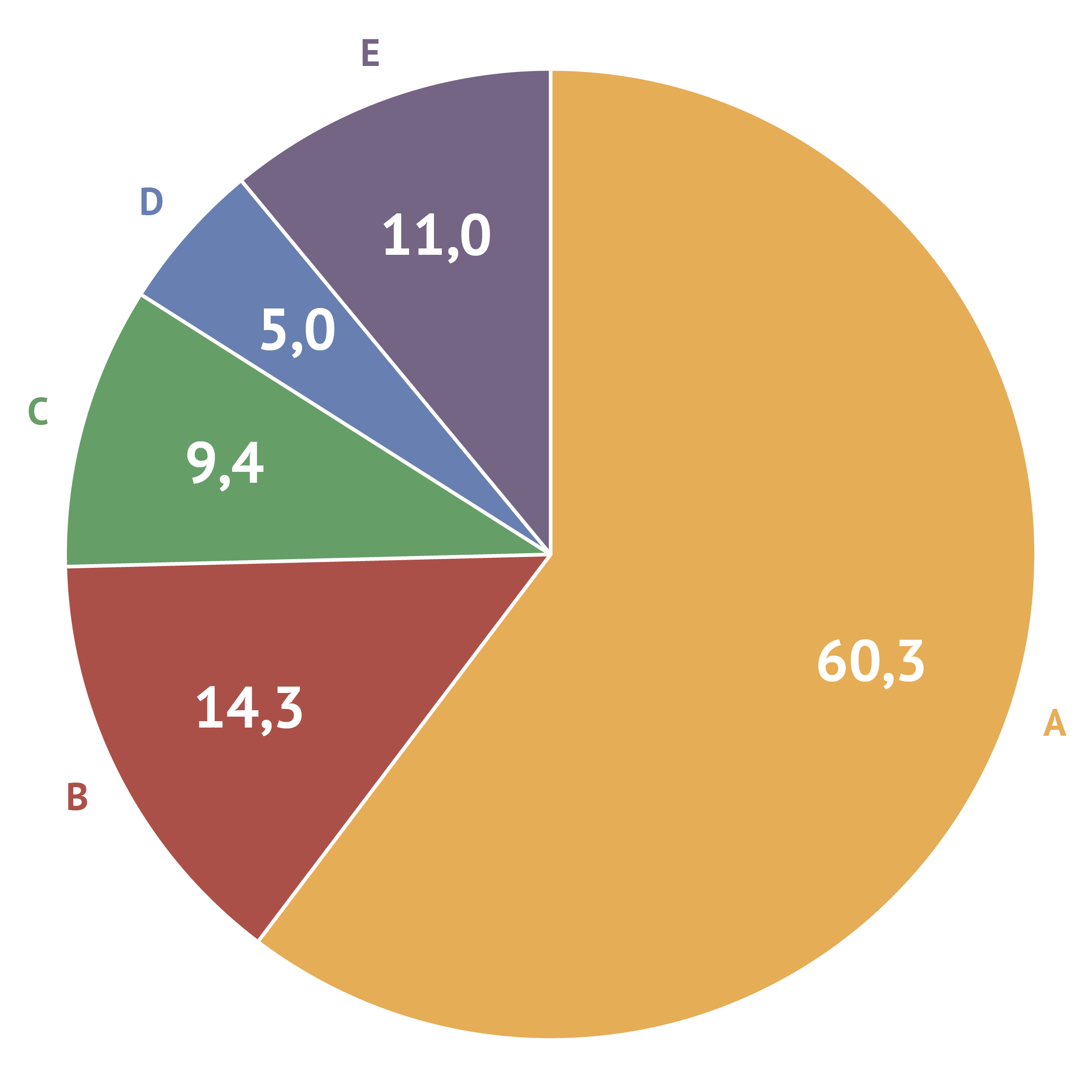
One issue that often comes up in visualisation when applying this rule, is that the numbers on charts that show relative proportions (like pie charts, stacked bar charts and stacked area charts) do not add up to 100 percent.

A pie chart totalling 99%. Source: Maarten Lambrechts, CC BY 4.0
In that case, rounding to 1 decimal might be appropriate (but values still might total to values like 99,9 or 100,1%).
Adding an additional significant number solves the rounding issue. Source: Maarten Lambrechts, CC BY 4.0
Solutions to this problem include rounding some of the values up (or down) to get a total of 100,0% or adding a note stating that totals do not add up to 100% due to rounding.