Next to position (in the x and y direction, and in the z dimension), sizing design elements is another obvious ways of bringing visual hierarchy into your designs: bigger things seem more important than smaller ones, and will draw more importance.
When the contrast in size is large enough, the size effect will compete with, or even overrule the positioning hierarchy, and the reading sequence will be changed. For example, a big and striking visualisation will be looked at first, even when it is not positioned in the top left, where most readers will usually start looking.
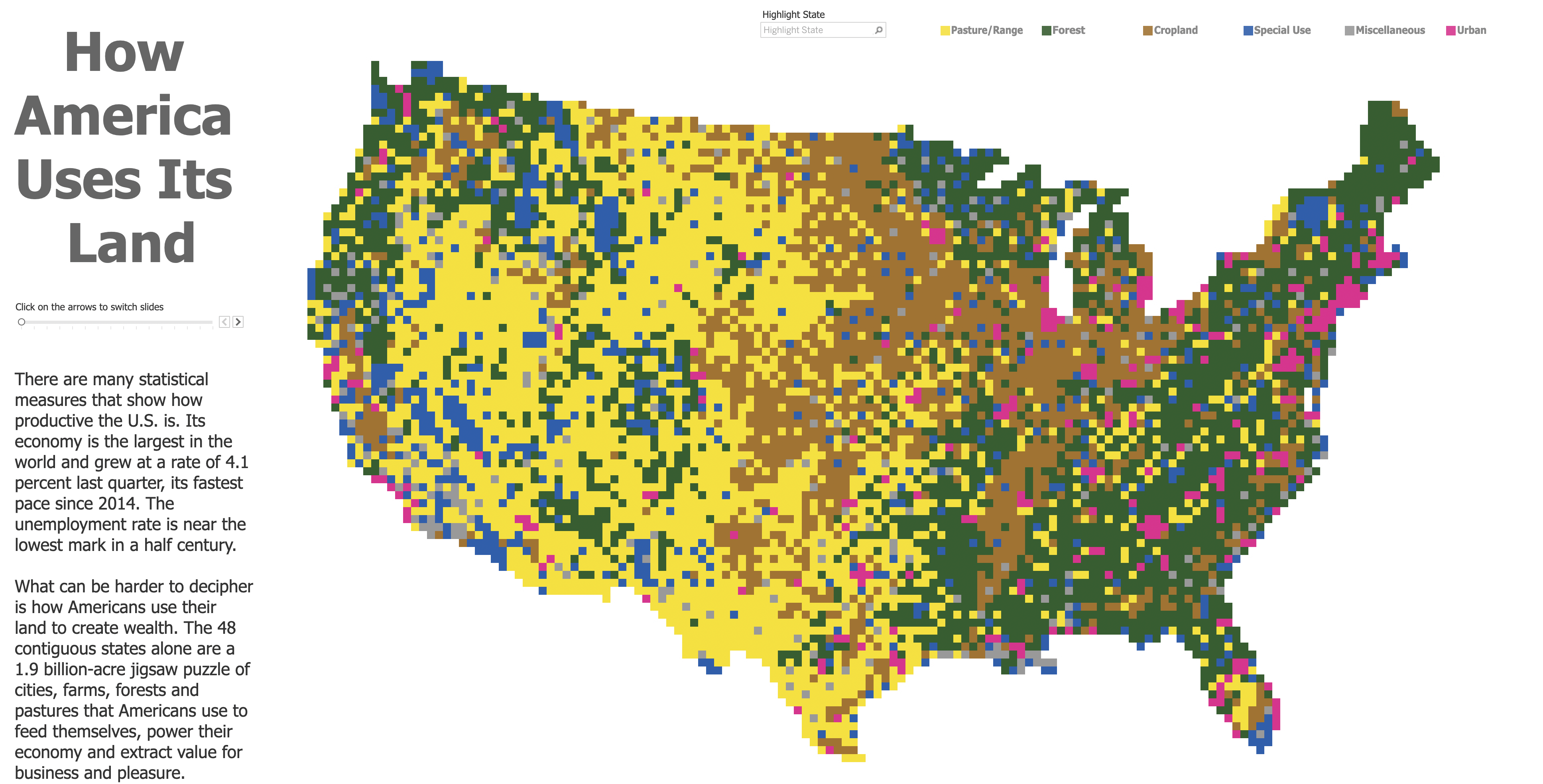
In this layout, the graphic is very big in size and competes for the highest place in the visual hierarchy with the title, which occupies the most important location in the reading order but is much smaller in size. Source: Alex Varlamov
In multi-visualisation designs, like dashboards, you could for example choose to position the key visualisation in the centre of the dashboard. As long as the contrast in size is big enough, it will be the part of the dashboard that people will be looking at first.
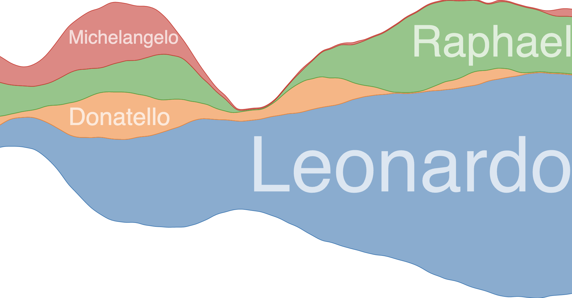
Within a visualisation, the sizing of text creates a clear visual hierarchy. Take a moment to look at the streamgraph below.
Source: github.com/curran/d3-area-label
What jumps into your eye first when you look at the graph? It probably is the “Leonardo” label, which is much bigger in size than the other labels.
This is the reason why the hierarchy in the text chart elements of a visualisation should be reflected in the sizing of the font. So the font size should go from large to small in the following order:
Title > Sub title > annotations > data and category labels > axis labels > small print, like credits and sources
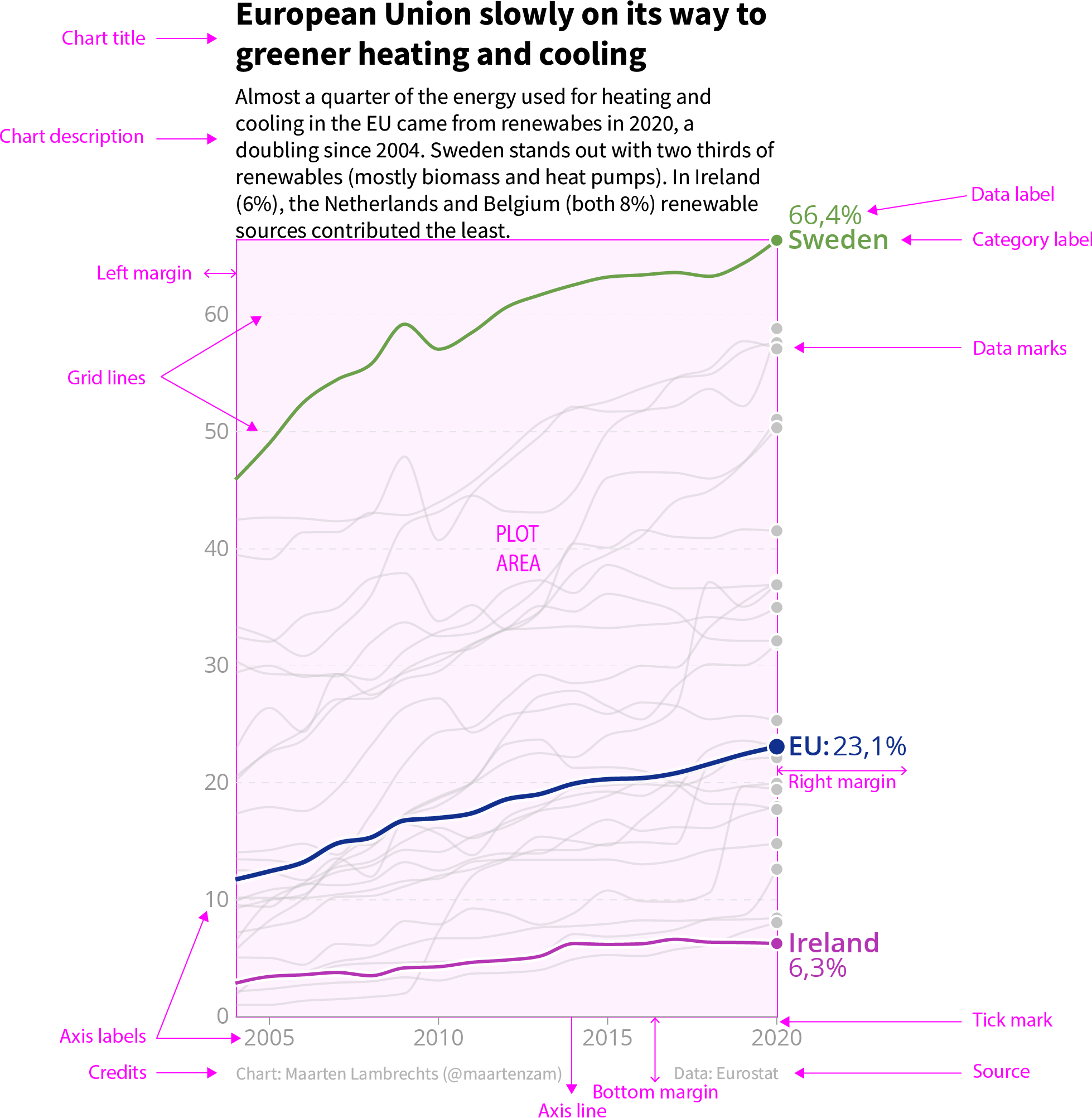
Source: Maarten Lambrechts, CC BY 4.0