Some patterns in data have a natural storytelling capacity. If one of these patterns is present in your data, chances are that your story or message will be built around it. Visualisations should show and highlight these patterns in the clearest way possible.
The most obvious pattern in data with storytelling capacity is evolution over time. Things that change over time reveal something about how the world we are living in is changing. These changes may affect our lives, and we might have to react to them. That is the reason line charts are so ubiquitous: they are excellent devices for showing changes over time.
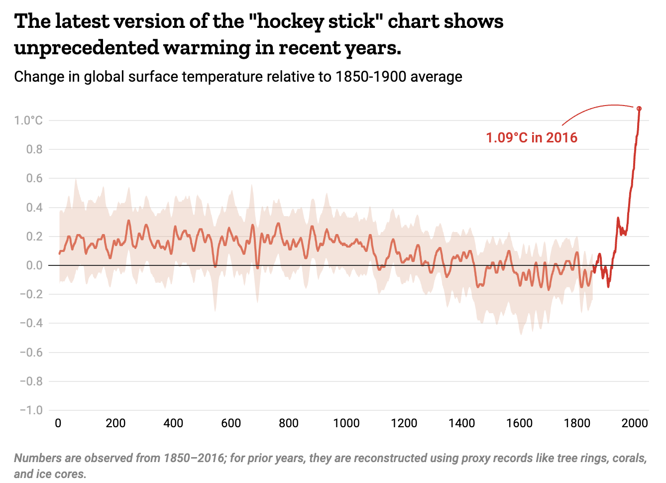
A version of the famous “hockey stick chart”, showing the recent observed global warming in a historical context. Source: ‘Widespread and Severe.’ The Climate Crisis Is Here, But There’s Still Time to Limit the Damage
Related to evolutions over time are intersections: moments in timey at which lines in a line chart cross each other. At those intersections, the values of one category become bigger than the values of another category. As a result, the categories have switched and a new situation has emerged in which the smaller category became bigger than the one that was previously the biggest.
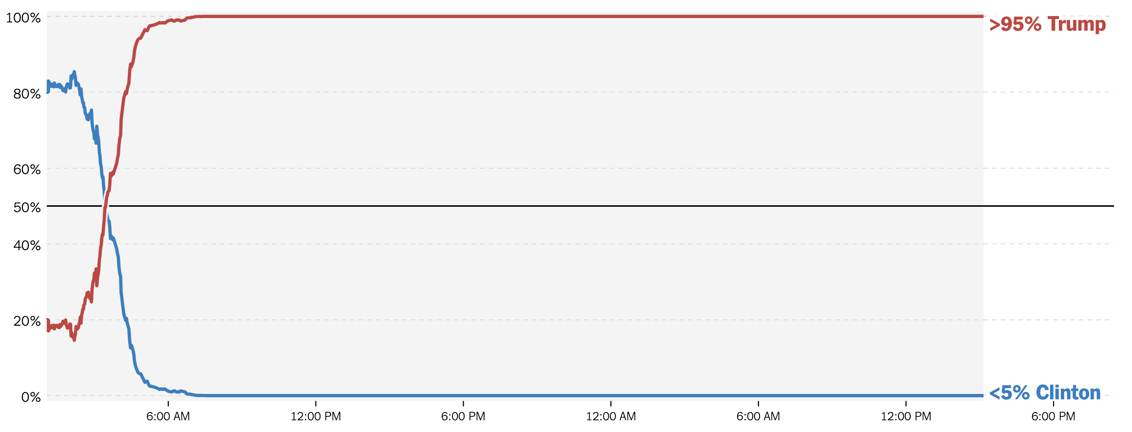
Source: Live Presidential Forecast, nytimes.com
Some chart types can show rankings, and are therefore good choices to show intersections. The chart below shows how one-person households became the most common household type in the United States.
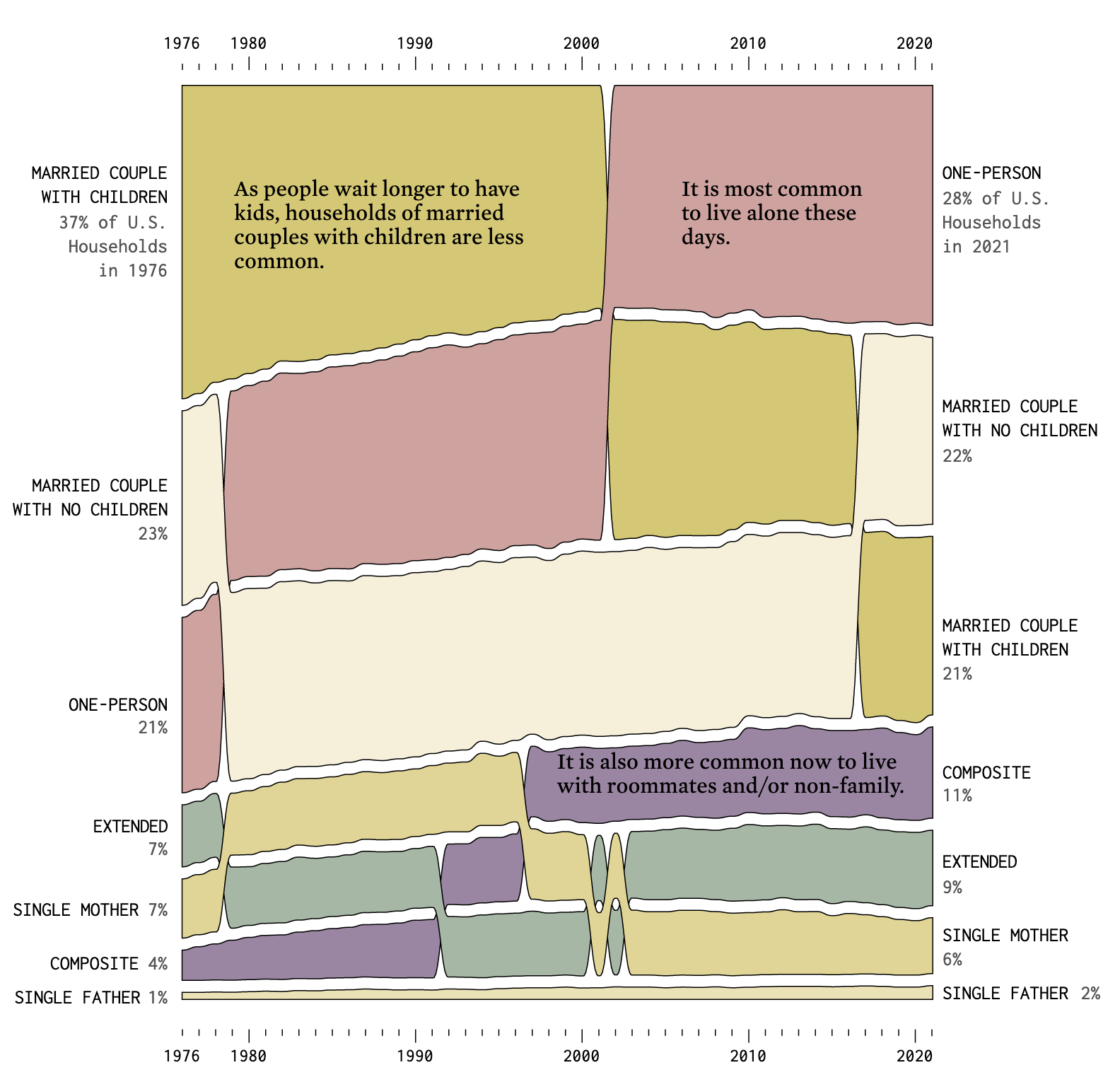
Source: Change in Common Household Types in the U.S., flowingdata.com
The ebb and flow of things overtaking other things can be very engaging, as the below “racing bar chart” shows.
Source: Bar chart race: the most populous cities through time, ft.com
Correlations are another powerful storytelling patters. They show us how something changes when something else changes, so they make the relationship between things apparent. When the relationship is a causal one, visualisations can show the cause and effect of things.
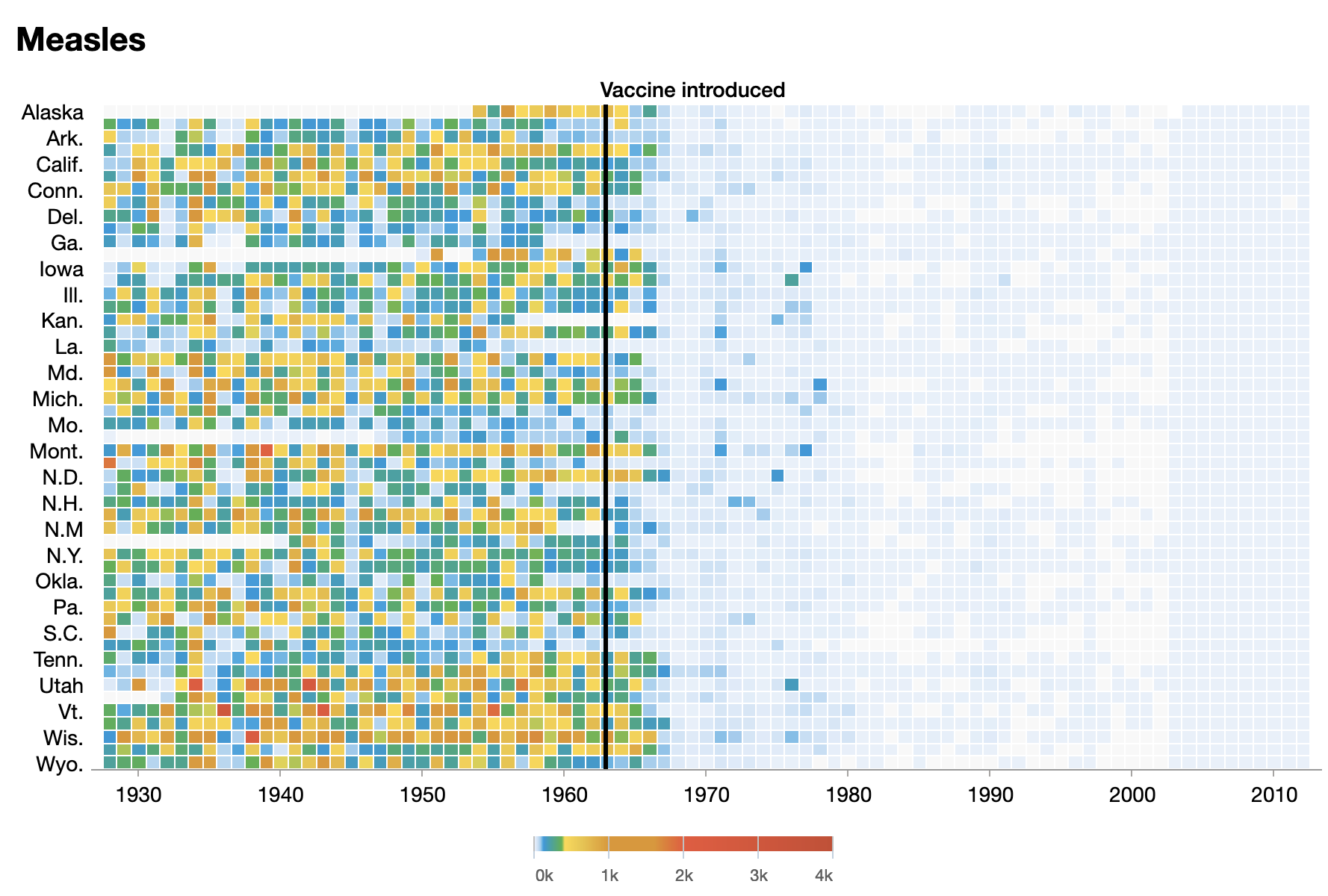
The incidence of measles in the United States, and the effect of vaccine introduction. Source: Battling Infectious Diseases in the 20th Century: The Impact of Vaccines, graphics.wsj.com
The most common chart type to visualise correlations are scatterplots. But they have to be used carefully, because people will read a causal relationship where there might not be one, as the below chart (with real data!) shows.
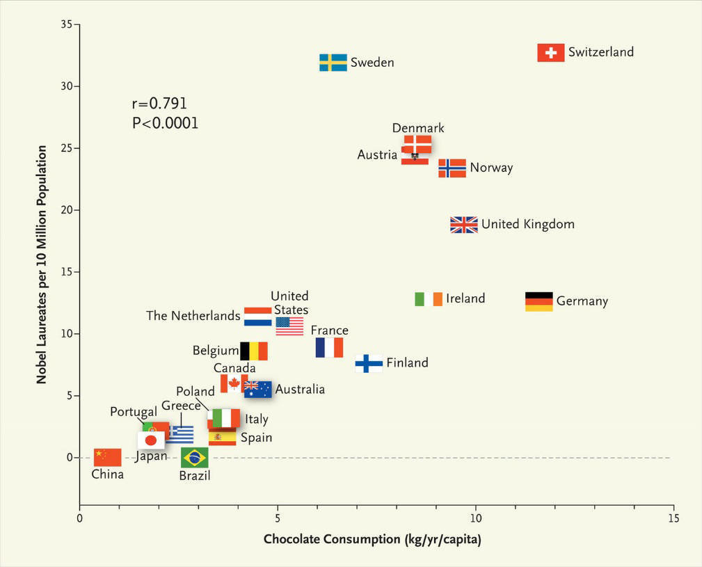
Can you explain the correlation between the per capita chocolate consumption and number of Nobel laureates in countries? Source: Chocolate Consumption, Cognitive Function, and Nobel Laureates
Outliers, items with extreme high or extreme low values automatically grab attention and trigger curiosity. Outliers are special data points, different from all other data points, and as a reader you want to know what is special about them and how their extreme values can be explained.
What strikes your eye in the chart below, and what data point would you like to see explained?
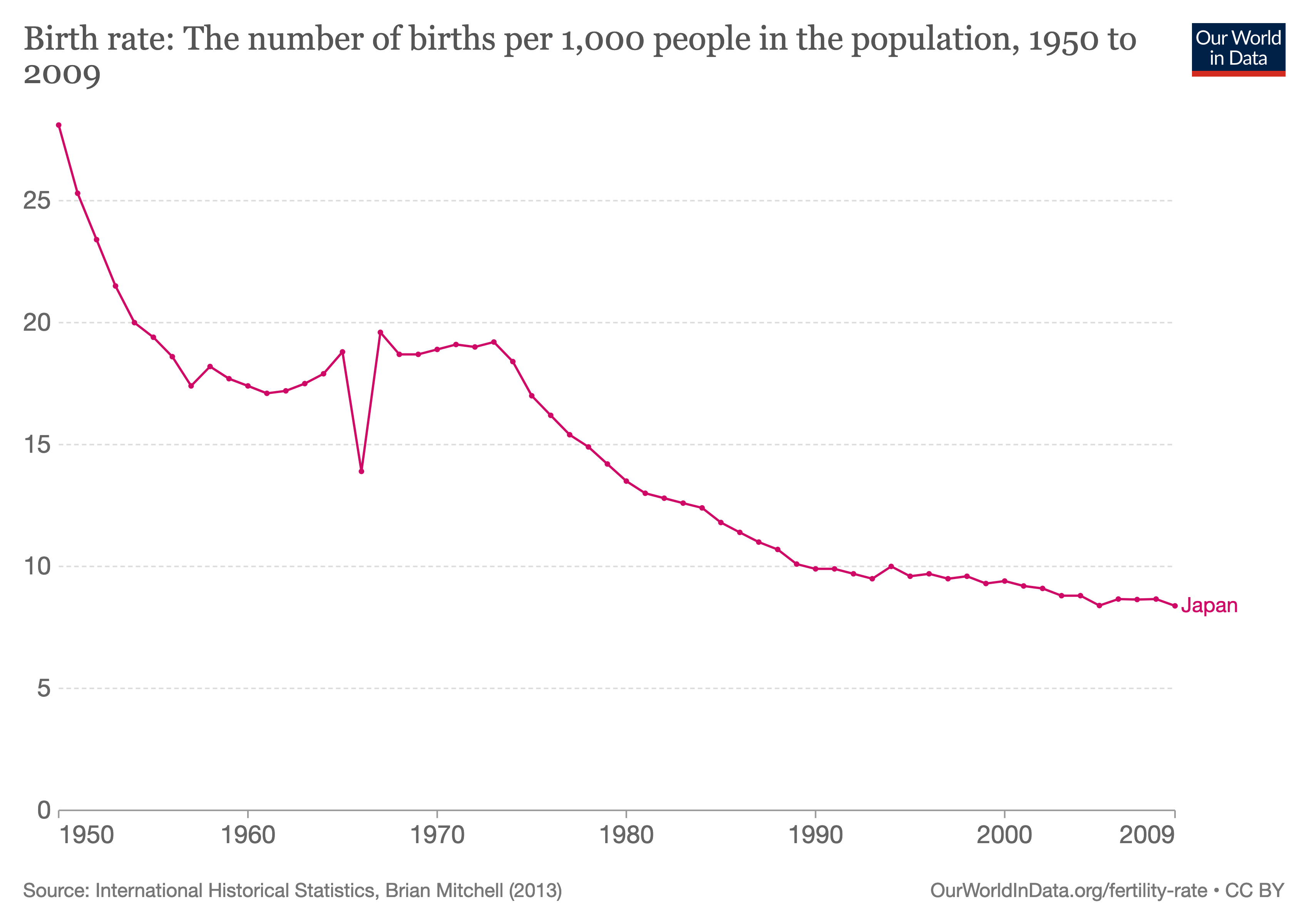
Explanation. Source: ourworldindata.org
Outliers are interesting data points to build a story around, but sometimes the story is not about the outliers. In those cases, they hinder the view on the other data points. They can be pointed out and removed to get a better view on the rest of the data.
Source: Why Budapest, Warsaw, and Lithuania split themselves in two, pudding.cool
Source: Why Budapest, Warsaw, and Lithuania split themselves in two, pudding.cool
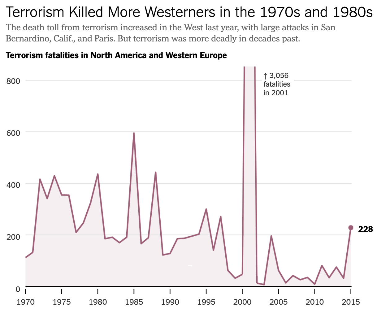
Source: Is Terrorism Getting Worse? In the West, yes. In the World, No., nytimes.com
When data contains information about how something is composed out of components, the breakdown into these subcomponents is also a great storytelling pattern. Classical chart types to show how parts add up to a whole include pie charts and stacked area charts. But many other kinds of visualisations exist to show components.
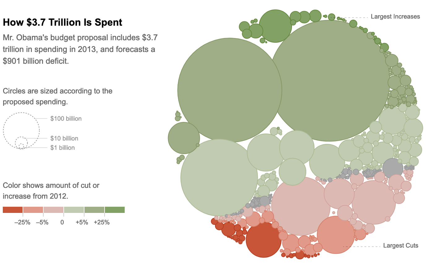
Source: Four Ways to Slice Obama’s 2013 Budget Proposal, nytimes.com
When subcomponents in their turn are composed of smaller units, the data has a multi-level hierarchical structure. Specific chart types exist to visualise this kind of data.
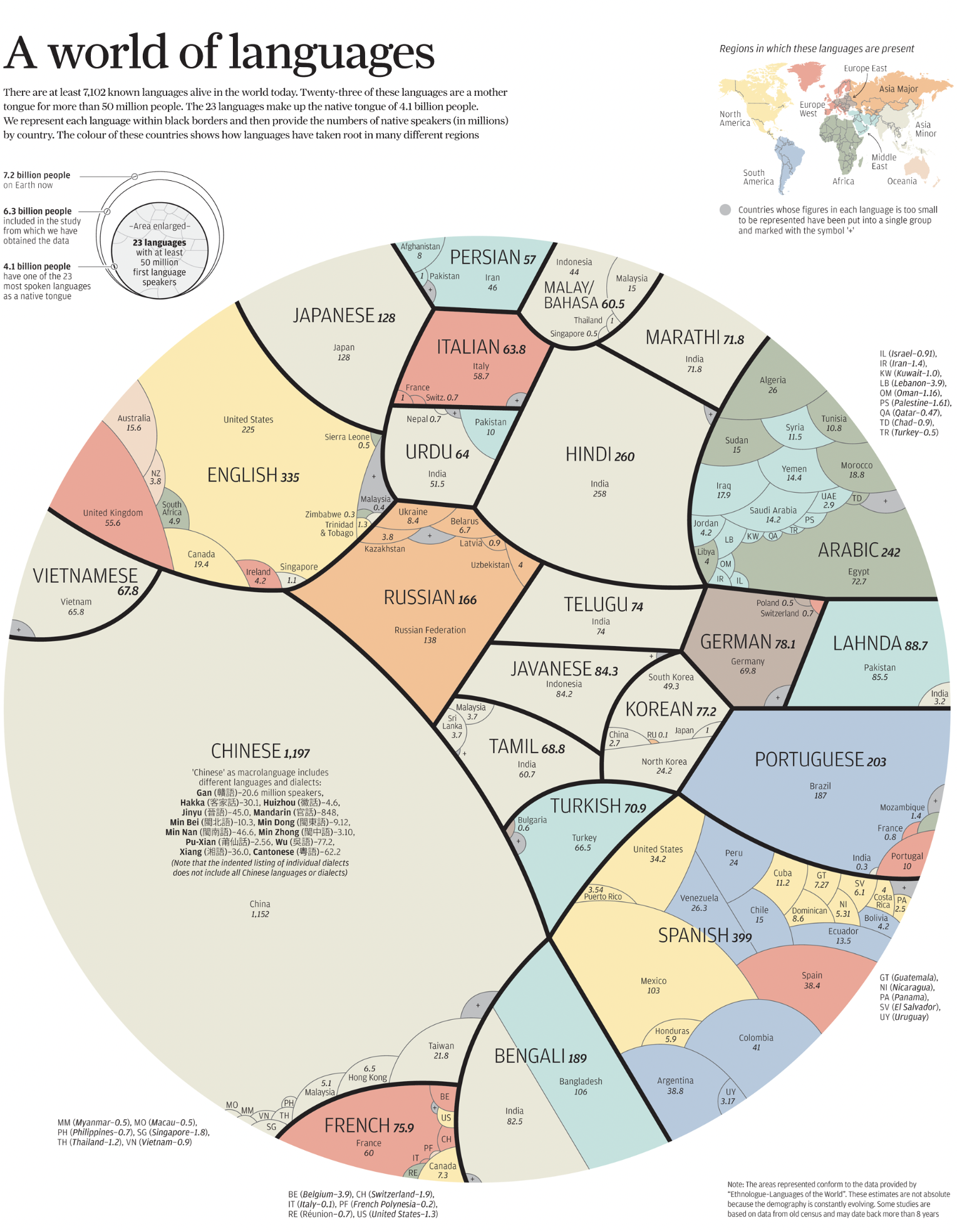
Source. In graphics: a world of languages - and how many speak them, scmp.com