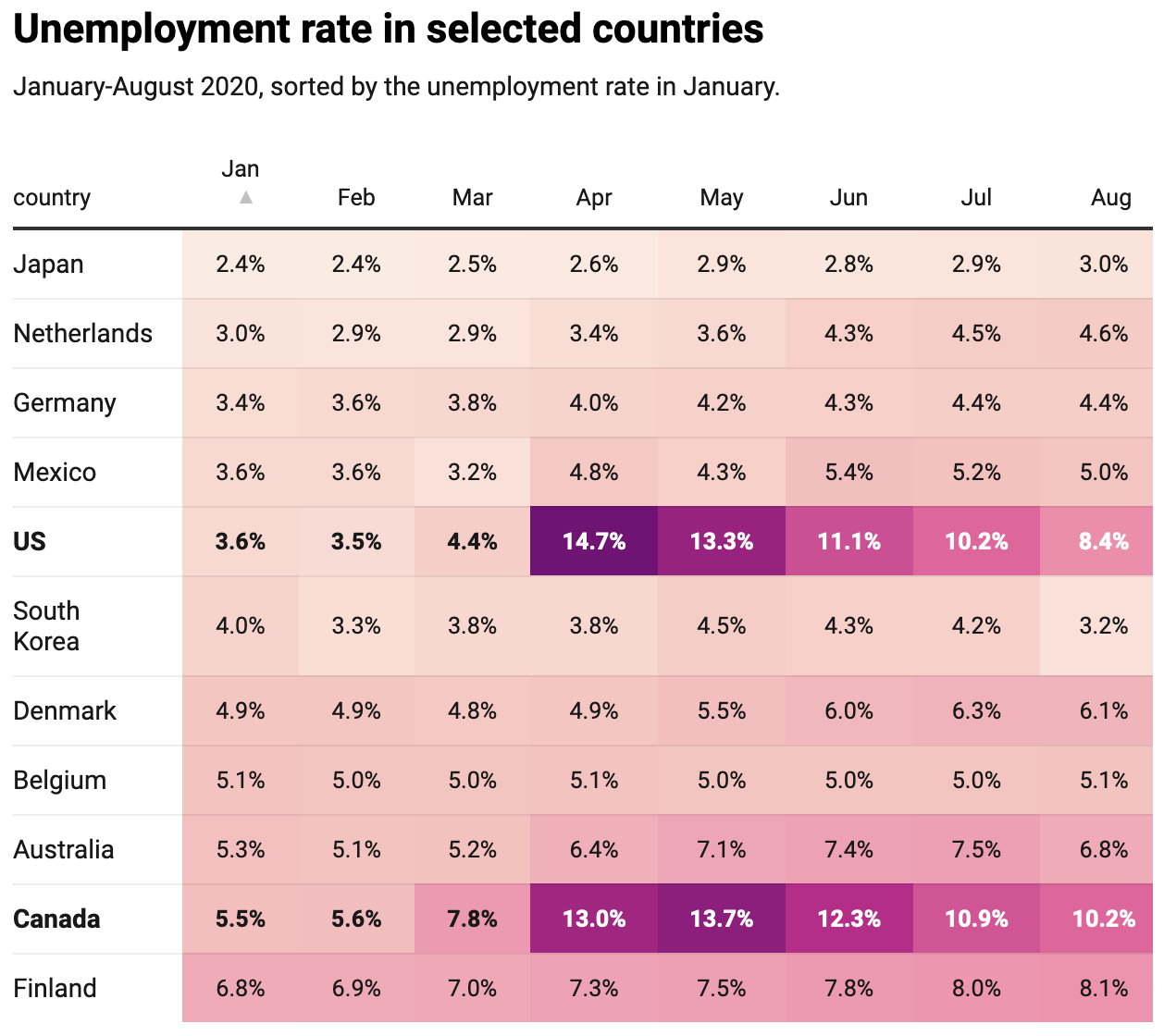
A table containing numbers is closely related to a heatmap, in which each cell in the table is coloured according to the values it contains.
Source: Datawrapper
This heatmap technique of colouring cells depending on their numerical value, can also be applied to individual columns in a table. This can help find the lower and higher values in columns with (unsorted) numbers or help in signalling the proportions between the numbers.
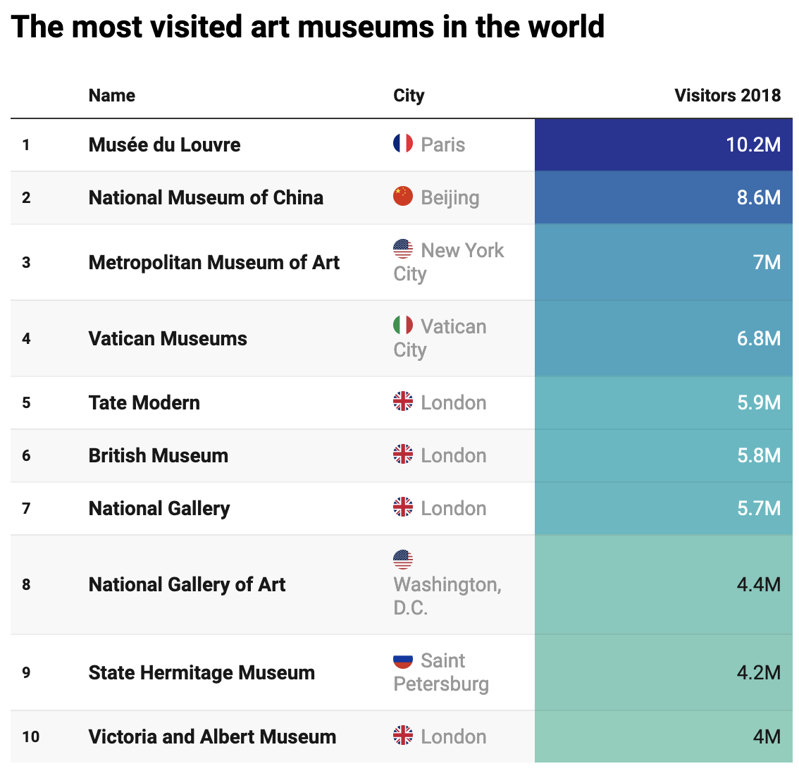
Another interesting technique for fusing visualisations and tables is to integrate bars into a column in which the bar length of the bar in a cell is proportional to the number it contains.
And when time series data is available, a table column can integrate mini linecharts (called “sparklines”) indicating the trend in the data.