Colour is strong design mechanism to create visual hierarchy. Like the size of elements, the colour of elements can signal to the reader what the most important ones are in a data visualisation.
In visual hierarchy, colour can be used to let the reader know what elements in a design are related and belong together. A common pattern is to use
- a striking colour to highlight and label the data marks or categories that are of most importance for the message of the chart
- more subtle colours for other secondary data marks or categories
- black for the most important text elements, like the title of the visualisation
- grey for data marks of lesser importance, only added for context
- grey for supporting chart elements, like axis labels and grid lines
Reading this article, you have already seen this pattern at work: just scroll back up to look again at the The Economist line chart above.
Here is another example, this time from Hungary:
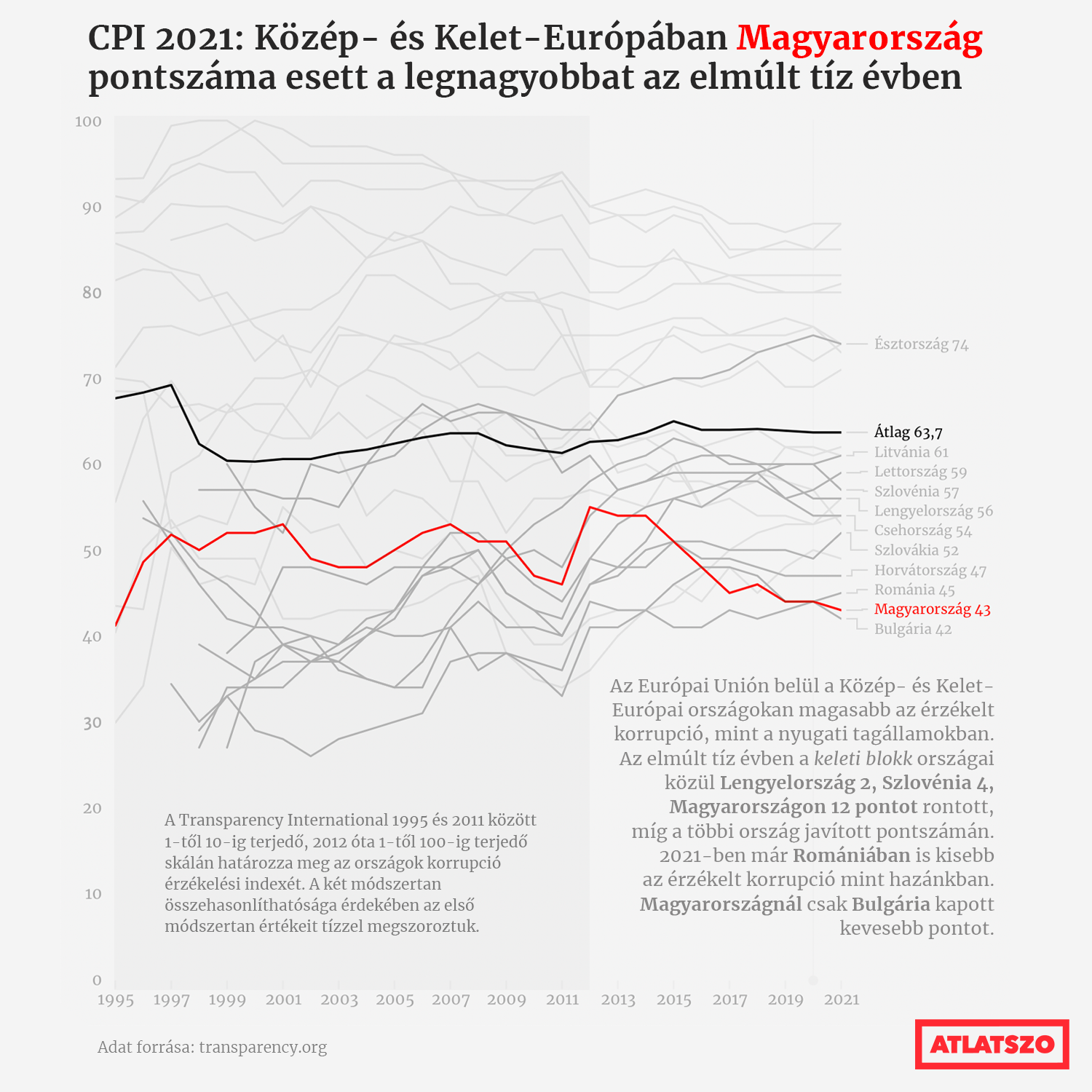
Source: atlatszo.hu
From the colours used, it is clear that the line to focus on is the line for Hungary (”Magyarország” in Hungarian). Following the visual hierarchy, the second line of importance is the one for the average (”Átlag” in Hungarian).
The time interval on the X axis on this chart is also clearly divided in two parts: the left part, with a darker background, and a second part on the right, with the same background colour as the rest of the graphic. So the visual hierarchy in the colours shows that in some way the 1995 - 2011 time frame is different than the one following it. Both time intervals are explained with annotations, but we don’t even need to read or understand the text to know that there are 2 time periods on the chart that somehow are different from each other.
One element in this chart that is violating the visual hierarchy in text elements described earlier, is the logo in the bottom right. It is positioned in the location that is the lowest in the visual hierarchy, but its colour promotes it to a much higher place in the visual hierarchy of all the elements in the chart.