


Structuring your publication
Why
You may be publishing original data or you may be using data from various sources to support your arguments. Either way, thoroughly introducing your readers to the data used in your publication fosters understanding, trust and transparency.
How
Describe what the data covers (dimensions and units), why it was collected (policy context), how it was collected and processed (methodology), who collected it and who owns it (source), and what it can and cannot be used for (definitions and limitations).
Besides describing the data in a text, you can also present the most important metadata in a table. If you are using one dataset throughout the publication, describe your data in the introductory chapter. This section should also contain a link to the main datasets or database. If you are using multiple datasets, you could introduce these throughout the publication.
Examples
- Key Figures on the European Food Chain, Eurostat (2022)
In the introduction to this publication, the data is described in a dedicated section, including coverage, methodology and limitations.

Why
Publications with too much text often lack variety and publications with too many data visualisations often lack context. Balancing the amount of text and data visualisations and bringing textual and visual elements into a consistent sequence will make your publication enjoyable and easy to read.
How
Set a rule of thumb for how much text follows or precedes each data visualisation. For example, you could aim always to have three to four paragraphs of text between visualisations.
In a print or PDF publication, try to place each visualisation as close as possible to the paragraphs that reference it. In an online publication, integrate the visualisation into the text flow: the paragraphs before the visualisation highlight the most important findings and introduce any concepts that are necessary for the reader to understand the visualisation; the paragraph after it can provide more context and summarise the visualisation’s most important message. When referencing visualisations from other parts of the publication, provide a direct link to the visualisation or to the page that contains the visualisation.
Resources
Contacts
Examples
- National Climate Assessment, US Global Change Research Program (2014)
The 2014 National Climate Assessment uses full-width images to delineate sections and alternates text with interactive charts. This balance between visual elements and text gives the report structure and makes it more enjoyable to read.
- Key Figures on Europe – Statistics illustrated, Eurostat (2020)
In this publication, the text is always immediately below or above the data visualisation, making it easier to read the text and the visualisation together.
Why
Just as you may provide a list of the literature that is referenced in your publication, it is good practice to provide a reference list of the data that you have used in your publication. This allows others to identify and locate your data sources, to reuse the data, to reproduce results, and to cross-check your data sources against others.
How
The format recommended by the Commission is the following:
Author(s), ‘Title’, version/edition, Publisher, date, date of extraction, PID
The PID is a persistent identifier in the form of a link to the dataset. The reference list should be numbered. Use a consistent referencing format throughout your publication.
Example: Sevini, F. and Arnés-Novau, X., ‘Export control handbook for chemicals’, 2021 edition, European Commission, Joint Research Centre, 2021, accessed 23 September 2022, http://data.europa.eu/89h/8f0d4fa2-110d-4c05-b2a8-ecd3addbf16b
Resources
Examples
- Confronting the Crisis, OECD Economic Outlook (Volume 2022, No 2)
The OECD, in a well-structured way, references and provides access not only to the tables and graphs of the publication, but also to the related database(s) from which the data has been extracted.

Why
Most likely you are already providing a list of figures. Data visualisations should be included in this list so that they can also be looked up and referenced.
How
The publication’s charts and maps can be entered into a simple reference list that is formatted according to your organisation’s citation guidelines. Additionally, you can show each visualisation as a thumbnail to provide a visual reference. This is especially popular online, where a publication’s charts and maps are sometimes collected on an additional page. Often, this is also where readers can download the visualisations.
Examples
- Early Childhood Education and Care in Europe, Eurydice/EACEA (2019)
This publication contains a classic table of figures.
- Wellbeing in Germany, German federal government (2016)
This publication collects all the visualisations on one page named ‘Indicators’. On that page you can download the visualisations and access the data behind the visualisations.
See also
Why
Data and data visualisations, like other literary, scientific or artistic works, may be protected by intellectual property rights, so you need to respect the rules. At the same time, to encourage reuse efforts (and with them the further distribution of your work, and the added value that may be generated as a result), you need to clearly communicate whether and under what terms the data and the data visualisations in your publication can be reused.
How
The EU (or your agency) is also the owner of publications produced by your contractor through a contract by means of which the rights have been properly transferred to the EU (or to your agency). To make sure that the EU (or your agency) also becomes the owner of the data and the data visualisations underlying your publication, mention those elements explicitly as contract deliverables (including in which formats).
Good-practice tips:
- In the copyright notice, give as much information as possible and mention the third-party elements your publication includes.
- Facilitate the reuse of the data visualisations of your publication as standalone elements.
- Include copyright and reuse information in the metadata, for both the data visualisations and the data underlying it.
- If in doubt, contact the Publications Office Copyright team.
Resources
- Reuse Guidelines, European Commission (2019)
- CC BY 4.0: a summary of the licence
- Publisher’s information in print and PDF publications: a quick reference guide
- CC0 1.0: public domain dedication (no copyright)
- An introduction to open data licensing: a data.europa academy lesson
Contacts
Examples
- Wellbeing in Germany, German federal government (2016)
In this publication, the licence is clearly mentioned and explained, both for the visualisations and for the data.
See also
Why
Unlike for data and visualisations produced by you, which belong to the EU or to your agency and which may be reused according to the reuse policy of your service (find out more under ‘See also’ below), you should be particularly careful when you use third-party data and data visualisations in your publication. Data and data visualisations not owned by your organisation may be protected by intellectual property rights, and infringement of such rights may have financial and reputational consequences for your organisation.
How
Some good-practice tips are as follows.
- In the copyright notice, give as much information as possible and mention the third-party elements your publication includes.
- Keep a copy of the licences covering third-party elements in your file.
- Facilitate the reuse of the data visualisations in your publication as stand-alone elements.
- Include copyright and reuse information in the metadata, for both the data visualisations and the data underlying it.
- If in doubt, contact the Copyright team of the Publications Office.
Resources
- Reuser’s Guide to Open Data Licensing, Open Data Institute
- Reuse Guidelines, European Commission (2019)
- Publisher’s information in print and PDF publications: a quick reference guide
- An introduction to open data licensing: a data.europa academy lesson
Contacts
See also

Writing about data
Why
Reading a text full of numbers can be exhausting. It is also hard to imagine larger numbers and what they stand for. There are various ways of writing about numbers that help readers get a better grasp of what they mean.
How
- Use rates, ratios, proportions, and fractions (e.g. ‘EUR 5 000 per person’ or ‘1 in 7 EU citizens’).
- Normalise your data so that readers don’t have to do maths.
- Ditch the decimals; use only whole numbers in your text.
- Use numbers for the main messages in your text and generalise the rest (e.g. ‘roughly’, ‘around’, ‘half of’).
- Provide a human scale as a comparison (e.g. football fields, coffee cups, etc.).
Resources
- Six ways to make numbers meaningful
- Data Journalism Academy: video lectures on writing and editing for data
Examples
- Wellbeing in Germany, German federal government (2016)
This publication uses short, concise paragraphs. The formatting of the text (e.g. as title, quotes, body text) also provides a clear visual hierarchy.
Why
When your body text says one thing and your visualisation shows another, your readers are likely to be confused. Therefore, a text that references or describes a data visualisation must complement what can be seen in that visualisation.
How
- In the text, make sure to introduce all necessary concepts for people to understand the visualisation.
- Make sure that the trends or overall developments described in the text match what the visualisation shows.
- In the text, use the same units of measurement as in the visualisation. You can always mention other kinds of units too, if necessary.
- Avoid contextual temporal adjectives (e.g. ‘last year’, ‘next month’). Instead, use exact dates, years or time periods.
Examples
- Wellbeing in Germany, German federal government (2016)
This publication uses short, concise paragraphs. The formatting of the text (e.g. as title, quotes, body text) also provides a clear visual hierarchy.
See also
Why
Writing text about data visualisations that are frequently updated with new data is a challenge. However, there are methods that minimise the amount of text that must be completely rewritten every time the data is updated.
How
- You can outline trends and developments and update only those specific descriptions.
- You can state only the values without describing any trends. Those numbers can be updated manually or be programmed to update automatically.
- You can abstain from naming trends or specific values and simply introduce the data and the methodology used to create it.
Examples
- Vaccination dashboard, German federal government (2021)
This website contains text that is automated based on live data.

Why
Whether you are producing a PDF (Portable Document Format) or a web-based publication, the chances are that users will read your content online on devices ranging from large desktop computers to small mobile phones. If you write for an online publication that will be read on a small screen, you can ensure a more pleasant reading experience across devices (the mobile-first approach). In addition, a well-defined text layout will make your content machine-readable and accessible, as online search engines and assistive technologies make use of these definitions.
How
- Define clear title hierarchies (3 max.). Consistently use the same font sizes and font styles for each hierarchy. To designate those styles, use HTML tags online and heading styles in Microsoft Word.
- Write in sentences that are concise and are no longer than 25 words.
- Break up your content into short paragraphs of about one to four sentences. Make sure that the width of these paragraphs in the publication layout is not more than 75 and not less than 45 characters.
- Use hyperlinks to point to further information and original research or data.
- Use the ‘inverted pyramid’ structure for your texts: start with the essential information; then expand on and supplement this information with details; and finally add non-crucial background information.
Resources
- European Commission web writing guidelines
- Writing for the web: articles and videos
- Be succinct when writing for the web
- How to use the inverted pyramid structure in your texts
- How people read online
- Readability: The optimal line length
- All about legibility, readability and comprehension
Contacts
Examples
- Wellbeing in Germany, German federal government (2016)
This publication uses short, concise paragraphs. The formatting of the text (e.g. as title, quotes, body text) also provides a clear visual hierarchy.
- Paying the Price of War – OECD economic outlook – Interim report September 2022
This digital report puts the main insights at the very beginning and then adds more details below.

Why
Plain language is simple, concise and well-organised writing that is appropriate for your intended audience. For a variety of reasons, many people struggle to read complex texts. Also, especially online, readers mostly do not study unnecessarily complicated texts. Plain language makes your content accessible and easy to consume.
How
- Know your audience and know the terms your audience understands.
- Use simple terms and explain them either on their first occurrence or in a glossary.
- Spell out acronyms and abbreviations on their first occurrence or add a list of abbreviations to your publication.
- Write in short sentences (20 to 25 words max.) and paragraphs (one to four sentences max.).
Resources
- What is plain language?
- All about legibility, readability and comprehension
- Using plain language
- Writer’s toolbox: writing help and advice
- European Commission Clear Writing Guide: with examples from Commission documents
Contacts
Examples
- Wellbeing in Germany, German federal government (2016)
This publication uses short, concise paragraphs. The formatting of the text (e.g. as title, quotes, body text) also provides a clear visual hierarchy.

Creating data visualisations
Why
Data visualisations present an insight into your data. They allow readers to compare, organise, make correlations and see relationships. Each visualisation in your publication should have a single, clearly defined purpose. The visualisation should be meaningful and easy to understand.
How
After you have analysed your data, think about what insights you have gained from it, then decide which of those insights would be interesting to your readers. For example, an insight may be that, over the years, the gender gap in cultural employment has become smaller across the EU Member States. Next, you can translate this insight into a message. Aim to create one visualisation per message. Following our example, the message could be: ‘The gender gap in cultural employment is at an all-time low’. Be sure to check this message against your data again.
In some cases, text or other types of graphics may be more suitable than a data visualisation: if your data has caveats (e.g. a small sample size), a data visualisation could mislead your readers. Likewise, if you have qualitative information rather than quantitative data, it may be better to create an infographic or even just to describe the information in the text.
Resources
- From hypothesis to visualisation: three questions to ask when creating charts
- Publications Office data visualisation services
- The Author Portal: online platform for requesting Publications Office publishing services
Contacts
Why
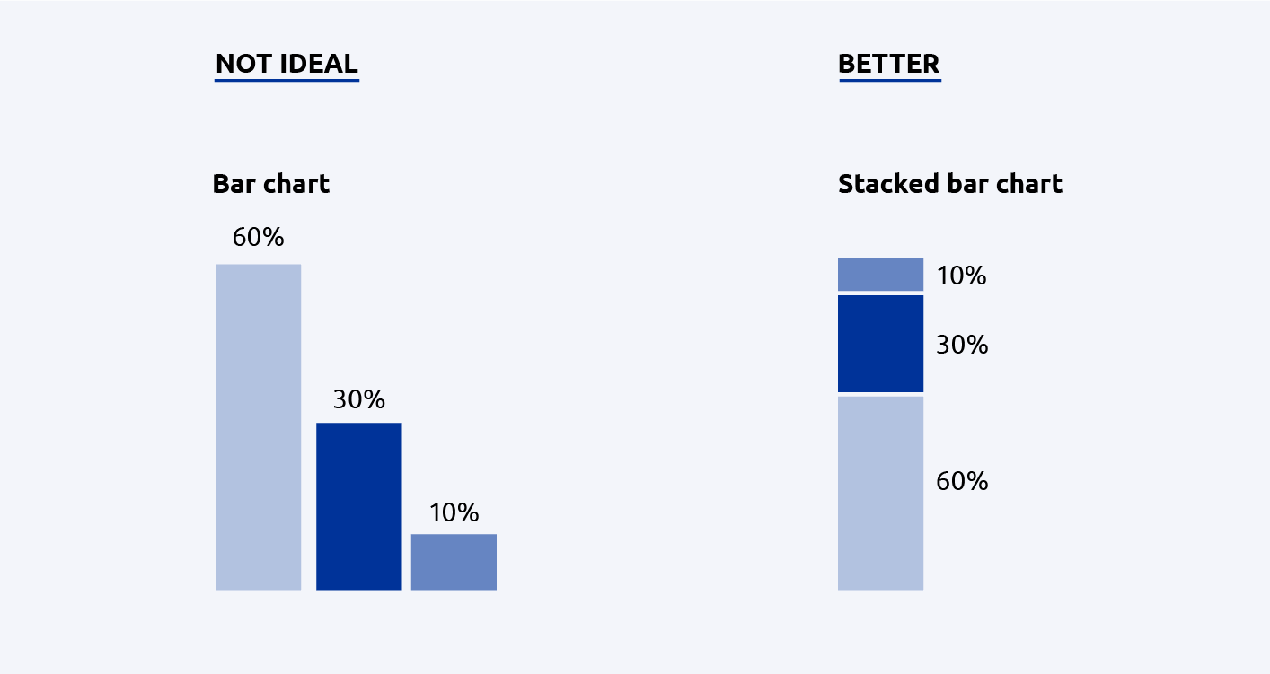
Bar charts, scatter plots, line graphs and area charts are examples of different types of charts. Each chart type encodes data in a specific way, rendering different aspects of the data visible. For example, a bar chart allows readers to compare amounts across different categories, while a line chart typically shows development over time.
How
Choose a chart type that makes the message you want to communicate from your data clear and understandable. Always check whether the chart type also fits the properties of your data. For example, you may want to allow readers to compare amounts across different categories. This would generally call for a bar chart. However, if the amounts are defined in percentages that add up to a whole, a stacked bar chart is more fitting. It allows the reader to compare the amounts in relation to the whole more easily. There are various resources that list all available chart types and help you choose the right one.
Once you have found a fitting chart type, consider small design amendments to communicate the information in your data more clearly (e.g. flip the bar chart 90 degrees so that the bars run horizontally across the page).
Resources
- The Data Viz Project: a chart encyclopedia
- RAWGraphs: an online tool for chart-making
- The Data Visualisation Catalogue: a library of visualisation types
- Visual Vocabulary: A poster and a website about different chart types, by the Financial Times
- Publications Office data visualisation services
- The Author Portal: online platform for requesting Publications Office publishing services
Contacts
Examples
- Wellbeing in Germany, German federal government (2016)
This online publication uses various types of visualisations to show different aspects of the data.
Why
Following common graphic design principles can make your data visualisations more attractive and easier to read. Many of these design principles also help make your visualisation more accessible.
How
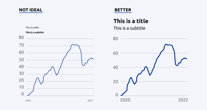
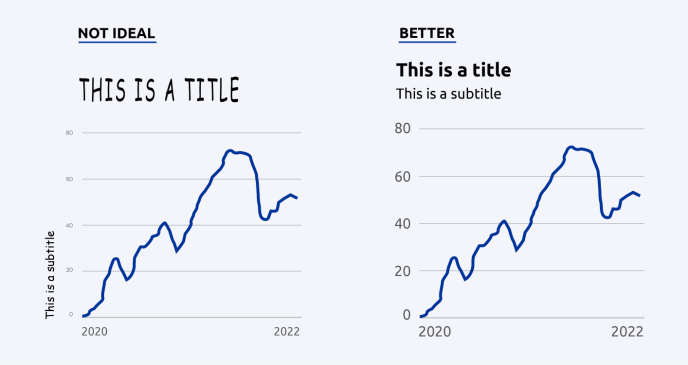
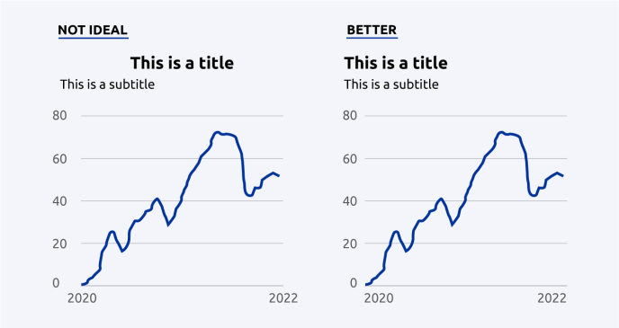
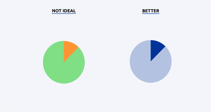
Make sure you apply the design principles consistently across the publication: use the same colours to encode the same variables and use the same font sizes and layout for each chart. A section on data visualisation in your style guide and predefined templates (e.g. in Excel) can help you stay consistent throughout and across publications.
Resources
- Data visualisation training with Maarten Lambrechts: three webinars (2019)
- Rate my visualisation: an interactive checklist that helps bring your charts into a good format
- Introducing data visualisation: a data.europa academy course
Contacts
See also
Why
When statisticians began creating and using data visualisations in the 18th century, people first had to learn how to read them. Today, people have grown used to certain design elements that help them decipher the meaning of a chart. If you want your readers to understand your visualisations quickly and with ease, you can make use of those design patterns.
How
Some dos and don'ts.
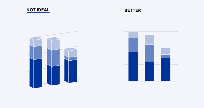
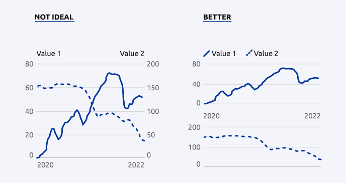
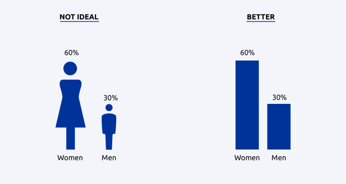
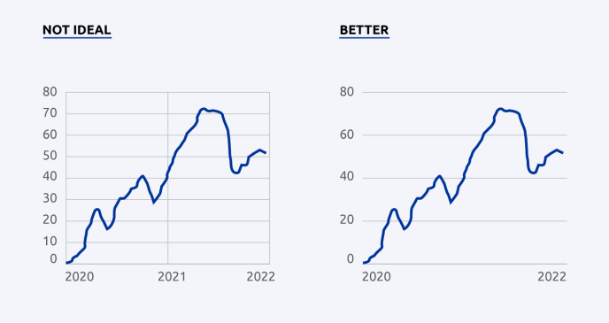
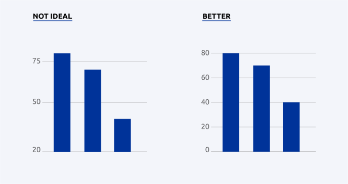
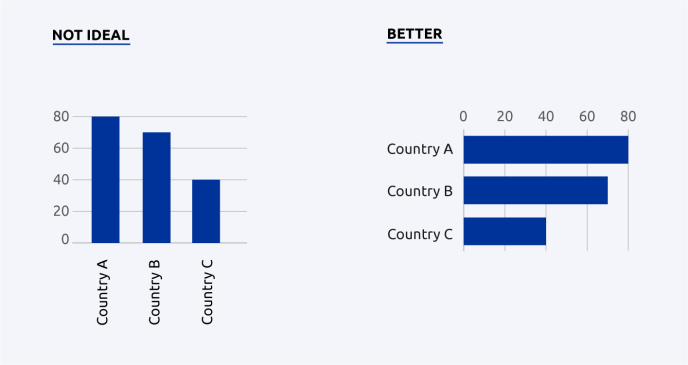
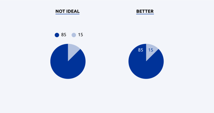
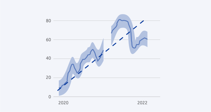
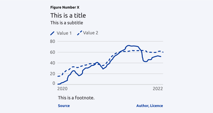
In the best-case scenario, these best practices are covered in the data visualisation section of your organisation’s style guide.
Resources
- Data visualisation training with Maarten Lambrechts: three webinars (2019)
- Rate my visualisation: an interactive checklist that helps bring your charts into a good format
- A collection of data visualisation caveats and how to avoid them
- Introducing data visualisation: a data.europa academy course
Contacts
Examples
- Wellbeing in Germany, German federal government (2016)
This online publication uses various types of visualisations to show different aspects of the data.
Why
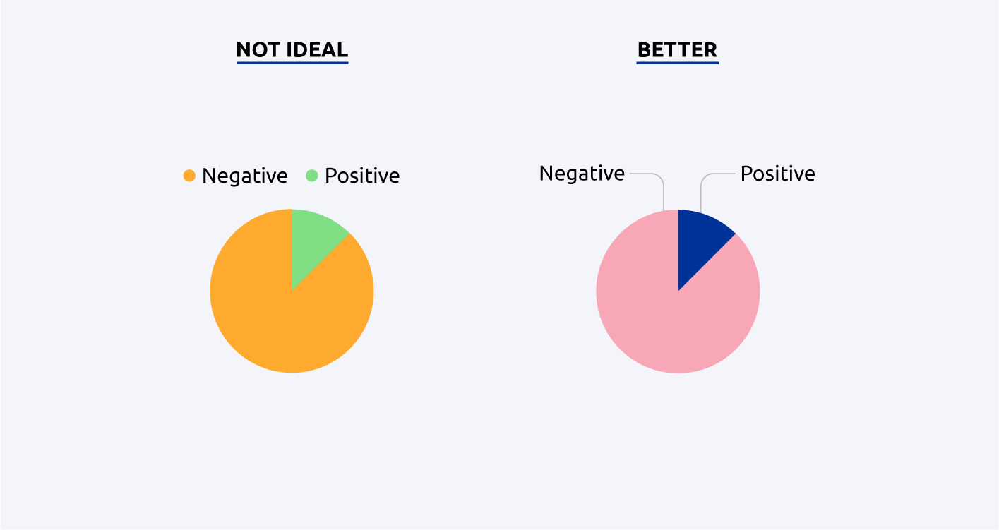
Some kind of colour blindness affects 1 in 12 men and 1 in 200 women. Many people also have poor eyesight or suffer from vision impairment. Under EU law, public-body websites and mobile apps have to be accessible to people with disabilities, including people with visual or hearing impairments. In HTML, essential accessibility requirements are outlined in the Web Content Accessibility Guidelines (WCAG) of the World Wide Web Consortium (W3C), which defines three levels of compliance: A (represents the absolute minimum requirements for basic accessibility), AA and AAA. Since 2010, all new websites under the Europa domain have to be built in accordance with level AA.
How
The first step is to avoid the use of colour and contrast as the only means to convey information. In addition, encode your data with patterns and labels to ensure readability.
Then, when it comes to defining your colour palette, pay attention to (1) contrast and (2) the combination of colours. Contrast is the difference in brightness between two colours. Your colours should have enough contrast compared to the background and one another. You can ensure this by running your visualisation through a contrast checker (see ‘Resources’ below). For conformance level AA, a contrast of at least 4.5:1 is required for normal text, and 3:1 for large text and graphic elements. When it comes to colour combinations, avoid using the following ones: red/green/brown; pink/turquoise/grey; purple/blue. This way people who have a colour weakness or a colour blindness for a certain hue can still distinguish your colours.
Resources
- Colour Contrast Analyser
- Coblis: a colour blindness simulator
- Viz Palette: an online tool for picking colours for data visualisations
- Accessibility on the Europa Web Guide
- Accessible publishing: concepts, tools, tips and tutorials
- Web Content Accessibility Guidelines (WCAG) 2.1
- A detailed guide to creating an organisational colour palette
- Visualising data for colourblind readers: a three-part series
Contacts
See also
Why
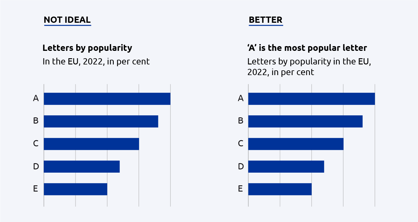
The title of a visualisation is usually the first – and sometimes the only – element the reader will look at. A meaningful title is a title that summarises the key findings shown in the chart. This helps guide readers through the data and makes the chart self-contained and reusable.
How
In the title, try to summarise the main message of the visualisation in fewer than 10 words. Use the subtitle to describe the data, its geography, the time period and the units of measurement.
Resources
Why
Legends describe how different data variables are encoded in visual elements, thus serving as instructions on how to read a visualisation. Legends are the key to understanding the visualisation and should therefore be created with considerable care.
How
First, make sure that each visual element is explained. Then, follow these two tips to make your visualisations clear and legible.
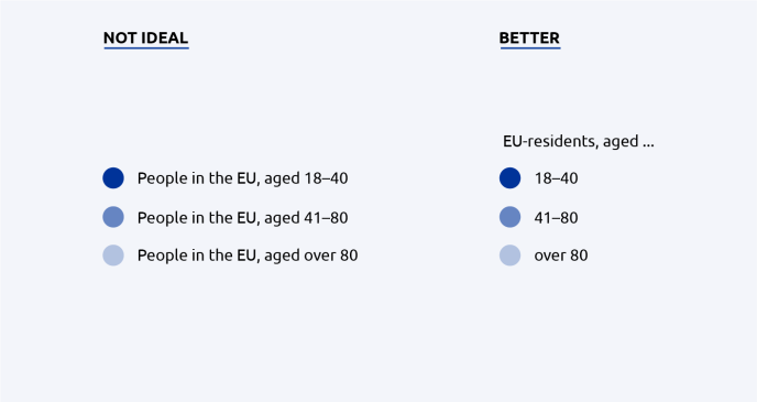
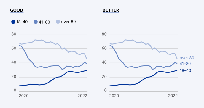
A good way to test whether your legend works is to show it to people outside your field of expertise. Ask them to describe their thoughts out loud as they try to read the visualisation.
Resources
Why
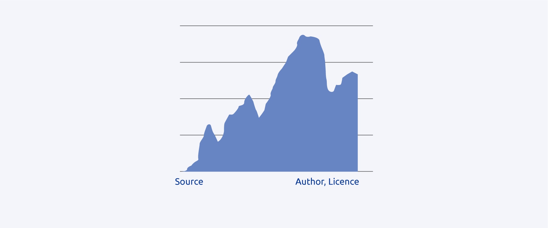
Nowadays, visualisations from a publication can easily be reused: they may be added to a PowerPoint presentation as a screenshot or downloaded and posted on social media platforms. Because your visualisations could reappear in different contexts, it is best to cite the author (the organisation or person that created the visualisation), the data source (the data used to create the visualisation) and the reuse licence (the conditions under which the visualisation can be reused, if at all) with each chart.
How
The author, data source and reuse licence are often placed below the visualisation, in the bottom left and right corner. Use a relatively small font size and/or a lighter colour than used in the rest of the chart. If possible, use abbreviations and underlay those abbreviations with links directly to the author, data source and licence description.
For the data source, you may choose to use the name of the data provider (e.g. ‘JRC’) or you may use your own reference system to refer to the data source (e.g. Eurostat uses a unique code such as ‘tag00001’ to identify each dataset).
For the reuse licence, follow the reuse guidelines applicable to images, photos and illustrations. Be mindful of the copyright rules applicable to data visualisations.
Resources
- Data Citation: A guide to best practice (2021) – a handbook and a webinar
- Reuse Guidelines, European Commission (2019)
- Data visualisation training with Maarten Lambrechts: three webinars (2019)
Examples
- Our World in Data
Charts from Our World in Data contain their logo, a link to the chart’s main topic and even the licence for reuse.
See also
Why
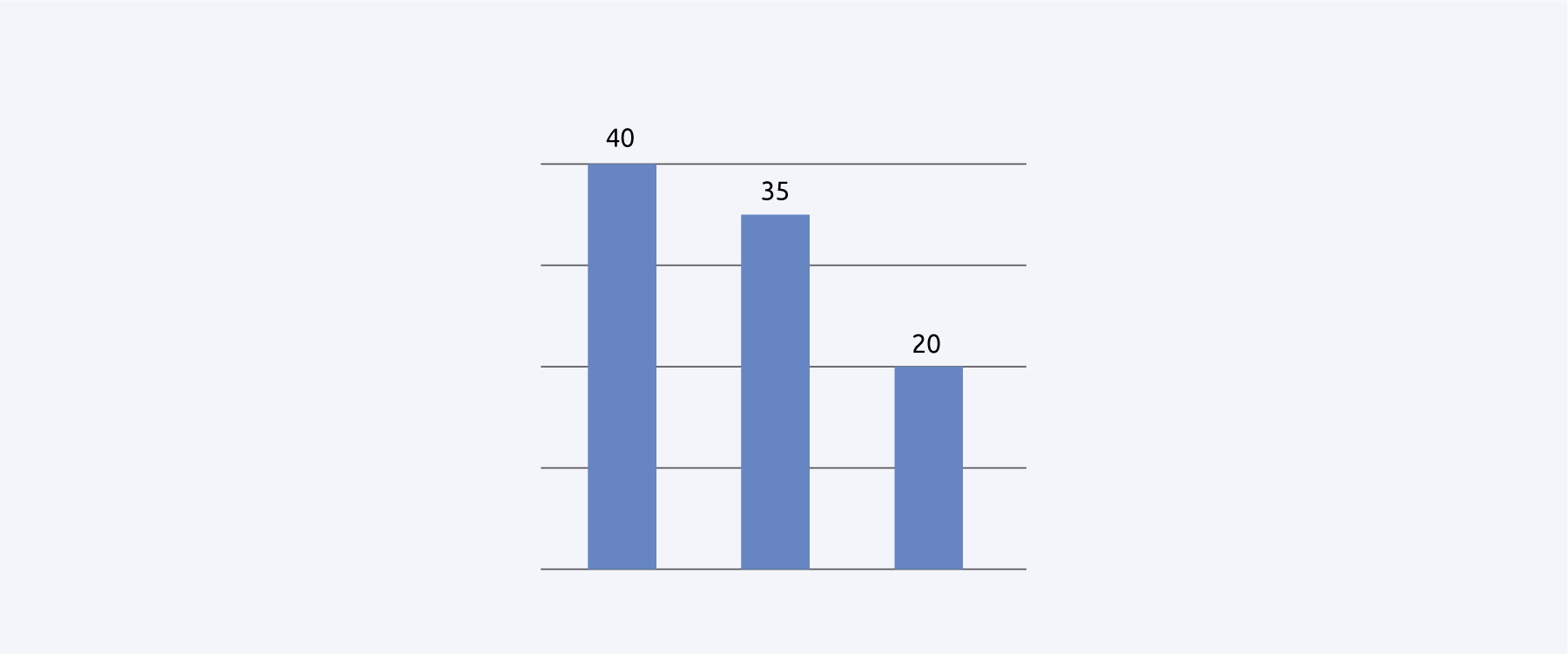
Showing the data values in the visualisation allows readers to check its quality. This increases readability and trust in the visualisation. It also makes it possible for readers to reuse the data even if it is not available for download.
How
In static visualisations, the data values can be shown directly in the chart. If there is not enough space to show all of the data values, annotate the chart with the most important ones (e.g. minimum, maximum and most recent value). In interactive visualisations, a tool tip can be provided that shows the data values when you hover over it.
In addition to showing the values in the visualisation, you can also show a data table. In a static publication format, the table can be shown below or next to the visualisation. In an interactive publication, you can allow the reader to switch between the chart and the table view.
Resources
Examples
- Early Childhood Education and Care in Europe, Eurydice/EACEA (2019)
In this publication, a table is often shown below the visualisation (e.g. p. 30).
- Our World in Data
Our World in Data offers tooltips to read the single data values. You can also switch between a chart, a map and a table view.
Why
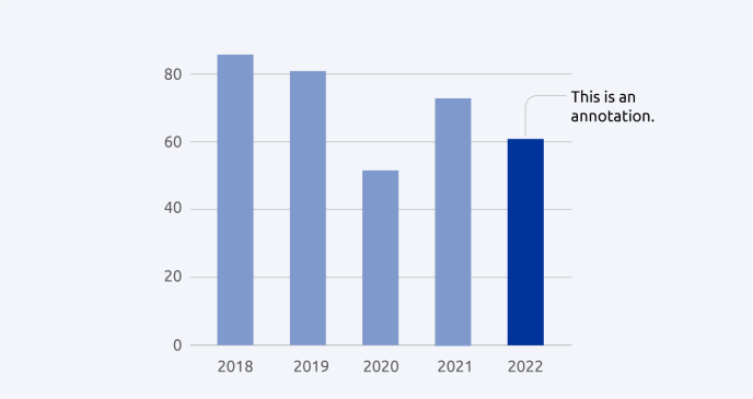
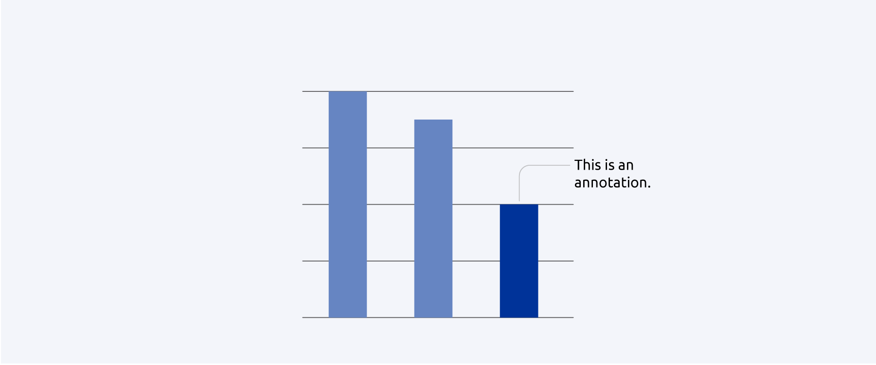
Annotations can guide readers towards important aspects of your data. They also provide context to the data, often explaining why certain developments, trends or changes are shown in the visualisation.
How
Identify salient features in your data visualisation. Is there a surprising development? Are there certain points that stand in contrast to the overall statement of the chart? Which features explicitly support the chart’s overall statement? Write short sentences or clauses to explain these features. Use arrows or lines to connect the feature to the annotation.
Resources
Why
The mapping of areas, especially disputed areas, in an official context is an extremely sensitive issue. Carelessly plotted, designed or labelled maps can cause far-reaching diplomatic incidents. The GISCO (Geographic Information System of the Commission) team at Eurostat, together with DG Communication and the European External Action Service, is responsible for correctly showing the EU’s official position on territorial conflicts.
How
When making maps for your publications, make use of GISCO’s resources. The GISCO team creates statistical and other thematic maps, manages a database of geographical information and provides related services to the Commission. The GISCO tools can be used by all EU institutions, along with external contractors. A login may be required.
Resources
Contacts
Why
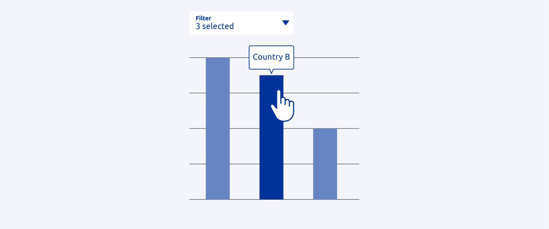
Many online charting tools come with integrated interactive functionalities and animations. These should not distract from the main message of the chart. Instead, they should offer the reader more information on demand and help them explore the visualisation.
How
Interactive functionalities, in order from less to more exploratory, include the following.
- Animations. Animations can autoplay or play when readers click a button. Used wisely, animations can support the interpretation of the visualisation (e.g. help readers see a development over time).
- Tooltip that shows underlying values. Tooltips help readers go into detail and read the values without having to download the data. Make sure the tooltips are mobile friendly and accessible.
- Controls to toggle or highlight chart properties. Such controls allow readers to set their own focus in the chart and are especially helpful for people who use your publication in a professional context.
- Controls to change the chart’s visual properties. Such controls allow readers to change the chart type and design. This allows readers to prepare the visualisation for their own use.
- Extended controls. These functionalities range from simple data filters to options for selecting or adding additional data sources. This allows readers to analyse the data directly in your publication.
Resources
- An overview of how interactivity can be used in charts, including tips and tricks
- An article about the advantages of interactive charts
- Publications Office data visualisation services
- The Author Portal: online platform for requesting Publications Office publishing services
Contacts
Examples
- Our World in Data
Our World in Data offers tooltips to read the single data values. You can also switch between a chart, a map and a table view.
Why
Not everyone can use a mouse to access content online. Therefore, it is important to ensure that charts can be navigated with the computer keyboard alone (e.g. with the ‘Shift’ and ‘Enter’ keys).
How
Most interactive charting tools, such as Highcharts, come with integrated keyboard navigation support. If you are using your own tools or implementing a new charting library, make sure to check and, if necessary, implement these features.
Resources
Why
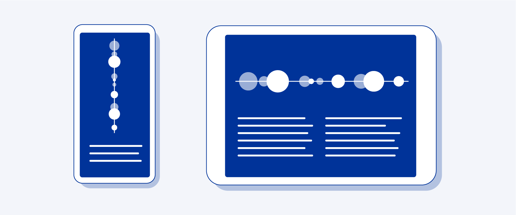
Increasingly, content is consumed on smaller screens, i.e. mobile devices. This means that online content needs to adjust responsively to the screen size the reader is using. Data visualisations are no exception: they need to be designed in such a way that the layout and font sizes adapt to the width of the screen.
How
Interactive charting tools such as Highcharts often come with built-in functionalities for responsive design. If not, check with your developers and designers which screen sizes you are optimising your content for. If you are working with static charts, designers may create multiple versions for different platforms and screen sizes (e.g. one for the PDF publication and one for social media platforms).
Resources
- Tips for creating responsive visualisations by data journalist Gurman Bhatia
- Techniques for data visualization on both mobile and desktop
- Publications Office data visualisation services
- The Author Portal: online platform for requesting Publications Office publishing services
- Highcharts: charting library for web and mobile
Contacts
Why
In contrast to many other international bodies, the European Union is a multilingual organisation. Many official languages of the Member States are also official EU languages. For one, this is to ensure that the general public and national courts can read and understand any applicable EU laws. For another, translated documents ensure democratic discussion and transparency.
How
When creating a visualisation for a multilingual publication, keep in mind that titles, keys, labels and annotations must all be translated. It is therefore important to keep any text in the visualisation short and succinct. When providing the publication to the translation service, ensure that you provide enough context to prevent those short texts from being mistranslated.
Resources

Preparing visualisations for publishing
Why
Visualisations may be protected by copyright. If you are (or your contractor is) using data visualisations not owned by the EU (or your agency), it may be needed to get proper permission from the original author to use them and to figure out whether and under what conditions the visualisations can be reused by others.
How
If you are not the author of the visualisation, make sure you obtain the permission to use it, and keep proof of this permission. Be mindful of the copyright rules applicable to data visualisations.
Resources
Contacts
See also
Why
A licence specifies the conditions under which others can reuse and share your visualisations. To support people in using and distributing your data visualisations, clearly communicate a reuse licence for your visualisations.
How
Be sure to check your own institution's reuse policy, which regulates which licences can be applied. By default, for example, visualisations created by the European Commission should be licensed under the Creative Commons Attribution 4.0 International (CC BY 4.0) licence. This licence allows anyone to adapt and share the visualisation, even for commercial purposes. Reusers must, however, give appropriate credit, and if they have made any changes they must indicate this.
Be mindful of the copyright rules applicable to data visualisations, state the reuse licence beneath your visualisations and in the metadata of the visualisations.
Resources
Contacts
See also
Why
Metadata not only ensures that visualisations are cited and attributed correctly, it also makes your charts accessible to people using screen readers and increases searchability online.
How
How you add metadata to your visualisations depends on which formats you are using.
- Standalone visualisation (JPEG, PNG). Images support IPTC (International Press Telecommunications Council) metadata that can be viewed, added or modified using several tools, for example Adobe Bridge 2022.
- Visualisations online. As metadata embedded in the standalone image files is not read out by screen readers, it is good to use HTML tags for image metadata online.
- Visualisations in PDF publications. In a Microsoft Word manuscript, you can add metadata to your visualisations by right-clicking on the image and selecting ‘edit alt text’. This description remains if the manuscript is converted into a PDF (as opposed to descriptions for tables, which are not preserved).
Resources
Contacts
Why
An important type of metadata is alternative text, also known as alt text. Alt text is a written description of the visualisation. If a reader is using a computer or a website in accessibility mode, this description will be read out by the screen reader. This allows visually impaired users to access the data visualisation through an oral representation of it.
How
Alt text is added via the visualisation’s metadata. In static data visualisations, the alt text corresponds to the ‘description’ field in the metadata. Online, alt text is added through the alt attribute in the HTML img-tag. Charting tools often provide the option to add alt text without the need to write any code yourself. Social media platforms, such as Twitter and Instagram, also allow users to add alt text to their images before posting them.
An easy formula to write alt text goes as follows: [Chart type] of [type of data] where [reason for including the chart]. An example would be:
‘Line chart of the number of hectares burnt in Europe over the year in 2020, 2021 and 2022, where 2022 clearly has the highest rates even though the year is not over yet.’
Resources
- Writing alt text for data visualization
- How to write good alternative descriptions for your data visualization
- Accessible publishing: concepts, tools, tips and tutorials
Contacts
Why
Your readers may want to reuse your visualisations in their own publications and in presentations, or share them on social media. Therefore, it makes sense to provide the visualisations as separate files, in addition to the main publication.
How
If you want to provide a closed format that users cannot modify, export the visualisation as a PNG (Portable Network Graphics format) file. If you want to allow users to alter the visualisation, you can also provide a vector-based format such as an SVG (Scalable Vector Graphics). Consider offering multiple aspect ratios, such as a 16:9 format for presentations and a 1:1 format for social media. Be sure that the exported visualisations contain metadata.
If you are working with a contractor, make sure to explicitly mention the data visualisations of your publication as a deliverable (including in which formats). Ask the contractor to prepare the data visualisations in line with the recommendations in this guide.
Contacts
Examples
- Our World in Data
Our World in Data provides the option to download both a PNG file and an SVG file, and has useful descriptions of what the user can do with those formats.
See also

Preparing data for publishing
Why
When public bodies share data openly, they increase transparency and accountability and encourage better policymaking and value creation. From a legal perspective, open data means that data can be freely accessed and that it can be used, edited and shared by all individuals and entities without legal restrictions. From a technical perspective, open data means that files can be easily found, retrieved, downloaded and indexed.
The EU institutions have adopted open data and reuse policies. In the case of the European Commission, for example, the data in documents and accompanying data is open by default. Furthermore, under EU law, public administrations that hold ‘high-value datasets’ should make them available free of charge, in machine-readable formats, via an application programming interface (API). ‘High-value datasets’ are datasets associated with important societal and economic benefits, such as geospatial or mobility data.
How
The 5-star deployment scheme for open data, suggested by Tim Berners-Lee (see ‘Resources’ below), can act as a guiding principle. Ultimately, as a publisher of open data, your goal is to enable others to use the data in as many use cases as possible, as easily as possible. To do so, it is recommended that you follow the FAIR principles, making your data findable, accessible, interoperable and reusable. The recommendations in this section will provide you with more detailed information on how to make use of the FAIR principles.
Resources
- Ten principles for opening up government information
- The Open Data Handbook: the why, what and how of open data
- European Commission open data policy
- Exploring the origin, features and examples of high-value datasets through visualisation
- 5-star deployment scheme for open data
- FAIR principles: findable, accessible, interoperable, reusable
- FAIR Data Maturity Model (2020): specification and guidelines, including FAIRness indicators
- Data.europa academy: the learning corner for open data
- Guidelines on data and metadata quality: a data.europa academy lesson
- Open data goldbook for data managers and data holders (2018)
- e-Learning programme on open data: modular, for all levels of expertise
- EU Open Data – The basics for EU data providers (2016)
Contacts
Why
Data and datasets may be protected by intellectual property rights. If you (or your contractor) are using data not owned by the EU (or your agency), it may be needed to get proper permission from the original owner to use it and to figure out if and under which conditions the data can be reused by others.
How
If you are not the data owner, make sure you obtain the permission to use it, and keep proof of this permission. Be mindful of the intellectual property rights rules applicable to data.
Resources
- Reuser’s Guide to Open Data Licensing, Open Data Institute
- Reuse Guidelines, European Commission (2019)
- An introduction to open data licensing: a data.europa academy lesson
Contacts
See also
Why
A licence specifies the conditions under which others can reuse and share your data. To support people in reusing your data (and in doing so help them create added-value products and services with your data), clearly communicate a reuse licence for your data.
How
Be sure to check your own institution’s open data and/or reuse policy, which regulates which licences can be applied. By default, for example, data produced by the European Commission should be licensed under the Creative Commons Attribution 4.0 International (CC BY 4.0) licence, whereas raw data or metadata can be released under the even more open provisions of the Creative Commons Universal Public Domain Dedication deed (CC0 1.0).
Even if you don’t publish your data on an open data catalogue such as data.europa.eu but on an internal one (e.g. the EC Data Catalogue), it still makes sense to license it accordingly so that other people know what they can do with it.
Be mindful of the rules on intellectual property rights applicable to data, and state the type of reuse licence in your publication’s copyright notice and in the metadata of your dataset(s).
Resources
- Reuser’s Guide to Open Data Licensing, Open Data Institute
- Reuse Guidelines, European Commission (2019)
- An introduction to open data licensing: a data.europa academy lesson
- CC BY 4.0: a summary of the licence
- CC0 1.0: public domain dedication (no copyright)
- Data.europa.eu licensing assistant
- License chooser, Creative Commons
- Data catalogues: an overview, European Commission
Contacts
Examples
- Wellbeing in Germany, German federal government (2016)
In this publication, the licence is clearly mentioned and explained, both for the visualisations and for the data.
See also
Why
Personal data is any information that relates to an identified or identifiable living individual, for example a name, address, email address or registration number. The protection of personal data is a fundamental right. Such data can only be processed and published if the consequences that arise from doing so are justified (principle of proportionality).
How
Data protection practices include anonymisation and pseudonymisation, along with sharing data in closed circles, for example only with dedicated researchers. Data protection is a broad and complex topic. If you are working with any kind of personal data, we recommend that you contact your data protection coordinator (in the Parliament and the Commission) or data protection officer (in the other EU institutions and bodies). Get in touch with them at an early stage in the drafting process.
Resources
- General data protection regulation
- European Commission Data Protection Guide (2019)
- Guidelines on data and metadata quality: a data.europa academy lesson
- Introduction to data protection: a data.europa academy lesson
Contacts

Why
The term ‘data scope’ refers to the amount of aggregation the data has gone through. For example, you may have a large database of original study data, single datasets that analyse specific topics and highly aggregated data tables that are used to create visualisations. Providing the right amount of data in the right format allows users with different needs to reuse it efficiently.
How
Identify the different data scopes and match them to the types of user you want to reach. For example, you may want to provide programmatic access to the database to researchers while also providing the data tables behind the visualisations to journalists.
Resources
- Guidelines on data and metadata quality: a data.europa academy lesson
- European Commission Data Advisory: corporate advisory service for data management and analytics
Contacts
Examples
- Eurostat Data Browser
The Eurostat Data Browser allows users to download the full dataset, along with custom datasets.
See also
Why
Metadata describes your data with additional information, stating, for example, the title, the author and the licence. These descriptions are standardised to ensure compatibility. Metadata allows machines to interpret and people to understand the characteristics and context of your data. If your data is published in a catalogue, metadata also makes it possible for others to find your data. Even if you cannot publish your data as open data, it still makes sense to describe it in a standardised format. That way, interested partners know that the data exists. If your data is not open, you must describe how people can request access to it.
How
The following metadata information should be provided in order to increase the findability of data: title, description, keywords, thematic categories, temporal information, spatial information, licence.
Often, when publishing your data in a catalogue, some metadata fields are set as mandatory, which means that they have to be filled in before the data can be published. However, it is recommended that metadata fields that are not mandatory also be completed. For the description of datasets, use DCAT-AP (the Data Catalogue Vocabulary of the EU), for thematic categorisation and classification use EU reference data such as the Eurovoc thesaurus.
Resources
- The data.europa.eu open data catalogue: the official portal for European data
- Data catalogues: an overview, European Commission
- DCAT and DCAT-AP: a data.europa academy lesson for basic to advanced users
- DCAT and DCAT-AP made easy: a short data story on data.europa.eu
- EU Vocabularies catalogue: collections to help you describe data consistently
- EU Vocabularies (EuroVoc): multilingual and multidisciplinary thesaurus covering the activities of the EU
- Guidelines on data and metadata quality: a data.europa academy lesson
Contacts
Why
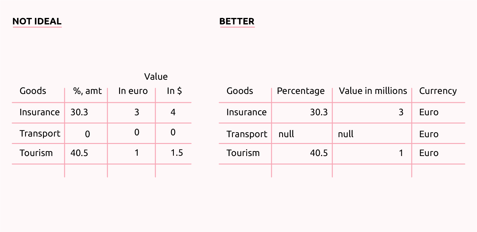
Open data is often read and processed with the help of computer programs. Therefore, it is important to structure the data in a way that makes it easy for a computer to understand – in a logical, consistent way.
How
- Give each column a short descriptive heading.
- Ensure you start your table in the first cell, i.e. A1.
- Use a single header row. Don’t use merged cells.
- Avoid white space and additional information in the file. Don’t embed charts, comments, or tables within a spreadsheet and don't use colour coding.
- Ensure that all rows have the same number of columns.
- Indicate units in an easily processable way.
- Mark null values explicitly as such.
- Check the formatting of decimal numbers and numbers in the thousands. Don’t use thousand separators such as white spaces and dots.
- Make use of standardised character encoding. Don’t include special (i.e. non-alphanumeric) characters within the spreadsheet, including commas.
- Encode date and time as ISO 8601 (YYYY-MM-DD hh:mm:ss). If applicable, the time zone used should be stated (derived from UTC – Coordinated Universal Time).
- Use URIs (Uniform Resource Identifiers) to identify entities.
Resources
- Cleaning open data: common errors and fixes
- Guidelines on data and metadata quality: a data.europa academy lesson
- EU Open Data – The basics for EU data providers (2016)
- e-Learning programme on open data: modular, for all levels of expertise
Contacts
Why
Basic metadata makes your data findable and machine-readable; documentation makes it human-readable. To support people reusing and working with your data, provide documentation.
How
The documentation should include everything that users need to fully understand the data, such as methodology, time ranges, sample sizes, definitions, descriptions of the variables and the acronyms used in the dataset, and limitations. The documentation can be provided in a separate file or published on the landing page from which the data can be accessed (e.g. on the data portal).
Resources
Examples
- ‘14-day age-specific notification rate of new COVID-19 cases’, European Centre for Disease Prevention and Control (2021)
In this ECDC open dataset, everything that users need in order to understand the data is documented in a separate file, which is then published along with the dataset.
Why
People who reuse your data may use various kinds of computer software or programming languages to do so. Therefore, it is important to provide file formats that can be read and processed, regardless of the specific software being used. These text-based file formats are often smaller and can therefore also be downloaded and handled more easily.
How
Save your data in a non-proprietary file format, such as CSV (Comma-Separated Values) or JSON (JavaScript Object Notation). You can always provide additional software-specific formats, such as an Excel file, for less technical users. When saving your data, deposit each table that is part of the dataset as a separate file. Give the file a name that appropriately reflects its content. When you are using the CSV format, make sure to use commas as the delimiter.
If you are working with a contractor, make sure to explicitly mention the data underlying your publication as a deliverable (including in which formats). Ask the contractor to prepare the data in line with the recommendations in this guide.
Resources
- Choosing the right format for open data
- Guidelines on data and metadata quality: a data.europa academy lesson
Contacts
Examples
- ‘City transport by bus by autonomous community’, Instituto Nacional de Estadística (2012)
This dataset is made available in multiple formats.
- ‘Results of the Open Data Maturity assessment 2022’, DG Communications Networks, Content and Technology (2022)
The CSV-formatted distributions of this dataset follow the format-specific recommendations provided in the Data Quality Guidelines (see 'Reading' section of the data.europa academy lesson, pp. 29–37).
See also

Publishing the data and the data visualisations with your publication
Why
Readers may want to reuse the visualisations in your publication. Providing a way to download the visualisations separately and in the right format will ensure that they don’t just take a low-quality screenshot of them. This should be done only if you hold all the rights to the visualisations and third-party material is properly licensed.
How
Provide the possibility to download your visualisations. Users may want to download all the visualisations from the publication at once. So be sure to provide both a single-file download option and the option to download a zip file containing all visualisations. If you are publishing an online publication that provides the option for users to make changes to the visualisations (e.g. the colour or the dataset shown in the chart), make it possible for them to download the visualisation as they have altered it.
To provide such download options, you need to create and maintain the necessary hosting infrastructure.
Contacts
Examples
- Our World in Data
Our World in Data provides the option to download both a PNG file and an SVG file, and has useful descriptions of what the user can do with those formats.
- Going Digital Toolkit, OECD (2019)
This toolkit offers a simple download button next to each chart so users can download a PNG file. It also provides multiple options for sharing the visualisation on social media platforms.
Why
Sharing visualisations online is a great way for people to reuse and discuss your work. Share buttons mostly allow readers to share the visualisation on social media platforms, but can also give them the option to copy a link to the visualisation or send the visualisation via email.
How
You can provide share buttons no matter whether you have a full online publication with interactive charts or you are simply providing a PDF publication and static visualisations to download. If you are using an online charting tool to create the visualisations, you can check whether it comes with a built-in functionality to add share buttons.
Apart from social media and link-sharing options, consider giving users the possibility to add your charts to their own websites by providing an embed code (a snippet of HTML code the user can copy).
Only provide those sharing options that are relevant to your target audience, so as to not overload your readers with possibilities.
Examples
- Going Digital Toolkit, OECD (2019)
This toolkit offers a simple download button next to each chart so users can download a PNG file. It also provides multiple options for sharing the visualisation on social media platforms.
- Regions in Europe - 2022 interactive edition, Eurostat (2022)
This interactive edition of the publication gives users the possibility to add the charts to their own websites by providing an embed code.
Why
The most interesting and well-structured data is lost if that data cannot be found and extracted. Therefore, providing easy and clear access to data is crucial.
How
Provide the possibility to download your data. As the EU data catalogue data.europa.eu does not normally host the data itself, but instead provides links to it, the data must be hosted on your organisation’s website or on an FTP (File Transfer Protocol) server. It is important to maintain those links to the data, i.e. to ensure that the links are not broken if the storage structure changes.
Resources
- Guidelines on data and metadata quality: a data.europa academy lesson
- The data.europa.eu open data catalogue: the official portal for European data
Contacts
Examples
- Paying the Price of War – OECD economic outlook – Interim report September 2022
The digital report offers multiple download options: download all data; download the report data; download the presentation data.
Why
An API (application programming interface) is a set of definitions and protocols that grant information users access to the data provided by you, the information provider. With an API, users can acquire your data in an automatic, systematic and customised manner, often via a URL (uniform resource locator).
How
It makes sense to consider providing an API for advanced users to be able to access your data more easily. For high-value datasets in particular (those the reuse of which is associated with significant benefits for society and the economy, such as geospatial or mobility data), you are required to do so by law. When setting up your API, it is important to use correct status codes and headers, along with paging for large amounts of data. Always provide ample documentation on the API to ensure that people can use it.
Resources
- Directive on open data and the reuse of public sector information
- European Commission open data policy
- Exploring the origin, features and examples of high-value datasets through visualisation
- Guidelines on data and metadata quality: a data.europa academy lesson
Examples
- Data.europa.eu APIs
Data.europa.eu provides a list of APIs for users to query the repository. It also provides documentation and examples of use.

Why
A data catalogue is an inventory for data. It is essentially a collection of metadata records that describe datasets. By providing tools to search this metadata, the catalogue allows users to find and access the data they need. Data catalogues such as data.europa.eu do not normally host the data itself, but instead link to the location where the data can be accessed.
How
If your data is open data, you can catalogue it on data.europa.eu. To do so, make a request for data identifiers in Dempub. This is possible regardless of whether you are publishing the publication with the OP or not. Once the request has been processed you will receive a unique identifier for your data, and the data will be included in the data.europa.eu catalogue. Even if data cannot be released as open data, reach out to your local data correspondent about publishing it on the internal EC Data Catalogue (for European Commission services) or on your institution’s internal data catalogue (for other Institutions, agencies and bodies).
Resources
- The Author Portal: online platform for requesting Publications Office publishing services
- The data.europa.eu open data catalogue: the official portal for European data
- Data catalogues: an overview, European Commission
Contacts
- Publications Office Front Desk for Authors team
- Publications Office Open Data team
- European Commission local data correspondents: role, and a list with contact details
Examples
- Study on Energy Storage, DG Energy (2020)
This publication provides access via a permanent link to the main deliverable of the study, which is published as an open dataset on data.europa.eu.
- ‘Inventory of recognised producer organisations in the EU’s agricultural sector’, DG Agriculture and Rural Development (2019)
This open dataset published on data.europa.eu is Annex VIII to the Study of the best ways for producer organisations to be formed, carry out their activities and be supported, and can be accessed via a permanent link directly from the publication.
About the guide
Nowadays, data has become a central component of any kind of government publication, be it a report, a study or a policy summary. Nonetheless, data is often not presented and published in a way that allows others to easily access, reuse and reference it.
Formatted as an extendable checklist, this guide compiles tips, examples and resources from across the EU. These recommendations will help you produce and publish accessible and reusable data, data visualisations and publications that contain data.
Who is the guide for?
This guide is relevant to anyone involved in the process of producing and publishing data and information for EU institutions, agencies and other bodies. This includes researchers, policymakers, communications specialists, data experts, IT specialists, publication coordinators, designers and contractors.
How should the guide be used?
The guide should be used at the very beginning of your publishing process – after you have received the OK for a publication, but before you have commissioned any work on it.
Ideally, all stakeholders should be involved in the process from the very beginning. That way, each person has the chance to make use of the recommendations that are relevant to their field of responsibility, be it analysing data, writing text, creating visualisations or publishing the data.
What kinds of publication does this guide target?
The publications can be any type of published content that contains or references data. This includes reports, studies and books, assessments, briefs and summaries, press releases, leaflets and brochures – both in print and online. The data could be a primary source (data produced and analysed specifically for this publication) or a secondary source (third-party data that is used as supporting material).
Give us feedback!
The Data in Publications guide was created by the Publications Office of the European Union. What you see here is a beta version of the guide. As we are continuing to develop it, we would love to hear your feedback. Please send us an email at OP-DATA-EUROPA-EU@publications.europa.eu, with ‘Data in Publications guide feedback’ in the subject line.