Using open data to understand politics
Using open data to understand politics
Looking to attract readers, media fill their sites with polls, news articles and opinions about the latest political events. These include elections. The message brought by different media outlets can vary markedly and it can be hard to distinguish the ordinary from the extraordinary. Open data became a valuable tool to help put election outcomes into the right context.
For example, during the 2019 European elections, the Greens obtained 12% of the votes. One media outlet described this result as a surge of support. Comparing the 2019 and 2014 elections, the Greens did increase from 7% to 12% of the vote. Is this a surge? How to best put this result into context?
Open data excels at providing objective facts about elections. Graphs of election results over time visualise trends over time that people can interpret for themselves.
But the number of seats, an objective fact, can mask other more subjective parts of these trends. For instance, has the political position of green parties shifted? If so, this would put the results into another context.
The advantage of open data is that it helps capture this more subjective side of election results. But still, be careful with interpretations: data and political scientists collect data and information on the positions of political parties. However, classifying these positions is a subjective. What one data collector classifies as "left-wing” might be seen as “centrist” to another. This can result in a biased view.
Which types of open data are available to examine election results?
Political scientists have constructed multiple open databases for Europe’s election results. These includes information on how political factions and coalitions have evolved over time.
ParlGov, for example, is a data infrastructure for political science and contains information for the European Union and most OECD members (37 countries), starting in 1900. The database combines approximately 1700 parties, 1000 elections (9400 results), and 1600 cabinets (3900 parties).
ParlGov scores parties on multiple dimensions, such as whether a party is left-wing or right-wing. Each political party gets a score between zero and ten for each dimension. Data for ParlGov comes from the openly available Chapel Hill Expert Survey (CHES), which estimates party positioning on European integration, ideology and policy issues for national parties in the Member States.
Another open data initiative, the Manifesto Project, analyses parties’ electoral manifestos to measure parties’ policy positions. The database covers over 1000 parties from 1945 until today in over 50 countries on five continents. The Manifesto group coded each election programme per written sentence. For example, if a sentence in an election manifesto is positive about the military, then it gets classified as such. This leads to a score to measure how positive or negative a party is on a policy area. The micro data per sentence can be downloaded via APIs (available for R and Stata) or as a CSV file.
Insights from the academic world: from data to interpretation
The open data collected and provided by ParlGov helps researchers and journalists observe trends and gain insights. Kayser and Rehmert (2021), for instance, analysed how coalition governments shift positions on the environment if the probability of a green party joining the coalition becomes higher (because, for example, they are higher in the polls). They looked at data in nine European countries between 1990 and 2012. The researchers found that the more likely a green party may join a coalition, the more likely the coalition government would have a stricter environmental policy.
Political scientists Funke, Schularick, and Trebesch (2015) also used ParlGov for their article “Going to extremes: Politics after financial crises, 1870–2014”. Based on historic election data, they show that financial crises trigger polarisation in countries and lead to electoral losses for more moderate parties. Interestingly, this polarisation did not happen after normal recessions or after other kinds of shocks, such as rising energy prices or war.
Insook Lee (2021) uses the left- and right-wing positioning data from the Manifesto Project to demonstrate how political polarisation leads to more government debt. Moreover, she notices that the re-election chance for the ruling political party decreases the higher the government debt. According to the expert, parties that are more likely to win re-election are generally more likely to lower government deficits and debts.
Do it yourself: take a look at historical data to gain insight in long-term trends
Open data leads to academic insights, but it can help us all to better understand electoral trends in our own country and others.
One tool that visualises these trends is the ParlGov dashboard created by Lukas Warode. It allows users to generate their own visualisations for all European elections of the last 120 years. As an example, the figure below shows the results of the 2021 elections in Germany with the number of seats and the percentage of votes per party. The parties are ordered from the political left to right, helping users understand which parties might be likely to form a coalition.
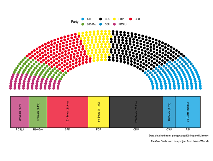
Figure 1: Vote share per party, German elections 2021, retrieved from ParlGov Dashboard
Another feature of the dashboard lets users compare parties over time. The figure below shows the results for Germany’s largest three parties. The data shows that the traditional parties CDU and SPD have been trending downward since the 1980s, whereas the Greens saw their share of votes increase slowly between 1980 and 2020, making further gains in the 2021 elections.
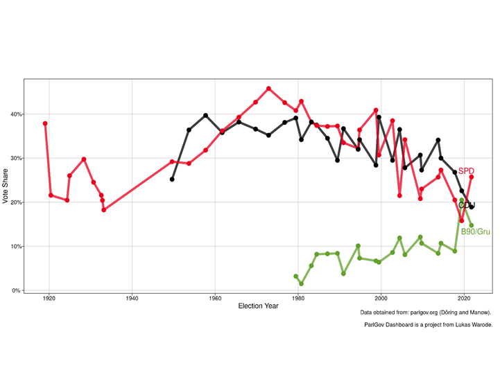
Figure 2: Historical share of the votes for CDU, SPD and the Greens, retrieved from ParlGov Dashboard