To produce bar charts, the Grammar of Graphics implementations use a bar geometry. A categorical value is used to spread out the bars over one axis, and a numerical value is mapped to the length of the bars.
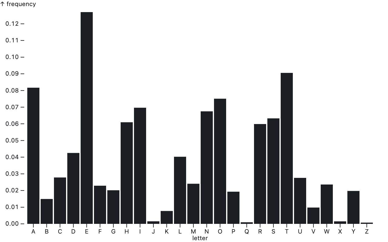
A chart showing the relative frequency of letters, using the barY geometry of Observable Plot. Source: observablehq.com/@observablehq/plot-bar
Bar charts can have 2 orientations: vertical and horizontal. Observable Plot has 2 different geometries for vertical and horizontal bars.
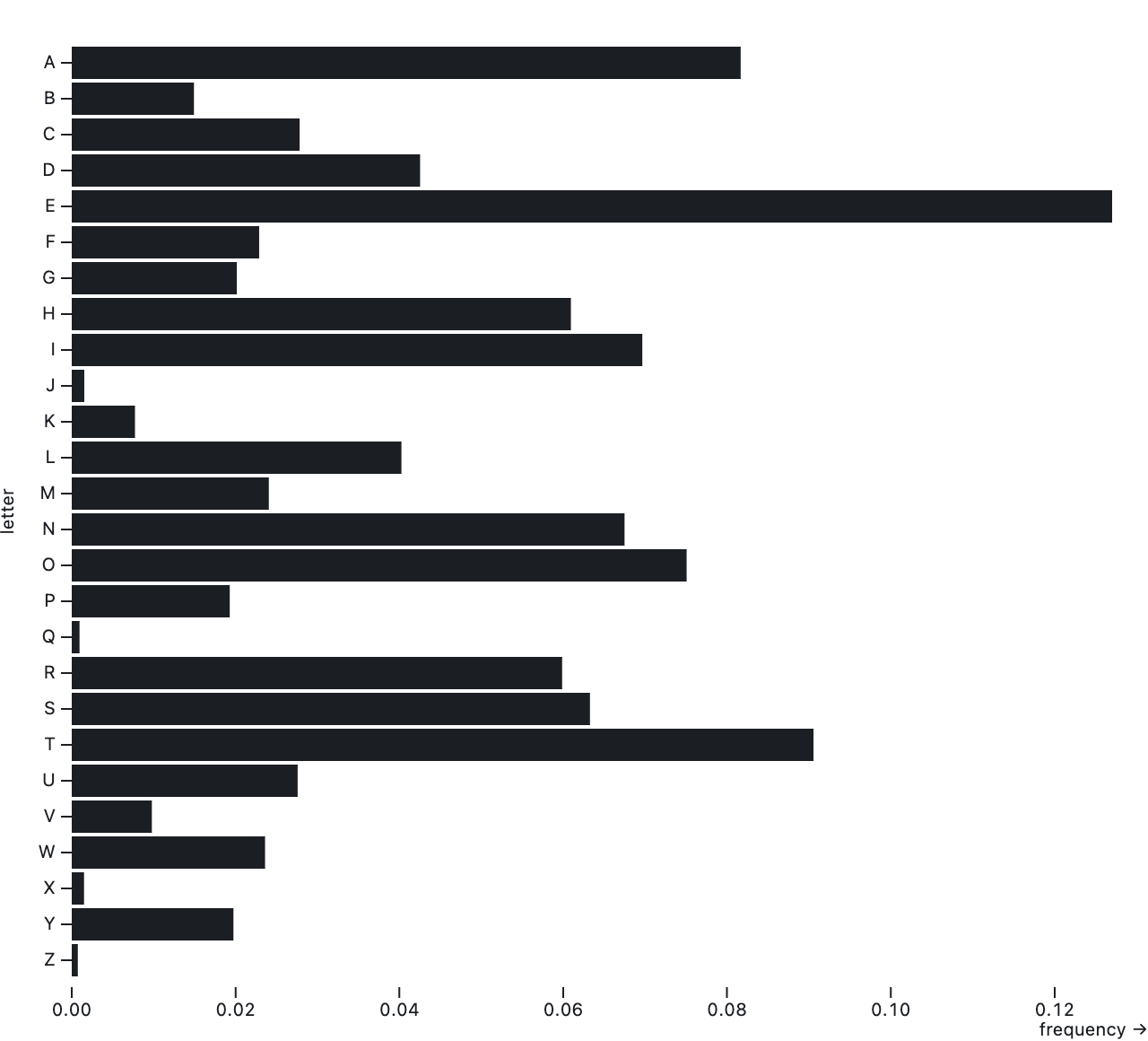
The same chart as above, but this time using the barX geometry of Observable Plot to produce horizontal bars. Source: observablehq.com/@observablehq/plot-bar
In Vega-Lite the orientation of the bars depends on which aesthetic is mapped to the categorical value and which one to the numerical variable. In ggplot2 the orientation can be flipped by flipping the whole coordinate system of the plot.
The method for producing stacked bar charts also differs between the implementations. In Observable Plot, a stacking transformation needs to be applied to the data first. This means that the position of each bar is calculated based on the size of the preceding bars.

Source: observablehq.com/@observablehq/plot-bar
In ggplot2 and in Vega-Lite, stacked bars are produced automatically when an additional categorical variable is mapped to the colour of the bars.
| Implementation | Geometry name | Required aesthetics | Additional aesthetics |
|---|---|---|---|
| ggplot2 | col | x, y | fill (to create stacked bars) |
| Vega-Lite | bar | x, y | color (to create stacked bars) |
| Observable Plot | barX, barY | x, y |
All 3 implementations have a rect geometry that produces rectangles. A bar geometry is also a rectangle, of course, but while the position and the size of a bar is determined by one categorical and one numerical variable, the position and size of a rect geometry is set by the location of its 4 corners.
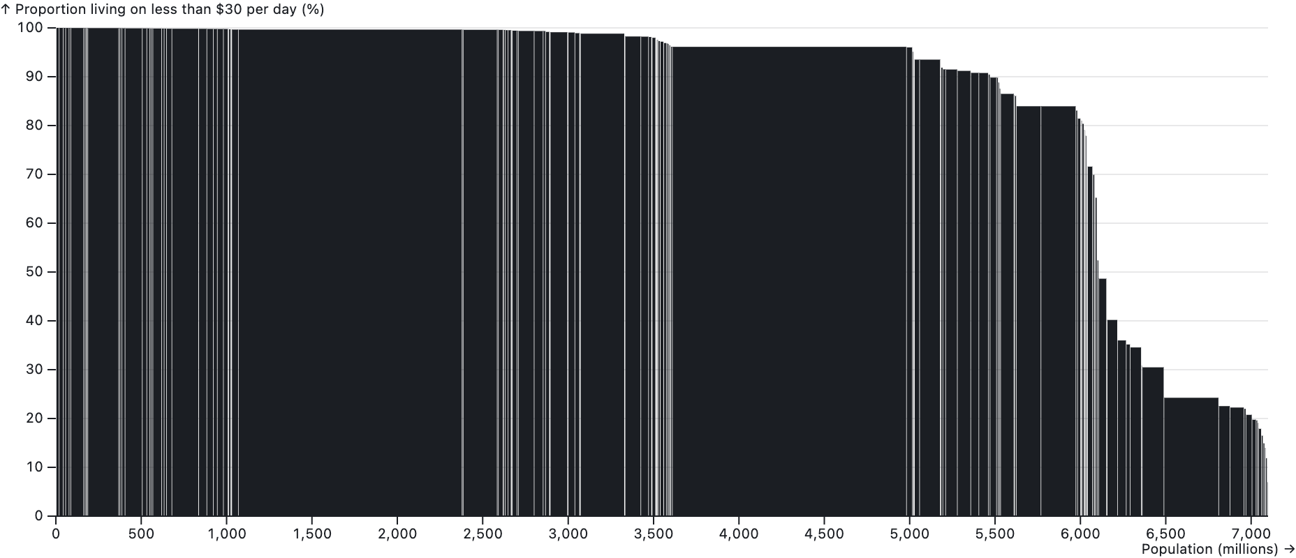
The population of countries and their shares living on less than 30 dollars per day are plotted using the rect geometry of Observable Plot. The position of each rectangle is computed using a stack transform. Source: observablehq.com/@observablehq/plot-rect
ggplot2 has an alternative to rect, called tile. It also produces rectangles, but based on the position (x and y) and dimensions (width and height) of the rectangles.
| Implementation | Geometry name | Required aesthetics |
|---|---|---|
| ggplot2 | rect | xmin, xmax, ymin, ymax |
| ggplot2 | tile | x, y, width, height |
| Vega-Lite | rect | x, y, x2, y2 |
| Observable Plot | rect | x1, y1, x2, y2 |
The rect geometry can also be used differently in Vega-Lite and Observable Plot. When the variables for the x and y aesthetics are categorical, discrete numerical or binned numerical variables, the rect geometry can be used to create heatmaps.
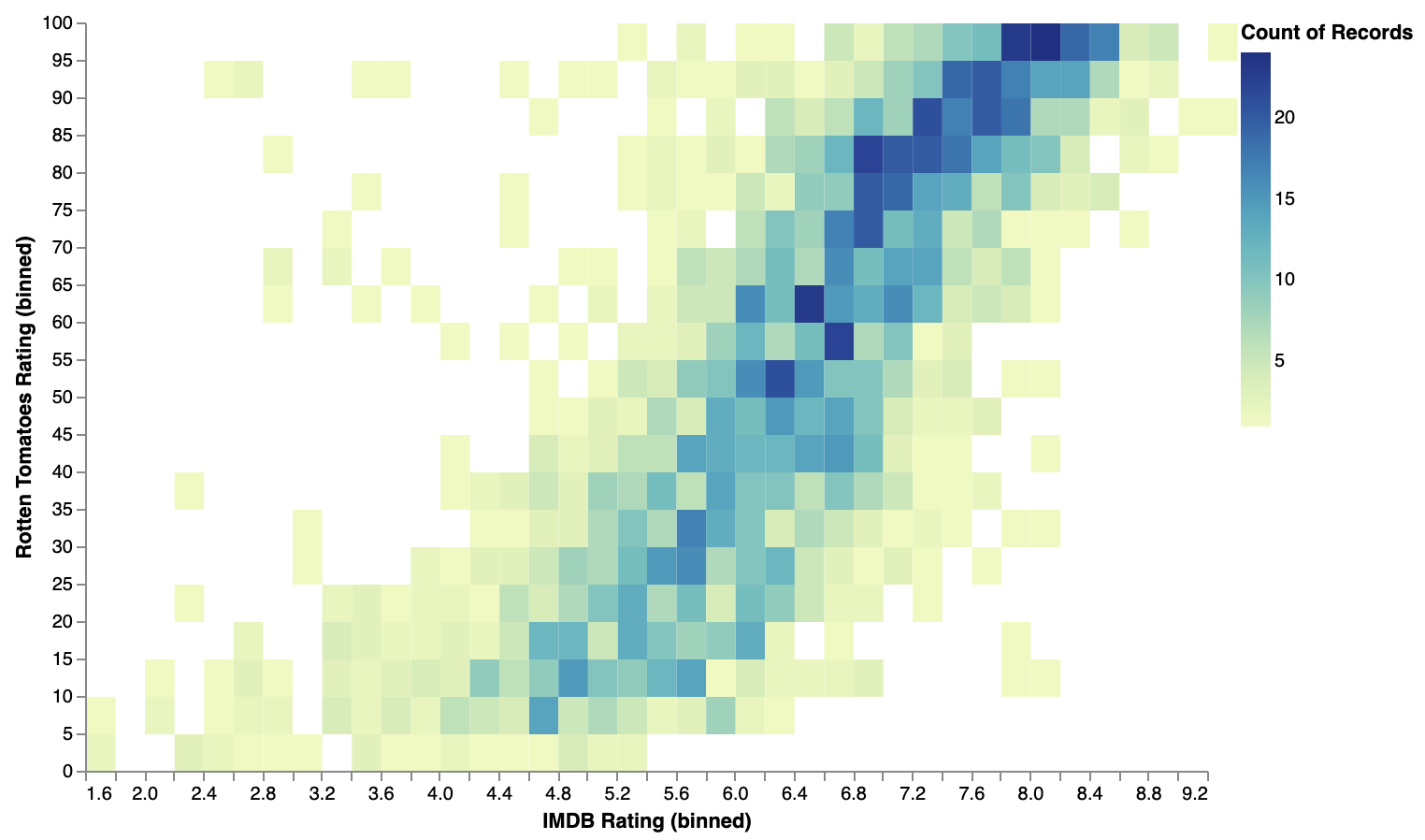
A heatmap (also called a 2D histogram) of movie ratings on Rotten Tomatoes and IMDB using the rect geometry of Vega-Lite. Source: vega.github.io/vega-lite/examples/rect_binned_heatmap.html
Similar plots can be created with the raster geometry in ggplot2 and the cell geometry in Observable plot.
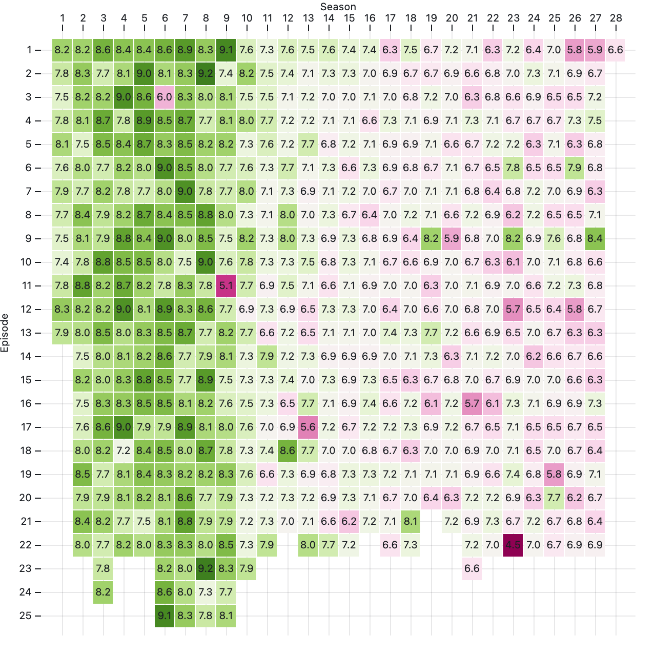
IMDB ratings of episodes of “The Simpsons” over 28 seasons, visualised as a heatmap using the cell geometry of Observable Plot. Source: observablehq.com/@observablehq/plot-cell
| Implementation | Geometry name | Required aesthetics |
|---|---|---|
| ggplot2 | raster | x, y |
| Vega-Lite | rect | x, y |
| Observable Plot | rect | x, y |
| Observable Plot | cell | x, y |
area geometries are closely related to line geometries, and are often used to visualise time series data. They generate a filled area between a top and bottom line.
Source: vega.github.io/vega-lite/examples/area.html
The bottom line is often the zero value on the y axis, but this isn’t a requirement: the bottom line can also be mapped from a variable in the data.
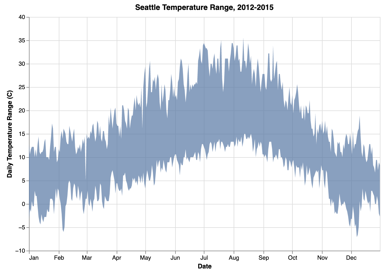
Source: vega.github.io/vega-lite/docs/area.html
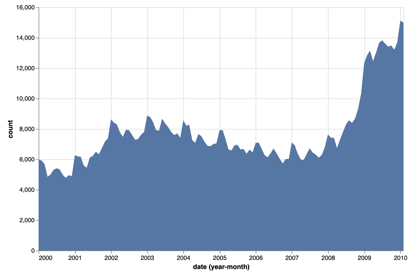
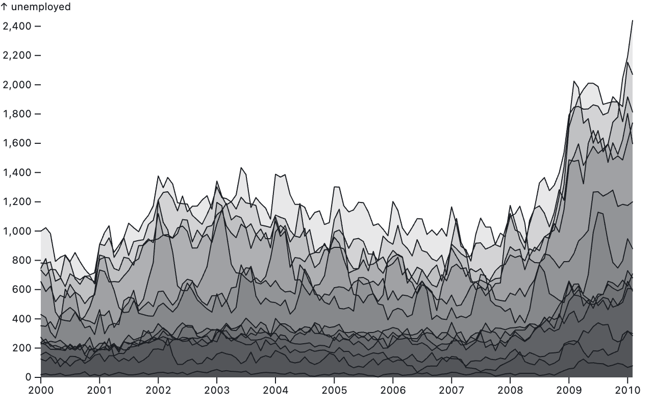
When multiple time series are plotted with area geometries, an additional aesthetic is needed to group the values in each series together. When colour is used to group values, all 3 implementations stack the areas of the series on top of each other.
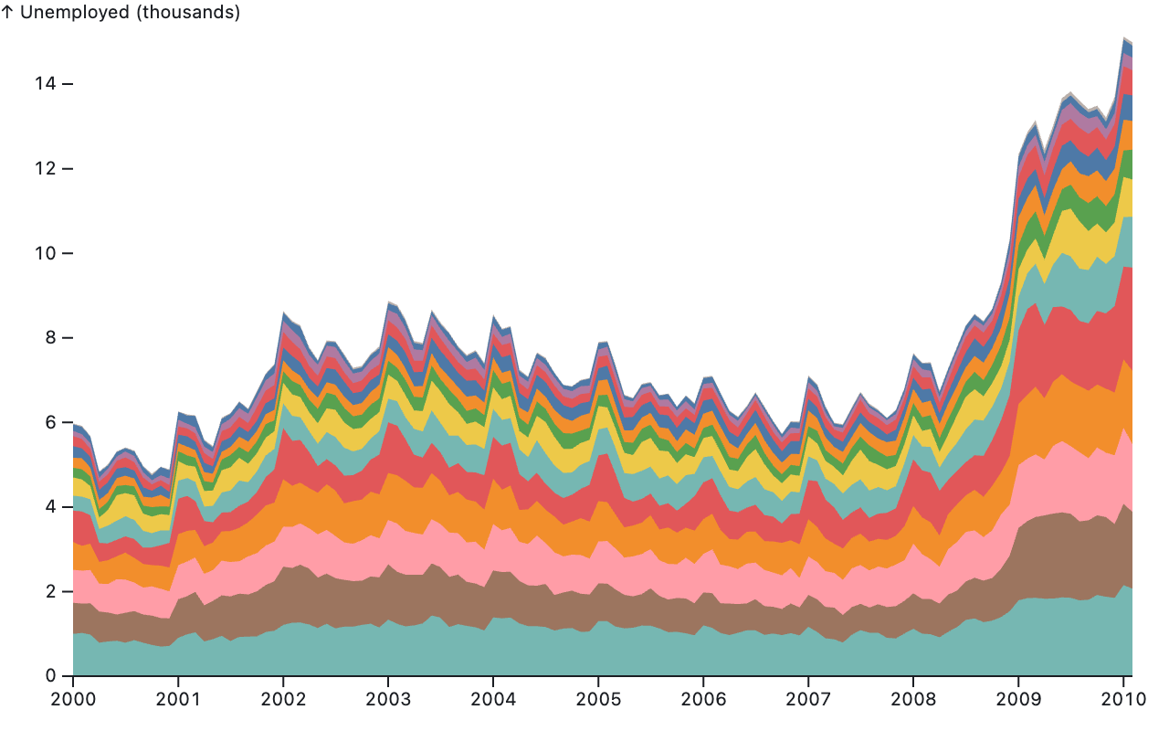
Source: observablehq.com/@observablehq/plot-area
But multiple series can also be plotted on top of each other.
Source: observablehq.com/@observablehq/plot-area
Finally, the connections between the datapoints don’t need to be straight lines. Other interpolations are possible with the interpolation parameter in Vega-Lite and the curve parameter in Observable Plot.
| Implementation | Geometry name | Required aesthetics | Additional aesthetics |
|---|---|---|---|
| ggplot2 | area | x, y | group or fill (to group observations in multi-series charts) |
| ggplot2 | ribbon | x, ymin, ymax | group or fill (to group observations in multi-series charts) |
| Vega-Lite | area | x, y (zero baseline) | |
| x, y, y2 (non-zero baseline) | color (to group observations in multi-line line charts) | ||
| interpolation | |||
| Observable Plot | area | x, y (zero baseline) | |
| y, y1, y2 (non-zero baseline) | z or fill (to group observations in multi-series charts) | ||
| curve |