A data visualisation tool that has some accessbility features and good responsiveness built in, is Datawrapper. With Datawrapper, you can create a range of different charts, but also tables and maps, to be embedded in your own web pages.
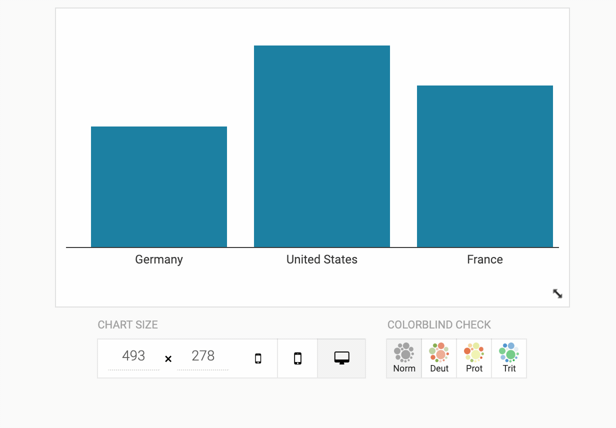
When you create a chart with Datawrapper, it will automatically run a colour blindness test on the colours you are using in your visualisation. The tool will show a warning whenever some colour combinations are not fully colour blind proof, and you can easily simulate different kind of colour blindness.
Source: academy.datawrapper.de
Next to the colour blind check buttons, you can find buttons to show how the visualisation will look like on screens with different dimensions. This is handy for testing the responsiveness of your visualisation.
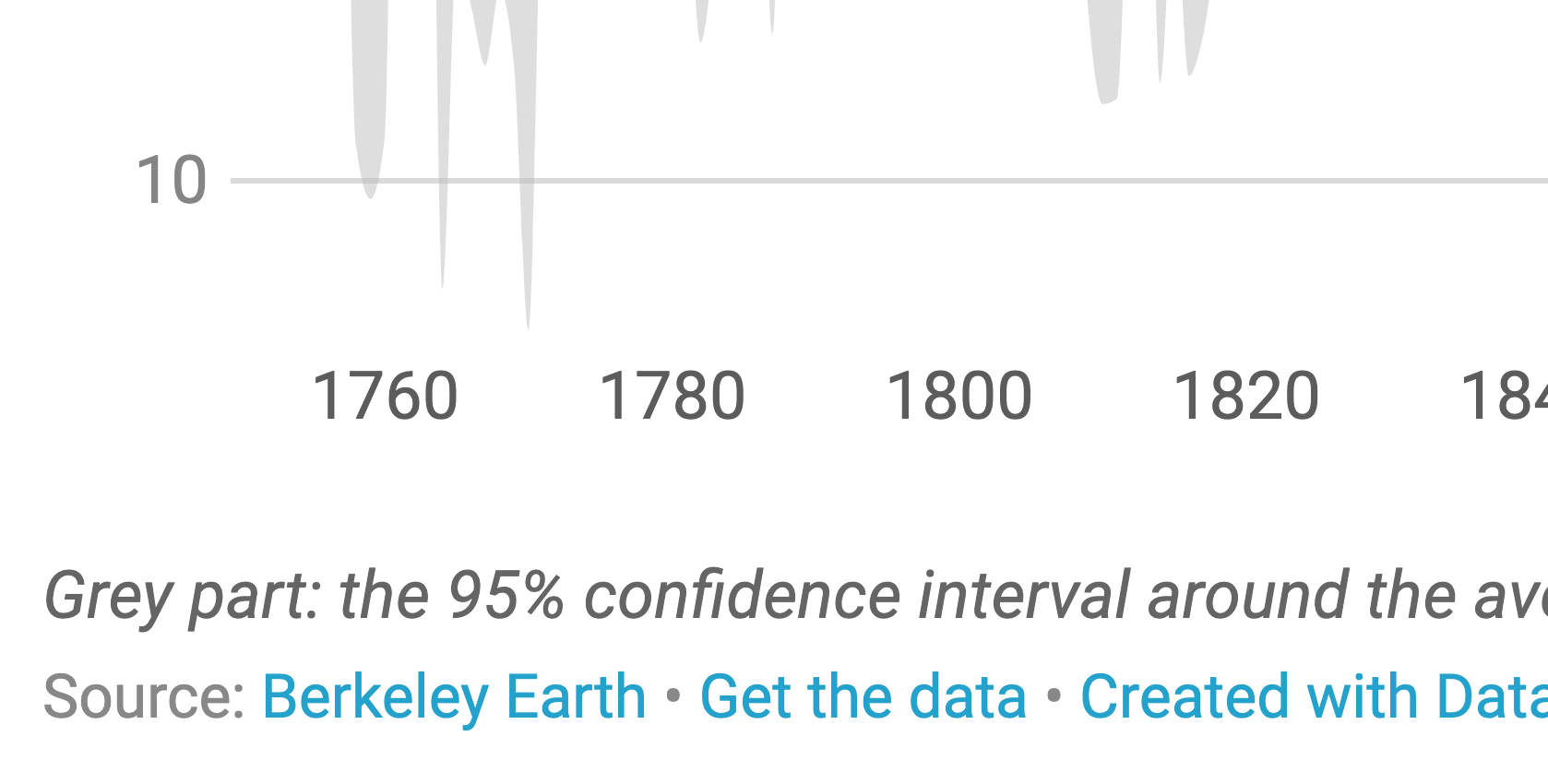
To show some of the responsive features of Datawrapper visualisations, below you can see two Datawrapper charts embedded with different widths. Notice the difference in the way the lines are labeled, and the number of tick marks on the x axis in the following 2 charts.
The 2 embedded charts below show how Datawrapper handles labels and annotations responsively. Check how the areas above and below the diagonal line are labelled, and how the amount of labels for the bubbles is reduced (automatically) when the the chart has a narrower width.
As an option, you can select to include a link to download the data of the visualisation, which also increases accessibility.
Source: academy.datawrapper.de
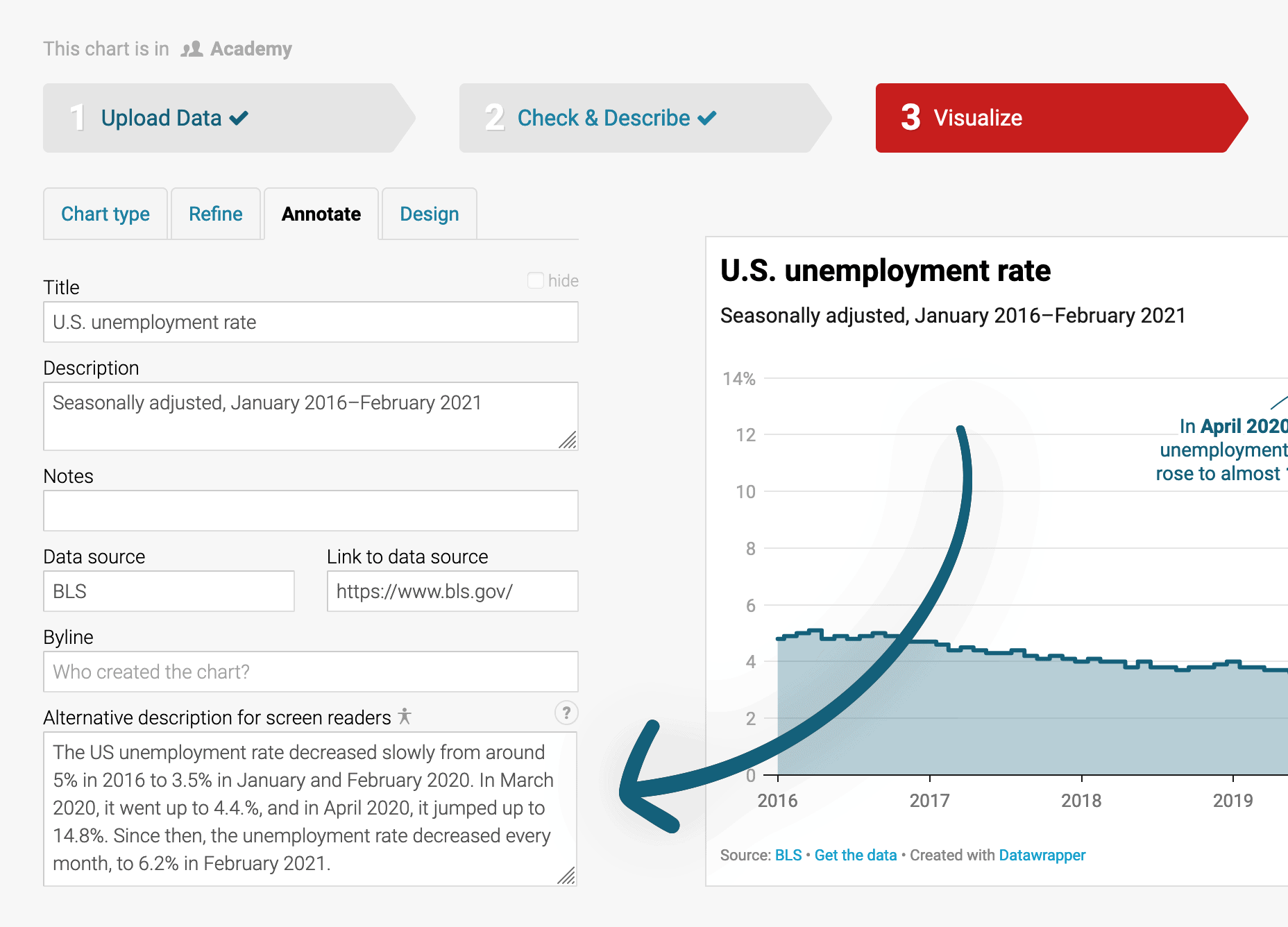
Probably the most important accessibility feature of Datawrapper is the alternative description for screen readers. This description is added to the HTML of the chart when it is embedded, and when it is present, the body of the embedded chart, including the annotations it contains, is hidden from screen readers.
Source: academy.datawrapper.de
When no alternative description is given, for some chart types Datawrapper will present an automatically generated description of the chart and its content. Check the chart below and the text that a screen reader will read out when encountering the chart in a web page.
The richer, the healthier GDP per person adjusted for differences in purchasing power (in 2011 international dollars) and life expectancy in years for selected countries, 2018. The bigger a circle, the more people live in a country. Category legend with 4 items. The items are Asia & Australia, Africa, North America, Europe. Scatter plot with 184 symbols. The horizontal axis is labeled as “GDP per capita”, the vertical axis is labeled as “Life expectancy”. This chart has one annotation: China’s life expectancy and GDP per capita are higher than India’s. Source (link) Gapminder. (link) Get the data. (link) Created with Datawrapper.