A common pattern in online data visualisation is revealing details about an item in the visualisation when it is hovered by the mouse, or touched on touch enabled screens. A tooltip is shown that identifies the data point, reveals the exact data values and sometimes also some additional information about the selected data point.
Use your mouse to reveal the tooltips in this scatter plot. Source: academy.datawrapper.de
Sometimes the viewer of a visualisation is given some control over what data a visualisation should show. This can be a filtering mechanism, in which the viewer can add or remove data points from the visualisation.
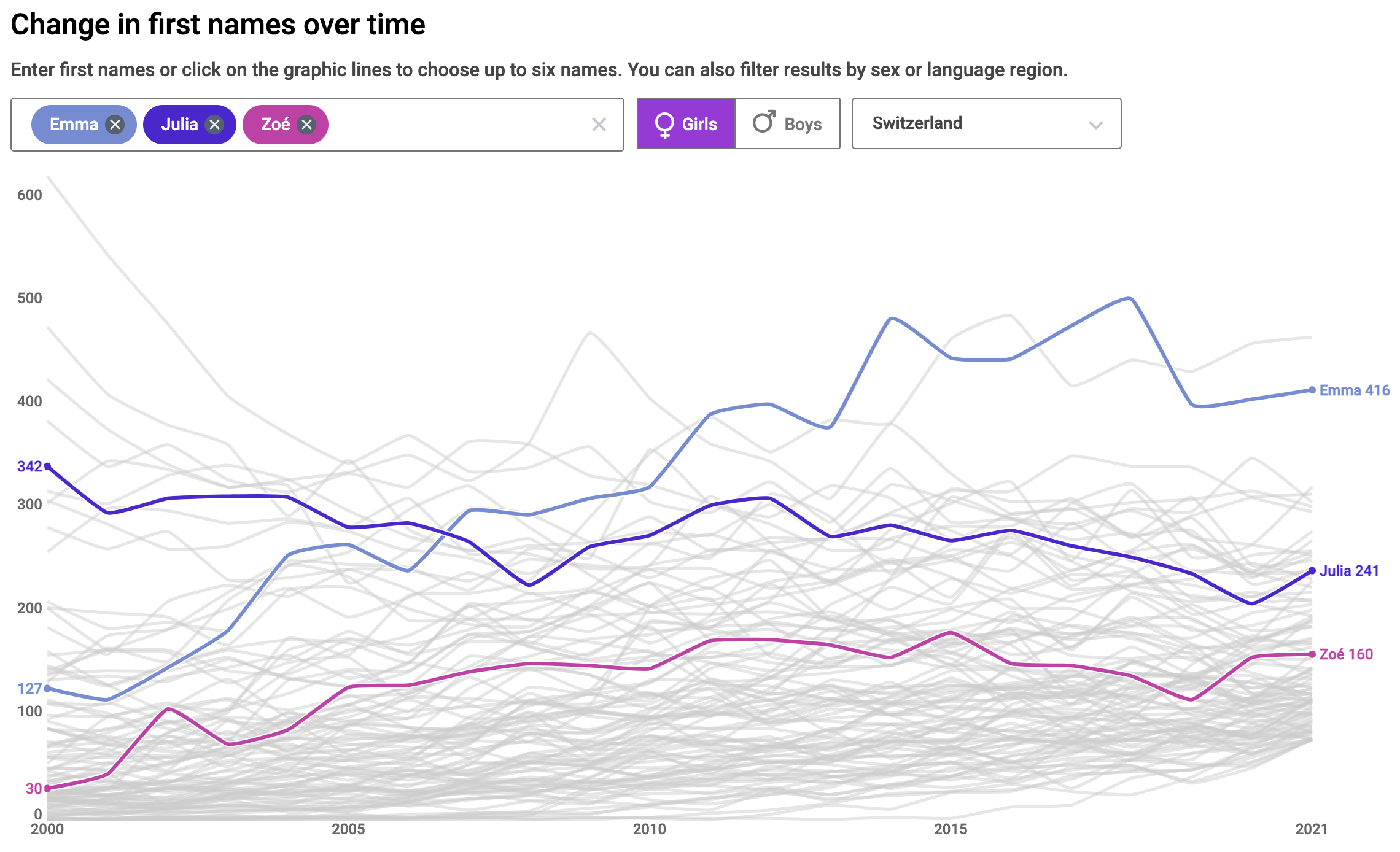
An interactive chart with filtering functionality. Source: babynames-stat.ch/en
Accessible navigation and filtering of the data points is currently implemented in the Accessibility module of Highcharts. Highcharts is a JavaScript library for data visualisation, and it is the most advanced of its kind in terms of accessibility.
For other interactive features of a visualisation, sticking to semantic HTML is the safest bet. When you allow viewers to change the data dimension(s) shown on a visualisation for example, use <input> to create radio buttons or use a <select> element to create a dropdown in the user interface. Try to avoid using non-semantic HTML and don’t rely on complex user interactions, like dragging over a visualisation to select data points, for example.
When a visualisation is part of a sequence of views on the data, like in a scrollytelling article or in a slideshow-like format in which the user advances from slide to slide, the transitions between the data views can include
- highlighting data items (by making them bigger, fade out other data items, …)
- zooming in on parts of a visualisation
- animating between different chart types showing the same data
Consider offering static versions for each view on the data, each with an appropriate description accessible to screen readers.