In its essence, data visualisation uses mathematical rules to convert numbers into visual properties (position, length, width, colour, …) of the geometrical shapes in a chart. For the human eye and brain this visual representation of abstract numbers is much easier to process, and hence the power of data visualisation.
These rules converting numbers into visual properties are called scales. A scale converts the numbers of a column in your data to the lengths of the bars in a bar chart, and convert two columns of numbers in the data into the horizontal and vertical position of dots in a scatterplot, for example.
But sometimes scales are fiddled with, and the resulting visualisations can become confusing or even misleading.
Breaking scales
A first pitfall regarding scales are bar charts with a numerical axis that does not start at zero (an axis is a visual representation of a scale). This is a very common pitfall.
Here is a recent example, shared by US vice-president Kamala Harris on Twitter.
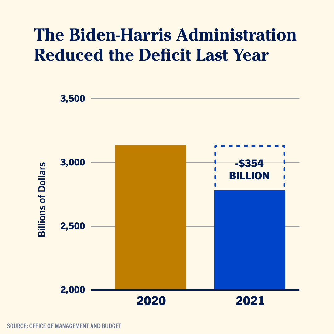
Source: @KamalaHarris
The numerical scale in a bar chart converts numbers into the lengths of the bars. But when the scale does not start at zero, the lengths of the bars are not proportional anymore to the numbers they are supposed to represent. The lower part of the bars are “cut off”.
This is how the chart should look like in reality:
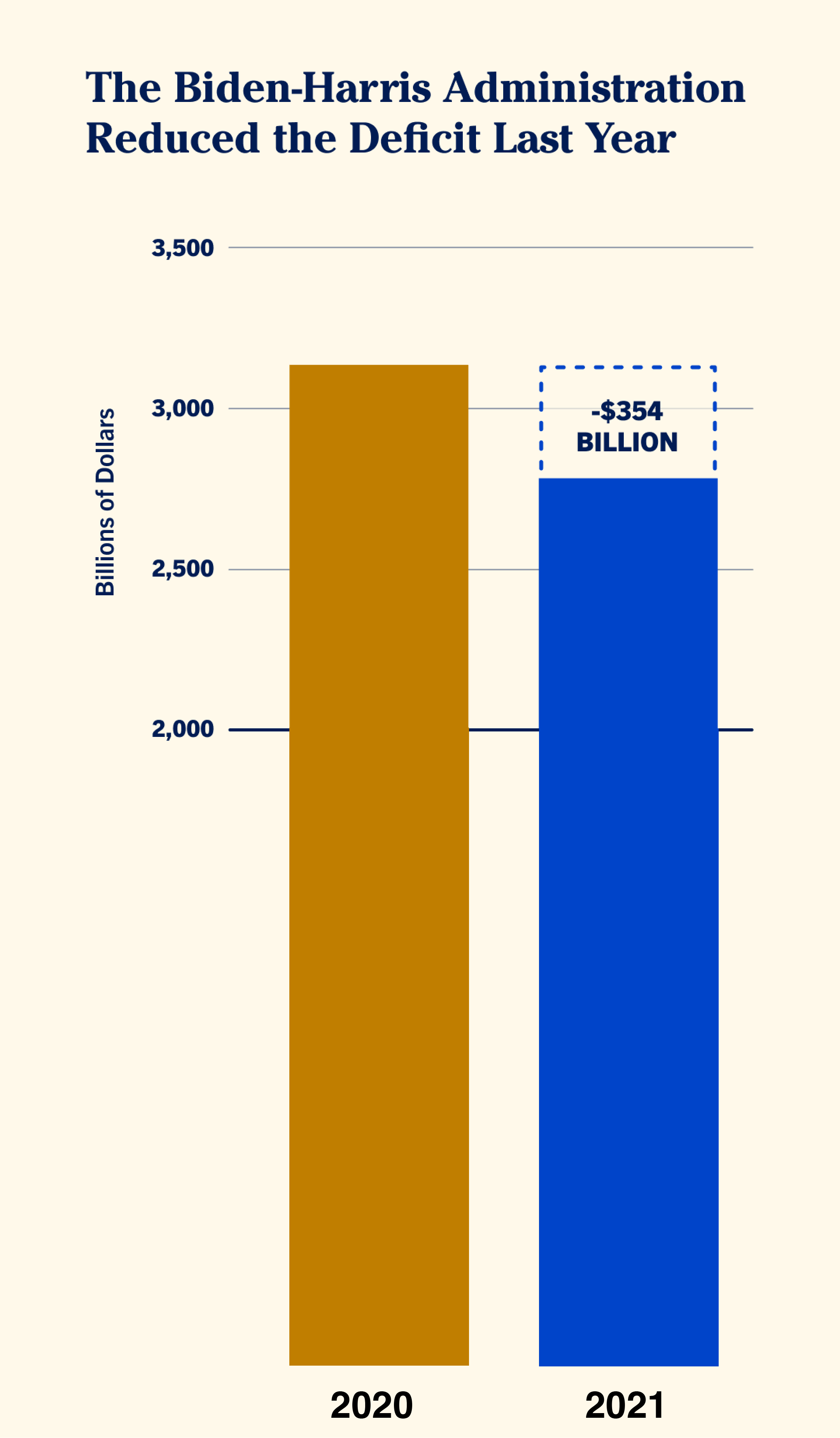
Source: Maarten Lambrechts, CC BY SA 4.0
In the case you want to highlight relatively small differences between large quantities, it can be tempting to leave out part of the bars by not starting the y axis at zero. But instead of doing that, it might be better to consider some other options:
- maybe you can try to not plot the absolute numbers, but plot the deviation from a reference value (the average, …) or the difference you want to highlight instead. In the chart above, this would mean plotting the difference of 354 billion dollar and put that number in context to the difference between 2019 and 2020, for example.
- you could consider a chart type that does not use length as the visual property computed by the scale. A dot plot (which uses position instead of length) or slope chart are options here.
Sometimes breaking a scale is more subtle than cutting a part of it off. Inspect the y axis on the below chart, also published by the White House, closely. Can you see what is going on?
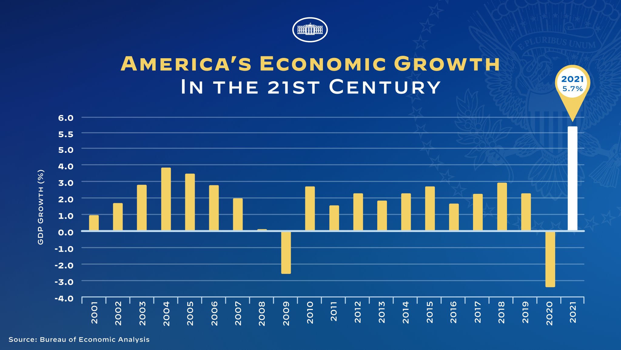
Source: @WhiteHouse
The scale is non-linear, because the upper end of the scale is stretched out. As a result the white bar with the value for 2021 is longer than it should be compared to the bars for the other years.
This “mistake” (it wasn’t clear if this was intentional or not) was corrected, and below is what the chart looks like with a linear scale.
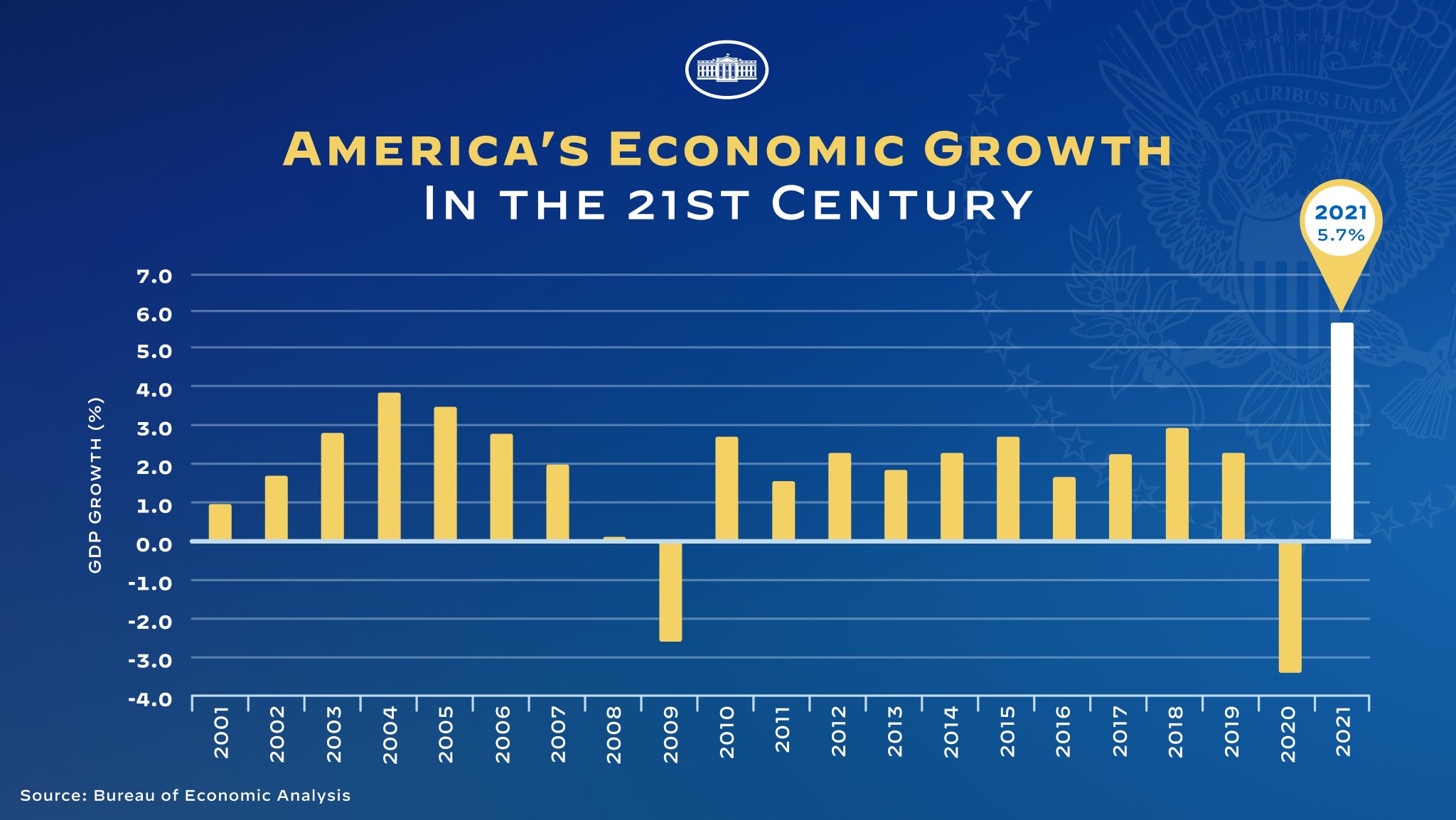
Source: @WhiteHouse
When dates are not recognised properly by the software used to make a visualisation, time scales can be broken accidentally. When dates are treated as strings instead of dates (see the data type mismatches page), a categorical scale will be used instead of a time scale. Categorical scales evenly space all values in a data column, which leads to breaks in the scale in the case the time data contains irregular time intervals.
This is best illustrated with a real life example. The charts below were published in Flemish newspaper De Tijd a couple of years ago. The chart shows the decline in extreme poverty globally and in different regions in the world. The charts seem to suggest a strong reduction in extreme poverty worldwide between 1999 and 2012.
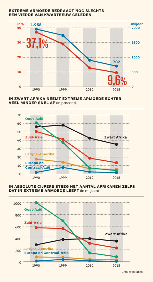
Source: De Tijd
But if you focus on the horizontal axis, you’ll notice that the time intervals are not equidistant: the first interval (between 1990 and 1999) spans 9 years, the second one 13 years and the last one only 3 years. So the apparent dip in extreme poverty in the middle of the charts is a result of the non-linearity of the time scale, and not due to patterns in the data.
Below are the corrected versions of these charts. The dip has completely vanished now that the time scale is linear.
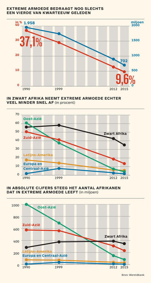
Source: De Tijd