When showing small differences between large quantities, data visualisation designers are sometimes tempted to start the numerical axis of a bar chart not at zero. Here is a recent example, shared by US vice-president Kamala Harris on Twitter.
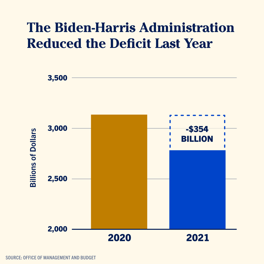
Source: @KamalaHarris
The numerical scale in a bar chart converts numbers into the lengths of the bars. But when the scale does not start at zero, the lengths of the bars are not proportional anymore to the numbers they are supposed to represent. The lower part of the bars are “cut off”.
This is how the chart should look like in reality:
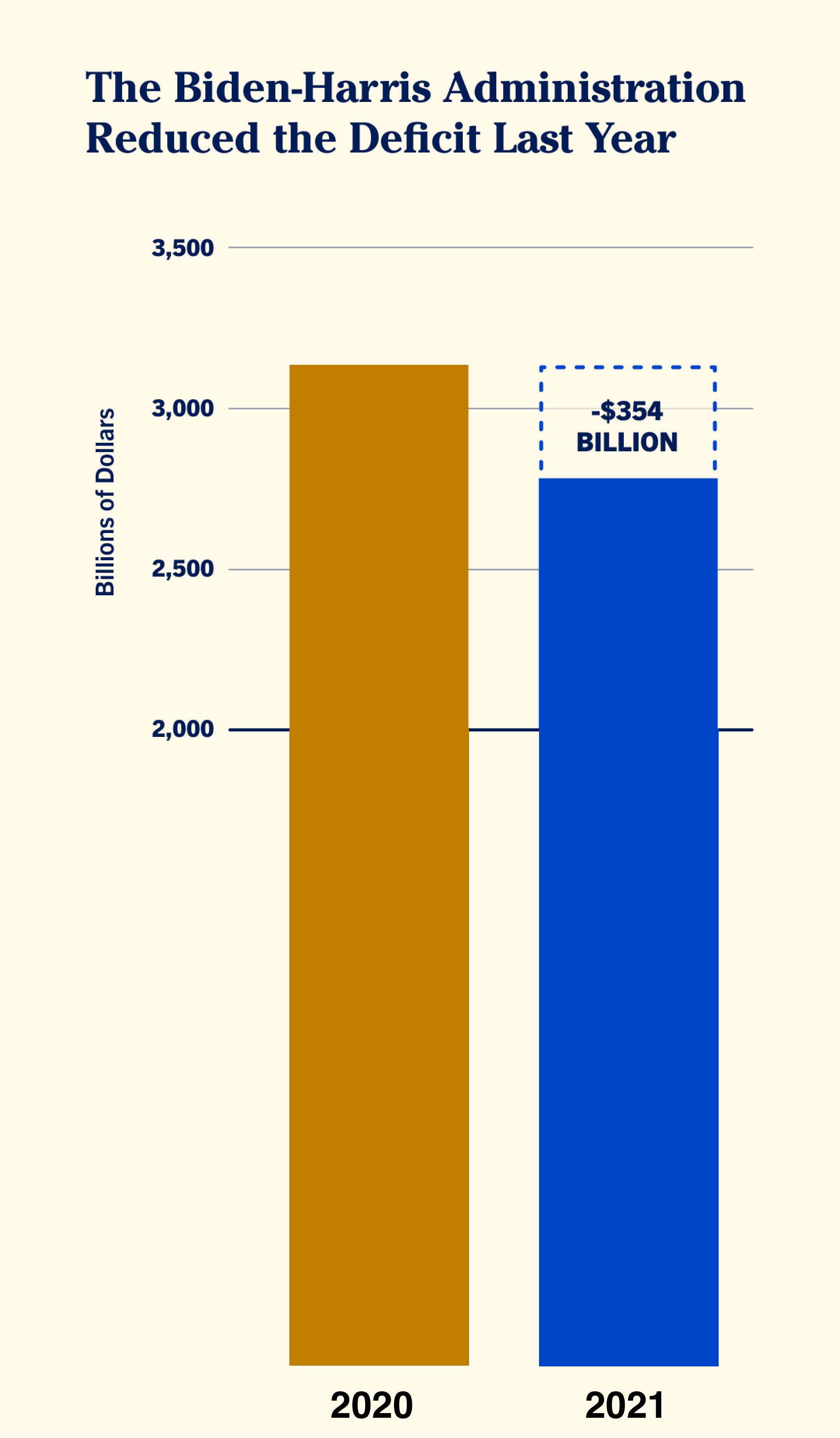
Source: Maarten Lambrechts, CC BY SA 4.0
Instead of leaving out parts of the bars and distorting the proportions, it might be better to consider some other options:
- maybe you can try not plotting the absolute numbers, but plotting the deviation from a reference value (the average, …) or the difference you want to highlight instead. In the chart above, this would mean plotting the difference of 354 billion dollar and put that number in context to the difference between 2019 and 2020, for example.
- you could consider a chart type that does not use length as the visual property computed by the scale. A dot plot (which uses position instead of length) or slope chart are options here.