Lately, the pushback against Tufte’s data visualisation design philosophy and his terminology of chart junk has become more audible. In 2021, a team of visualisation researchers published the Manifesto for Putting ‘Chartjunk’ in the Trash. According to the manifesto, the term chart junk was originally coined as a provocation on some design practices. But the term entered the data visualisation lexicon, and has been used in multiple books and scientific papers.
A critique on the use of the term is that Tufte uses a very broad definition of what is chart junk, including “harmless junk”. But by using the word “junk”, any kind of additional non-data chart element immediately is associated with a negative connotation.This makes talking about these chart elements in a neutral and scientifical way difficult. So the authors of the Manifesto propose to stop using the term “chart junk”, although they did not suggest another term or definition to replace it.
Also recently, there seem to be some renewed interest in making more playful chart designs, integrating hand drawn and illustrative elements. One exponent of this style of data visualisation is data journalist Mona Chalabi. Her popular Instagram page contains many visualisations that clearly violate Tufte’s rules, but that do get a message across and are appreciated by a huge audience.
Source: @MonaChalabi
Source: @MonaChalabi
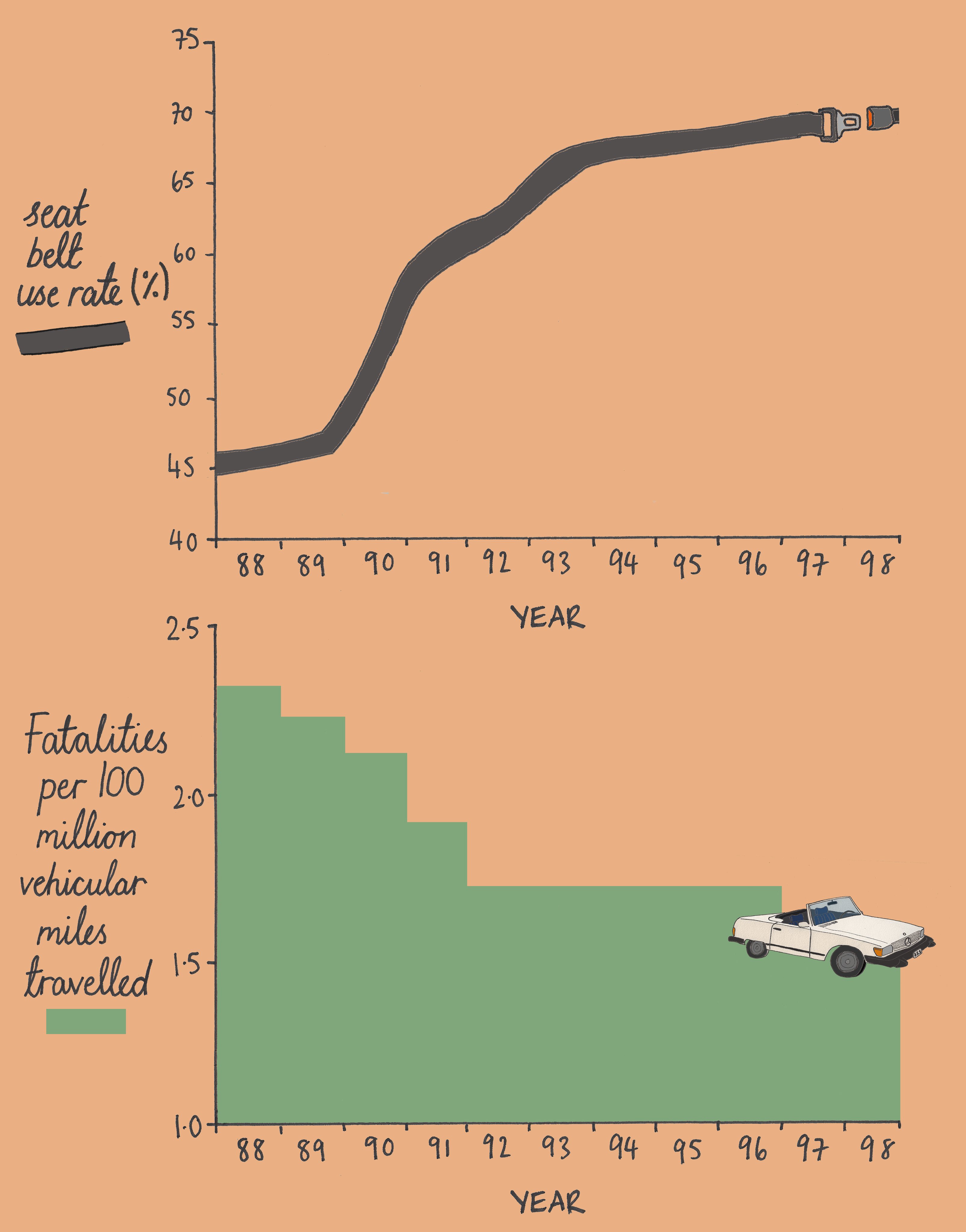
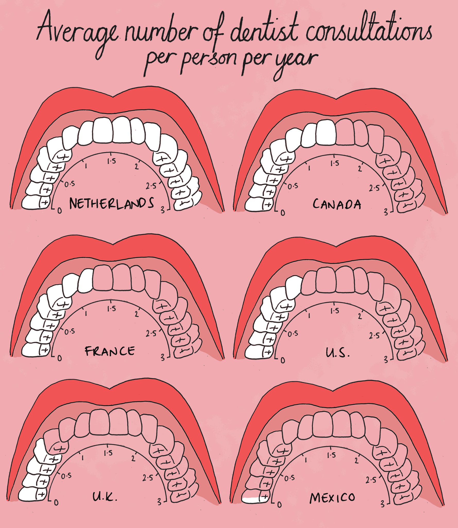
Data illustrator Gabrielle Merite is adding to the same genre, with collage-like data visualisations.
Source: @Data_Soul
Source: @Data_Soul
Source: @Data_Soul
In a talk at the Outlier 2022 Conference, Robert Kosara (the researcher who coined the term “harmless junk”), highlighted this chart:
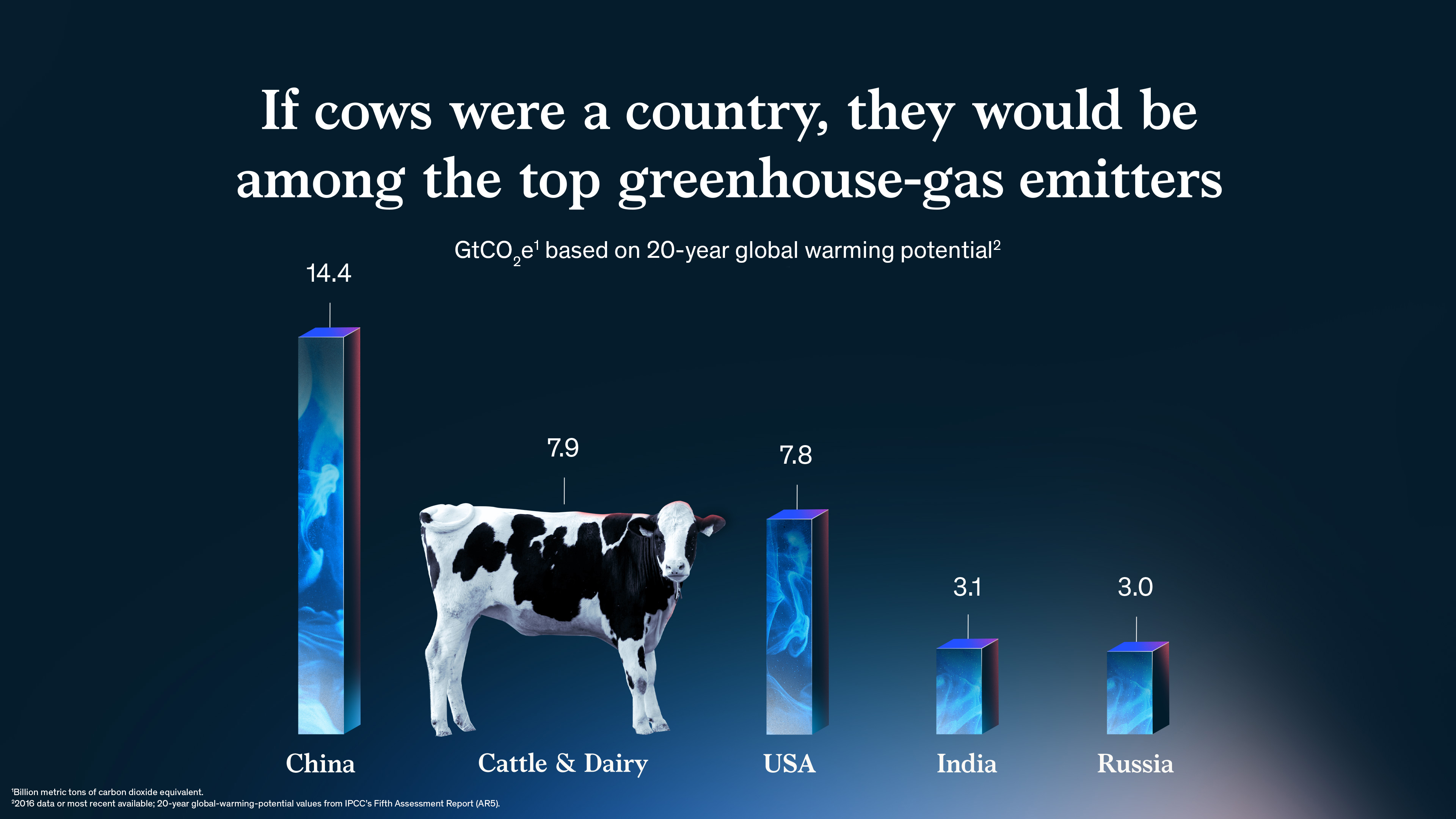
Source: @McKinsey
It compares the greenhouse emissions of cattle worldwide with the ones of countries, and it represents emissions of cattle and dairy farming with… a cow.
Tuftean purists might say that because the cow is so wide, people might overestimate the value it represents, and that because it has no straight top, it is impossible to read the exact value from the cow’s shape. On top of that, the bars representing the countries are 3D bars, which have problems of their own.
But would the message be so powerful if the data was represented like below?
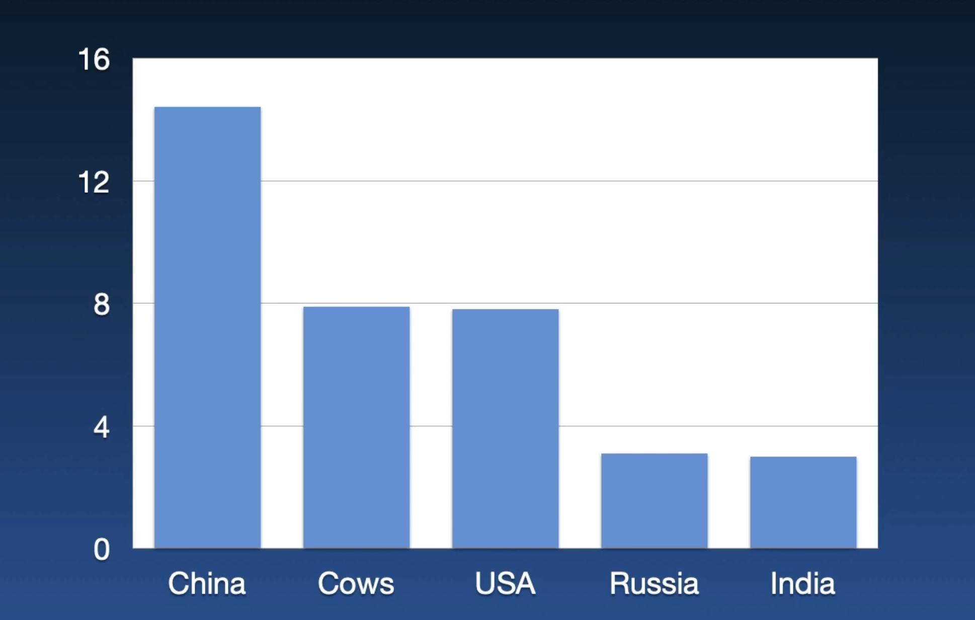
Source: Robert Kosara—Outlier 2022—This Should Have Been a Bar Chart
As Robert concludes his talk:
Having some fun with a chart goes a long way in getting peoples attention and standing a chance of being remembered. We seem to think that when something is fun, it can’t also be serious, and we feel the need to strip every chart down to its bare foundations, and in that way, naturally get rid of all the fun bits as well. […] We should all strive to present ordinary data in extraordinary ways.