With the concept of chart junk and the “maximize data ink” rules in mind, Edward Tufte redesigned a few visualisations in his book “The Visual Display of Quantitative Information”, resulting in ultra minimalistic looking charts. This style of visualisation, and the philosophy behind it, became very influential in the decades after Tufte’s book was published.
In his next book, “Envisioning Information”, Tufte repeated his critique on illustration style data visualisation, in which the hand of the designer was very visible. As an example, he used a graphic by (then) Time magazine illustrator Nigel Holmes: the now famous “Diamonds were a girl’s best friend” chart:
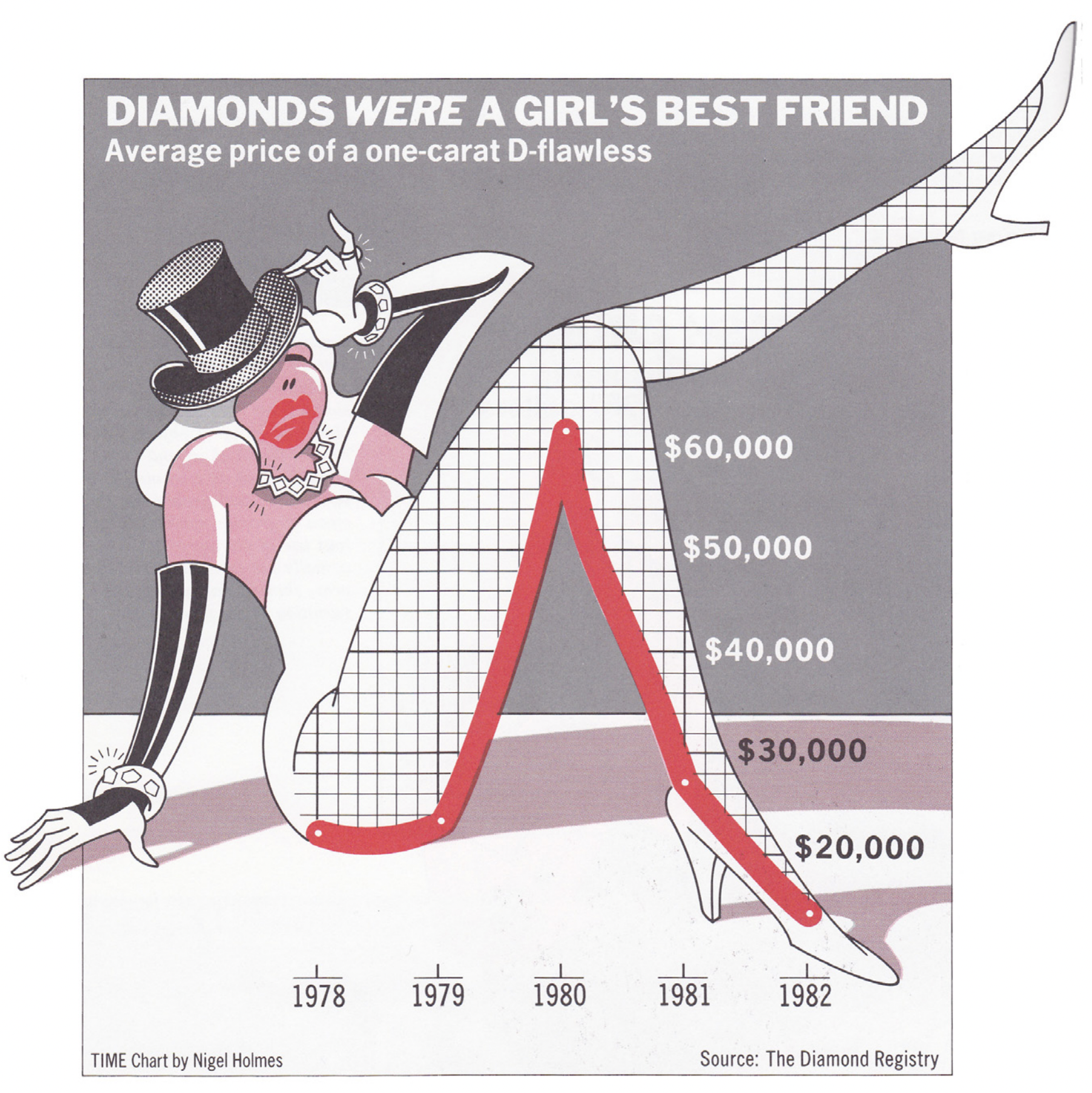
Source: Nigel Holmes for Time Magazine
This kicked off a Tufte vs Holmes debate, in which Holmes claimed that “Tufte, in his insistence on absolute mathematical fidelity, remains trapped in ‘the world of academia’ and is insensitive to ‘the world of commerce,’ with its need to grab an audience”.
So, do illustrations and “chart junk” hinder the interpretation of a chart? In 2010 researchers tried to find out and settle the Tufte vs Holmes discussion by exposing people to visualisations designed by Holmes and versions of these charts following Tufte’s rules:
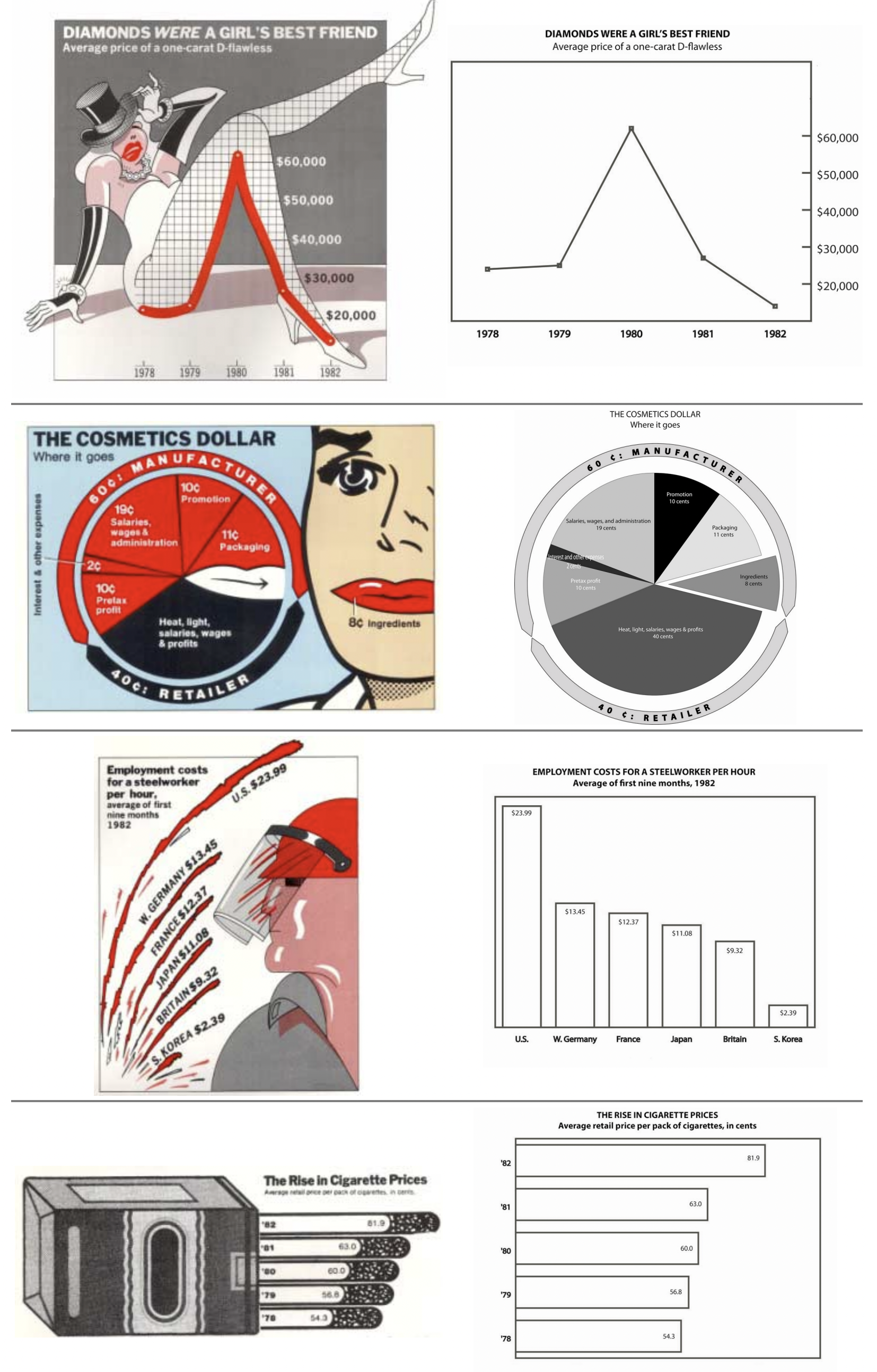
Left: Holmes’s graphics, right: minimalistic versions of the charts. Source: Useful Junk? The Effects of Visual Embellishment on Comprehension and Memorability of Charts, Bateman et al
The researchers found that the embellished charts did a better job in getting the message across, and that people had a better memory of the charts after a three week period. So adding illustrations and non-data visual elements does not seem to affect communicating a message in (simple) data sets. However, what the researchers did not study, was how well people were able to read data values from both kind of charts.
A sane way of looking at the Tufte versus Holmes is to see them as two extremes of a continuum. How much ink you can and should spend on non-data elements in your designs depends on the medium, the audience, the topic and also of your own taste and style. If you are after readable values, effective comparisons, and a scientifical look: go towards minimalistic. If you want engagement, some humour and memorability, go more for the Nigel Holmes style.
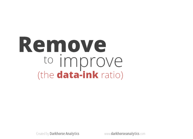
Going from one end of the spectrum to the other. Source: Data Looks Better Naked, Darkhorse Analytics
What the 2010 study showed is that a lot of chart junk is actually harmless: the message of the chart survives the embellishments and decorations.
But an area where Tufte’s rules probably hold is in what visualisation researcher Robert Kosara calls “harmfull junk”: the kind of chart junk that actively interferes with the reading and understanding of a visualization or infographic. This includes elaborate graphics that hide the true end of a bar, busy background images, etc. Non-data ink or non-data pixels that are harmful junk, should best be removed from your designs.