In order to be meaningfully visualised, larger datasets often have to be aggregated: totals, means or medians are calculated to summarise the data. The aggregation method you choose can give very different results and views on the data.
When you use totals, results might not be comparable because of correlation with population, for example (see the normalising data page). And when using the mean, you need to take into account its sensitiveness to outliers. When outliers are present in the data, you should consider using the median instead (see the median versus the mean page).
When using visual summary techniques like histograms, the output can vary widely depending on the numbers of bins used. For example, taking the data on the eruptions of the Old Faithful geyser from the distributions page, the bimodality in the data is much clearer when using 8 bins compared to using 10 bins. This means that the number of bins can be used to amplify or hide patterns in the data, for good or for bad.
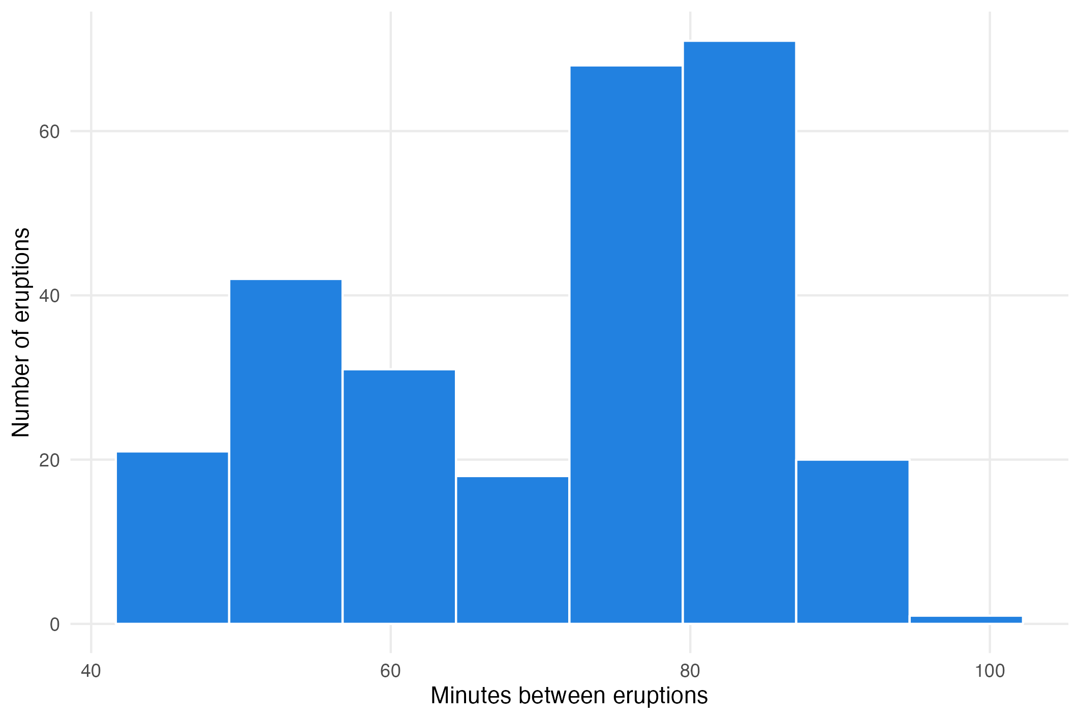
Histogram of the minutes between eruptions of Old Faithful using 8 bins. Source: Maarten Lambrechts, CC BY SA 4.0
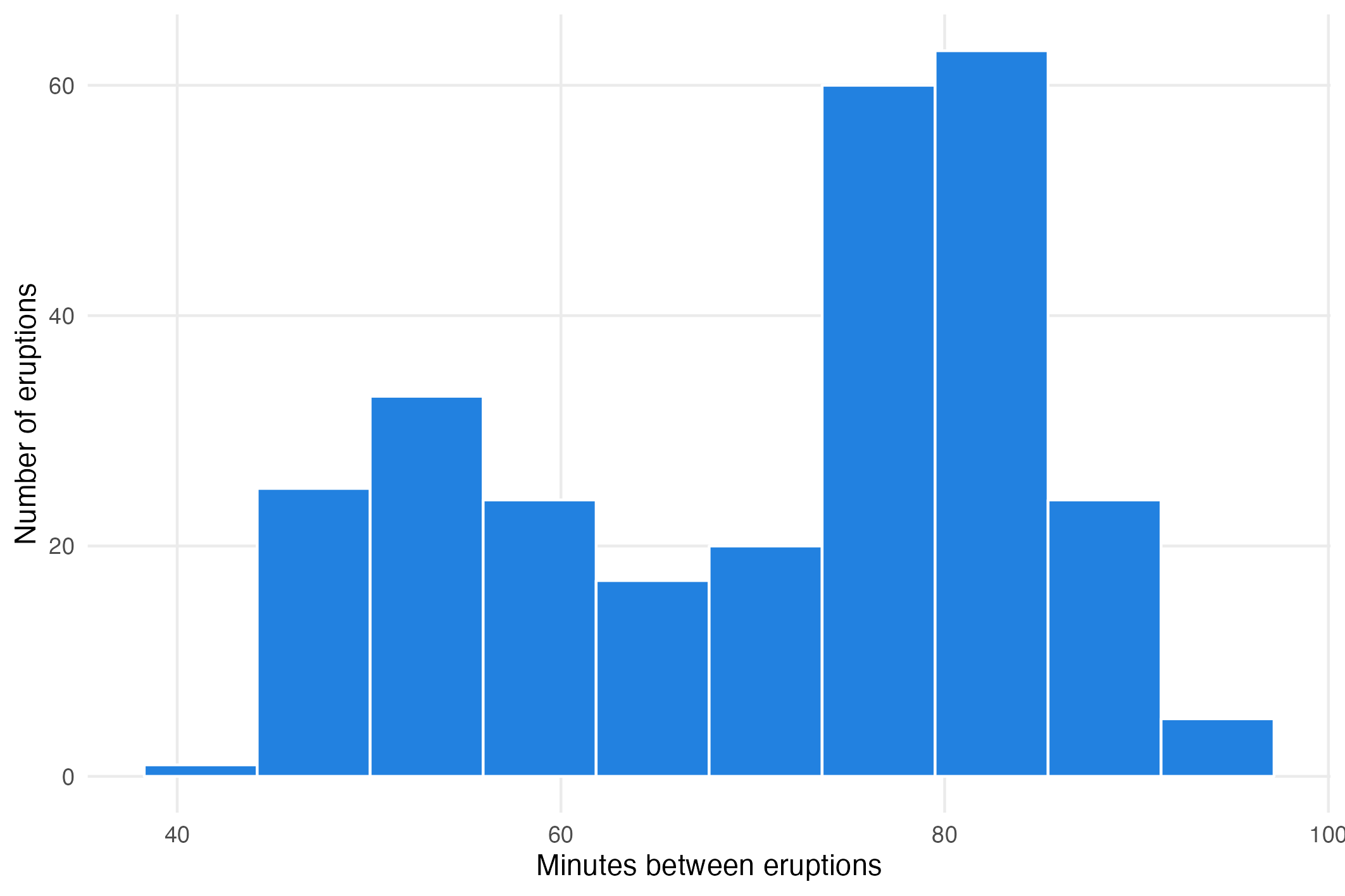
Histogram of the minutes between eruptions of Old Faithful using 10 bins. Source: Maarten Lambrechts, CC BY SA 4.0
In the same way, using different binning methods on choropleth maps can produce visually very different results (see the choropleth classification methods page). The binning method can be chosen to show or hide outliers, for example.
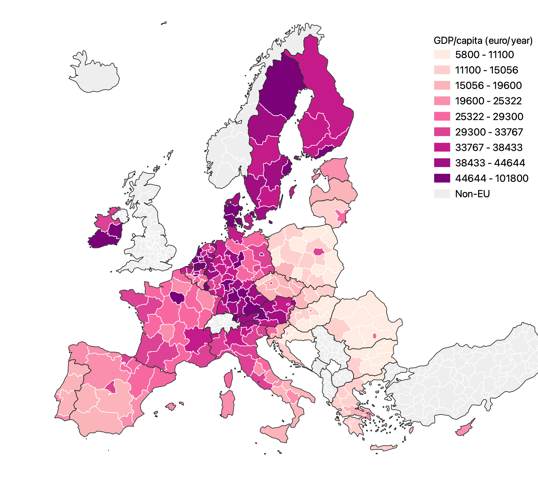
Regional gdp/capita numbers using an equal interval classification. Source: Maarten Lambrechts, CC BY SA 4.0

Regional gdp/capita numbers using a pretty breaks classification. Source: Maarten Lambrechts, CC BY SA 4.0