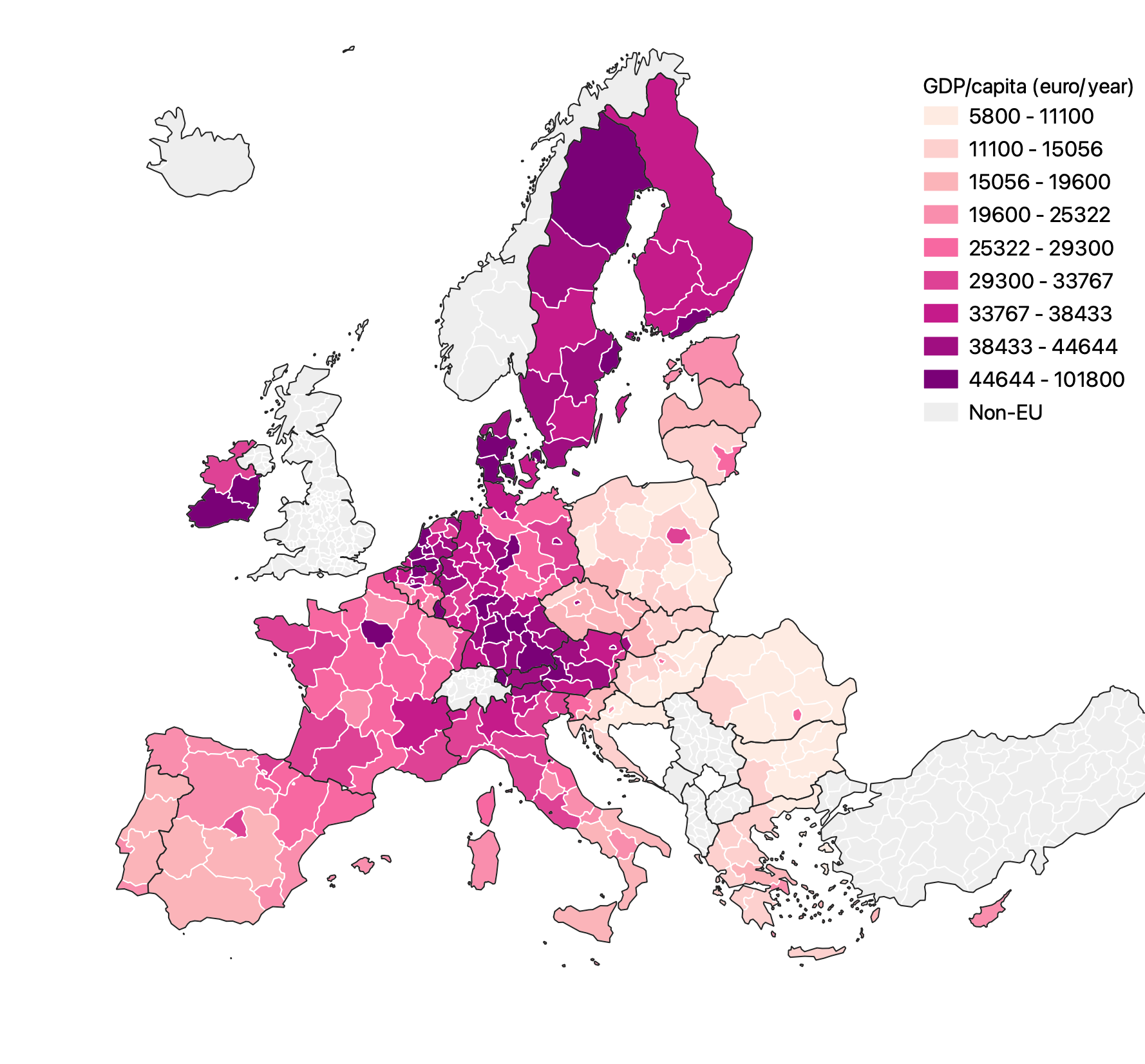
Choropleth maps are a popular way of visualising numerical data associated with geographical entities. Below is a choropleth map of gross domestic product per capita of EU regions.
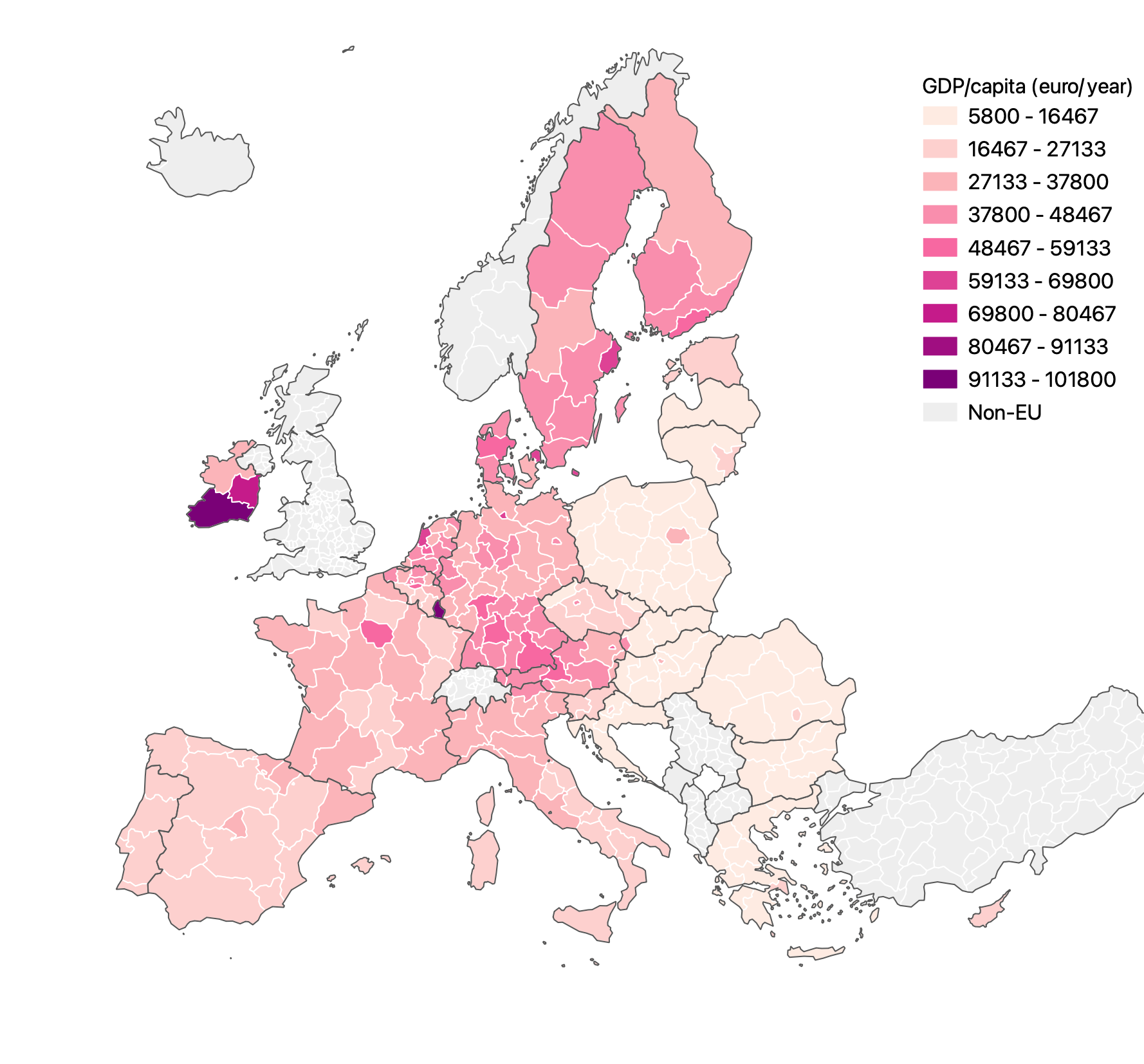
Source: Maarten Lambrechts, CC BY SA 4.0
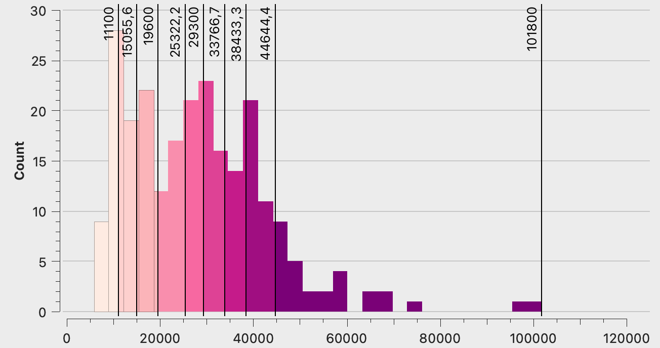
This map uses 9 classes, or “buckets”, to group regions with similar gdp together. The breaks between these classes are not chosen at random: in this case they are chosen so that each class has the same interval between the class boundaries (this method of classifying is called “equal interval”). You see that in the histogram below.
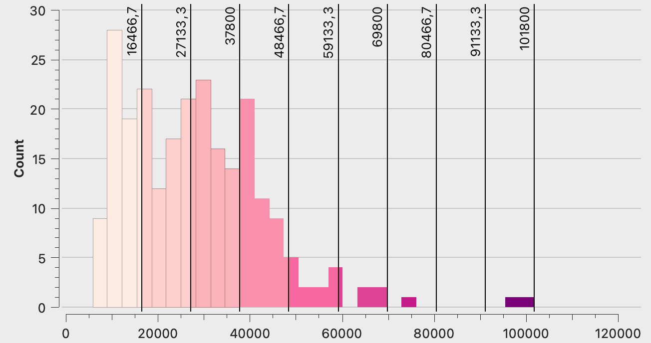
Source: Maarten Lambrechts, CC BY SA 4.0
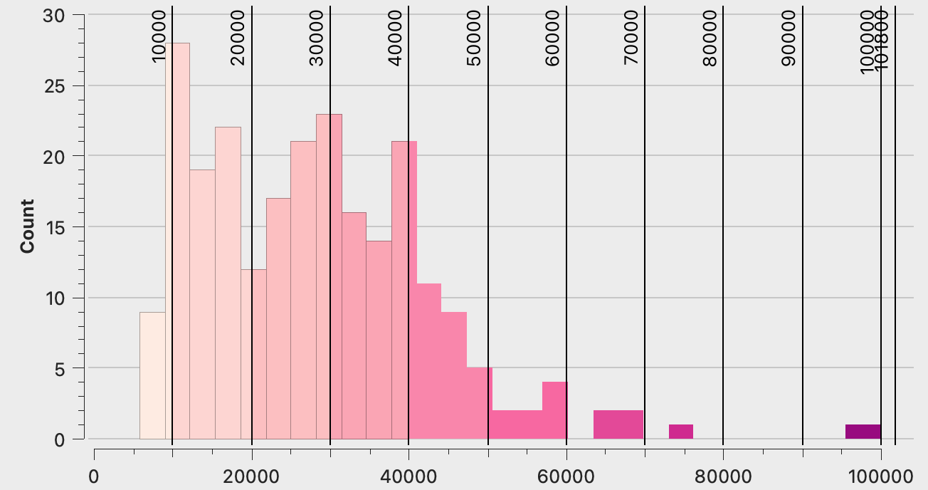
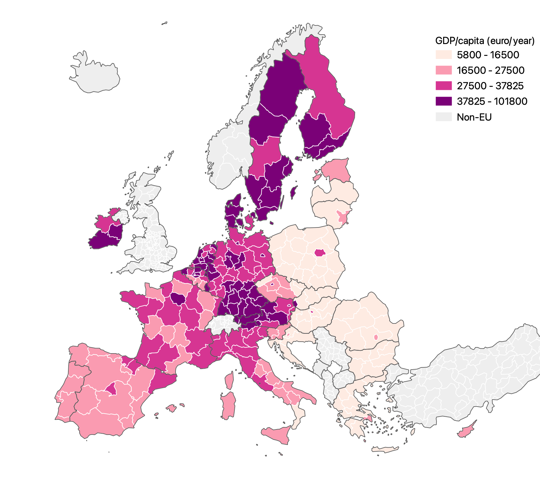
A better legible classification for this map is to use a “pretty breaks” classification, that uses round numbers for class breaks. Apart from the first and last classes, all classes still have the same width.
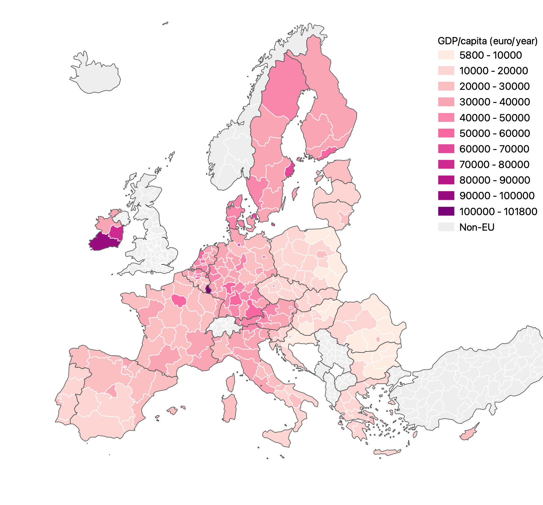
Source: Maarten Lambrechts, CC BY SA 4.0
Source: Maarten Lambrechts, CC BY SA 4.0
By now you might have noticed that 2 regions are outliers, with a very high gdp/capita: Luxembourg and the Southern region of Ireland. Using an equal interval or pretty breaks classification might not be the best choice here, because the presence of the outliers compresses a lot of the other regions in the classes with low values.
Another classification method is to choose the class breaks in a way that every class contains the same amount of regions. This is called an “equal count” classification.
Source: Maarten Lambrechts, CC BY SA 4.0
Source: Maarten Lambrechts, CC BY SA 4.0
The number of classes also determines the patterns visible on the map. This is the same map with an equal count classification, but with 4 instead of 9 classes.
Source: Maarten Lambrechts, CC BY SA 4.0
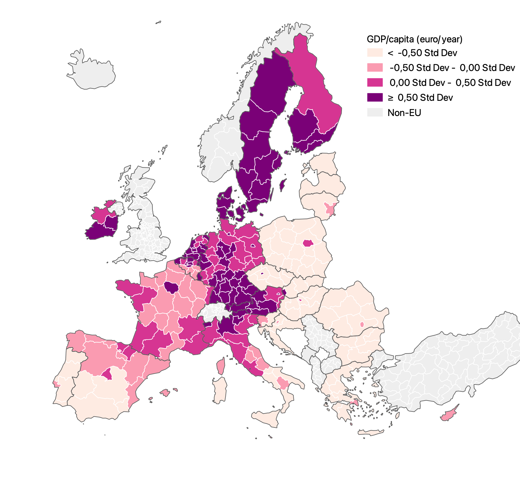
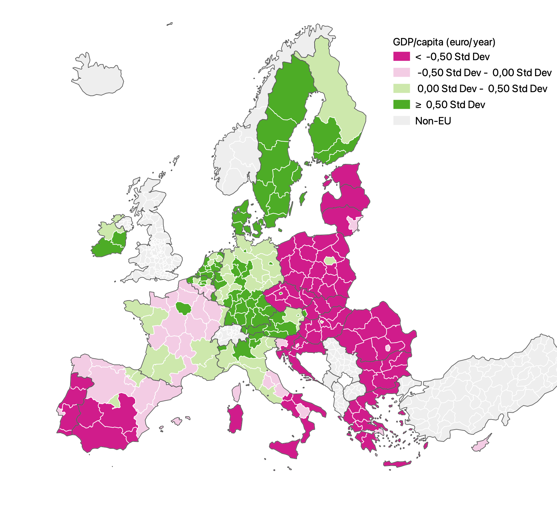
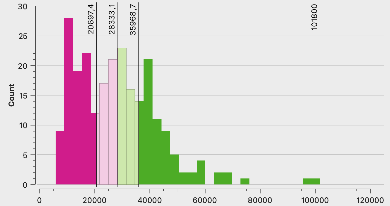
And yet another classification method is to show how far from the mean value each region’s gdp is using the standard deviation.
Source: Maarten Lambrechts, CC BY SA 4.0
In this case, it makes more sense to use a diverging colour palette, to show the regions with lower than average values with one colour, and regions with higher than average values with another colour.
Source: Maarten Lambrechts, CC BY SA 4.0
Source: Maarten Lambrechts, CC BY SA 4.0
These different versions of the regional gdp map show that a choropleth map can look very different depending on the classification method and the number of classes used. The classification method should be chosen in a meaningful way that best reveals the patterns in the data.