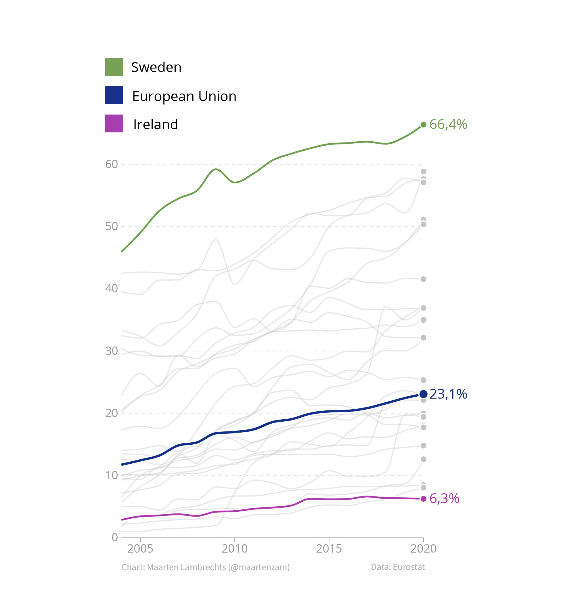
When colour is used to distinguish between categories in a visualisation, many visualisation tools will generate a colour legend to identify the categories.
Source: Maarten Lambrechts, CC BY 4.0
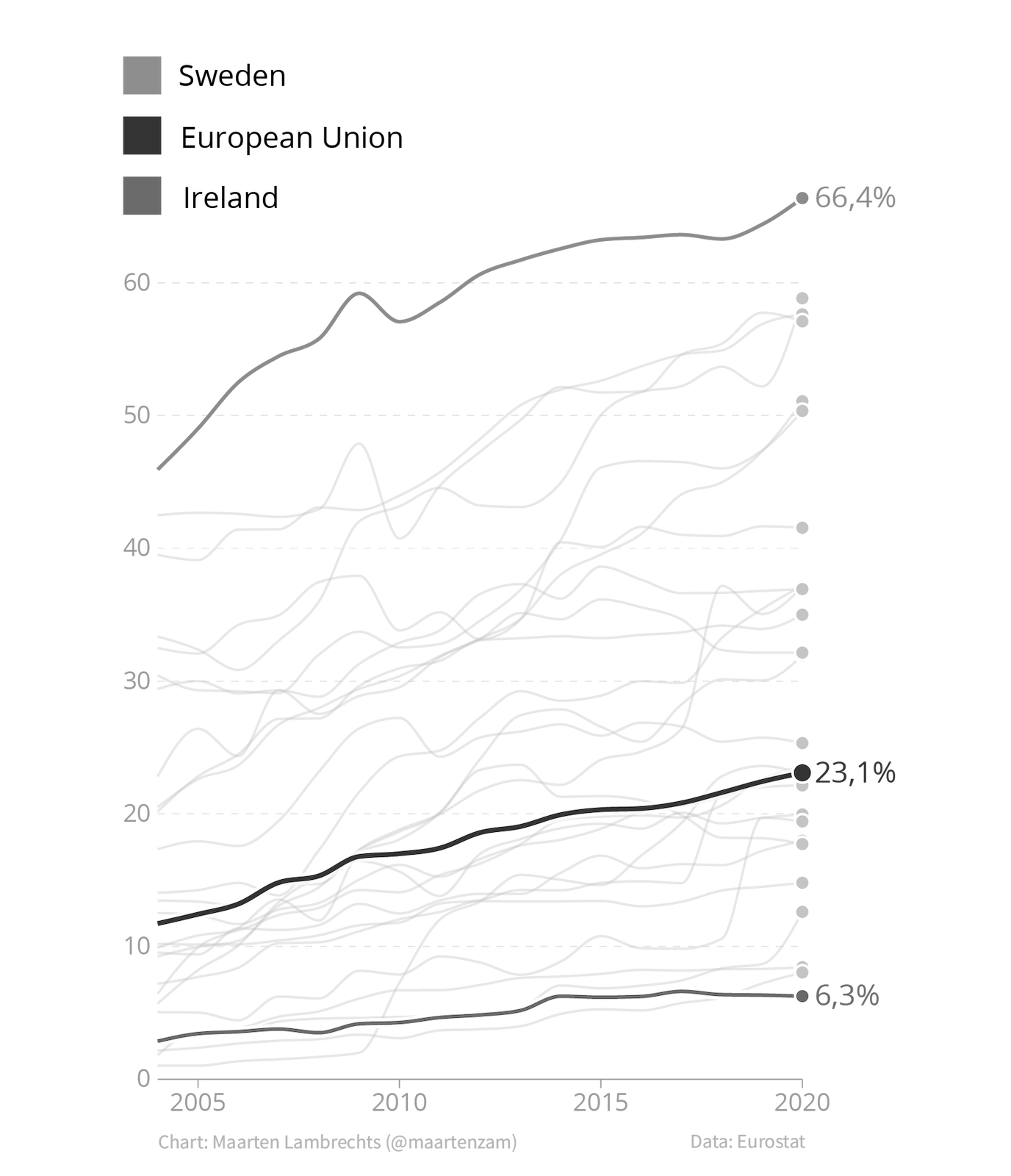
Separate colour legends make reading charts more difficult: they require readers to look back and forth between the chart and the legend to identify the elements with different colours on the chart. On top of that, many colour legend will loose their functionality for colour blind people, or when printed on black and white.
Source: Maarten Lambrechts, CC BY 4.0
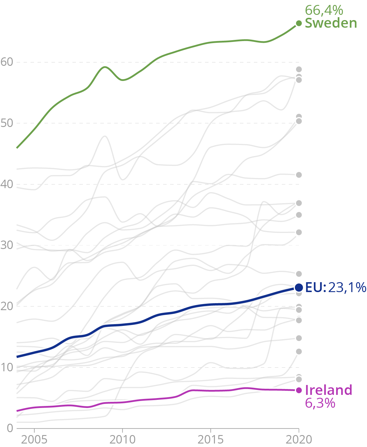
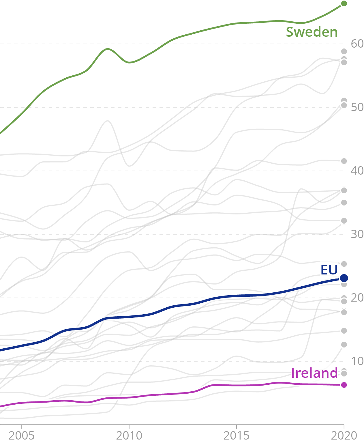
A solution to this problem is a technique called direct labelling: integrating the names of elements and categories in the chart and positioning their labels next to the elements. This removes the drawbacks separate legends suffer from.
Source: Maarten Lambrechts, CC BY 4.0
Direct labelling has its limits though: when many elements are close together on a chart, it is tricky to direct label each of them without creating overlapping text. And most visualisation tools don’t have an option to apply direct labelling. So in that case direct labelling means manually adding the labels.
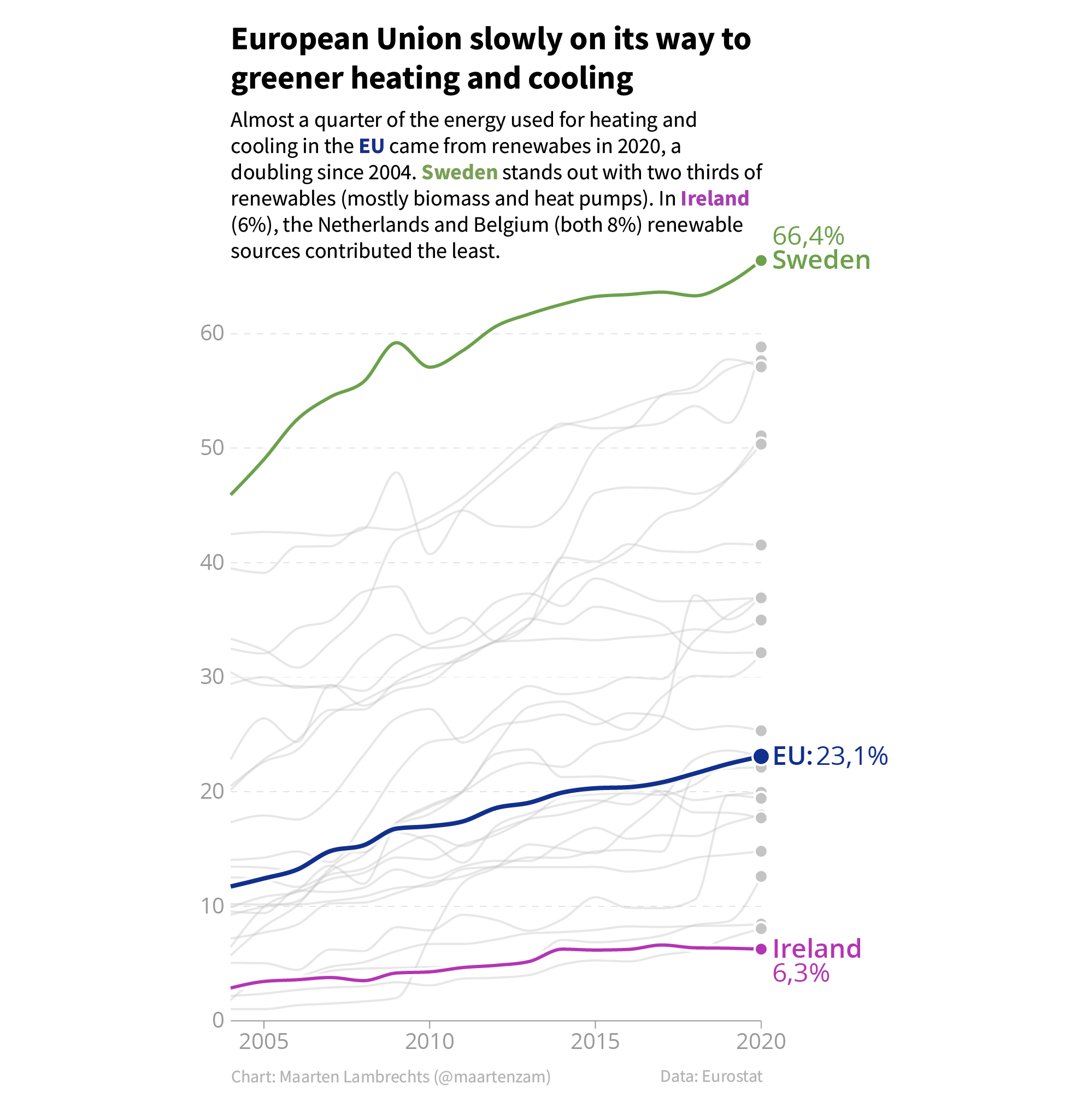
Another technique that can work really well and that integrates a visualisation and the surrounding text, is to reuse the colours on the chart in the surrounding text.
Source: Maarten Lambrechts, CC BY 4.0
Many visualisation tools put the y axis on the left of charts. This creates space for labels on the right side of the chart. But online charts showing time series data, the most interesting values on the chart are usually the most recent data. So when no labelling is applied, it makes sense to move the y axis to the right of the chart.
Source: Maarten Lambrechts, CC BY 4.0