Text elements like data labels and annotations might be placed on top of parts of a visualisation that carry some colour. This also happens a lot with labels on maps. To assure that text is always readable on any background, mapping tools usually have an option to apply a halo to text. A halo is an outline of text that has a different colour than the text itself. By making the text dark and the halo light (or vice versa), you can ensure that text elements always have enough contrast with their background.
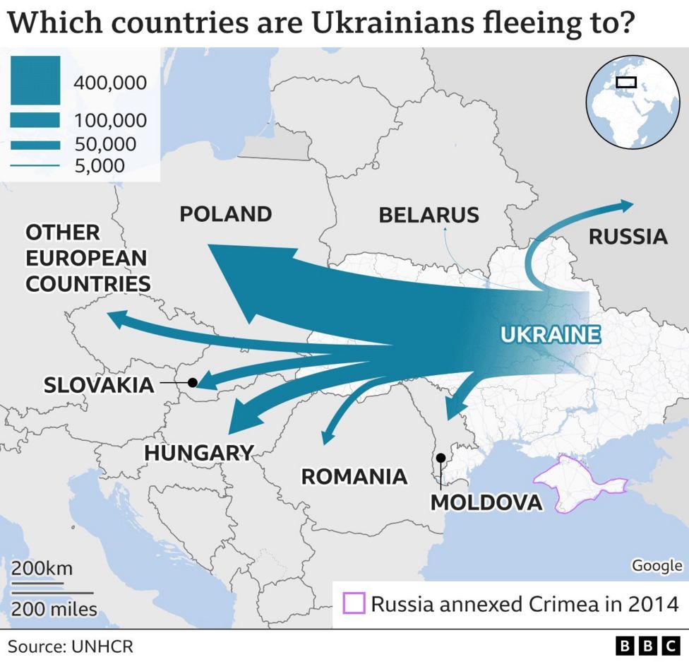
In this map, most country names have a white halo applied to them. This makes them stand out and makes sure they are easily legible, even when they run over country boundaries. Source: Ukrainians on way to UK hit paperwork dead-end in Calais, bbc.com
If the text elements of your chart are positioned on coloured elements in the background, you can consider to add a halo to it to guarantee legibility. The halo can be subtle…
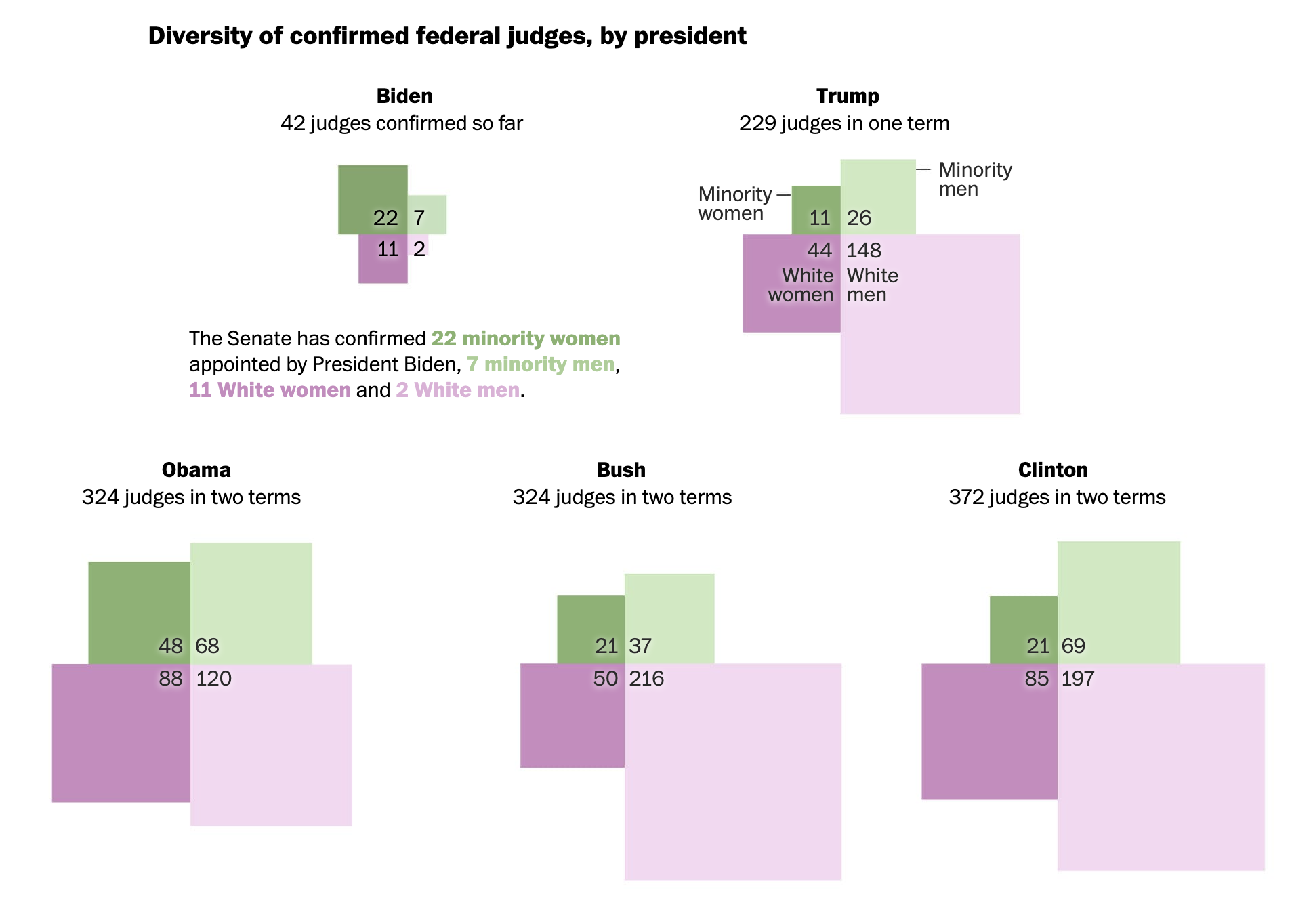
Source: Biden, who pledged to diversify the Supreme Court, has already made progress on lower courts, Washington Post
…or very strong.
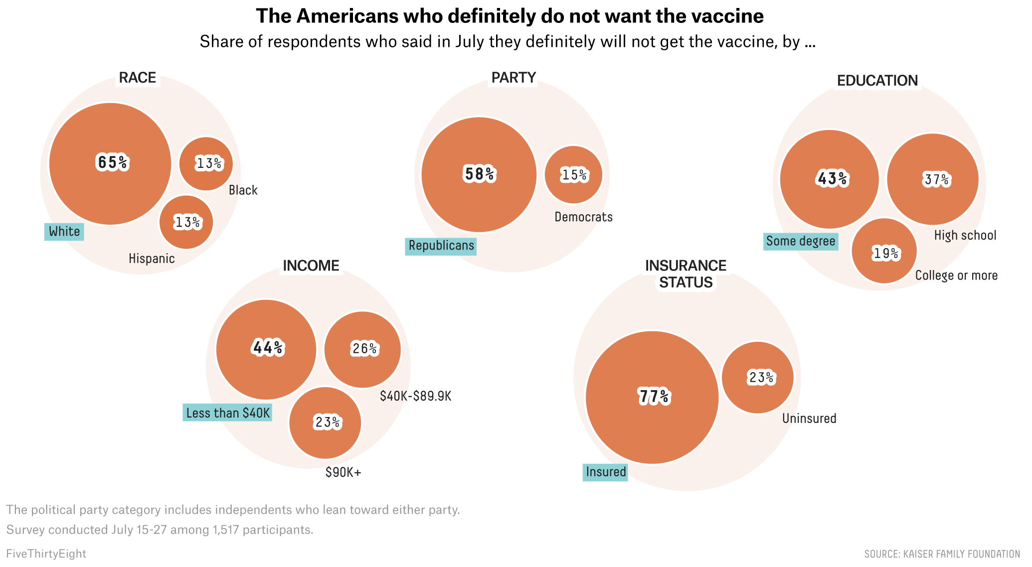
US based data journalism medium FiveThirtyEight has a very striking data visualisation style, which includes heavy text outlines. This makes annotations stand out and legible on all backgrounds. Source: Unvaccinated America, In 5 Charts, fivethirtyeight.com