Thinking about your visualisations as a set of information layers stacked on top of each other can help in structuring their design.
You might think that the graphical elements in a visualisation, like lines, dots and bars, are its most important element on a chart. But you can argue that the text that is embedded in a visualisation is more important than these graphical elements. After all, if you take away all text from a visualisation, there is not way for the reader to understand a chart or to take away any message from it.
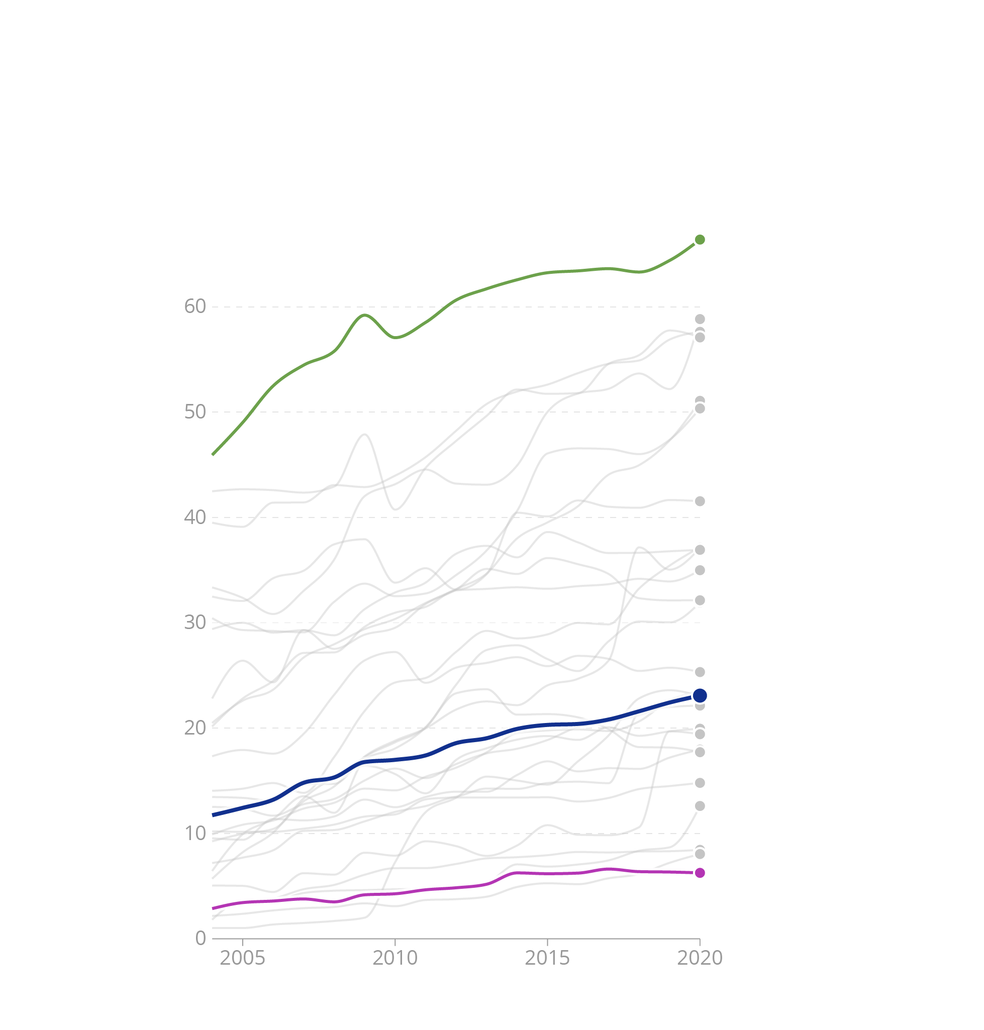
Source: Maarten Lambrechts, CC BY SA 4.0
On the other hand, if you leave out the graphical data elements, readers will still understand the topic of the chart, and if the title is well written, they will still be able to tell what the message of the chart is.
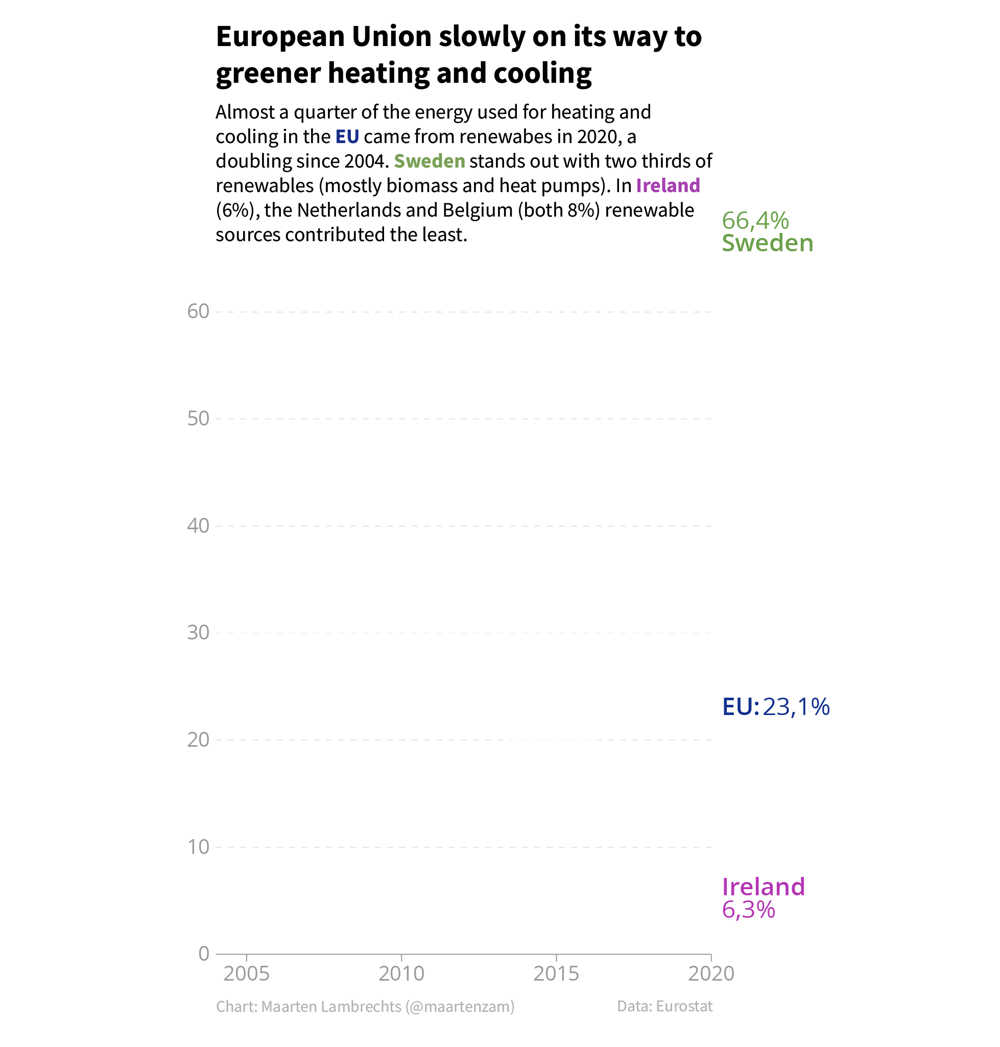
Source: Maarten Lambrechts, CC BY SA 4.0
Based on this argument, we can determine how the layers in a visualisation should be stacked:
- because text is the most important element, it should be on top of the stack, and on top of all other layers
- the graphical elements representing the data should be stacked below the text
- lastly, all other layers that help in reading the chart are positioned at the bottom of the stack. This layer contains things like the axis lines and gridlines.
Many visualisation tools will use this stacking order automatically, and as a user you can’t control how layers are stacked. But in other tools it is up to the user to determine the stacking order.
This stacking is not set in stone, however. If you control the stacking order, you can be creative and apply the technique of “invisible visible gridlines”. This involves giving the gridlines the same colour as the background colour, and stacking them on top of the data elements.
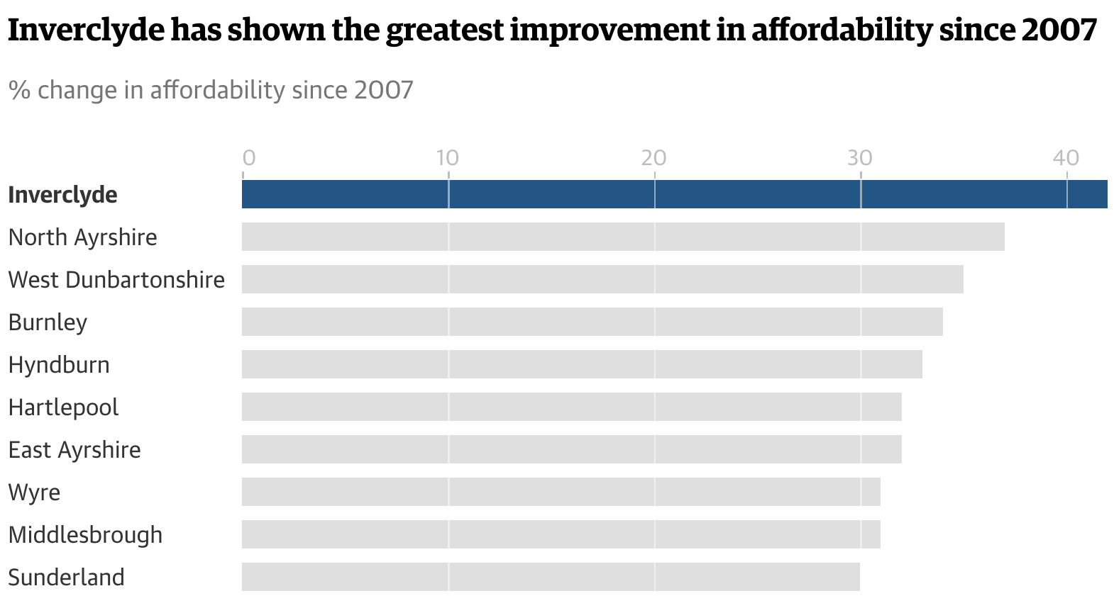
Source: Houses more affordable across half of UK now than in 2007