For visualisations using a cartesian coordinate system, with an x and y axis enclosing the plot area, a common pattern is to apply some margins around the plot area to place text elements, like the title, the axis titles and the axis labels.
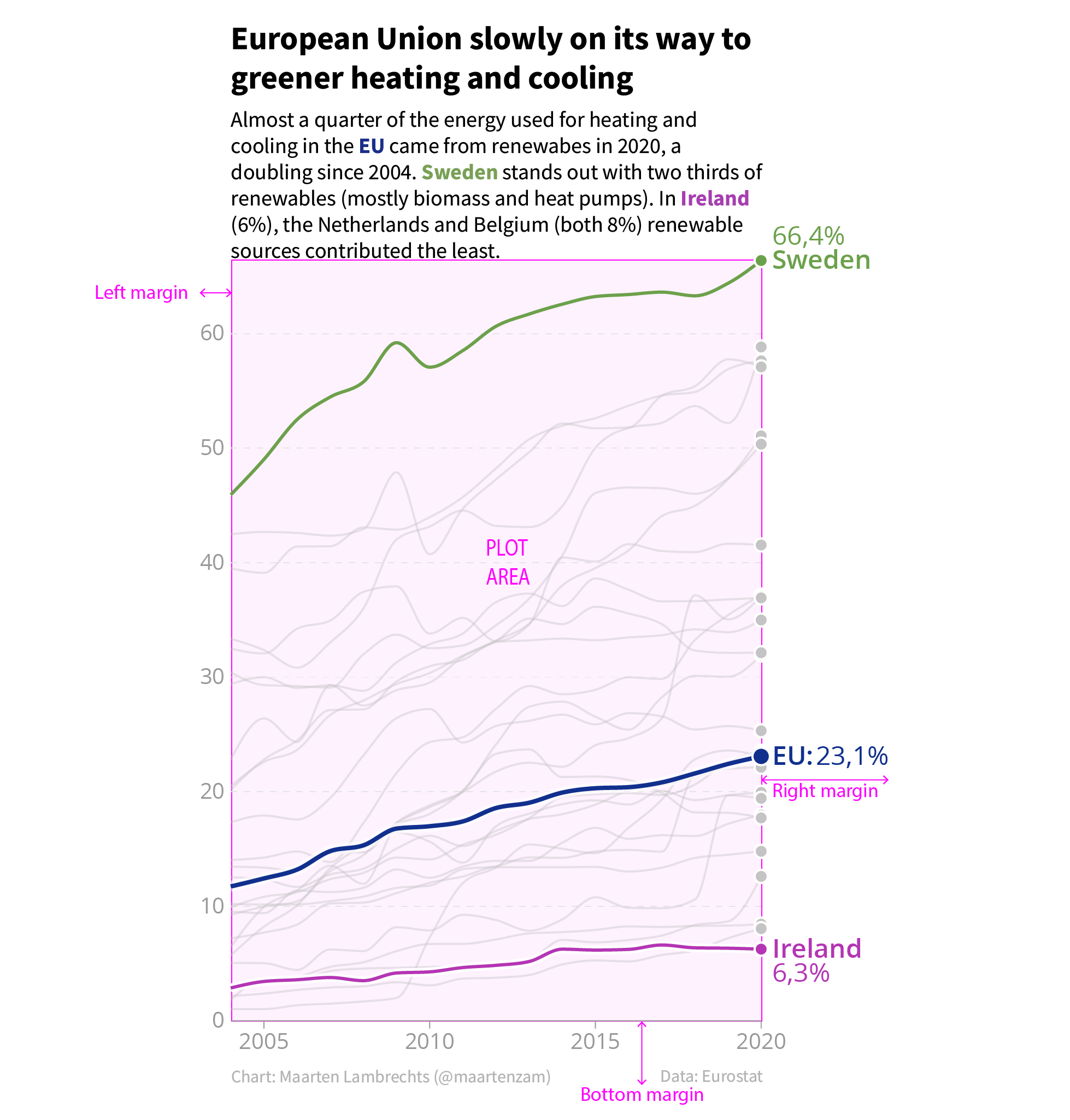
Source: Maarten Lambrechts, CC BY SA 4.0
Many visualisation tools apply this pattern, because it ensures that these text elements are not overlapping data marks and other elements in the plotting area. But sometimes the shape of the data is such that parts of the plot area do not contain. In those cases, you can deviate from the margins pattern, and move text elements into the chart. Gridlines are not useful for the parts of the plot area where there is no data visible. So they can be cropped without any issue.
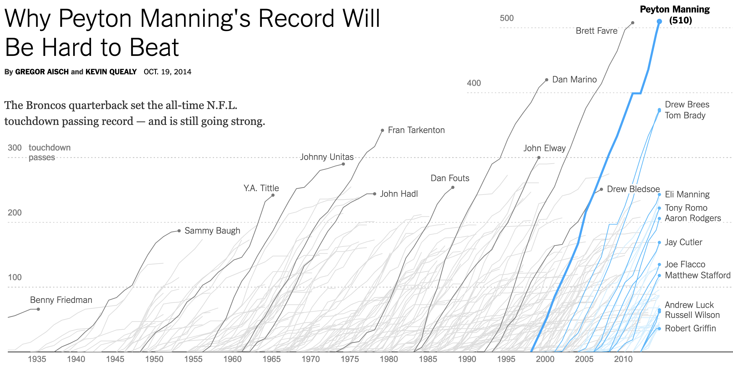
Source: Why Peyton Manning’s Record Will Be Hard to Beat, nytimes.com