The Office for National Statistics of the UK translated the insights regarding chart titles from research and from practitioners in fields into a guide for chart titles to support chart authors.
The main idea of the guide is that chart authors should formulate the main message of the chart in 10 words or less. Adding titles like this to charts has several benefits.
Reading the main message of a chart before even start looking at it and interpreting it, prepares the reader for what to look for in a visualisation. This can speed up reading and comprehension, and can avoid misinterpretation. And as the research has shown, this title can make people remember the chart and its message better.
The chart title should not contain metadata and statistical information, like the shown time frame, the geographical area or the units of the data. This information can be provided in other places on the chart, like in the subtitle, the chart itself or in notes below the chart.
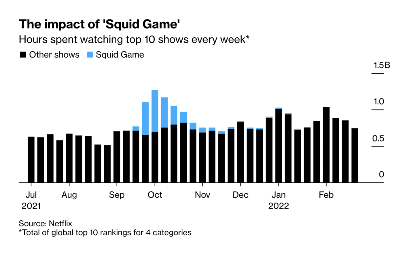
The units of the data and additional notes on it are provided in the subtitle and notes below the chart, while the title is reserved for the main message of the chart. Source: These are Netflix’s Most Popular Shows (According to Netflix), bloomberg.xom
This approach to chart titles has additional benefits. The need to summarise the main message of a chart can make chart authors think about the optimal chart type for the message and about the placement of the chart in a publication. It can even lead to questioning whether a chart is needed at all.
Also, a telling title makes a chart more self contained: readers have less need for the surrounding content to understand a chart ant its purpose.
Any objections?
Common objections to the application of this approach to chart titles can be
“My chart contains more than one message”
Charts trying to communicate multiple messages at once can be overwhelming and confusing for readers. As a chart author, you should prioritise the messages and design your visualisation for the most important one. Secondary messages can be added through the use of text annotations or notes on the chart, or by providing more explanations in the surrounding text.
In case of multiple messages of equal importance, you can consider making multiple visualisations. “One chart, one message” is a good rule to stick by.
“By adding messages in the title, I could be accused of being biased”
This is a common concern in the context of charts being produced in organisations that have to remain a neutral position, like government agencies and statistical offices. But in most cases, describing the message of a chart can be done in a neutral way, sticking to the patterns in the displayed data. If numbers are going up over time, there is no bias in stating that in the title of a chart. If needed, clarifications can be added through annotations or notes.
Filtering out data and leaving additional data and information out could be considered introducing bias in a visualisation. If this left out information is important for a good understanding, than additional explanations or additional visualisations (with their own chart titles) can be added so that people can understand the bigger picture correctly.
“My chart is interactive, so its content is dynamic and a telling title might not be valid for some views on the data”
This is a valid concern. Descriptive chart titles only make sense in explanatory data visualisation, where chart authors’ objective is to communicate a pattern in the data to their audience. In exploratory data visualisation, where people can use interactive features like filtering, aggregating and changing the chart type, descriptive chart titles can’t be applied.
For exploratory data visualisations (which are interactive by nature), it makes more sense to add a title that invites the user to start interacting with the chart and its user interface. Media and other organisations have experienced that titles like “Explore how crime varies by type” can work well for these kind of interactive data visualisations.
If you can manage to address people directly, by putting “you” or “your” in the title, for example with a title like “See how your area compares to the national average”, this can work even more as a trigger for people to start exploring. You can find examples of this technique in the Putting the “you” in the headline page.
More guidelines
Given the convention on reading order, chart titles should be placed in the top left corner of the visualisation. Research has shown that placing titles in other places, like below the chart, leads to readers focussing less on the titles.
The title should also have the biggest font size, to augment the likelihood of people focussing on the title even more.
Titles should not repeat the message of the preceding and surrounding text. Instead, the title and the message of the chart should build upon and complement the surrounding context.
Above all, chart titles should not contradict the patterns visible on the chart, or point to secondary patterns when another, more obvious pattern is present.
An example of a chart title that does not align well with the patterns visible on the chart. Source: @GoodPoliticGuy
Finally, as The Economist proves, even a serious medium reporting on serious topics can make use of humour in chart titles to engage their audience.
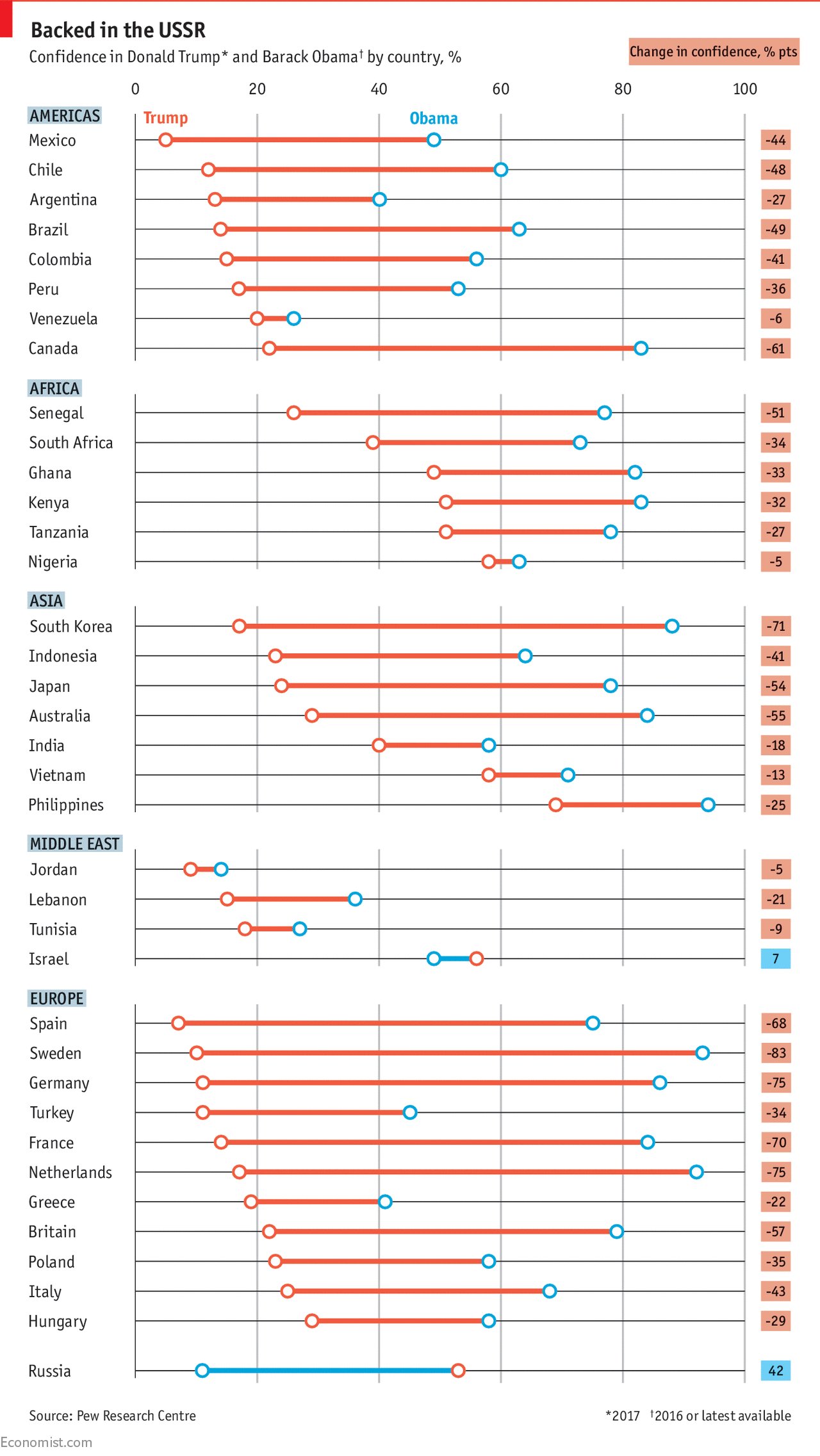
Source: America’s global standing plummets under Donald Trump, Economist.com
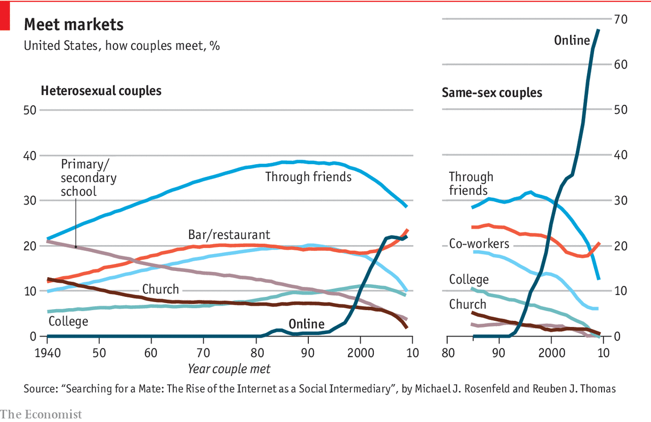
Source: The irresistible rise of internet dating, Economist.com
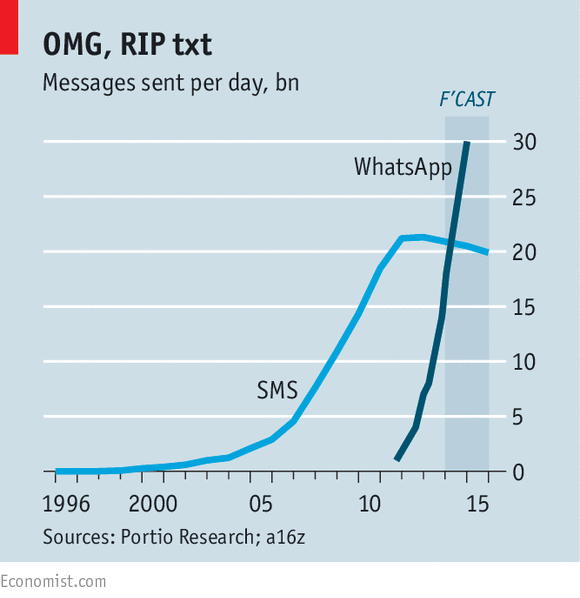
Source: The message is the medium. Economist.com
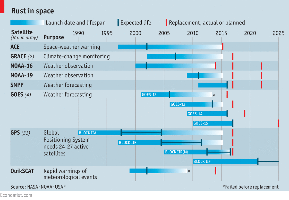
Source: Tough old birds, Economist.com