Research has shown that the title of a visualisation is very important in communicating its purpose: it is often the first thing people look at in a visualisation, and what people remember best after being exposed to the visualisation. When a user is using a screen reader and the title of the visualisation is accessible to it and positioned correctly in the document, the title will also announce the visualisation.
So the title of a visualisation should not be a generic one, like “Share of renewables in energy used for heating and cooling”, but should instead communicate what the user should look for in the visualisation and what to take away from it, like “European Union slowly on its way to greener heating and cooling”.
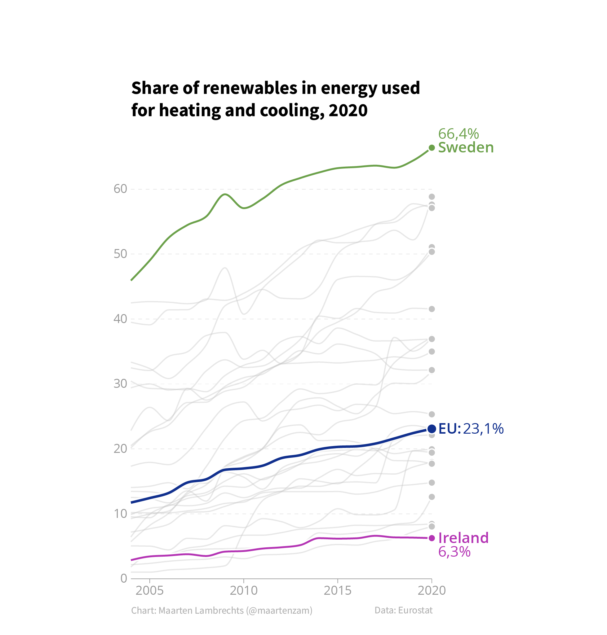
Source: Maarten Lambrechts, CC BY SA 4.0
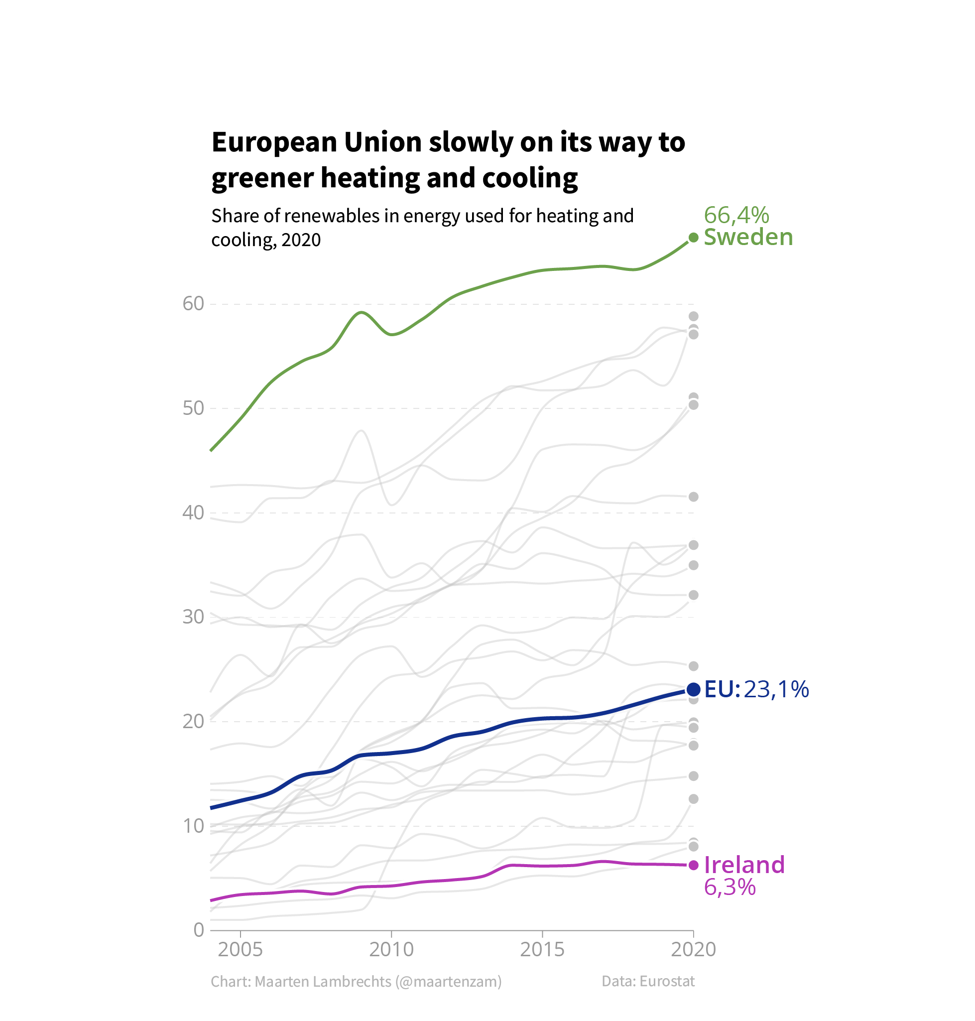
Source: Maarten Lambrechts, CC BY SA 4.0