In online media, a powerful way to relate data to people and their is to let readers find themselves in the data. With search and filter functionality, the readers can find and visualise the data most relevant to them (like the local statistics for their municipality, the wages paid in the sector of the economy they are working, or key numbers for their age group).
This technique can be called “Putting the “you” in the headline” because that is what many of the titles of these interactives published in media have in common: they address readers directly, and invite them to start interacting to find their own data.
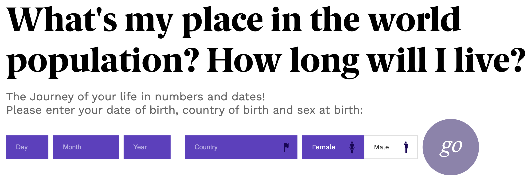
One example of this technique is population.io. Instead of putting “you” in the headline the site is putting “my” and “I” in the headline, but the interface is boldly inviting you to provide some data about yourself.
Source: population.io
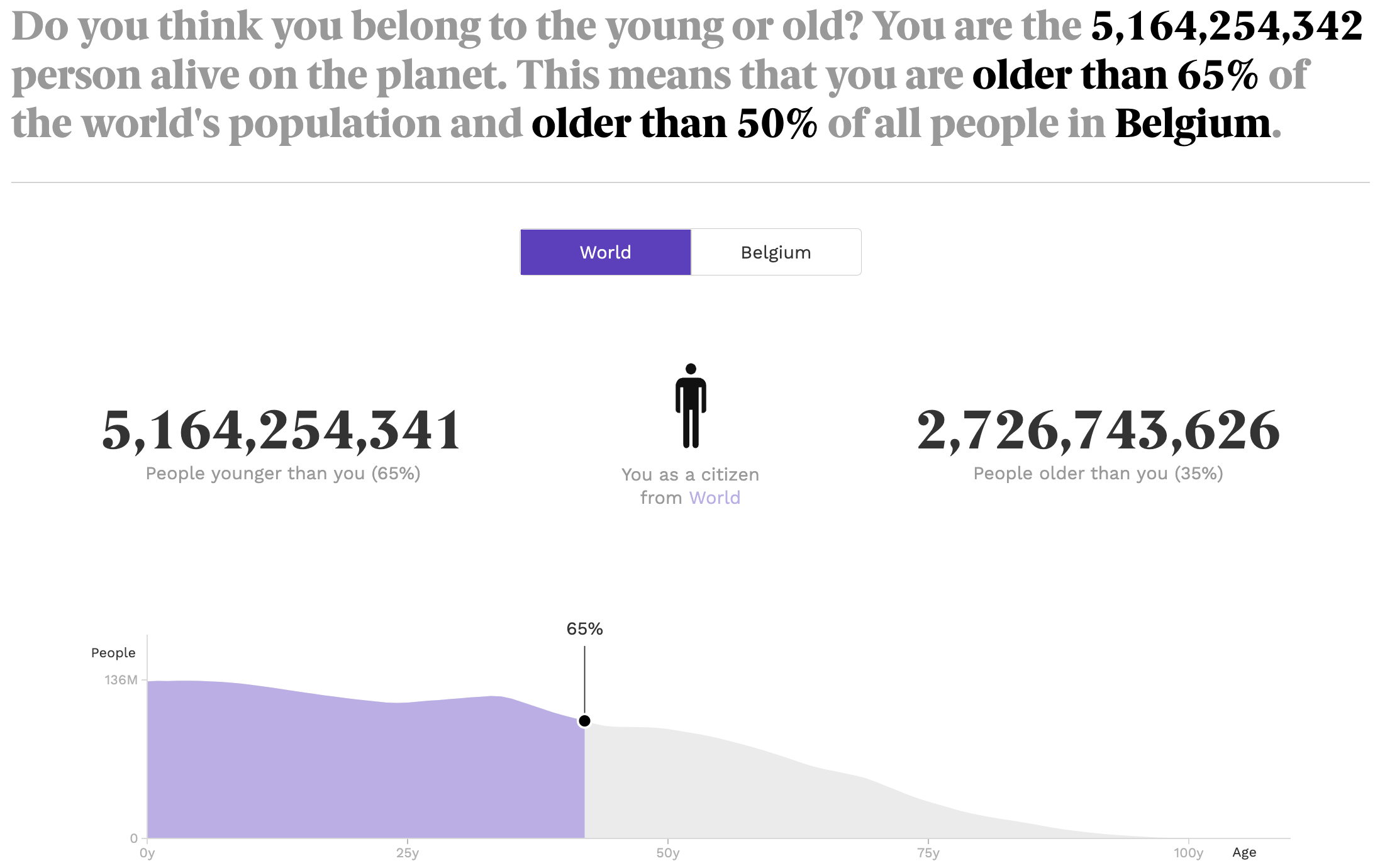
After entering your data, the site returns some personal statistics about yourself in the world population and the population of the country you live in.
Source: population.io
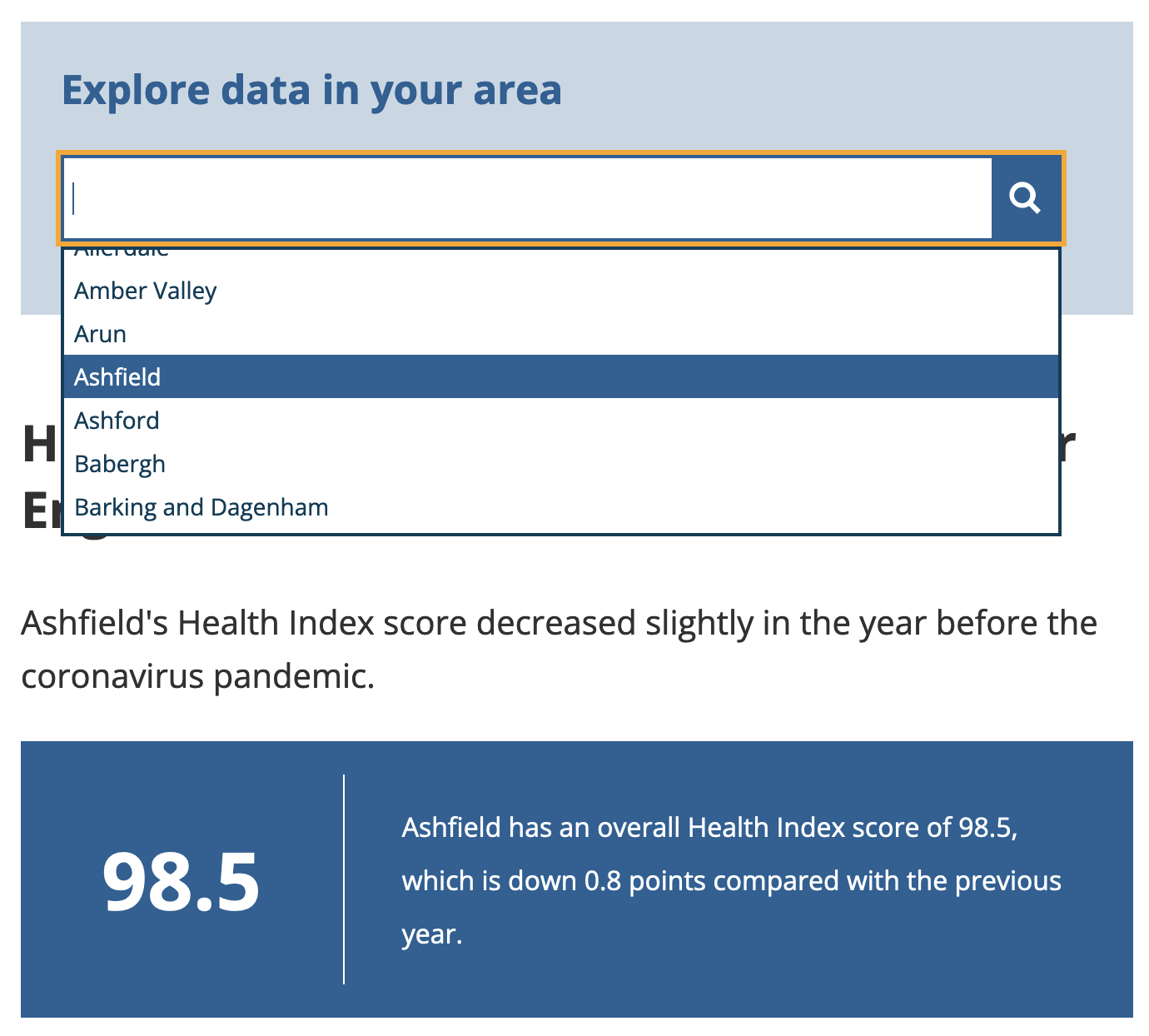
The Office for National Statistics of the UK put the “you” in the headline in How health has changed in your local area. After selecting an area of interest, the text and the visualisations of the article are updated and center around the selected area.
Source: How health has changed in your local area, ons.gov.uk
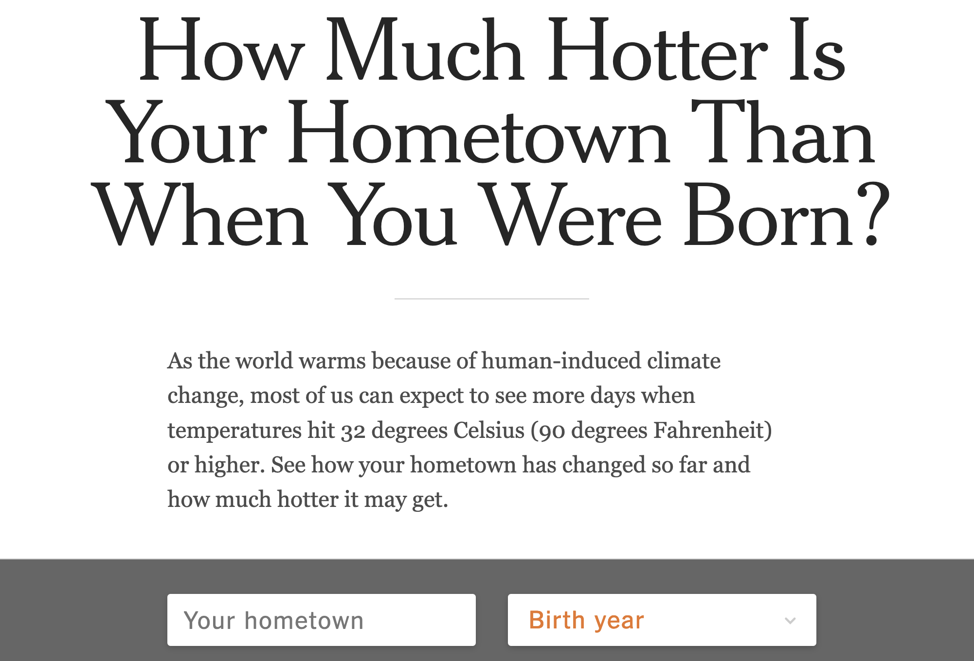
The New York Times managed to put the “you” in the headline twice in a single piece. The interactive in How Much Hotter Is Your Hometown Than When You Were Born? asks you for your birth year and hometown to not only connect you to your age group, but also to a geographical place you care about.
Source: How Much Hotter Is Your Hometown Than When You Were Born?, nytimes.com
After providing this information, you are presented with a personalised visualisation.
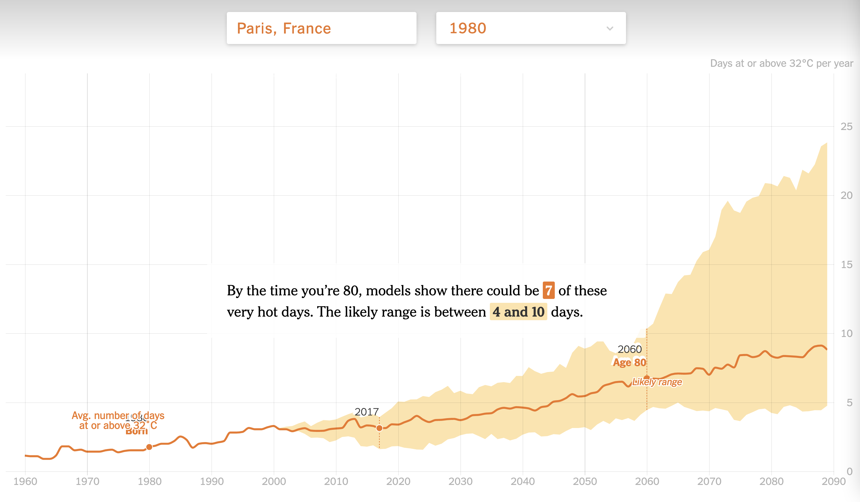
Source: How Much Hotter Is Your Hometown Than When You Were Born?, nytimes.com
These Put the “you” in the headline interactives can be really powerful, engaging and popular. But the amount of information the user needs to provide, and the ease with which this happens are critical for their success. If the amount of information to be entered is too large, or when the user interface is confusing or not easy to use, users will disengage very quickly.
For this reason, the article The Best and Worst Places to Grow Up: How Your Area Compares, tried a novel approach to make it easier for people to find the data for the area they live in. The main interface of the interactive article is a map, with a search box to find a particular county. The map is centered on New York (this is a New York Times article), but if users agrees to share their location through the browser, the article zooms in to the location of the user automatically.
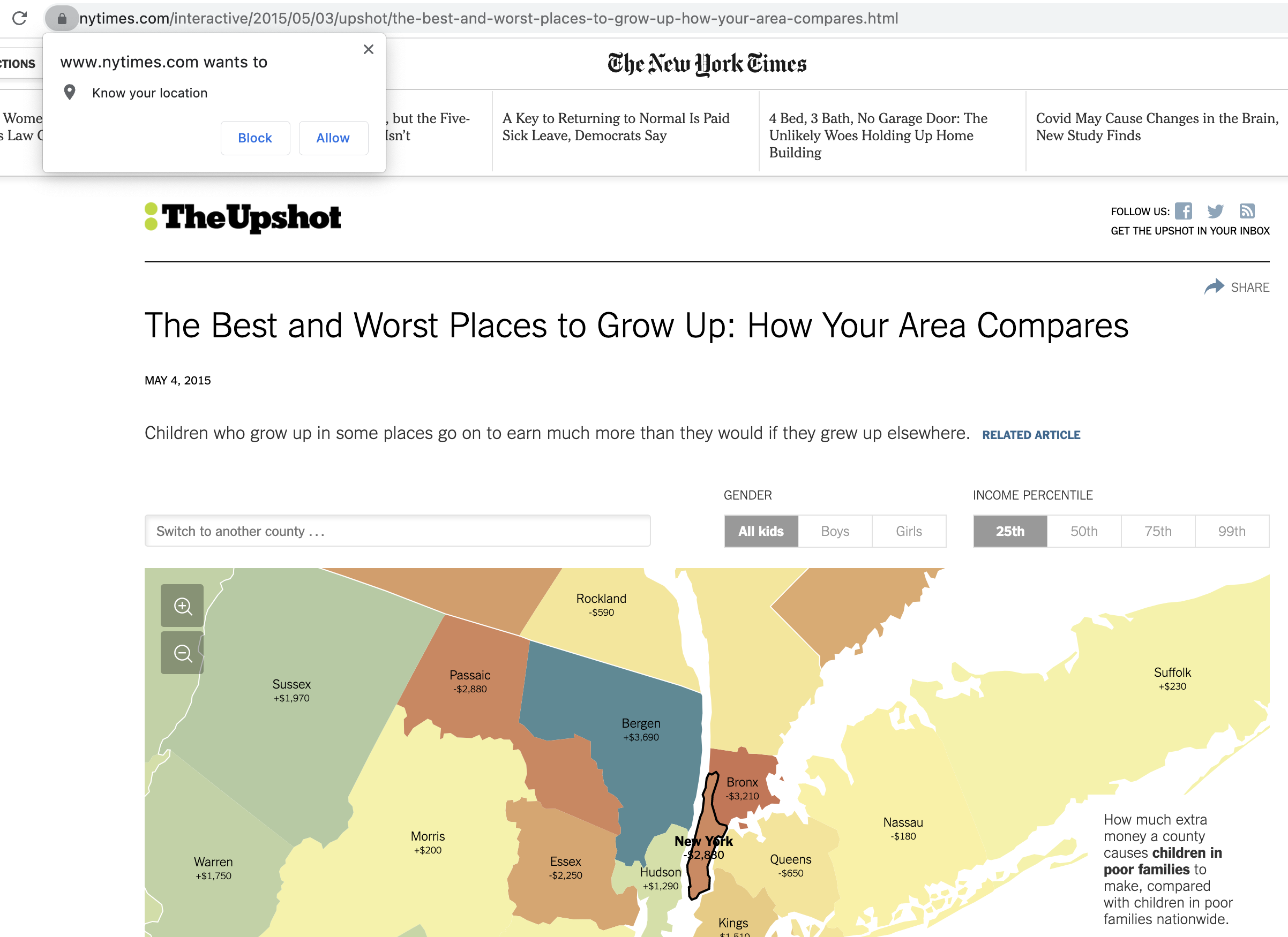
The browser requesting to share the user’s location. Source: The Best and Worst Places to Grow Up: How Your Area Compares, nytimes.com
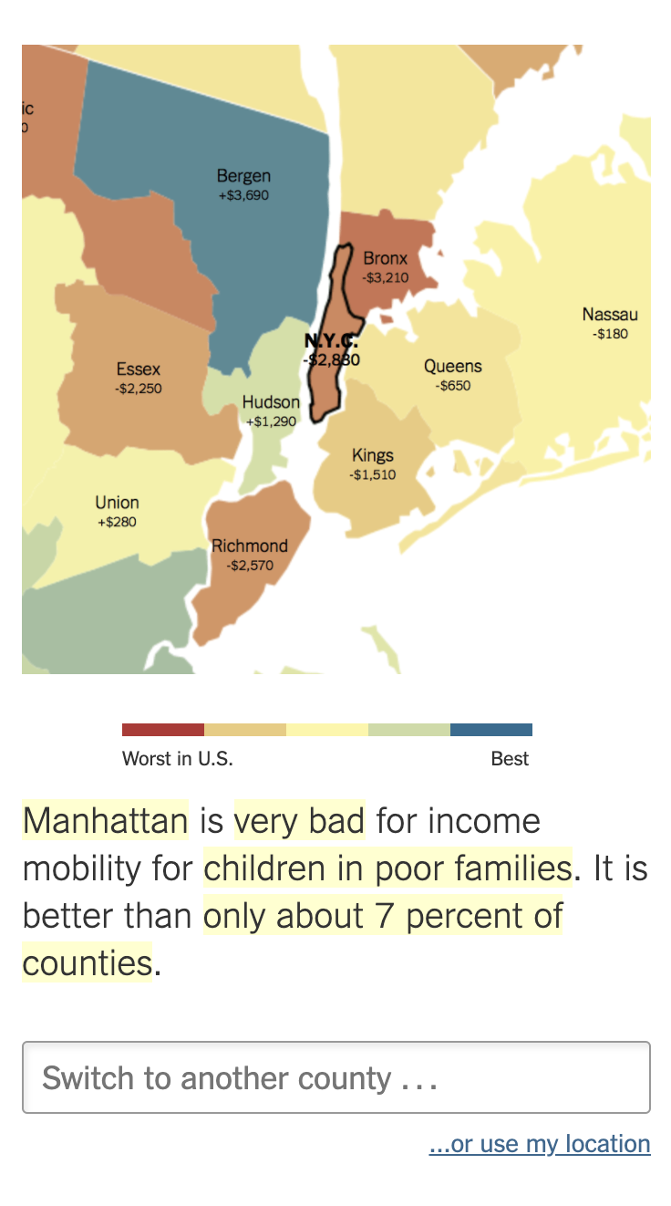
After sharing your location, the map zooms in to your county (if you are in the US), so you can consult the numbers for your county. But it doesn’t stop there: the text of the article adapts itself, and puts your county up front. The text mentions the numbers for your county and even compares it to neighbouring counties and other counties in the same state.
Interesting to note here is that on desktop screens, users can zoom out to see the whole map of the US. But on mobile phone, this option is disabled: users can only share their location or search for a county to let the map focus on a single county.
On mobile screens, the interactivity of the map is limited to just searching for a county. Source: The Best and Worst Places to Grow Up: How Your Area Compares, nytimes.com
So on mobile phones, the article is clearly violating the information-seeking mantra, as one of the authors of the article, Gregor Aisch, explained himself during a conference talk.

Source: Data Visualizations and the News, Gregor Aisch at Information+ Conference 2016