Since covid-19 entered our world, we have become all too familiar with exponential growth and the use of logarithmic scales in data visualisation. The “why” of the use of log scales is explained very well by others, the focus here is on the “how”: how to design an axis that uses a log scale without confusing readers.
The easiest way to make it clear that a chart is using a logarithmic scale is to simply add an annotation like “Logarithmic scale” to the axis title or in some other place on the chart.
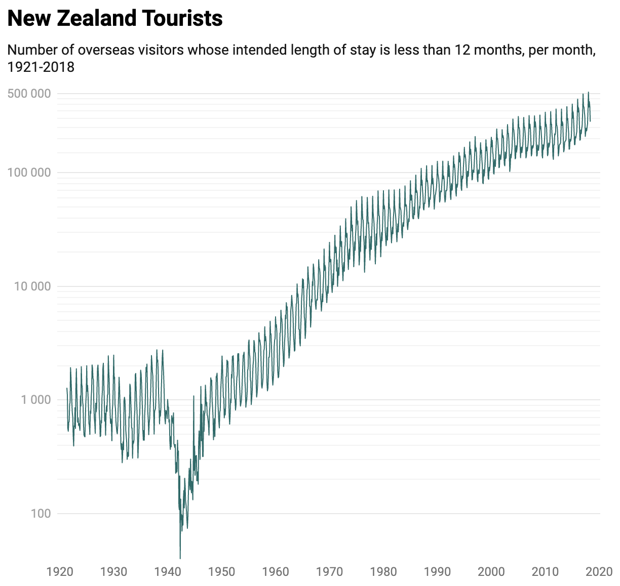
But there is more you can do. If the range of the data on the axis spans multiple orders of magnitude (from 1 to 1 million, for example), you can label each multiple of 10 on the axis. This makes it clear that the same interval on the axis means a multiplication by 10.
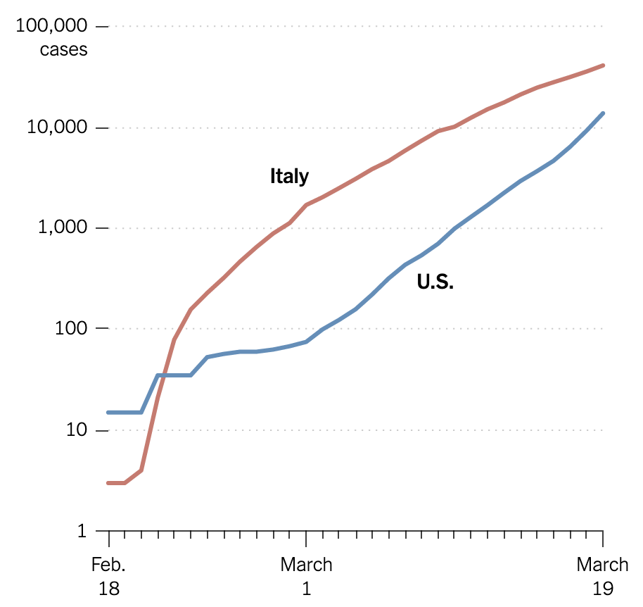
Source: A Different Way to Chart the Spread of Coronavirus, nytimes.com
When gridlines for the values in between the axis labels are added, these signal how intermediate values are “contracted” for higher values, which is an indicator for the use of a logarithmic scale.
Source: edited from How to read a log scale: Growth rate, blog.datawrapper.de
The same effect can be achieved with tick marks instead of grid lines, and intermediate axis labels can also be added:
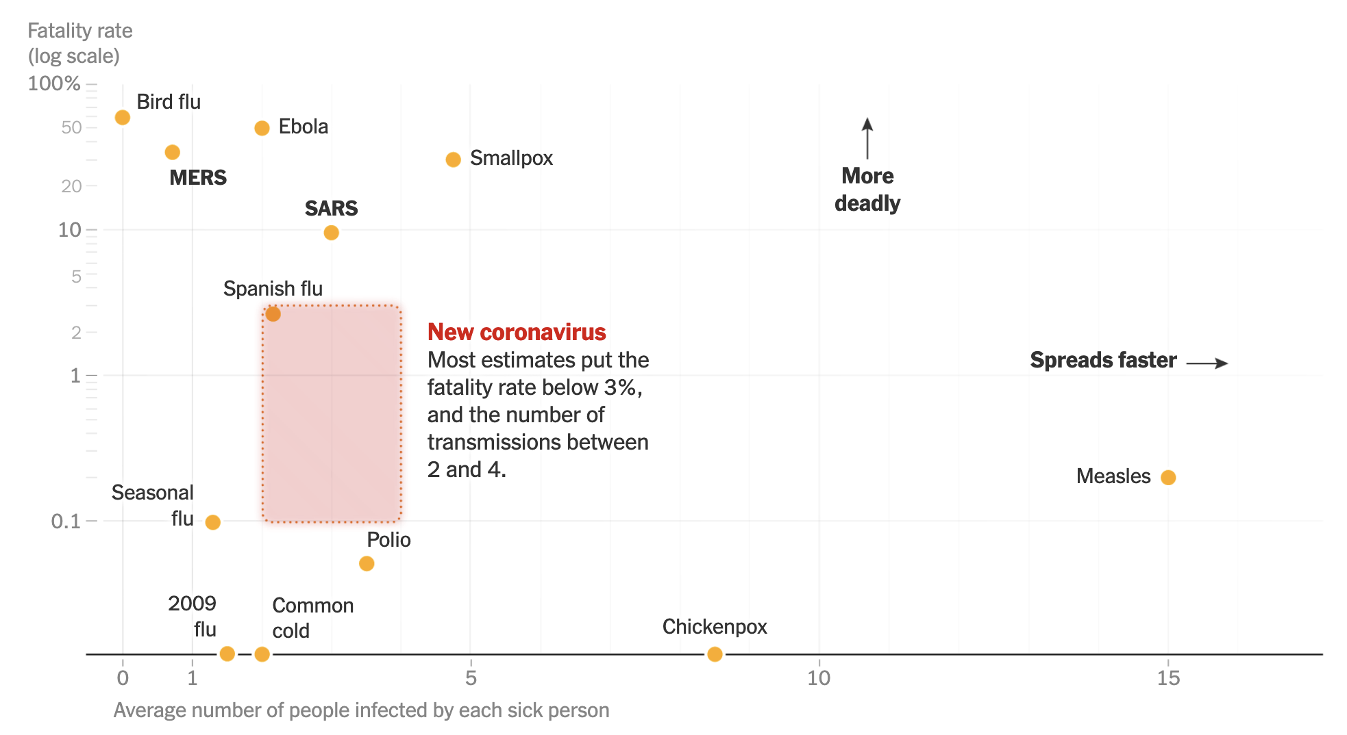
Source: How Bad Will the Coronavirus Outbreak Get? Here Are 6 Key Factors, nytimes.com
When logarithmic scales are used well, they are used to reveal certain patterns in the data that would be harder to see when a traditional linear scale would be used. Readers should focus on these patterns of interest, and not so much on the axis, or on reading exact values from the chart. In the example below, the diagonal lines representing “Deaths double every day”, “…every 2 days”, “every 3 days” and “…every week” are of much higher importance for reading the chart than knowing that y axis is a logarithmic one.
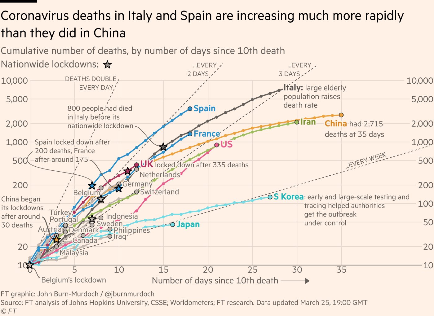
Source: @jburnmurdoch
Or, as Financial Times data journalist John Burn-Murdoch and author of the chart above puts it:
In my opinion, much of the concern over “the reader doesn’t understand log scales” is misplaced. When a reader ponders this chart, they are asking “are these two countries on the same course?”, “or how many days until country X is at Y cases?”, not “how many pixels represent 100 cases?”