Consider the following chart:
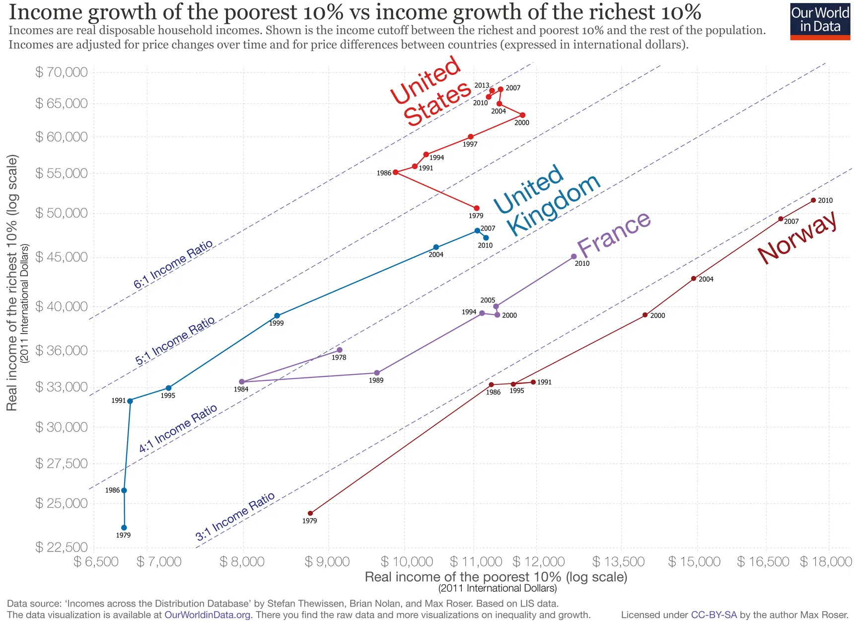
Source: The US lags far behind its peers on “inclusive” economic growth, vox.com
There is a lot going on in this chart: there are a lot of different visual and text annotations, both axes use a logarithmic scale and there is a lot of text in the chart description, in the axis titles and in the notes at the bottom of the chart. But the biggest issue is probably that this it not a classical line chart: the chart shows evolution over time, but it has no time axis.
This chart type is a connected scatterplot: a scatterplot in which dots are connected by lines in chronological order. It can be a good chart type for showing how two numerical dimensions evolve over time together, but it is not very common.
That is the reason why the authors of the chart above decided to introduce the chart step by step.
In the first step, they use one single data point (France in 2010) to explain what the axes and the diagonal lines mean:
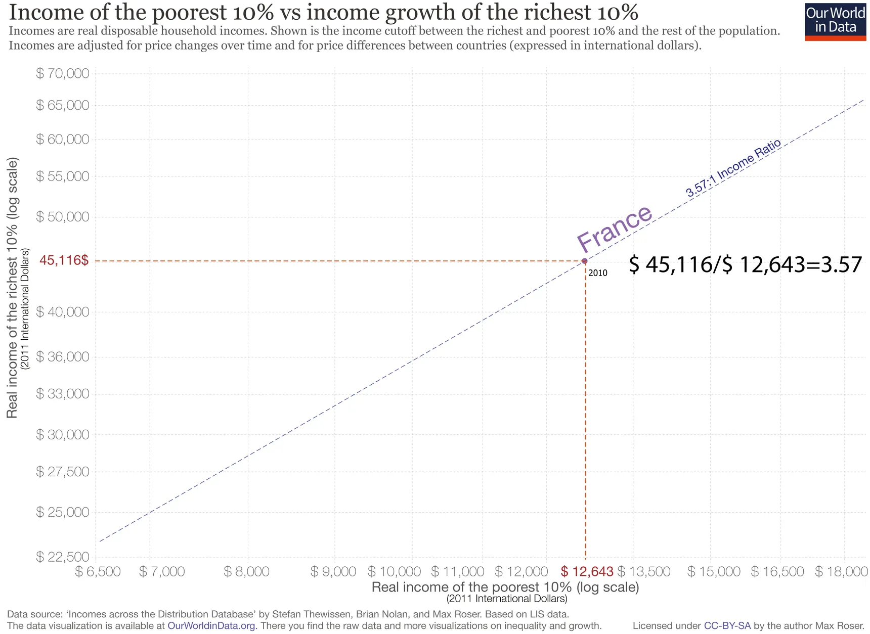
Source: The US lags far behind its peers on “inclusive” economic growth, vox.com
Then they reveal France’s trajectory over the 1978 to 2010 period, showing how the chart works, and with arrows and annotations they highlight what it means if a trajectory moves to the top left and bottom right corners of the chart.
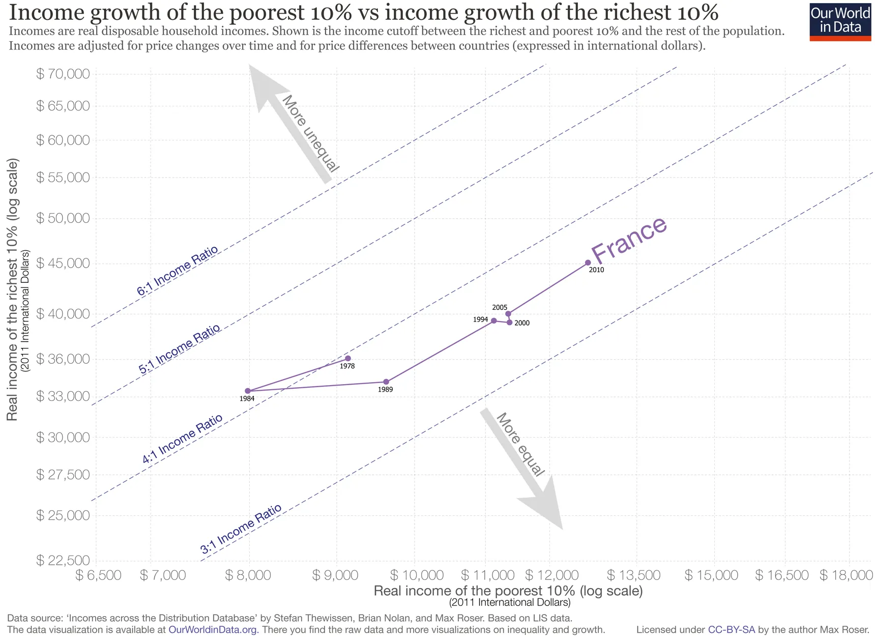
Source: The US lags far behind its peers on “inclusive” economic growth, vox.com
After this, they add other countries to the chart, whose trajectories are discussed in the surrounding text of the article.
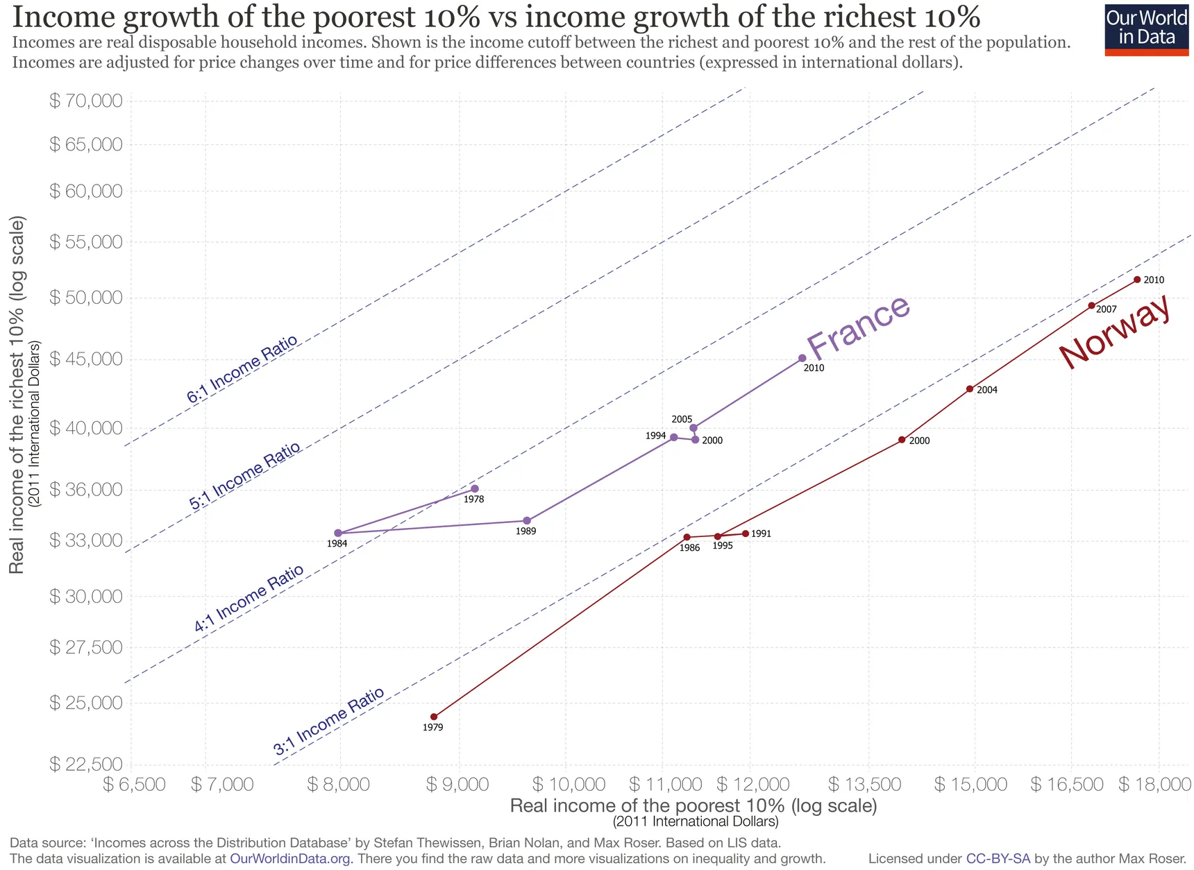
Source: The US lags far behind its peers on “inclusive” economic growth, vox.com
Only after this step, the final chart is revealed.

Source: The US lags far behind its peers on “inclusive” economic growth, vox.com
So, to lower the cognitive load of this unfamiliar chart type, the chart authors reveal the complexity of the chart in small chunks, which is much easier to digest (see the cognitive load concepts for storytelling page) . On top of that, they use very clear annotations to indicate what lines and directions means on the chart.
Here is another weird looking chart you are probably not familiar with:
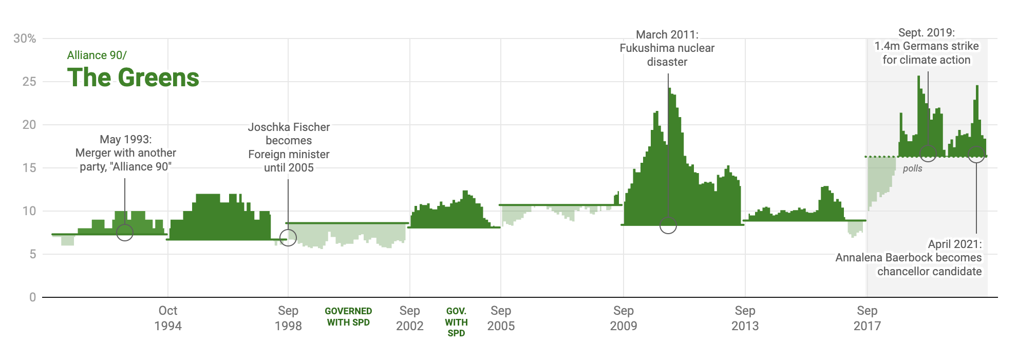
Source: Which German party is the most unlucky when it comes to election dates?, blog.datawrapper.de
It is a chart showing the polling scores of the German Greens party, and how much the polling results where above or below the next election result of the party. The chart can’t be interpreted without this information, and explaining in words how to read it is much less effective than including a visual legend, as the legend below proves.
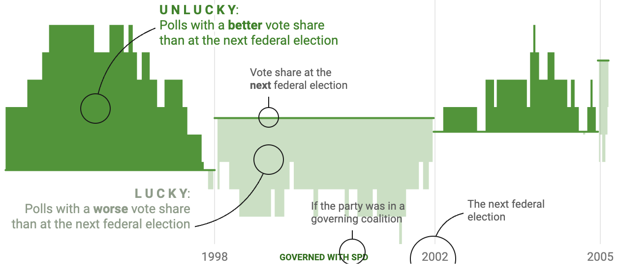
Source: Which German party is the most unlucky when it comes to election dates?, blog.datawrapper.de
So another strategy of explaining how a chart works is including a small version of the chart and explain how it works by adding annotations.
Horizon charts are another example of chart types that definitely need some explanation for the reader. Here is an example of horizon chart published in a newspaper.
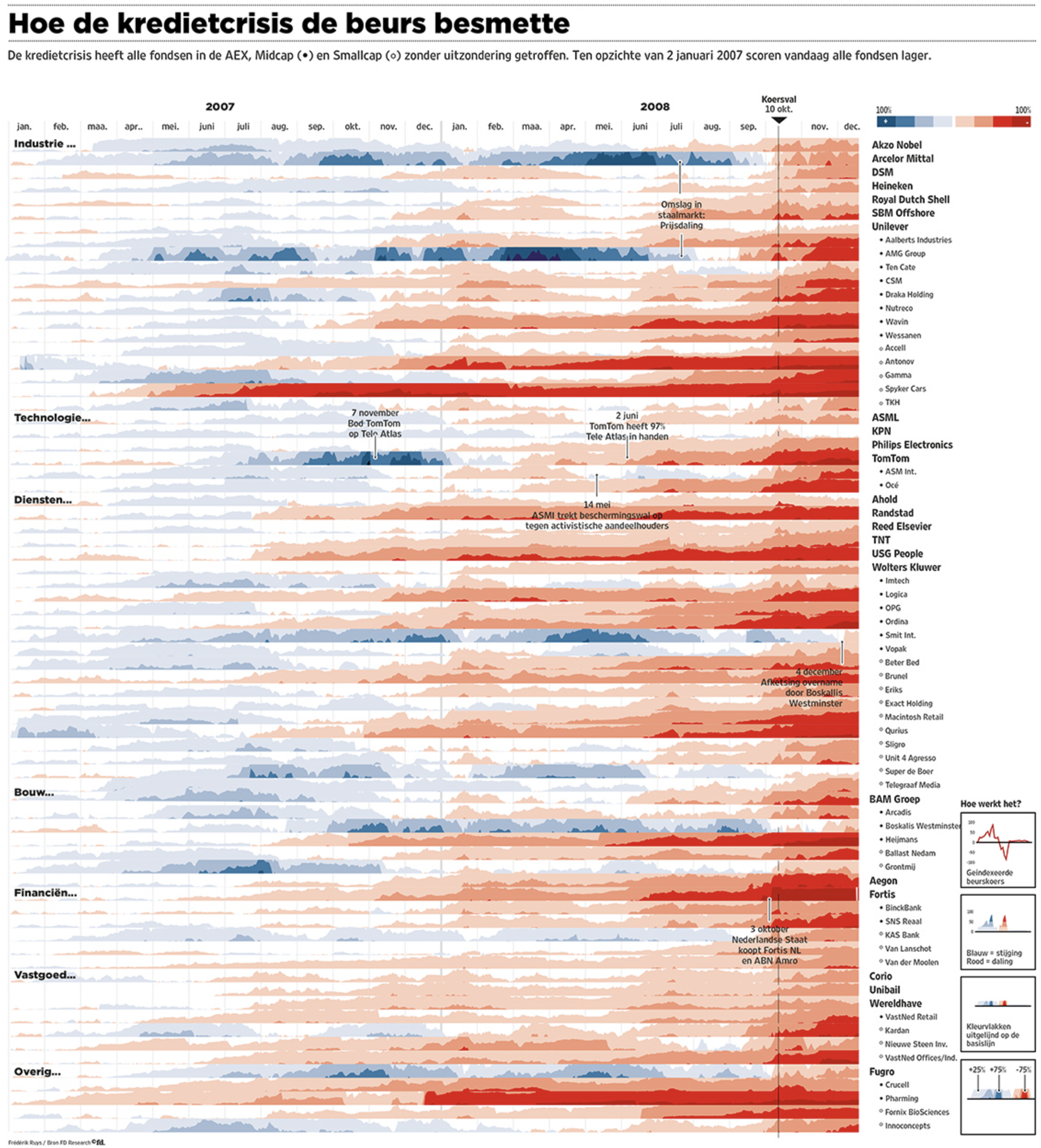
Source: Frédérik Ruys for Financieele Dagblad
Notice the small “How the chart works” section (”Hoe het werkt” in Dutch) in the bottom right corner. This is not so much explaining how the chart should be read, but rather how it is constructed. Only the last little panel shows how the horizons should be read. Frédérik Ruys, the author of the chart, also made a little animation to show how horizon charts are constructed.
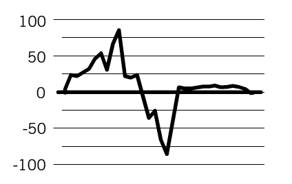
Source: vizualism.nl