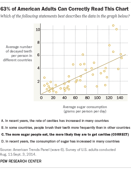
Research has shown that only six out of ten (American) adults managed to interpret a scatterplot correctly.
Source: The art and science of the scatterplot, pewresearch.net
So, how could the design of the chart increase the share of people understanding it? Here are some ways.
The first, and probably the most important measure to take as the author of this chart is to add a title to the chart that clearly communicates the take away message. The survey participants were shown a chart that didn’t have a title, because the researchers wanted to see if they would be able to identify the message themselves in the chart. But when you are communicating a data-driven message, chart titles are of critical importance (see The importance of visualisation titles).
It should also be made clear what each dot in the scatter plot represents. In the chart that people were shown, you can only know that each dot represents a country from reading the title of the the y axis that mentions “in different countries”. Making it obvious that each dot represents a country can help understanding. This can be done in multiple ways, for example by adding country names to (some of) the dots, by using country flags as the dot symbols and by adding an explicit annotation directly on the chart that says “each dot represents a country”. Combining any of these techniques can reinforce this message.
In order to interpret a scatterplot correctly, a good understanding of the axes of the plots is very important. Instead of just showing axis labels (the numbers on the axis) and an axis title explaining the units the numbers are expressed in, text can be added that explain what the ends of the axes means, in human readable and simple language. For example, the left end of the x axis could say “Low sugar consumption” and the right end of the axis “High sugar consumption”. Arrows can also be used to reinforce the direction of the axes.
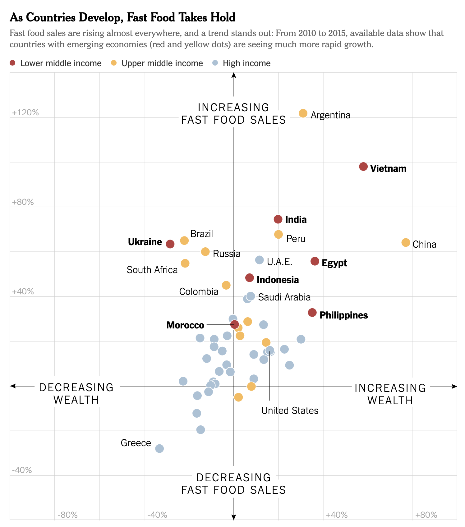
A scatterplot with very clearly labelled axes. Source: Obesity Was Rising as Ghana Embraced Fast Food. Then Came KFC., nytimes.com
The scatterplot in the Pew survey contains a regression line showing the trend in the data. To help the understanding, this trendline should be explicitly annotated. The line could be annotated with a generic annotation, like “Trendline”, but better would be to annotate it with text reinforcing the take away message of the chart, like “Higher sugar consumption is associated with higher numbers of decayed teeth”.
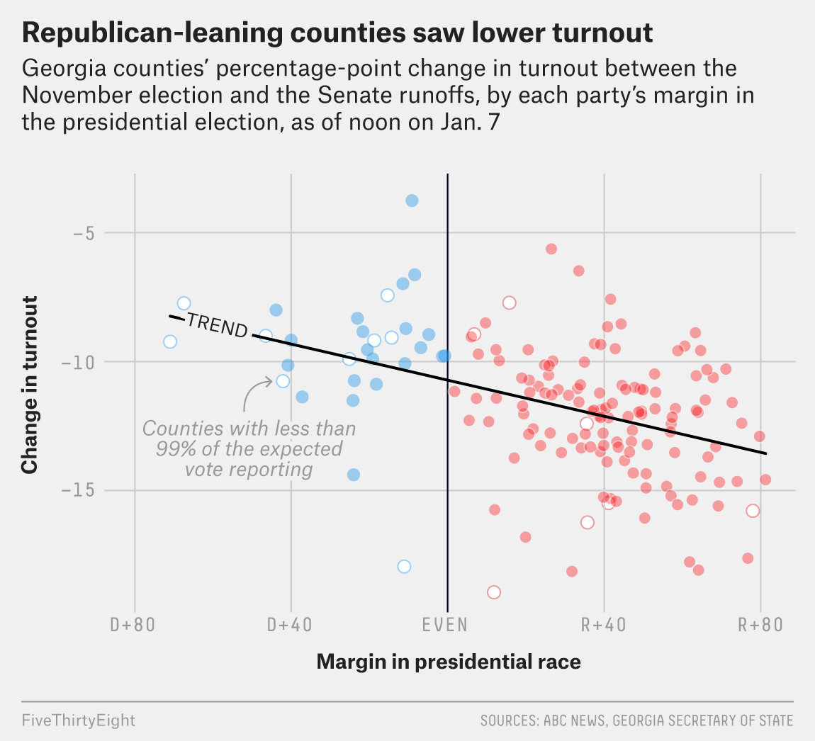
An explicitly labelled trendline. Source: fivethirtyeight.com
This trendline in the Pew scatterplot divides the scatter plot into two regions: the region above the line contains the countries with people having relatively high numbers of decayed teeth, and in the countries below the line people have low numbers of decayed teeth. If the countries below the line would have some shared characteristic relevant to the story (like high per capita numbers of dentists, good government policies on detal care, …) the area below the and above the trendline can also be explicitly labelled.
Similarly, the chart could be divided into quarters using the medians for both x and y. This makes a clear distinction between the higher and lower values on each axis, and the resulting quarters can be labelled to improve understanding even further (this technique is discussed more in detail on the Visual annotations: aggregation and distribution.
Combining lines for the medians and a trendline on the same chart, however, is not advisable, as it will create a cluttered scatterplot.