Traditional bar charts only use the length of rectangles to encode numerical data. But rectangles have other visual properties that can be used to encode data.
The width of the bars can also be used to encode numerical values. This is especially useful when absolute numbers are combined with a rate of change, for example. The chart below shows total populations (width of the rectangles) and rate of population change (height of the rectangles) for EU member states (Malta not shown). The result is that the surface area of the rectangles represents the population growth in absolute numbers:
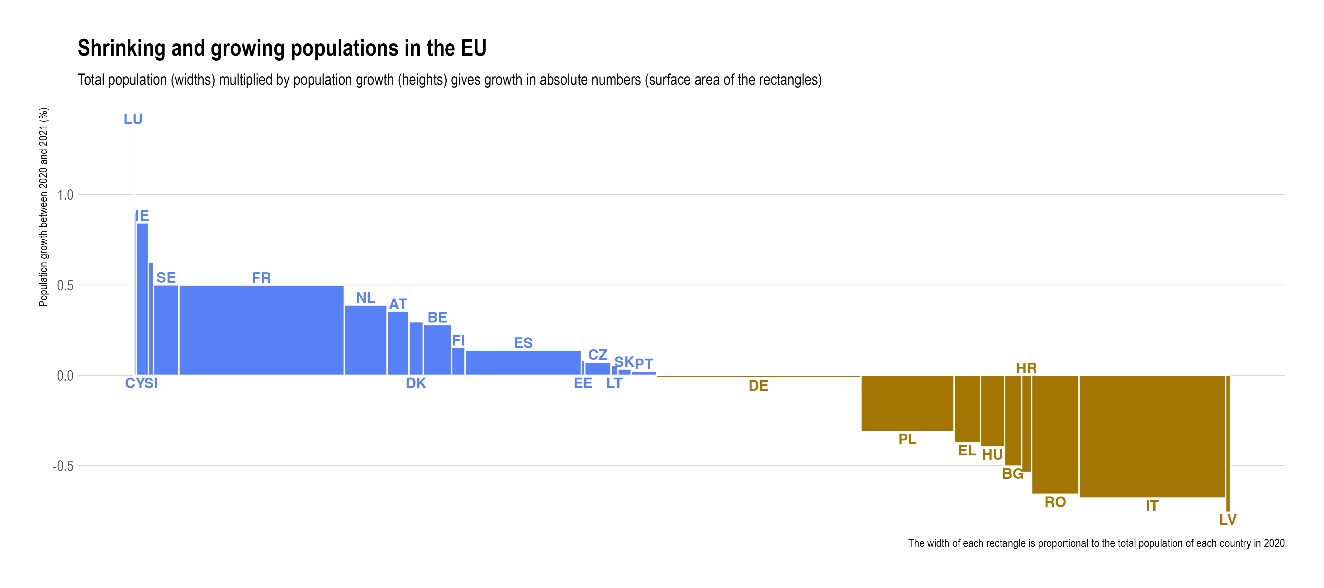
Source: Maarten Lambrechts, CC BY SA 4.0
This technique can be combined with shifting the baseline of stacked bars to show a dichotomy in the categories. For example, the chart below shows the total amount of electricity production in European countries (width of the bars) and their share of clean electricity (the coloured area of the bars, above the 0% line).
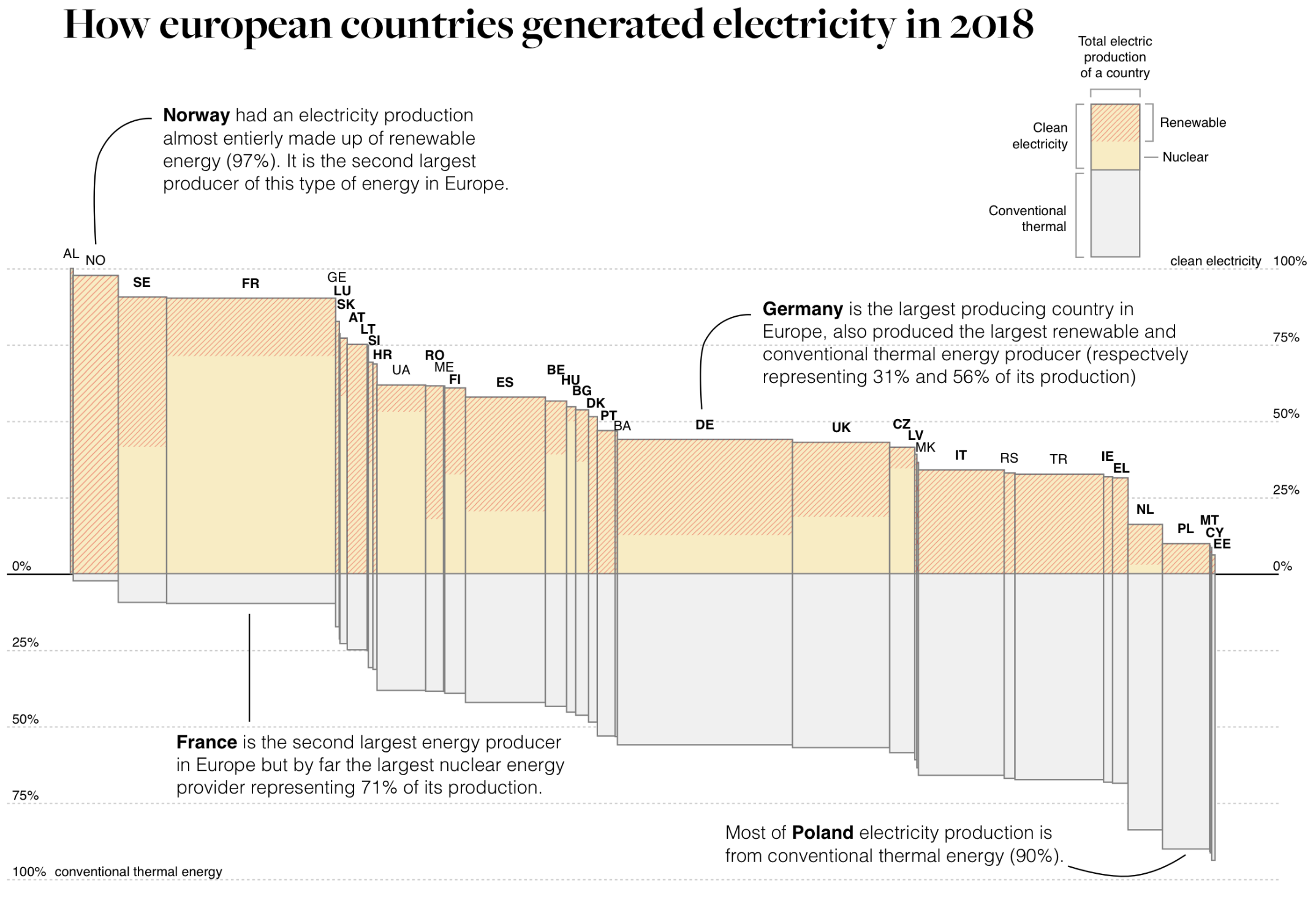
Source: observablehq.com/@karimdouieb
When both the width and height of stacked bars are used to encode data, and when both the x and y axis are percentages, the resulting chart is called a Marimekko chart or mosaic plot. In the chart below, the population distribution among age classes is represented by the bar widths, and the proportion of each vaccination status within each age group is represented by the height of the stacked bars.
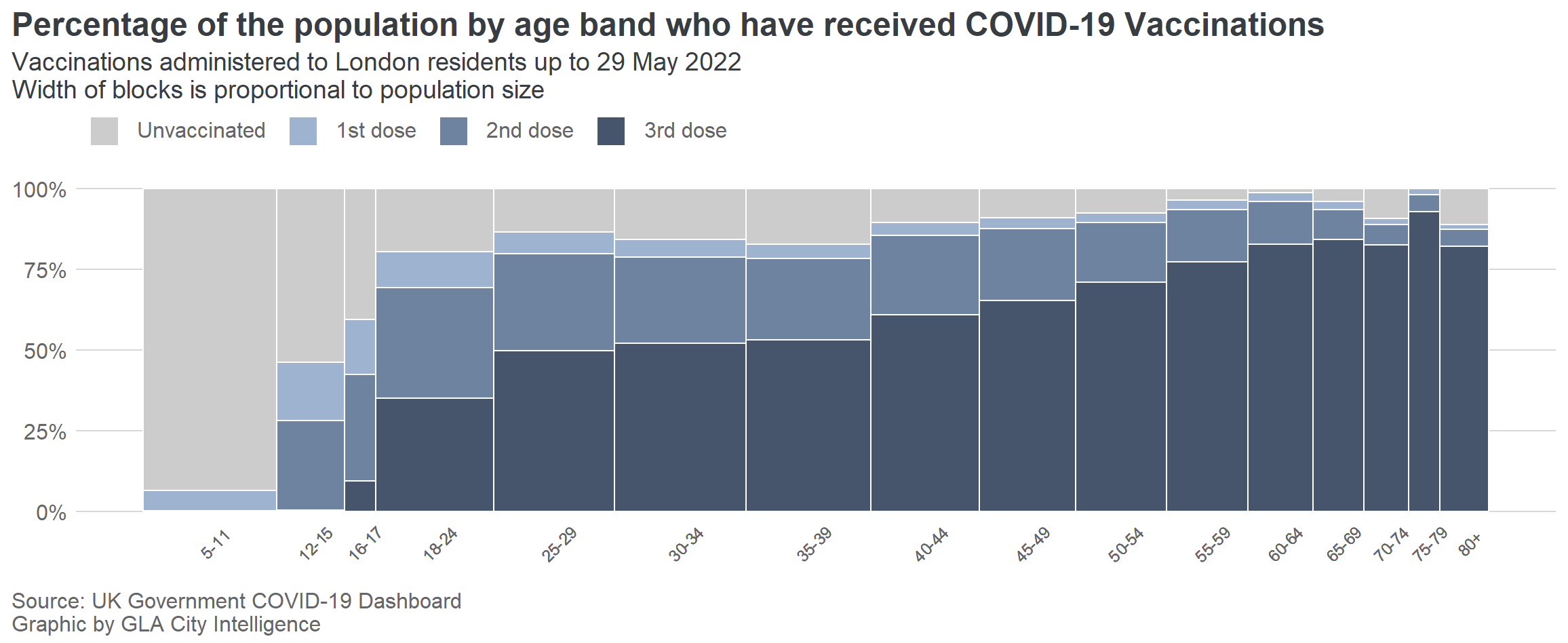
Source: data.london.gov.uk