A scatter plot shows 2 dimensions of your data: the x position of the data marks is mapped to one dimension, and the y position is mapped to a second dimension.
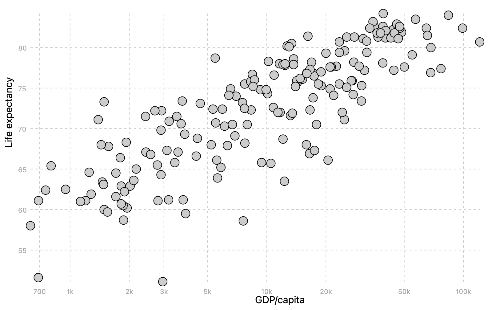
Source: Maarten Lambrechts, CC BY SA 4.0
But the visual properties of the data marks (in this case the dots on the chart) can be used to map more dimensions in your data. For example, you can use the colour of the marks to show data points belonging to the same category.
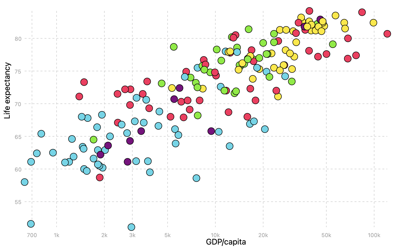
Source: Maarten Lambrechts, CC BY SA 4.0
And than you can use the size of the marks to show another numerical dimension on the data. This creates what is called a bubble chart.
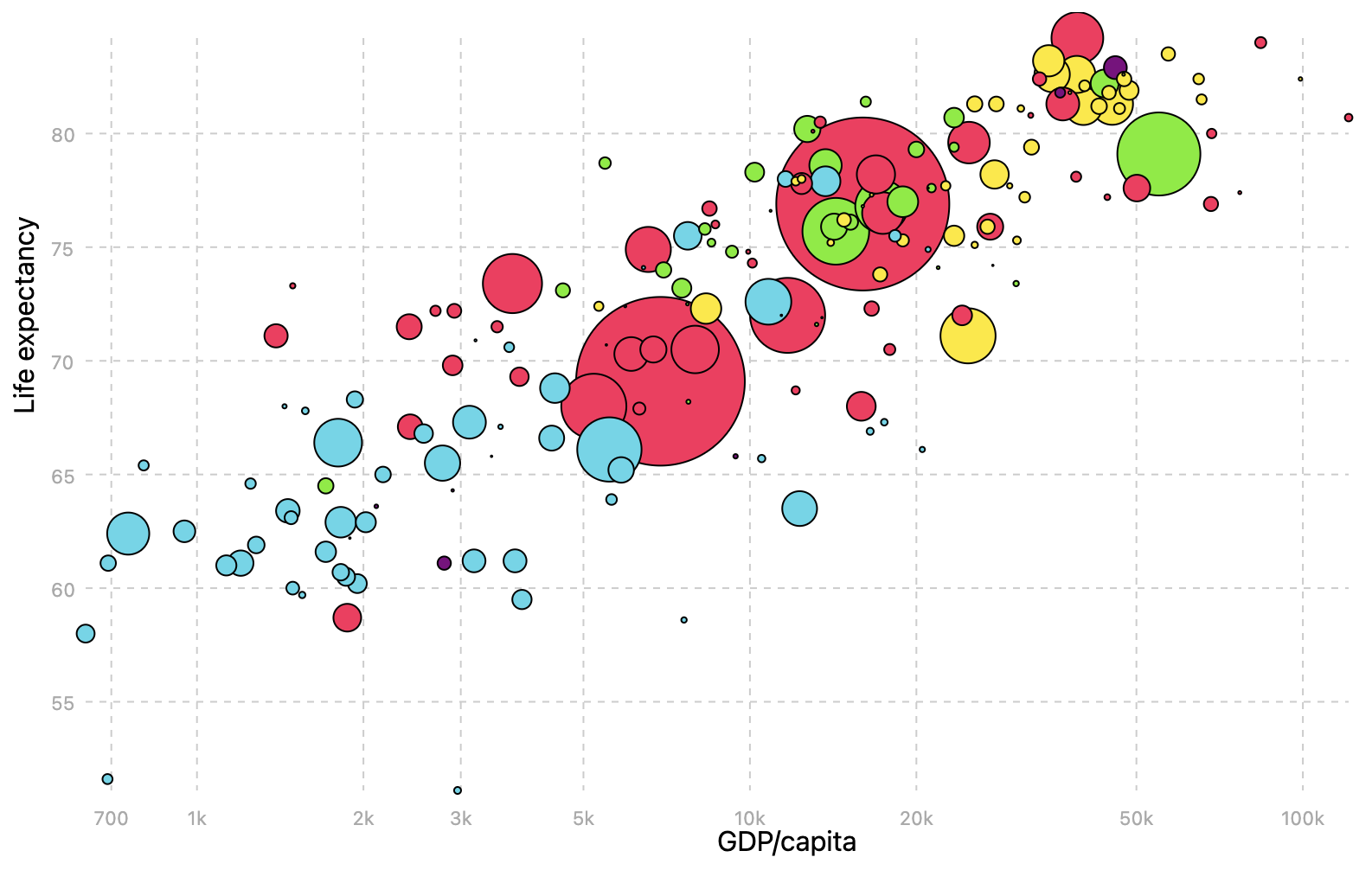
A bubble chart showing the life expectancy (y), GDP per capita (x), region (colour) and population (size) of countries. Source: Maarten Lambrechts, CC BY SA 4.0
In theory, you can extend bubble charts even further, by mapping another categorical dimension in the data to the the shapes of the data marks. But this might create an overloaded and difficult to read visualisation
When the data also contains a time dimension, this dimension can be mapped to the frames of an animation. An example of an animated bubble chart is embedded below. The chart is embedded from gapminder.org, the website of the late professor Hans Rosling, who popularised the bubble chart with his entertaining videos in which he comments on the animated bubble chart.
The bubble chart uses 5 dimensions in the country level data:
- GDP/capita (x position of the circles)
- Life expectancy (y position)
- Population (size)
- Region (colour)
- Year (frames in the animation). Click the play button in the bottom left corner to start the animation, or use the slider next to it to navigate through time)
Source: gapminder.org/tools