When data contains a secondary categorical breakdown, a bar chart can be turned into a grouped bar chart.
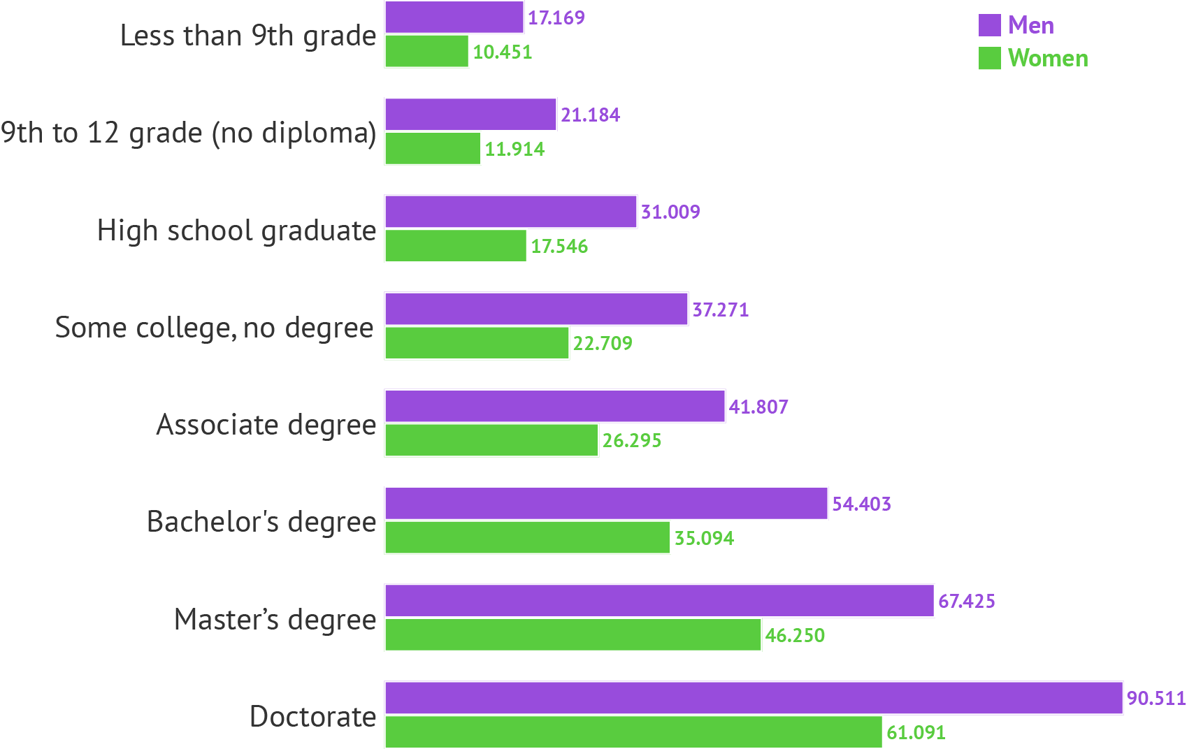
Pay gap between man and women according to education level. Source: Maarten Lambrechts, CC BY SA 4.0
When the differences between the two groups are more important than the absolute values, it makes more sense to replace the grouped bar chart with a dumbbell chart. In a dumbbell chart, the values for the 2 groups are shown with a data mark (a circle or any other symbol), and the values are visually connected to highlight the differences between them.
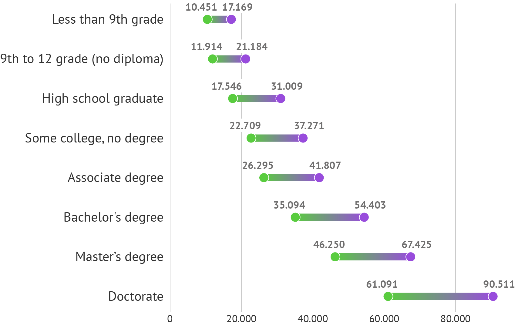
Source: Maarten Lambrechts
In the case the 2 groups represent moments in time, the dumbbell can be replaced by an arrow showing the direction and magnitude of the trend. This results in an arrow chart.
![]()
This arrow chart shows the same data as the dumbbell chart above, but in this case it would show the evolution in the wages of people with different education levels between two moments in time. Source: Maarten Lambrechts, CC BY SA 4.0
When the number of groups is limited, grouped bar charts can work well. But when the number of groups grows, they become a lot harder to read.
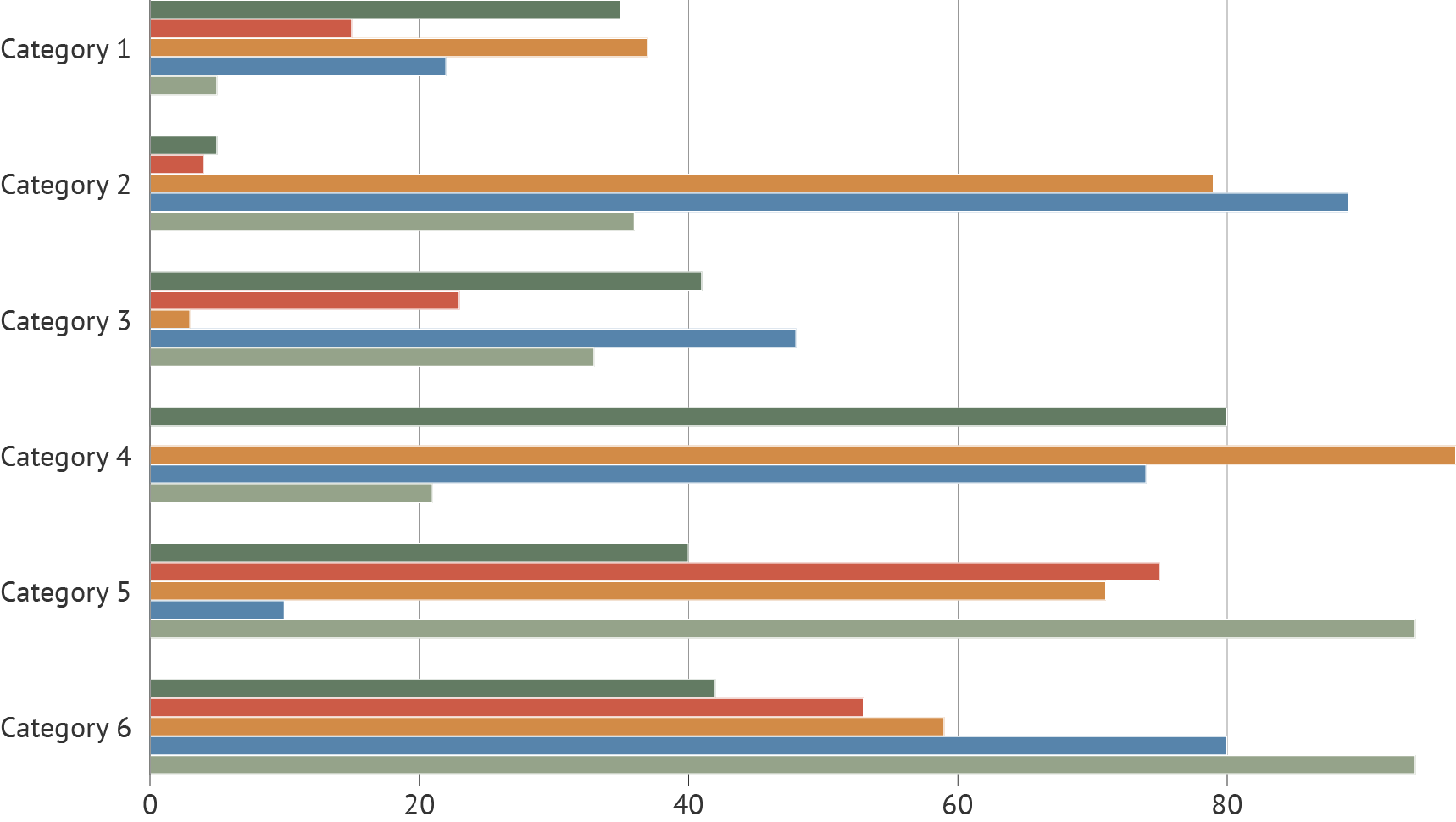
Source: Maarten Lambrechts, CC BY SA 4.0
In those cases, dot plots can provide a nice alternative.
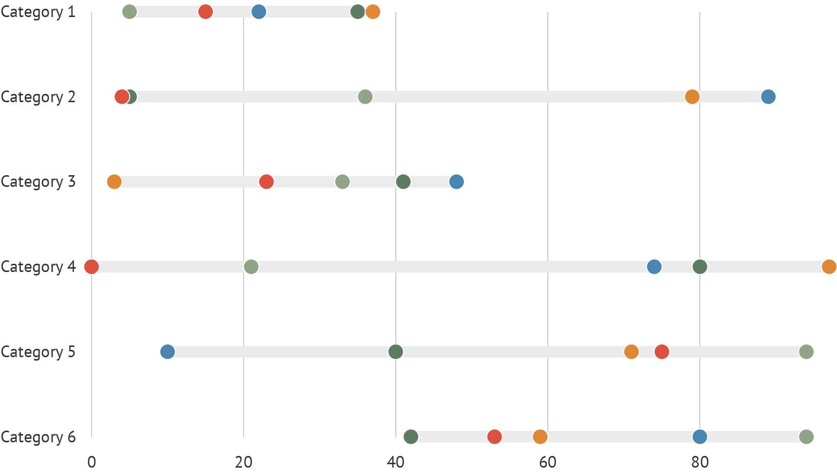
Source: Maarten Lambrechts, CC BY SA 4.0