The following chart was shown on German tv and is supposed to show that out of 1,6 million vaccinations with the AstraZenica covid-19 vaccine, 8 people were affected by blood clots in cerebral veins.
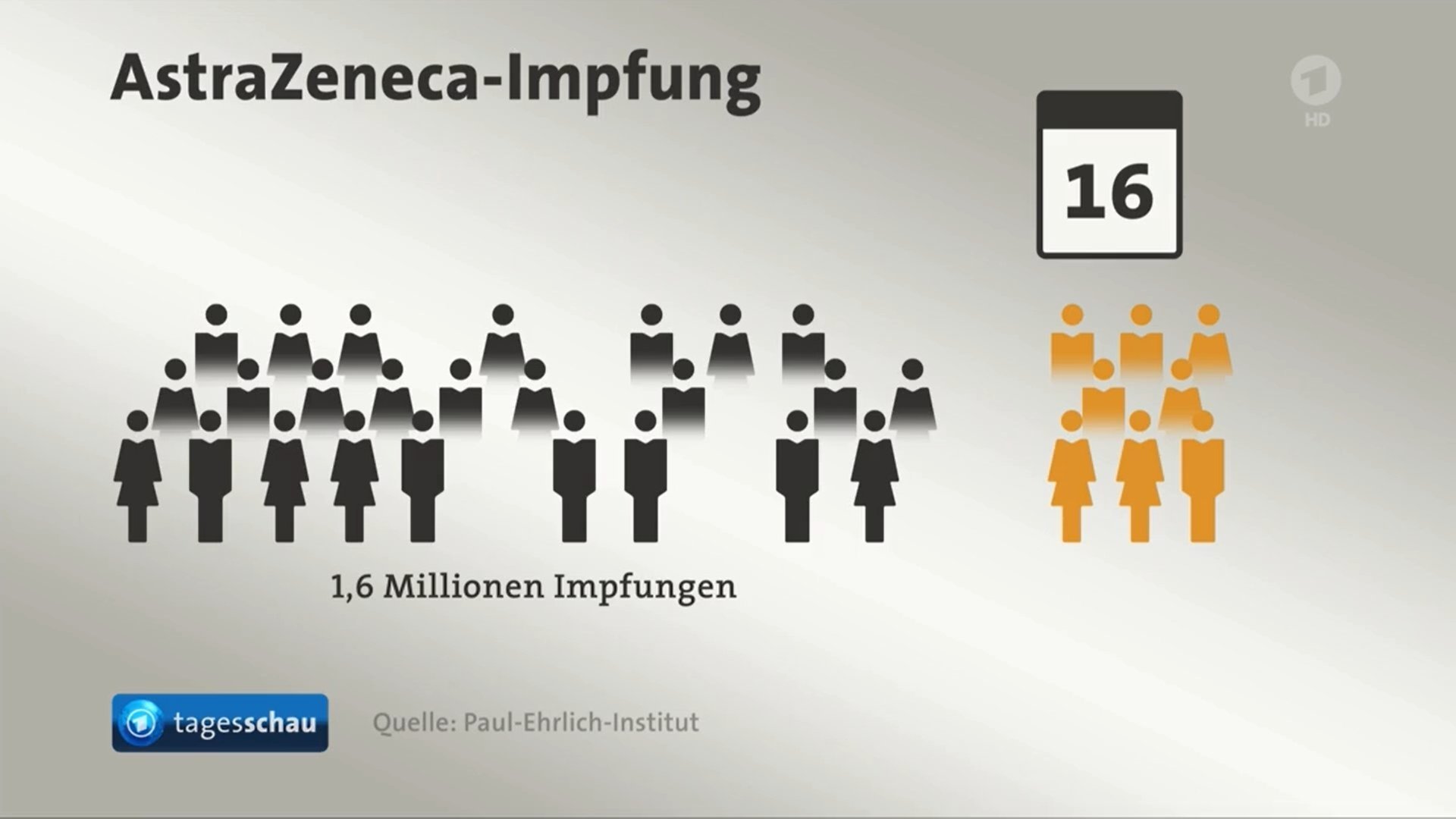
Source: @FabianHabersack
The proportions are completely off in this graphic: it shows 33 icons, of which 8 developed blood clots (the orange icons on the right). The graphic suggest that almost a quarter of vaccinated people develop blood clots, while in reality, it is only 0,00005%.
Of course, it is difficult to visualise 8 cases out of 1,6 million on television. But that it is possible, proofs the following chart on the same topic. It shows the number of cases of blood clots in the treatment and control groups in the AstraZeneca clinical trial, and preserves the proportions in the data completely.
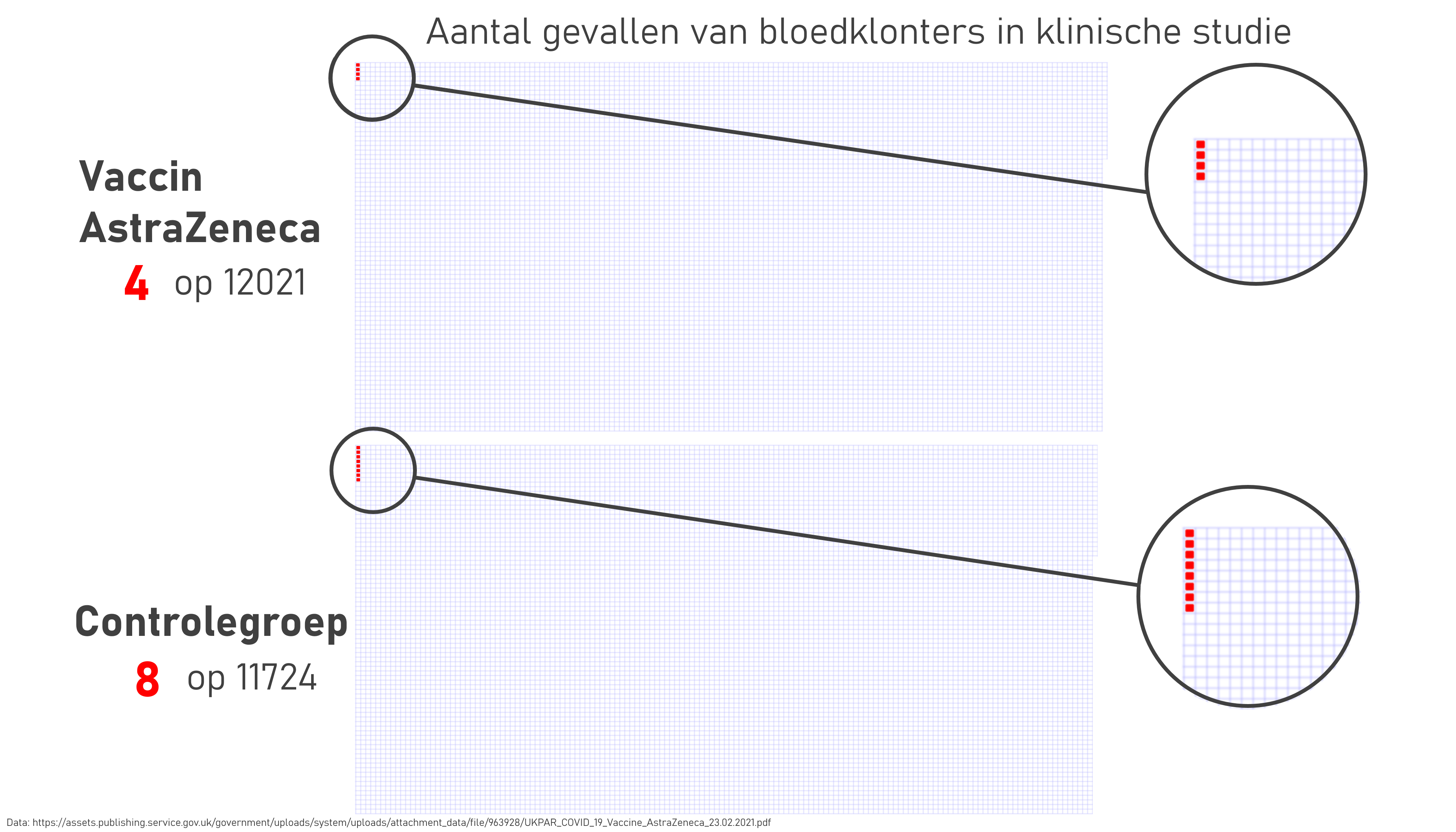
Source: @pfsmet
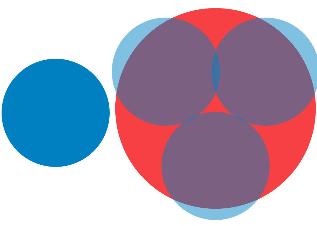
A common way of (accidentally) distorting proportions happens when surface area is used to visualise numerical data. Take for example these two circles, meant to show the difference between the numbers 37,7 and 69,2:
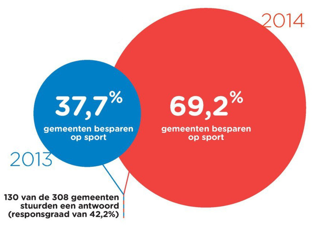
Source: De Morgen
Looking at the numbers, the blue circle should fit less than 2 times in the red circle. But the red circle is much bigger than 2 times the blue one.
Source: Maarten Lambrechts, CC BY SA 4.0
In fact the blue one fits around 3 times in the red one.
Source: Maarten Lambrechts, CC BY SA 4.0
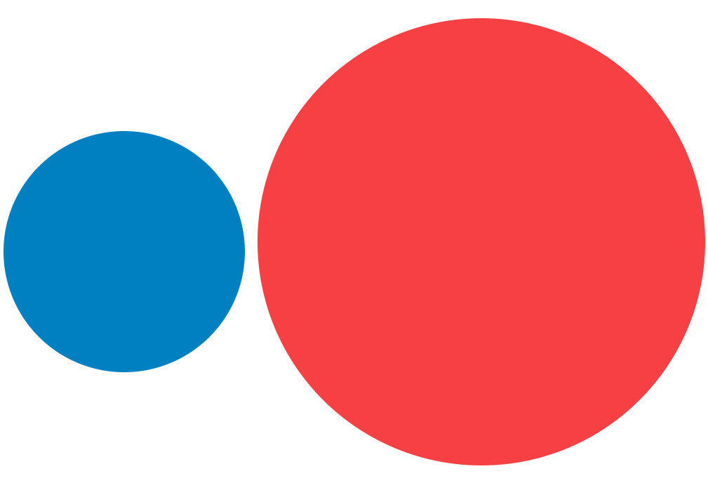
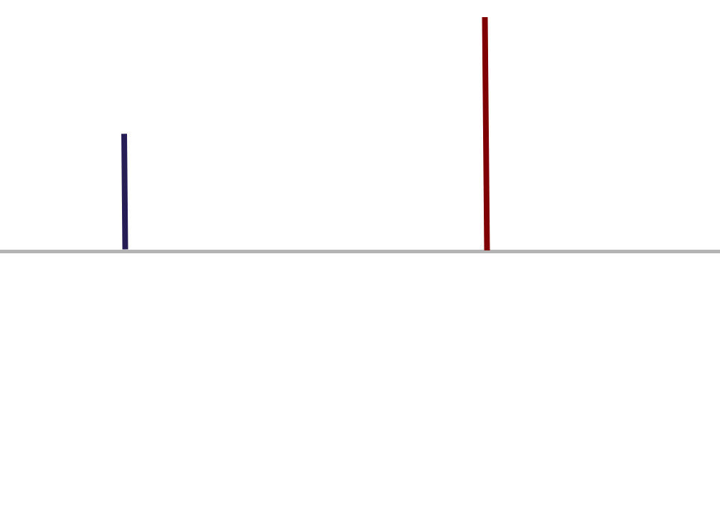
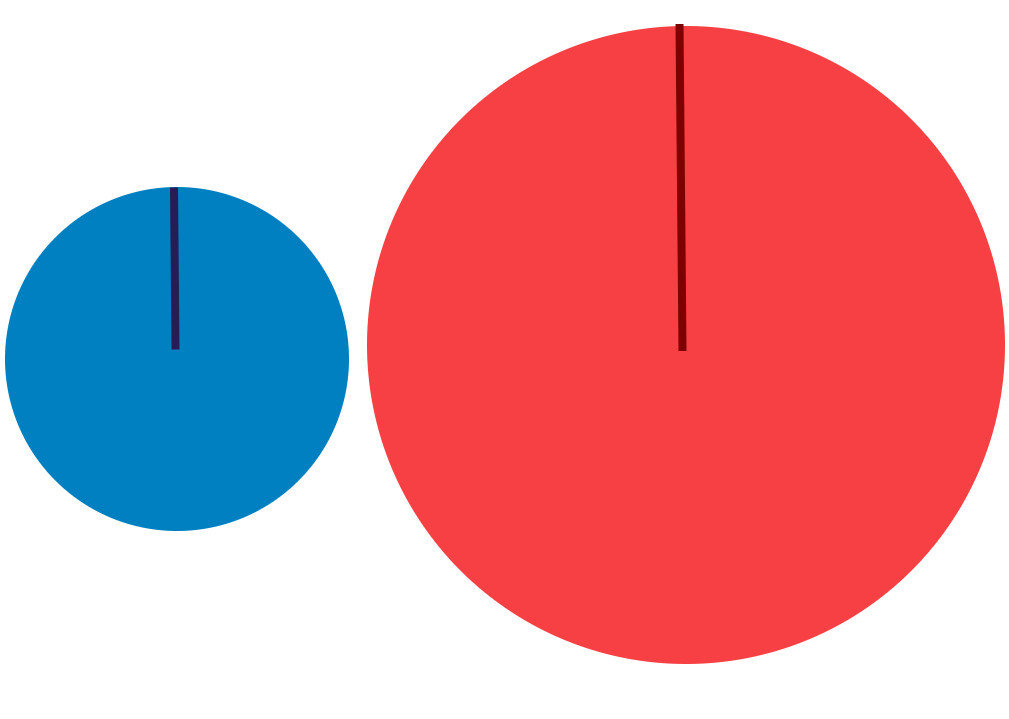
What probably happened here with the circles was that the designer of the circles took the numbers 37,7 and 69, 2 and mapped them to the radius of the circles. From the image on the left below, you can see that the radii of the circles more or less have the correct proportions.
Source: Maarten Lambrechts, CC BY SA 4.0
You might remember that the formula to calculate the surface area of a circle is
So while the proportions between the bigger and smaller numbers is
the proportions between the areas of the bigger and smaller circles is
So when using the surface area of circles to encode numbers, you should take the square root of the numbers first before using them as the radius for scaling the circles.
The following video shows that this also applies to the surface area of squares, and explains what this means if you scale the width and height of icons to communicate numbers.
Source: eagereyes - Robert Kosara