The easiest way to make visualisations fit different screen sizes, is by making them scale. This works in the same way as for images: the visualisation is shown bigger on big screens and smaller on small screens.
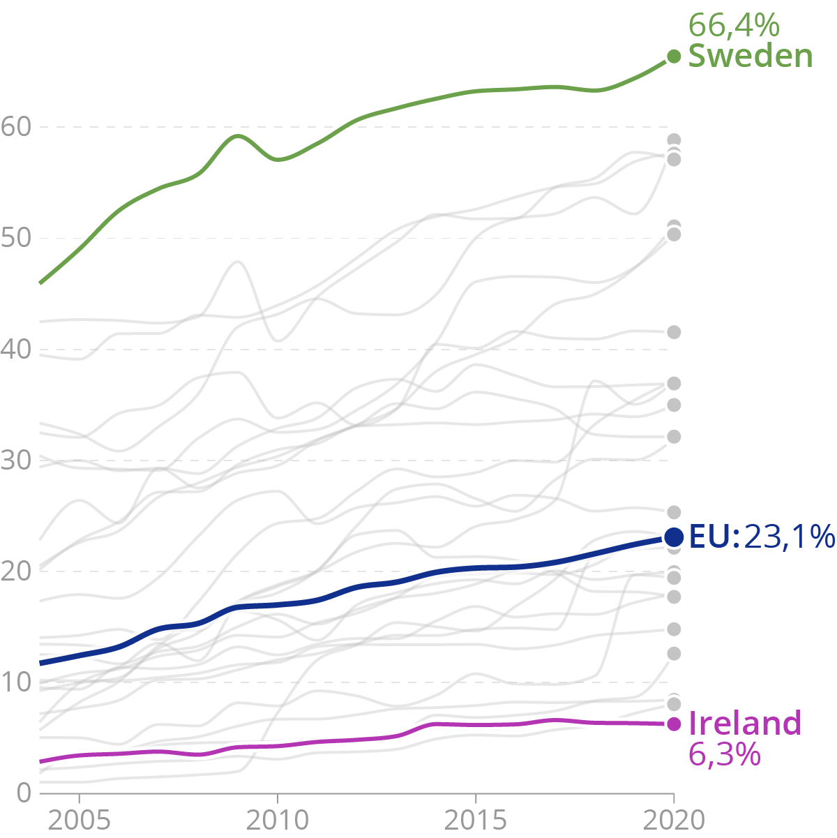
A chart with normal proportions… Source: Maarten Lambrechts, CC BY 4.0
But scaling data visualisations has its limitations. Small screens usually have a lower resolution, and because of smaller amount of pixels, finer details in a visualisation design might not be visible.
When scaled down, the text on a visualisation may also become too small to be read.
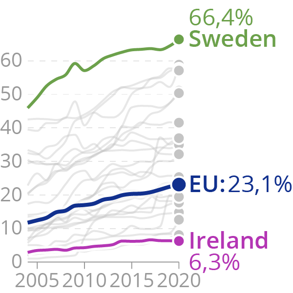
The same chart scaled down
Or vice versa: when scaled up, the text can be rendered disproportionally large.
The same chart scaled up. Source: Maarten Lambrechts, CC BY 4.0
Different scaling can be applied for text and non-text elements in a visualisation, to keep font sizes to appropriate levels. But this can lead to the problem that the text in a visualisation will not fit its designated space anymore and will start to overlap with other elements in a chart. Check for example the labels on the x axis in the following version of the chart, in which the text is not scaled down.
The same as above, scaled down but with the same font sizes. Source: Maarten Lambrechts, CC BY 4.0
When elements on a chart are scaled down, targeting them with a mouse pointer (to reveal tooltips, for example) can become very difficult (targeting them with a finger on a touch device will be even more difficult).
Research has shown that smartphones are used in portrait mode in 92 percent of the time. As a consequence scaling works best for visualisations with a tall layout. Visualisations with a wide layout will not scale well on mobile phones.