The medium a visualisation is published in also has an influence on what the optimal chart type is.
The most obvious property of a medium are the dimensions it can provide for a visualisation. Many visualisations today are consumed on mobile phones and other devices with limited screen sizes. The design of a visualisation can be optimised to fit on smaller screens, but these optimisations have their limits: at some point, it makes more sense to display a different chart type on smaller screens.
For example, displaying a world map (which has a wide layout) on mobile phones (which have a long layout, with a limited width) is not ideal. An alternative on small screens is to use 2 hemispheres stacked on top of each other.
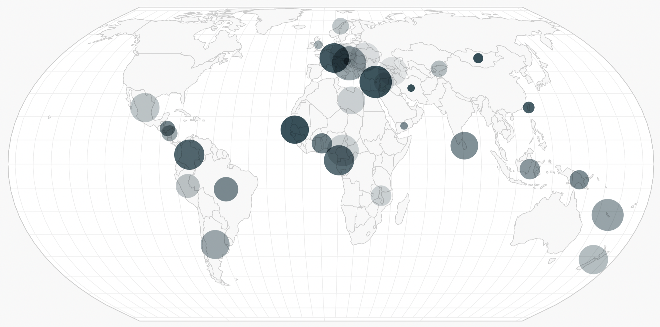
Source: Amelia Wattenberger
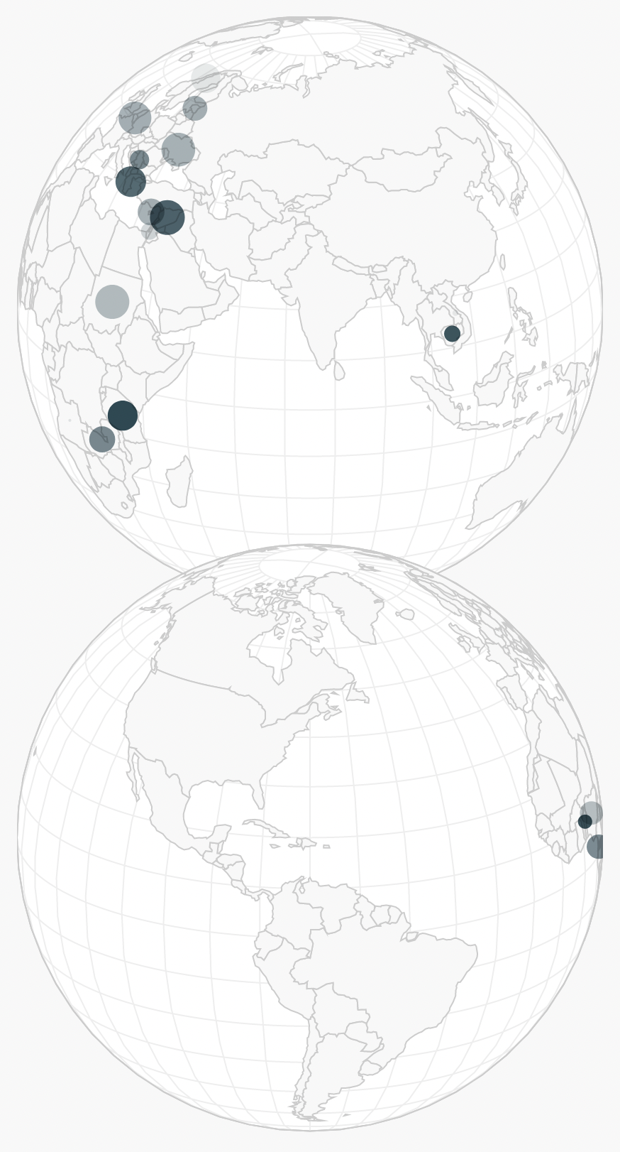
Source: Amelia Wattenberger
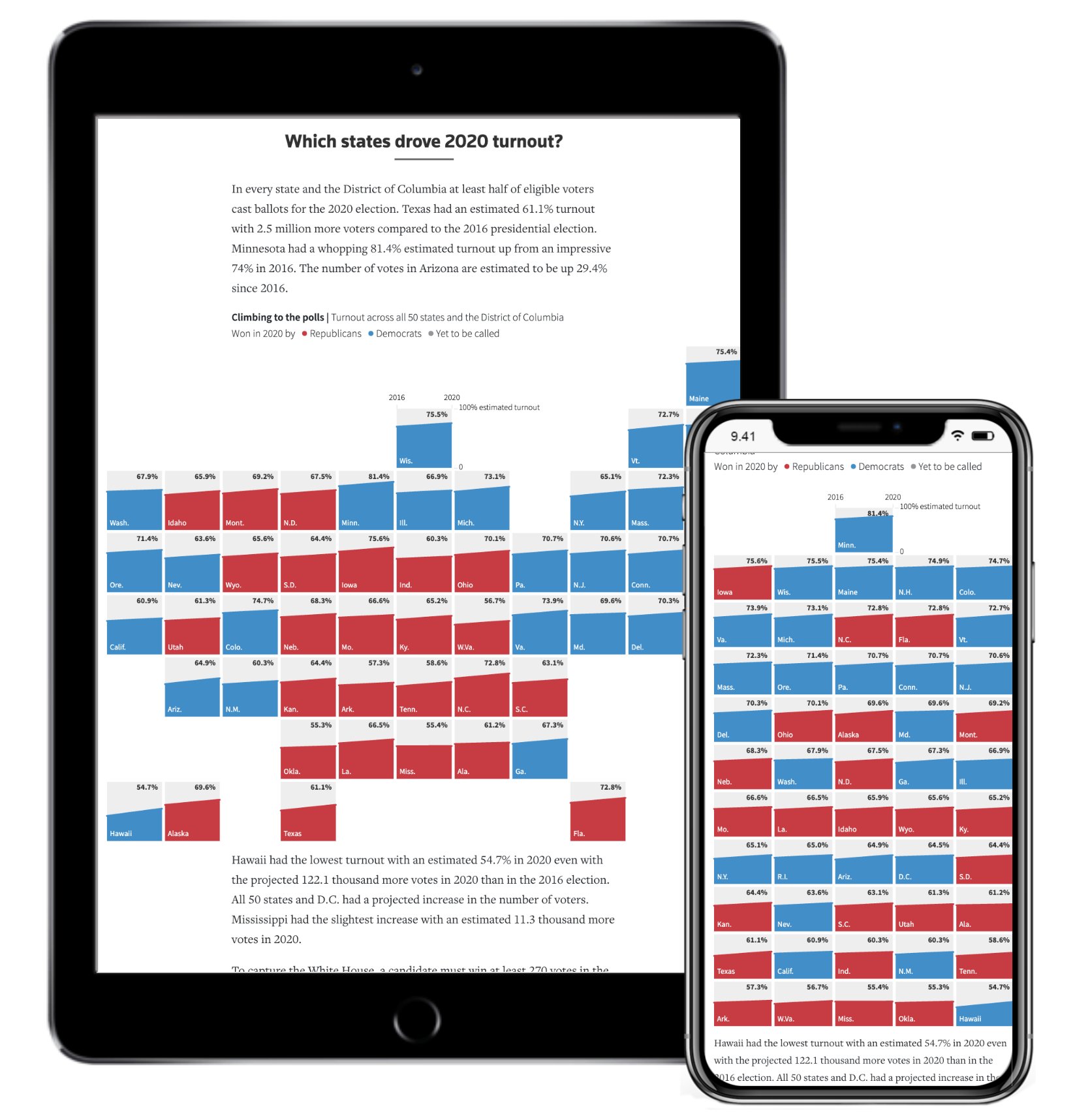
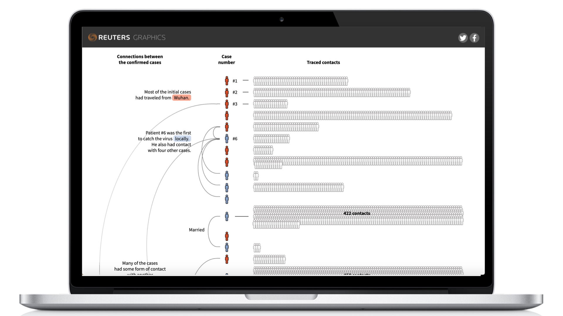
More creative visualisations and layouts, like radial layouts or grid layouts based on geography, can be simplified to regular bar charts and simple grids:
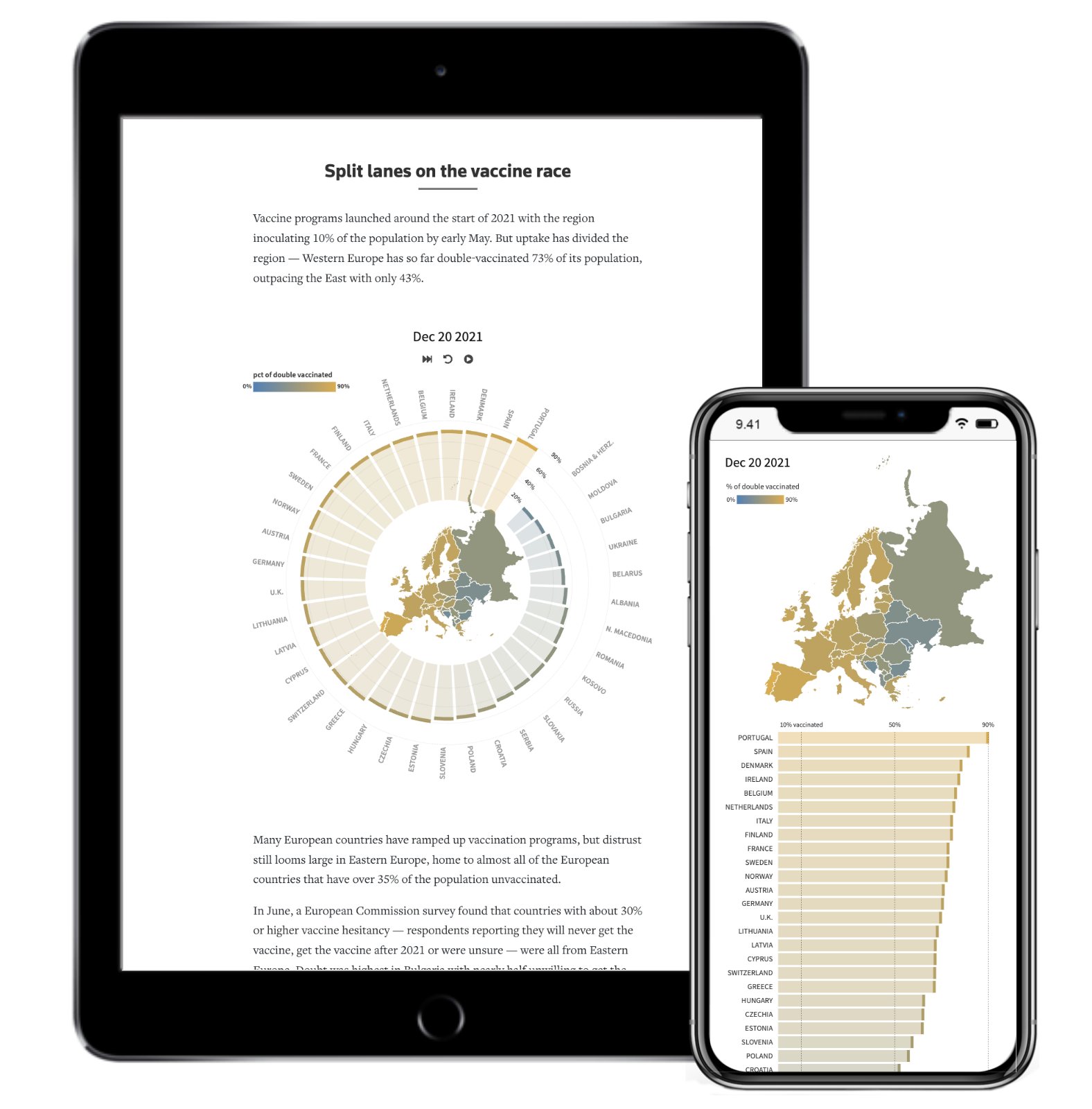
Source: Prasanta Kumar Dutta, Reuters
Source: Prasanta Kumar Dutta, Reuters
Source: Gurman Bhatia, Reuters
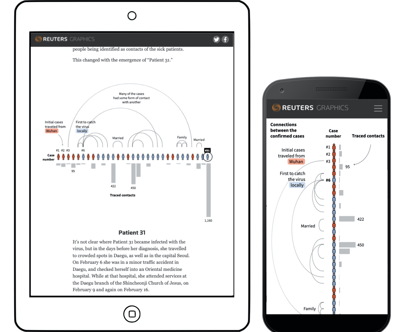
Source: Gurman Bhatia, Reuters
For visualisations on smaller screens, you might ask yourself if it even makes sense to make a visualisation suited for smaller screens: it might take a lot of time and effort to get it working on small screens. A simple table with the most relevant values could make more sense in those cases (bar charts with horizontal bars usually work well too on mobile phones).
Just like more data in the same space requires more data dense visualisations, the same data in smaller space also requires more data dense chart types. So a fallback for a scatter plot on smaller screens could be a hexbinned scatter plot, for example.