Some visualisations can have a fluid layout: they can be made wider, narrower, higher or less high without losing their functionality. But other visualisations have an inherently wide or high layout. A bar chart with vertical bars will usually have a wide layout (when the number of bars is higher), as do most world maps and line charts showing longer time series.
For these wide layout charts, rotating them to high layout on smaller screens can make sense. That is why some online media serve charts in different layouts depending on screen sizes. Below are two examples.
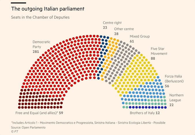
A visualisation with a wide layout is rotated on narrower screens. Source: Italy elections 2018 polls: who is running and why it matters, ft.com
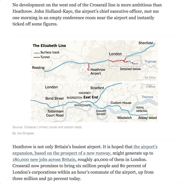
A map showing a long feature running east-west is rotated to have north to the left to fit on mobile screens. Source: London’s New Subway Symbolized the Future. Then Came Brexit, nytimes.com
Showing long time series in wide layout can be challenge, even on desktop screens. Because readers are used to scrolling web pages, longer time series can be visualised using a chart with time on the y axis.
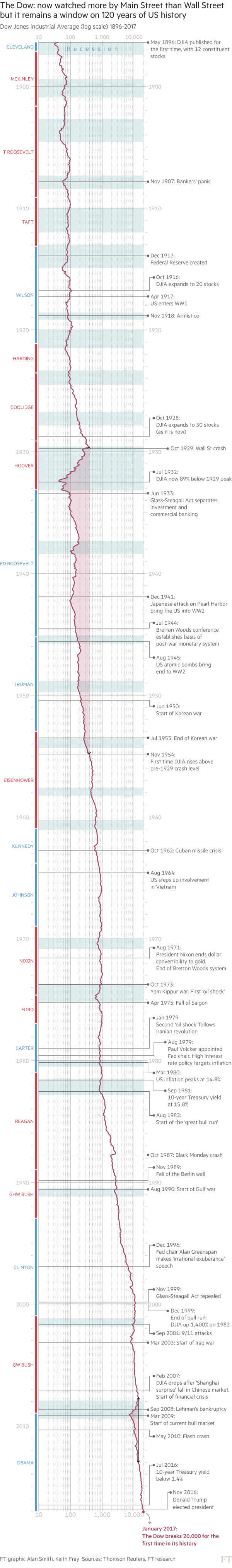
Source: ft.com
Rotating a chart can lead to unusual charts, because they break conventions: people are not used to reading maps where the North is not up, or line charts where time does not move from left to right. This may cause some confusion for some users, but the benefit of having a readable visualisation on all screens can outweigh this confusion some users might suffer from.