For larger charts data marks and font sizes should be scaled up to some degree: bigger charts need thicker lines, larger dots and bigger letters. Otherwise the design can look empty. The reverse is also true: these elements need scaling down for smaller charts.
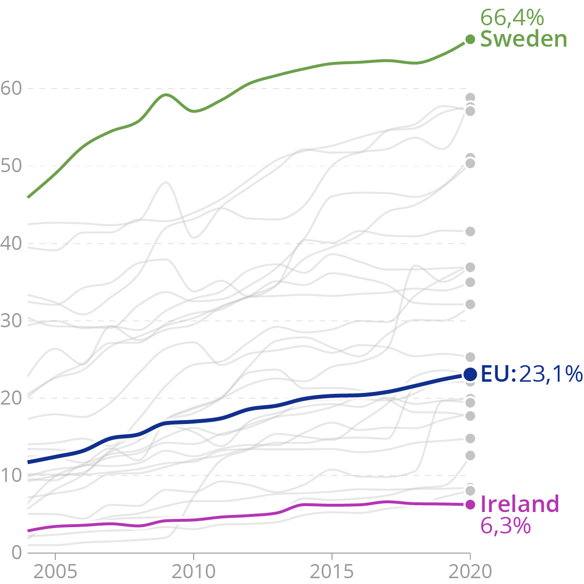
A chart with normal proportions… Source: Maarten Lambrechts, CC BY 4.0
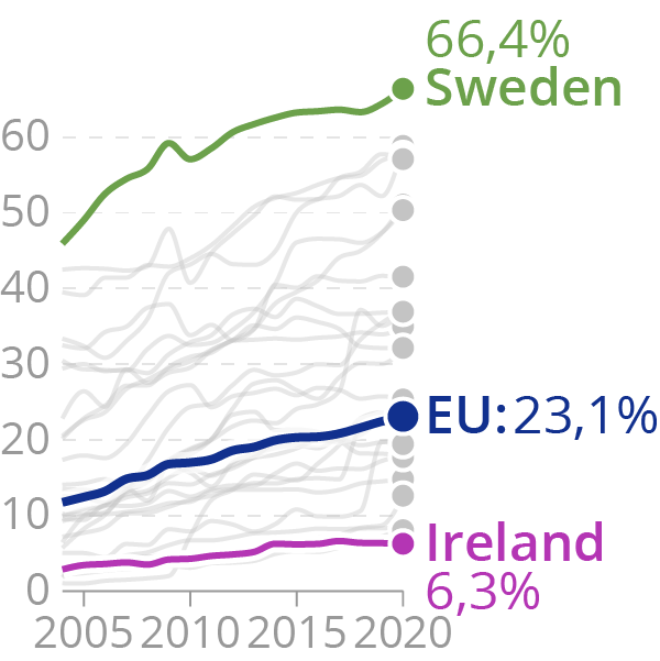
…and the same chart in smaller size, but with the same font sizes and stroke widths. Source: Maarten Lambrechts, CC BY 4.0
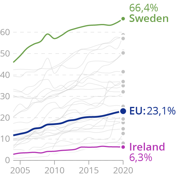
On this chart, font sizes, stroke widths and dot radii have been adapted to the chart dimensions. Source: Maarten Lambrechts, CC BY 4.0
But designing the same chart in different dimensions is not simply a matter of scaling all chart elements up or down. There is more to it.
Bigger charts can hold more data than smaller charts. So one obvious adaptation to chart size is including and excluding chart data.
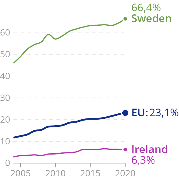
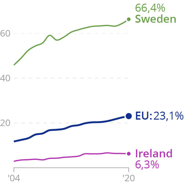
The grey line representing the other EU member states are removed from this chart. Source: Maarten Lambrechts, CC BY 4.0
To avoid overcrowded axis, smaller charts should have less axis labels. Labels on smaller charts could also have a more compact formatting.
Source: Maarten Lambrechts, CC BY 4.0
Bigger charts also offer more space for annotations. When the annotations are important for the message the chart is trying to communicate, they can not simply be left out of smaller versions of the chart. One solution is to move them out of the chart, to a separate space below the chart for example.
Annotations can be integrated into a visualisation when its dimensions allow it. Source: Datawrapper
When space is limited, the annotations can be listed below the visualisation. Source: Datawrapper
A more radical adaptation to a reduction in size is to change the orientation of a visualisation. When a chart has ample space in the horizontal direction, it could have a wide layout. But when the same chart needs to be designed for smaller widths, one solution is to rotate it 90 degrees, so that the layout changes to high instead of wide.
Some online media serve charts in different layouts depending on screen sizes. Below are two examples.
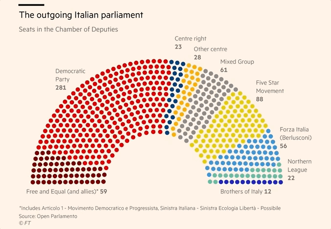
A visualisation with a wide layout is rotated on narrower screens. Source: Italy elections 2018 polls: who is running and why it matters, ft.com
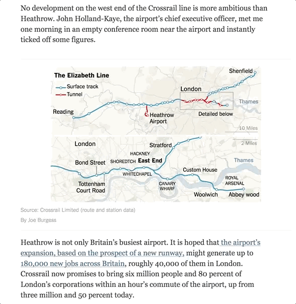
A map showing a long feature running east-west is rotated to have north to the left to fit on mobile screens. Source: London’s New Subway Symbolized the Future. Then Came Brexit, nytimes.com
And finally, the most radical adaptation to different constraints in dimensions is to change the chart type altogether. On mobile phones, a simple ranking or bar chart can make more sense than a choropleth map or a line chart for example.