Especially in news graphics, annotations highlighting and explaining data values and patterns in the data are popular and widespread (they also improve the understandability of visualisations). Of course, when the dimensions of a visualisation are reduced, there is less space to place these text elements. That is why they are often repositioned, reduced in length or even removed altogether in smaller versions of the visualisation.
Check the number, content and the placement of the text elements (including the chart title) on the following versions of the same chart, each designed to be shown on screens with decreasing size.
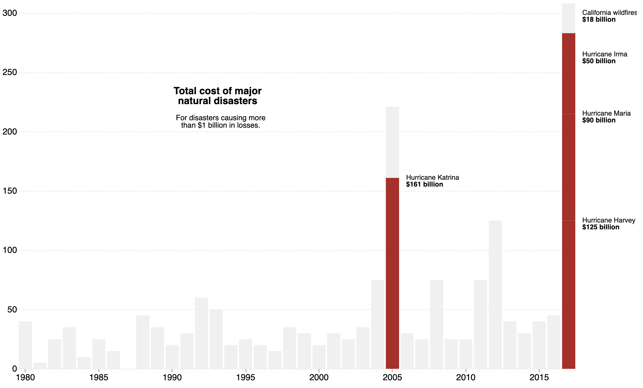
Desktop version. Source: Techniques for Flexible Responsive Visualization Design, Hoffswell et al
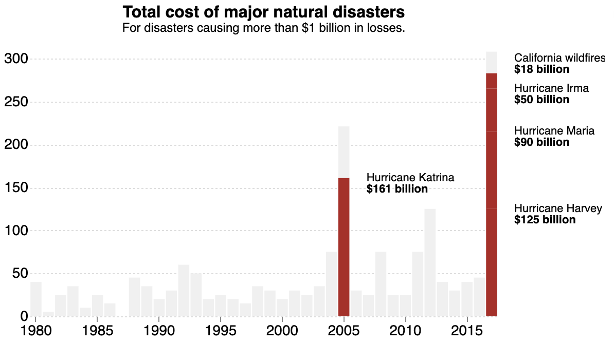
Tablet/phone in portrait mode version. Source: Techniques for Flexible Responsive Visualization Design, Hoffswell et al
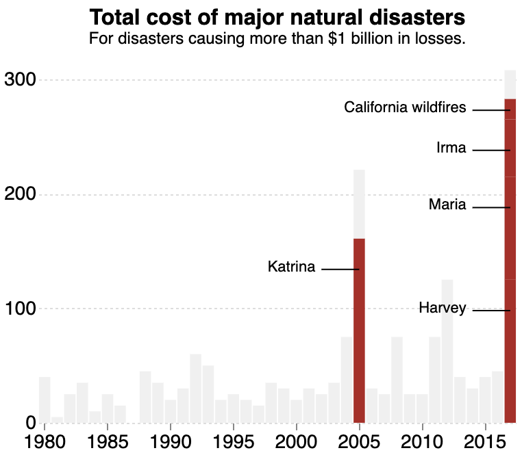
Phone portrait version. Source: Techniques for Flexible Responsive Visualization Design, Hoffswell et al
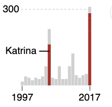
Thumbnail version. Source: Techniques for Flexible Responsive Visualization Design, Hoffswell et al
Other text elements in a chart are the axis labels and legends (together sometimes called guides). The number of axis labels can be reduced on smaller displays, and their formatting can be made more compact. Rotating the labels of the x axis is also an option, but because this compromises legibility, this is not good practice.
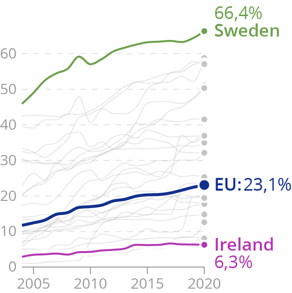
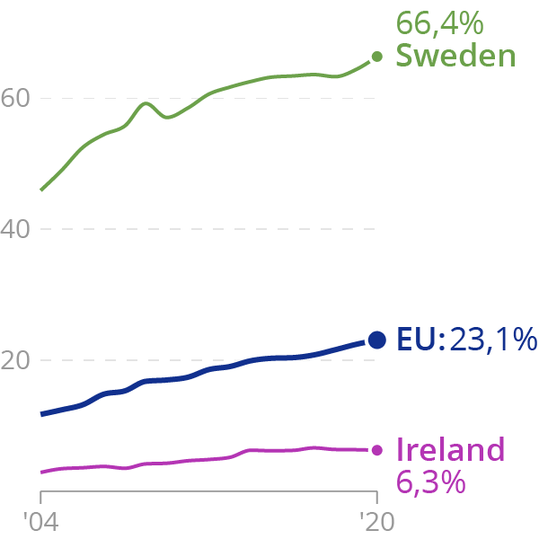
Consider the two following versions of a chart designed for small displays.
Source: Maarten Lambrechts, CC BY 4.0
Source: Maarten Lambrechts, CC BY 4.0
In the latter version, the data in the background is left out, and the number of labels on both the x and y axis are reduced. The formatting for the years on the x axis is also made more compact.
When data points are sufficiently labelled, axes can be left out completely, just as legends.
Another solution when many annotations are present and when the annotations are important and can not be left out, is to move them out of the chart, to a separate space below the chart for example.
Annotations can be integrated into a visualisation when its dimensions allow it. Source: Datawrapper
When space is limited, the annotations can be listed below the visualisation. Source: Datawrapper