One chart that is especially sensitive to differences in aspect ratios are line charts.
A wide layout, with a high width to height ratio, will flatten trends in time series. A high layout, with a low width to height ratio, will do the reverse and stress or even dramatise trends in the data.
A wide and flat layout suggest slow trends or even flat lines. Source: Maarten Lambrechts, CC BY 4.0
Narrow and high designs exaggerate trends. Source: Maarten Lambrechts, CC BY 4.0
So what is a “good”, “correct” or “honest” aspect ratio for line charts? One often cited rule, called “banking to 45 degrees”, says that the average slope of the lines on a chart should be 45 degrees.
This rule stems from a paper dating back to 1988: But the topic of the paper was how well people were able to compare the slopes of two lines on a chart. So it was not about extracting insights from a single time series, or about seeing the big picture in a line chart with many time series plotted.
On top of that, the researchers did not include average slopes lower than 45 degrees in their study. A follow up study actually showed that people performed better with lower average slopes.
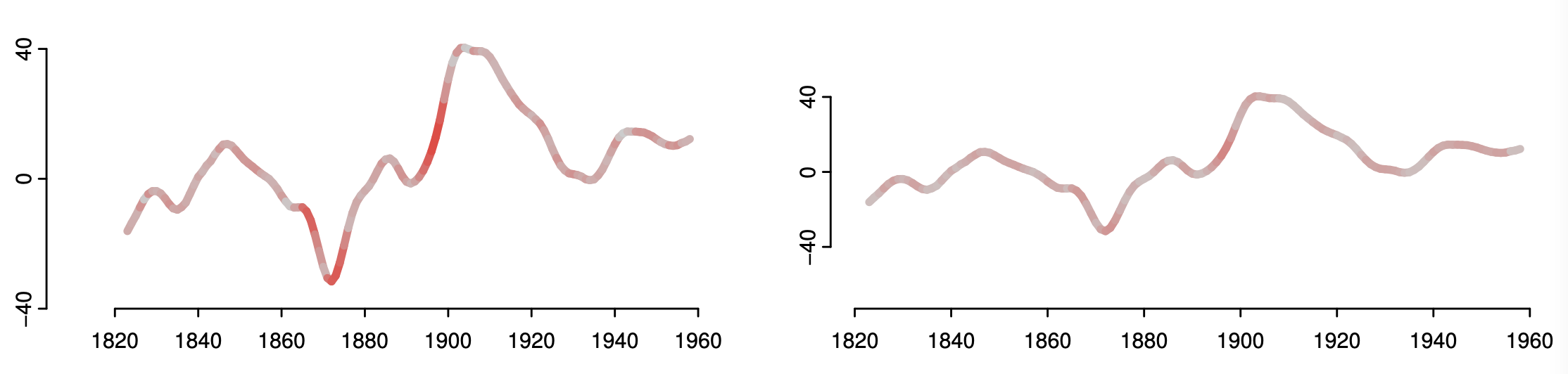
Both of these charts show the same data. The more intense the red, the higher the error in comparing the slope of a chat segment compared to other segments. A flatter layout leads to lower errors. Source: An Empirical Model of Slope Ratio Comparisons, Justin Talbot, John Gerth, and Pat Hanrahan
Despite the shortcomings of the initial study, “banking to 45 degrees” might still be a good starting rule, that produces balanced and ok looking charts. But deviating from that rule should be allowed when there are good arguments to do so.
A study from 2006 illustrated that different aspect ratios can reveal different signals in time series. Below are 2 charts showing the same data: the CO₂ concentration in a measuring station on Hawaii. The data on both charts show an upward trend, with yearly, seasonal cycles.
The first chart has a more or less square layout. On this chart, you can see the upward bend in the time series: the increase in CO₂ concentration is accellerating.
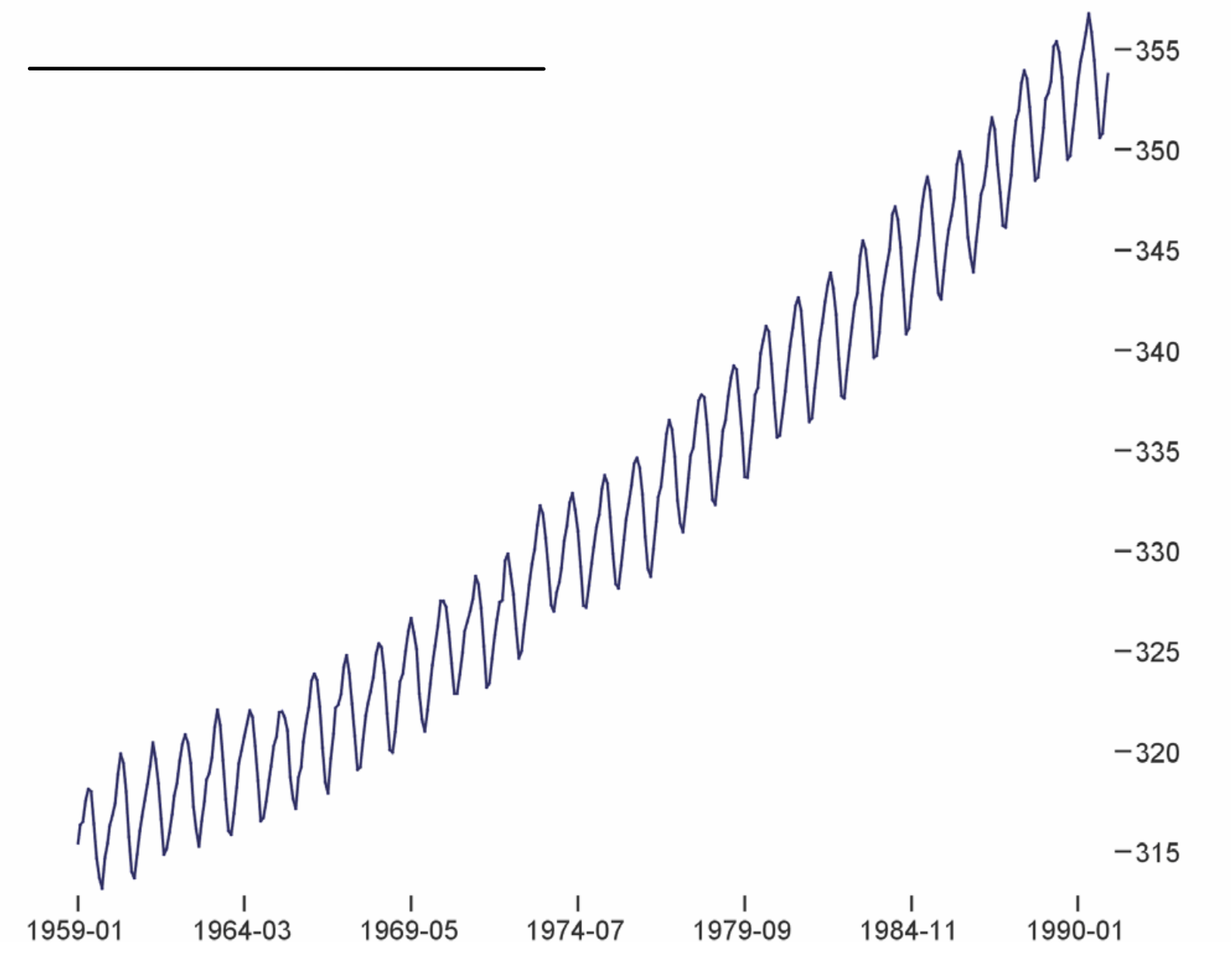
Source: Multi-Scale Banking to 45º, Jeffrey Heer and Maneesh Agrawala
The second chart has a flat layout. The upward bend is less visible than on the chart above. But something else becomes more visible in this chart: the seasonal decreases in CO₂ concentration have a higher slope (so they happen faster) than the yearly increases. This is less visible in the chart above.
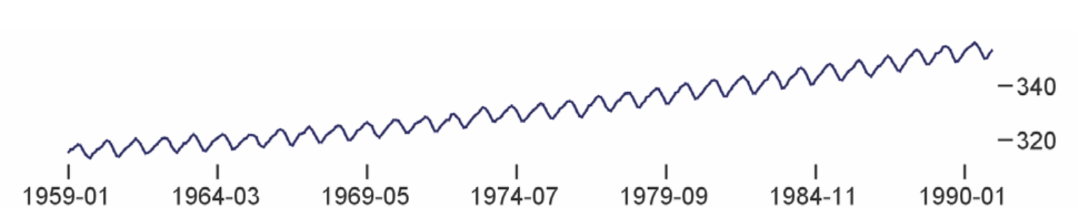
Source: Multi-Scale Banking to 45º, Jeffrey Heer and Maneesh Agrawala
This shows that the aspect ratio of a chart can influence what you can see in the data. So, let banking to 45 degrees be starting point, but deviate from the rule when needed.